Wednesday, October 14, 2015

HALLOWEEN ART MASKS


Geez, it looks like I won't have time to get a really good costume together for Halloween. If I had I might have tried a painted face of some sort. Maybe something painterly, like the kind of thing Philip Burke does. What do you think of his Arnold Schwarzenegger (above)?

I do worry, though. What if I put all that paint on and couldn't get it off? I'd have to go through life like that. Does gouache wash off easy? Is it poisonous?


Painted masks look great on girls!


Picasso's style makes for great painted faces (above). Even when it doesn't completely work, the attempt is usually worth seeing.

Here's (above) an interesting effort. Geez, Picasso would have made a great fashion designer.

I wonder if Picasso-type face makeup will become the standard for women someday. Stranger things have happened.


This girl (above) is dressed in cardboard. She deviates from the original in some ways but she looks like she had fun and she proves a point: Picasso could design real clothes.


For comparison, here's (above) the original.


I never thought of Picasso as a fashion designer til now. He was so prolific that you'd expect to see all sorts of wearables based on his designs, but I searched the net and didn't find a single one. Isn't some of his work public domain now? 

Lots of designers did their own version of Picasso's general style (above), but that's not what I had in mind. Not tee shirts, either.


Wow! This kid looks great!


Here's a takeoff on Picasso's "Weeping Woman" from 1937. 


For comparison (above).


On the net I came across some Picasso-type cars. I kinda' like this one.

Monday, October 12, 2015

CONCRETE BLOCK BOOKSHELVES


You can make great bookshelves with bricks or concrete blocks and a few planks, but that's a potential only, something that's seldom seen in the real world. Most tall brick shelves look horrible. These guys (above) pulled it off because they have an unusually high ceiling and are professional designers.


Most brick and plank shelves look like this (above)...


...or like this...


...or (Gasp!) like this!!!!!


Brick bookshelves should be low and wide...the length of the entire wall! The two-tier shelves in the picture above aren't made of bricks and planks but the proportions are right. I'm stuck with using available examples. Two tiers of books is just right. One more tier of books on the top shelf, with no plank on top, also works, but that's the limit...no more!

Tucking this kind of shelf under windows works best but if that's not possible, and you need more height, then the additional upper shelves should be bracket shelves.


 Frank Lloyd Wright used used to say "Emphasize the horizontals!" That goes for bookshelves as well as walls. Bookshelves like the ones above should have a dynamic, wall-to-wall horizontal sweep.

There should always be a little air space under the bottom shelf. That's to make it appear that the shelves are so light that they're flying. In reality they're heavy enough to squash an elephant!


Last but not least, the wooden planks should be thick, wide and long.  Don't use wood that's thinner than the ones in the example above. When I used to have shelves like this I used three inch thick cedar planks. If I remember right, they were 9 inches wide.

I prefer a natural wood look. One coat of varnish only. The thin, glossy white planks that are sold as bookshelf planks aren't thick enough. They look like they're struggling to hold the books and evoke pity.


Saturday, October 10, 2015

ORSON WELLES: GENIUS

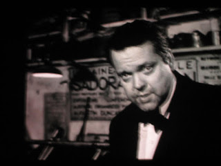
I promised some friends that I would tell them how the last complete episode of Orson Welles' TV travelogue show turned out. Well, I saw it last week at Steve's and it was, just like the other episodes, a revelation.  Some call it the Jean Cocteau episode, but Cocteau was hardly in it. Mostly it was an interview with a skilled American sculptor who lived in Paris and insisted on wearing a toga instead of pants.


Steve rightly summed up Welles' role as that of the listener. The focus was on what the sculptor had to say. Orson spoke only to provoke the man to keep talking. What seemed to interest Welles was not the man's opinions about pants but rather his dignity and good will. As in the other episodes Welles found a subject who represented what was good about mankind and just let the camera roll, trusting that we'd be interested. And we were.


One more thought: Welles was a little more active than I indicated here, though his technique was subtle. With his own voice and demeanor he established a civilized and encouraging tone. Maybe with a different interviewer the man's opinions would have degenerated into a rant, but with Orson they came across as thoughts deserving respect. The film was shot in the aftermath of WWII and I imagine that Welles believed in the healing power of friendly and intelligent conversation.

Interesting, eh?

Thursday, October 08, 2015

CHRONIC DEPRESSION


Recently I watched a couple of Youtube videos on the subject of Depression. Holy Mackerel! I realised that I know next to nothing about the subject. How many of us do?

Apparently the sexy subject these days is Manic Depression. Plain old run-of-the-mill Depression now appears so...yesterday. Maybe that's because the treatment for Depression is so standard now: anti-depressant pills plus maybe two years of therapy. The therapy is just to make sure you get in the habit of taking the pills. If you have Manic Depression add lithium to the list.

Anyway, through the videos I discovered that I'm in danger of getting some sort of depressive disorder.


 I'm moving to a part of the country where I'll likely have no cartoonist friends and where I'll probably have drastically reduced face-to-face contact. Recent studies show that this will put me in a high risk category for Depression.


Geez, I better enjoy Los Angeles while I still can.


People say that Skype is the remedy for isolation, but is it?  It's a futuristic technology and I love the idea, but it hasn't worked well for me in the past. I always run out of things to say, something that seldom happens when I'm face to face.


You could argue that the kind of depression you get from isolation is really just plain old everyday sadness. If my sad-inducing circumstances improved then my illness would vanish and with it my claim to a serious problem. That's a comforting thought if true, but the behaviorist in me can't help but wonder if the negative habits acquired in isolation can be shed so easily. I don't think they can.


Manic depression certainly is a lot more fun to think about. At least the manic people have times when they think they can do anything and are positively euphoric. The problem is that, according to one video, for some people it doesn't lead to anything positive at all. The ideas they get look silly the next day. They're just spinning their wheels. And besides, the depressive episodes of the disease last longer, and are more severe, than the manic ones.

That's all I have to say about this subject. I really don't know much about it. If I made a mistake I hope someone who knows better will correct it.


BTW: I noticed something called Borderline Personality Disorder on the sidebars of depression sites. BPDs are said to be impulsive, prone to mood swings, and lack empathy and a clear identity. Yikes! I've read that there's 140 kinds of personality disorder. That means an awful lot of us probably have a screw loose somewhere. It's scary!


Monday, October 05, 2015

RUTH ORKIN: PHOTOGRAPHER

Here's (above) a poster you've no doubt seen before. Can you guess the photographer's name? Good for you if you guessed Robert Doisneau, the famous photographer of street life in Paris, but...no, it's not by him.


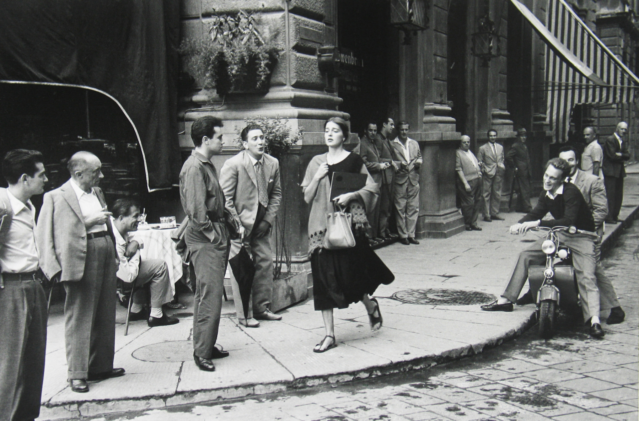
It was shot by an American, Ruth Orkin, for a photo essay called "American Girl in Italy." I looooove Orkin's work, and would like to try something a little bit similar.  I can't afford models so I'll try to badger my friends into acting for nothing.


 She liked to shoot girls being ogled. In some places pretty women cause traffic jams just by walking across the street.


Geez, we men are such horndogs! I think this picture was taken by Eisenstadt.


You can't rely on candids for shots like this (above). This picture is probably Orkin's and it appears to have been staged. Even so, it looks like it was insufficiently planned. Seeing misfires like this gives me a heightened appreciation of the pictures that worked.

BTW, notice the rider of the Vespa on the right has the same pose as the bike rider in the Italian picture at the top.


I think both Orkin and Doisneau wanted their pictures to appear to be candid, even though they often weren't. Poor Doisneaux was taken to court because his alleged models demanded money from the sale of the posters, even though I don't think that was part of the original agreement. The case dragged on for years and was said to have put gray hairs on the man. I wonder if Orkin had a similar problem.


Thursday, October 01, 2015

THE IDEAL WOMAN

There's a subject we've never discussed on Uncle Eddie's Theory Corner, and it's time to do that now. I speak of the Ideal Woman, the woman that all men dream about and who all women aspire to be.   


Notice I didn't say, "The Perfect Woman." No, no. The Ideal Woman isn't perfect. Nobody is. Expect her to be a tad moody sometimes.


And her friends might be a bit...oh, a bit on the "wild side."


Maybe some of them are a bit generous with their phone numbers. That's okay.


The woman I'm talking about cultivates an inner life that insulates her against the temptations of the  world. 


Her mind is on things like...science.


Of course the Ideal Woman has certain physical assets.


Cultural assets, too. She's always up on what the cutting-edge poets are doing.


And Earthy. She's very Earthy. The needs of the flesh are no stranger to her. 


The Ideal Woman isn't a slave to the fashion du jour.  


She chuckles at the fashion follies of lesser women.


No, the Ideal Woman embodies principals that are timeless. She's a thing of beauty that transcends attribution or description.


There she goes, a basket of wild flowers in her hands, leading the rest of us mortals to the bright and sunny uplands.

Tuesday, September 29, 2015

A CONTEMPORARY LIVING ROOM

I love the updated craftsman-type houses (above) that are popular now. They're pricey, though. All that wood and stone...the irregular room shapes, the architect's fee...they don't come cheap. Fortunately a number of neo-craftsman innovations have been incorporated into other more affordable styles, and I thought I'd discuss that here. 


For comparison here's the home of a friend. The house has a good vibe and my friend and his wife like living there. I see Mediterranean, craftsman, ranch and post-modern influences. I even see a little Cliff May and Frank Lloyd Wright.

The two posts are Craftsman. The ultra wide living room entrance/central corridor is Cliff May and the vestibule area is post-modern. I don't know who invented the sunken living room but I'll attribute it to Wright because he introduced so many similar ideas.


This view (above) is from the front door area looking into the central corridor. To the left we see a hint of the dining room and to the right we get a glimpse of the kitchen.

The pillars look like an obstacle in the photo but that's because I didn't photograph them well. In reality they come off as playful and even sheltering.

The very latest house theories would have the kitchen entrance at the end of the corridor rather than off to the right, but the right access is a nice counterpoint to the rest of the house so it works for me.


The dining room (above) is raised above the sunken living room and that works just fine. The steps look like something you'd trip over but I'd be surprised if anyone ever did. The raised floor lends importance and a sense of fun to the dining room and the abundant daylight makes it very inviting.

I'll bet lots of people sit on the steps during house parties.


I only have room for one more photo, so I'll put up this one, showing the door and darkened vestibule area. This probably suits my friend who has to stare into a brilliant computer screen all day, and no doubt welcomes a little rest for the eyes. Me, I don't have that problem right now so I'd opt for more light.

I'd put translucent glass panels all around the door. The light would bounce off the nearby walls as if they were additional light fixtures, and probably unpredictable mood lighting would result. Of course the neighbors would think I was crazy for undoing something that worked fine at the start.