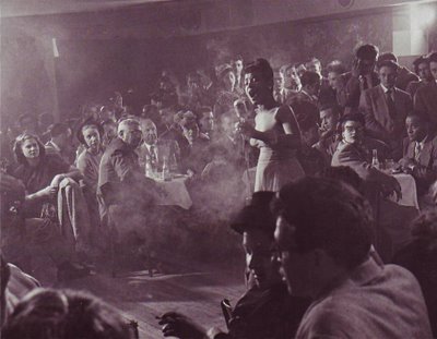
I love crowd shots. They remind me how much fun it is to be with a lot of people who like the same things I like. One of my all-time favorite crowd photos is this one (above) in what appears to be a nightclub. The people look like they came out of an old master's painting like Gericault's "Raft of Medusa." This is every performers dream, to be surrounded by listeners who "get it," who are on the same wavelength. Click on the picture to see the detail.
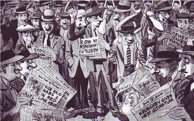
Crowds look better in magazines than in newspapers. Papers just can't resolve the faces, at least not photo faces. Drawn crowds like the Wood drawing above look good in any print medium. If you're a print cartoonist learn how to draw funny crowds!
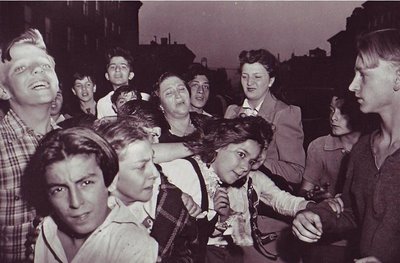
I know who did this crowd: Weegee the great New York tabloid photographer. A gambler's just been shot and a torrent of humanity streams out of the tenaments to get a look. It has that gritty 50's feeling. Humanity is portrayed as consisting of angels and demons with every shade between.
Saturday, August 12, 2006
Friday, August 11, 2006
DRAWINGS BY JOHN K. & CHUCK JONES
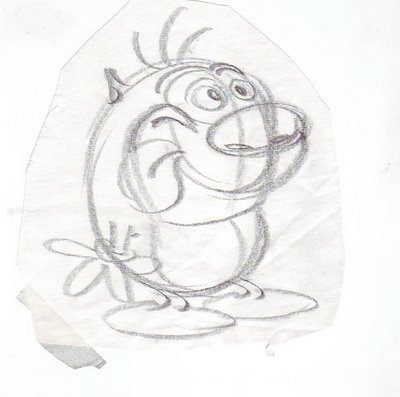
Here's a rough (above) that John did for Ren's opening shot in "Sven Hoek", R&S second season. The shape and height of the chair is hilarious, the placement of the picture frame is perfect. Like everything John draws the line is confident, the silhouette lets lots of air in and the pose is funny as it can be. Notice how he avoids "twins" in the legs and feet. Click to enlarge. Another John drawing (above), probably from the same show. I don't think this was intended for production. John was always drawing things like this on scrap paper to show people how to draw the characters. Look how tight the sausage of Stimpy's body is! And the emphasis on volume actually makes the drawing funnier!
Here's a xerox of a drawing that Chuck Jones did, maybe in the late 70s. Maybe it was a telephone doodle. The face on the right is an interesting blend of flat and constructed style. There's something offputting, even evil, about the characters but the skill is undeniable.
Thursday, August 10, 2006
MORE ABOUT DELSARTE
Readers who hated the last post I did about Delsarte will probably hate this one too. It's a hard sell to convince people that Delsarte's old-fashioned "tie-the-pretty-girl-to-the railroad-tracks" school of acting is actually worth studying.
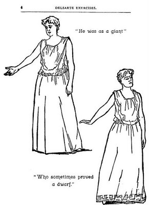
Here's the picture (above) I posted a few days ago. Look at it closely. The woman refers to the man as a giant, yet she's looking down and her hand is at waist-level. Why isn't her hand way up? She should be pointing up to the sky, shouldn't she? The guy's a giant after all. When she says he acted like a dwarf she looks upward disdainfully. What's going on? How come at the mention of "dwarf" she looks up, where she didn't at the mention of "giant?" Why is the orator defeating our expectations? Why don't her expressions and attitudes describe what's happening in the dialogue?
The Delsartean answer is that her gestures are describing what's really happening in the scene. the emotional point of the scene is that she's heart-broken with disappointment. The description of the guy is secondary, and is only an excuse to convey her emotion. The idea that gesture shouldn't slavishly follow text is extremely interesting. I remember a quote from Norbert Weiner: It is a cybernetic law that the more expected a communication is, the less information it contains." In other words, gestures that only mirror the dialogue are boring. Gesture should ADD to what the dialogue tells us!
Delsarte is full of ideas like this. How about the one where he says gesture should always preceed dialogue? Or repeated expressions of the same thought should always be identical? Or never dwell on the final word? Or geture should always be choreographed? Or...well, you see what I mean. It doesn't matter if the man is right. What's important is that he stimulates our imaginaton!
Wednesday, August 09, 2006
MORE CARICATURES OF ME!!!
Here's more caricatures of me by John Kricfalusi. The one on top has ears growing out of my cheeks, little curly hair whisps and lemur fingers. The expression defies description. It's an emotion that science hasn't catalogued yet. I see the figure as something out of "Island of Dr. Moreau":
"Men die under the lash...of his TORTURING WHIP...
Women SHUDDER at the touch ...of his CRUEL CARESS!
There's no escape...from this HALF MAN/HALF ANIMAL'S PARADISE OF TORTURE!"
Here I am (above) as a rat. I seem to be a likable rat. I have a curly, little whisp of an upper lip with piano keys dangling from it, a cavernous ear, and eyes that look like custard cups with a couple of flies sitting on them.
Oops! Here's the beast man again:
"What FIENDISH EVIL lurks behind this face? What WEIRD VENGEANCE is brewing!?"
Tuesday, August 08, 2006
JUST ONE MORE WORD ABOUT BOMBSHELLS
I have no idea how blogger will arrange the pictures I scanned in. Probably in the ugliest way possible. Oh well, nothing can dampen my enthusiasm for this post. I love talking about blonde bombshells. It was one of the greatest entertainment innovations of the 50s. It was not only good for busty actresses and scandal magazines but for popular literature, art, comedy, and the morale of the whole civilized world.
So far as I know the bombshell was invented by Norma Jean...I don't know her last name...the genius who transformed herself into Marylin Monroe. She was already beautiful but she wanted more than beauty, she was looking for something funnier and more flambouyant. She began by imitating Jean Harlow's look in "Dinner at Eight" then she slowly personalized the look. In the act of stylizing herself she helped to stylize the whole era she lived in. Charismatic, super-stylized characters like Marylin and Elvis provoke new structures in the media that portrays them, new kinds of stories, music, film making and acting. They're catalysts who stimulate everyone else's creativity. No wonder Arthur Miller fell in love with her.
INTRODUCING MILT GRAY'S MS. VIAGRI AMPLETEN
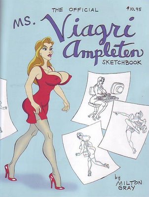
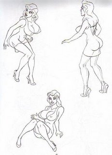
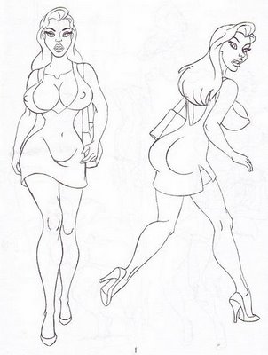
I wonder if blonde bombshells are making a comeback? For some artists they never really left. One of those is my friend Milt Gray who's just published his own how-to-draw-the-bombshell book (above). Milt is from the Jessica Rabbit, Bill Ward, Eric Stanton school of girl art. He goes bananas over a certain part of the female anatomy. Can you guess which part?
The pictures in the book are character layouts from a 12-minute sexy adventure film he's working on. He estimates that he'll have to generate about 15,000 drawings so down the line he'll need some help. If you need a job and can draw or animate this sort of thing, let him know. He plans to put up a web site soon at www.miltongray.comAt the moment the only way to get the book is from Astounding Comics, 224 E. Orange Grove, Burbank 91502, tel: (818) 953-7234 (What's the store's net address? Aaaarrgghh! I forgot to ask and it's a trillion o'clock at night as I write this). The store accepts mail orders.
By the way, You should also look up an article Milt wrote on animation timing for John Kricfalusi's blog. It's flat out one of the best things I've ever read on the subject!
Sunday, August 06, 2006
MOVEMENT THEORIES OF DELSARTE
A while back I talked about Laban's theories of gesture. Maybe I should give equal time to gesturist I like a lot better: Francois Delsarte. Delsarte was the 19th century theoritician who came up with the over-the-top acting style you see in some silent films, the ones where the poor old lady is thrown out of her house by the evil, black-caped landlord. The technique is so old-fashioned and so funny-looking that our entire modern theory of acting exists to refute and bury it. That's too bad because nothing better has ever been invented.
I'm not saying that we should throw out all the great performances of the last 100+ years and go back to stylized caricature. What I'm saying is that we should keep what was of value in Delsarte: strong sillouettes, an emphasis on style that seems real rather than realism, and acting with the whole body rather than the face where it's appropriate.
If you think Delsarte was only studied by campy, second-rate actors, think again. Among his advocates were dancerIsadora Duncan and fundamentalist preacher Billy Sunday (above and below). I'd like to add Lawrence Olivier but that's a guess and I haven't read it anywhere.
Billy Sunday is the best American orator I've ever heard. You can hear him here at: http://billysunday.org/audio/prohibition.wav
Delsarte was a elocution theorist as well as a movement specialist. Billy Sunday didn't try to tone down Delsarte, he pumped it up and exagerrated it. He was the most popular preacher of his day. I've never seen a film of Billy but I've seen a lot of still pictures. He must have put on quite a show.
Subscribe to:
Posts (Atom)