 Here's a rough (above) that John did for Ren's opening shot in "Sven Hoek", R&S second season. The shape and height of the chair is hilarious, the placement of the picture frame is perfect. Like everything John draws the line is confident, the silhouette lets lots of air in and the pose is funny as it can be. Notice how he avoids "twins" in the legs and feet. Click to enlarge.
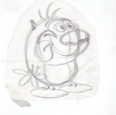
Another John drawing (above), probably from the same show. I don't think this was intended for production. John was always drawing things like this on scrap paper to show people how to draw the characters. Look how tight the sausage of Stimpy's body is! And the emphasis on volume actually makes the drawing funnier!

Here's a xerox of a drawing that Chuck Jones did, maybe in the late 70s. Maybe it was a telephone doodle. The face on the right is an interesting blend of flat and constructed style. There's something offputting, even evil, about the characters but the skill is undeniable.
 Here's a rough (above) that John did for Ren's opening shot in "Sven Hoek", R&S second season. The shape and height of the chair is hilarious, the placement of the picture frame is perfect. Like everything John draws the line is confident, the silhouette lets lots of air in and the pose is funny as it can be. Notice how he avoids "twins" in the legs and feet. Click to enlarge.
 Another John drawing (above), probably from the same show. I don't think this was intended for production. John was always drawing things like this on scrap paper to show people how to draw the characters. Look how tight the sausage of Stimpy's body is! And the emphasis on volume actually makes the drawing funnier!
 Here's a xerox of a drawing that Chuck Jones did, maybe in the late 70s. Maybe it was a telephone doodle. The face on the right is an interesting blend of flat and constructed style. There's something offputting, even evil, about the characters but the skill is undeniable.

16 comments:
It is impossible to not laugh while looking at the first drawing. Like you said Eddie, it's as funny as it can be. Ren's mouth is hilarious- I saw a bum in downtown la who had the same thing going on except somewhere else.... super gross!!!!
Stimpy's shape is so squished and cute, one can't help but want to reach out and squeeze some of his fat.
Holy crap Eddie! these are awesome! I love seeing pre production sketches.. You must have a stock pile of John drawings laying around in your closet or something. The stimpy drawing is so simple. Im sure a simply constructed character is great for an animator, but I also think that most of the greatest characters are the most simple designs. Do you find yourself designing characters even more simple for animation, or do you design the way you want even if it consists of complex construction?
Ryan: Simpler for animation!
What cartoon is that Chuck Jones drawing from? I'll take a wild stab and guess one of his Raggedy Ann & Andy films but I'm not even 20% sure of that.
That Chuck drawing should be pictured in the dictionary next to the word "mannerisms".
See ya
Steve
Hy Eddie
that's not my drawing of Stimpy. It's Charlie Bean or someone.
And Ren's legs do have twins! I'm fired.
John
I love all these drawings. I would love to see more of your drawings on here though. I like seeing your rough sketches more than anyone elses. Do you still work in cartoons, Eddie? Are you doing any work right now? I'd love to see you direct again. "Tales of Worm Paranoia" really blew my socks off.
awesome drawings thanks for sharing eddie!
"Look how tight the sausage of Stimpy's body is!"
-You're so funny, Uncle Eddie.
Max: I'm dying to do more drawings for this site! When I started my intention was to make 50 % of the entries new drawings. It's a lot of fun for me and it keeps me drawing when I'm between jobs. I just got busy and am temporarily taking some heavy meds. That won't last long.
I'm dying to direct again! I have lots of ideas I'm chomping at the bit to try! This is an exciting time to be in animation. Keep your skills up because things are getting interesting again!
Ryan: Glad to see you liked John's drawing(s)! Lots of people have more of his drawings than I do. We need to get the best of them published on the net!
I'm with you, the pencil roughs are the pearls of greatest price. That's where you see the artist struggling with his ideas and the best way to execute them. Even a xerox of a pencil rough is good for study.
Well Eddie, I guess Charlie (or "someone") isn't a half-bad artist himself, as it turns out. ; )
Hi Eddie
Sven Hoek has got to be one of the coolest, funniest and most classic Ren & Stimpy episodes ever made from Bob Jaques studio. I know that you love the psyhcotic ending with Ren, so do I. Thats the best scene out of the hole cartoon. I feel that Bob Jaques & Kelly Armstrong animated the best Ren & Stimpy cartoons ever made. I mean they did "Big House Blues", "Space Madness", "Stimpy's Inventions", "Man's Best Friend", "Sven Hoek", "Stimpy's Fist Fart", "Onward & Upward" and "Ren Seeks Help".
Jesse
P.S.
You should post up some of your Ren & Stimpy drawings & layouts here.
If I ever hear about an Eddie Fitzgerald cartoon in production, I am jumping on the opportunity to work for you.
That Chuck Jones drawing was done in the mid-to-late 1960's, as one of his casual 'telephone doodles', Xeroxes of which Ben Washam gave us around 1978 in his weekly animation class. While those two characters may have been done for The Phantom Toolbooth, they could easily have also been unrelated to anything in production. Most of these doodles were done on MGM 60's era animation paper, which Chuck had designed to display field limits for a 1:85 theatrical cutoff. These were of course drawn with his signature Blackwing, a very soft lead pencil resulting in this rough Xerox translation. Remember when you asked Chuck a question even he couldn't answer, Eddie? That was a classic moment in history! You showed him a print from an art book in his office and asked "Chuck, why do I like this picture?" The man was, for once, speechless.
Tom Minton
So Chuck used Blackwings, eh Minton? I never knew that. Fie on you, Eddie, not passing along that pertinent info! Well, you did say you thought I'd named my blog after a sword and sorcery game or some such crapola, didn't you? The shame of it!
I can well imagine that scene in Chuck's office. What were you guys doing there, showing him Tiny Toons designs? Lese majeste!
Jenny: Benny Washam brought us. The thing I remember most was Chuck showing us how he held a pencil. You hold it as high as you can control it. The higher the better.
Post a Comment