Thursday, January 31, 2008

SOME INTERESTING PICTURES!


I'm still wrestling with my new mac, trying to figure out how to get it to do what my old PC used to do. Boy, changing operating systems is traumatic! It's like going to live in a new country where you don't speak the language!  Every night I wrestle with some new mac problem, and I get so tense that it takes me a couple of hours to get to sleep.  Tonight I think I'll put all that aside and have some fun. Here's some pictures borrowed from other blogs that made me laugh out loud. Maybe they'll do the same for you!

Here's (above) a fine figure of a woman:  Bluto in drag from Bob Jacques' Popeye blog. What a pose! Why can't we buy cel set-ups like this? Click to enlarge.

 
In the best Popeyes the close-ups are always a special treat.  I'm awed by the unashamed cartooniness of this picture and the way it depicts Bluto's head as a tiny, ugly pimple  sitting atop a massive body. 


Bluto (above) makes his moves! It's profoundly disturbing and funny at the same time! Bob Jacques loves this stuff.  He even taught himself how to dance to the Popeye theme!  

 
How about some girlage, courtesy of Nico's blog.  Nico put himself to the task of enumerating the great cartoon women. He made some obvious choices like Red from the Tex Avery cartoons, but he also came up with some insightful, left-field picks like Olive Oyl (above). 


Nico says Beaky Buzzard's mom (above) was one of the greats, and maybe he's right! The Hungarian voice was inspired!

  
Of course Betty Boop's on the list!  How did Grimm ever think of giving her a head like a fly?


Nico also picked Jones' Ma Bear. Excellent choice! I wonder who did the voice? You don't think it was Stan Freberg, do you?


Man, she could turn on the charm (above)!


Here's (above and below) a couple of hillbilly pictures from Katie Rice's blog, "Funny Cute." This show needs to be on TV!


I'm getting all sorts of error messages so I can't provide links to these worthy sites, but most of you probably have them already.


Tuesday, January 29, 2008

SOME RANDOM THOUGHTS ABOUT ARCHITECTURE


Don't you hate wind traps?  I mean the buildings in big cities that catch the wind and throw it back at you, usually when it's cold outside and you're not dressed for the weather.  After a few minutes of walking past a wind trap you feel raw, like you've been sand-blasted.


I don't know any ordinary person who likes wind traps but amazingly, architects love them! How about this building by Frank Gehry? How'd you like to walk along the side of this building (above) on a windy day? Of course for wind trap-type buildings, every day is a windy day.  

I've never seen this building close up so I can't tell if it's accessible from the street. It looks like there's half a chance that the main door faces the river, not the front, forcing people from the street to walk around the bleak and arid concrete side. Probably most people come out of what looks like a wind trap parking lot on the right.  Imagine how cold the space in front of that lot gets when the wind blows off the river!

Maybe most people don't use the exterior doors and come into the structure from an escalator or an elevator in the parking lot.  Maybe it's just me, but that strikes me as sad. The space around a building is so electric and full of potential.  I think of a building as a big old shaggy dog of a thing that wants to be part of a community, not an isolated island that's imposed on it.

 On another point, I've never understood why architects don't make the exterior ground floor of their buildings more interesting. All you have to do is provide space for lots of little shops and let the merchants take care of the rest.  Of course you have to make sure the shops are visible from the street.  If it's a windy area you make an arcade. Visitors will come from all over to window shop along stores if they have the right "vibe."  Architects should be specialists in the art of "vibe."  


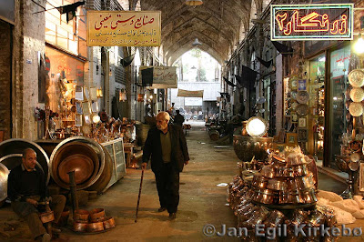
Here's (above) what every architect dreads...the cozy little street full of buildings conceived by by non-architects, and which come out of a specific cultural tradition.
 
 
On such a street you never know what you'll stumble on.  Every store reflects the unique character of the owner.

  
Changing the subject again, here's (above) a nice picture of St. Basil's Cathedral sitting in what used to be called Red Square, next to the Kremlin.  This has to be one of the most appealing buildings in the world. Legend has it that Ivan the Terrible had the eyes of the architects put out so they could never again build anything as beautiful.

  
Here's (above) the same building minus the snow.  What gorgeous color!


You don't see many pictures of the inside of St. Basil's.  Maybe that's because it's divided into eight chapels like the one above.  What an awesome room! The pattern looks like it was derived from delicate teacups and plates. It gives the room a fragile look, like a sneeze might bring the whole thing tumbling down.


Saturday, January 26, 2008

WHY SOFTWARE SUCKS


Well, there's a long answer and a short answer.  The short answer is the picture of a programmer's desk, above.   If you were a programmer yourself, can you imagine entering this guy's room and asking for advice about how to make a program easier to use for old ladies?

This is the domain of the ubernerd.  The guy's obviously obsessed with computing, has no girlfriend, eats his meals (frozen TV dinners, Kraft macaroni, canned chili) in front of his computer, and has a huge collection of action figures. This guy, who rarely sees the light of day, sets the standard for other programmers.  A guy like this couldn't even imagine a project less interesting than making programs easy to use. 

 
At least that's what David Platt says in his recent book (above) on the subject. Platt's a programmer himself and he used to be an ubernerd. He only changed when he started designing sites for big companies who had a financial stake in being accessable to the public. If you don't want to buy the book, try his websites: "whysoftwaresucks.com" and "suckbusters!"

According to Platt, programmers who try to make programs easy to use have no status at all where they work. Real status comes from increasing control, from figuring out how to increase the number of options for things, from helping the user to customize, and from making toolbars and desktops look pretty. 

I'm not kidding about the pretty thing.  A long time ago, when I got my first computer (a gift from John K) I lost a couple of hours trying to find the start icon on the computer screen. Everybody told me it was on the lower left but I didn't see anything there. I wanted to scream. Finally a programmer friend came over my place and, with eyes rolled up to show his annoyance, used a keyboard command to scroll up.  From the bottom of the screen, below anything you could see, emerged a start icon.  Just like a submarine surfacing.  I was shocked! Dumbfounded, I asked why anyone would hide a thing like that and he said it was necessary to make the screen more beautiful! He actually admired the people who made it that way!


That brings us to another point, namely that a large number of hardcore programmers consider themselves to be Nietzscean supermen and social Darwinists. They see themselves as a superior race. People who have trouble with programs are the unfit, the weak, the chaff -- those who need to be weeded out, or at least not catered to.  


That's such an odd attitude.  Don't the programmers benefit from the simplicity of supermarkets where all the types of food are conveniently under the same roof? Don't they benefit from the convenience of hospitals, departments stores and large electronic stores? If they benefit from the work of others who made things simple for them, how can they be so hard-hearted when it's their turn to return the favor?
 
Sometimes I wonder how valuable these people really are to the companies who hire them. They create value, no doubt, but they also remove value. How many people held off from buying programs or devices because they didn't want to wade through thick and boring instruction manuals?  

 America on Line got to be big enough to buy Time Warner because they attempted to make the internet more easy to use.  There's clearly a dollar to be made by making things easy, but the ubernerds aren't interested in that dollar, in fact they have disdain for it. Are they really serving the best interest of their employers? 


Friday, January 25, 2008

ANOTHER BLACK & WHITE! STILL VAMPING WHILE I FIGURE OUT THE MAC!


"Hi folks! I, uh...thought you might like to meet a friend of mine!" 


"He's kinda' shy, but...I don't know....maybe we coax him out!"


"Wait a minute! There he is...hold on just a second....."


"And here he is!!! Folks, meet my pal Rudolph!!!!!! Say hi, Rudolph!"


"Folks, don't run away!  I know a lot of you hate puppets! Big mistake! Ya gotta give them a chance! They're the cutest little things! Here, watch this......"


"Hey Rudolph, do you have a message for our readers?"


"A hug!?? That's the message!?? Aw, that's Rudolph's message...a great big hug!"


"Well, here's back 'atcha little guy!"


"Another hug!? Awwwww!"


"I love you too, Rudolph!"


"Hey, why don't you keep everybody entertained while I get a cup of coffee?"


"Be right back! See ya in a minute (laughs)!!!"


Silence as Rudolph waits till Uncle Eddie is all the way out.


Puppet:  "Laugh now, Bucktooth, because you won't be able to laugh later on!  Your time is running out!"
Puppet: "The day will come when puppets will no longer have to tolerate human hands in their pants!"

 
Puppet:  "The day will come when the doors of my jungle laboratory will roll up, and a new race is unleashed upon the world....a race of zombie super puppets! Puppets who VILL TAKE OVER THE VERLD!"


Puppet:  "Yes, they will take over the Verld, and I, Rudolph, shall be their Supreme Master!!!!!! Prepare to bow down, vile worms! Your new Master is here!!!!!!"


Uncle Eddie (off screen):  "Everything going OK, Rudolph!?"


Uncle Eddie: "How'd it go!? They loved you right!??"


Uncle Eddie (Voice Over): "Of course they did!! Everybody loves Rudolph! He's so doggone lovable!"

He gives Rudolph some "noogies" on the head. 

Uncle Eddie:  "Gotta go! Bye everybody!!!!!! Say good-bye Rudolph!!!! Byyyyyeeeeee!!!!!!!"


Note:  Thanks to Mike for the cool puppet! And thanks to Ed Wood for the laboratory line!


Wednesday, January 23, 2008

WHY DID 60S FILMS LOOK SO BAD?

Something that needs to be explained is why color films of the early 60s were so badly photographed and composed.  Every shot in the films of this period seemed geared to producing good lobby cards.  Telling the story seemed to be secondary.


It's doubly puzzling because only a short time before, in the black and white era, Hollywood had no difficulty shooting dramatic scenes (above) in a convincing way. 

Sometimes I think Technicolor was to blame. The color was gorgeous but lighting it may have been so difficult that studios opted for simplistic set-ups.  Maybe wide screen was to blame. Maybe flattening long lenses. 


Another possiblity is that the minimalist aesthetic had set in and art directors simply thought that less was more. Look at the Hanna Barbera cartoons (above) from this period. Some of them are mind-numbingly bleak and arid, but I doubt that many people complained.  


Here's (above) what we would call today "TV lighting" and staging applied to a feature film. The characters are reduced to simple shapes. The background is generic, made a little dark in one spot to make Doris Day pop out.  The whole look is flat. Probably the technicolor was beautiful, but so what -- the composition and modelling are lifeless.

 
Here (above) human beings are reduced to cardboard cut-outs; just shapes and colors. It's scary because you get the feeling that the stories were simplified and streamlined to fit the clunky photography. 


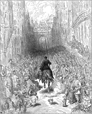
Me, I prefer lighting that brings out the gritty humanity of the characters. I also like to see lots of extras, like in the scene below.  That doesn't work at all in animation, but it makes live action spring to life.