Thursday, July 26, 2012

THE UNKNOWN REN AND STIMPY


I'm so excited to see that John K's Kickstarter numbers are right where they should be, and that the new George Liquor cartoon may actually get made. Even so I'll be biting my nails til the final results come in. 

All this thinking about John has prompted me to share some Xeroxes of John drawings I saved from Spumco. Unfortunately most of that stuff is boxed up in the garage, but I have a few things near my desk that I can whip on the scanner right now. See what you think.

Hmmm...most of the folder pictures are from an episode of Adult Party Cartoon called "Onward and Upward." That was the first show of the series, and I just loved it.

Here's (above) some photos of John and me acting out Ren and Stimpy sitting at a table, about to eat soup. John plays Ren, who's very snooty and concerned that the rules of etiquette be observed. I play Stimpy who just wants to wolf everything down. Aaargh! My Stimpy looks pretty stiff here, but the photos were still useful, if only to point out that my acting needed more ooomph.

Amid Amidi took the pictures with John directing.
John had lots of ideas for how Stimpy (above) might reach for his soup spoon.

Here's (above) John trying out some Ren snooty poses.  Geez, the man can draw! It's a combination of classic volume combined with flat, and of strong lines and shapes combined with thin, graceful ones.

 Now (above) John tries out a Ren reaction pose. Ren is completely grossed out by Stimpy's coarseness. The cat is so uncouth!


Here (above) John experiments with how Stimpy might sip the final pea in the spoon. In this version Stimpy has difficulty getting the pea past his teeth. I love the way Ren leans in and does a slow burn as he watches.  He just can't believe how stupid his friend is.

BTW, how do you like that one-of-a-kind face on Ren? John was constantly coming up with expressions nobody'd ever seen before.

Finally Stimpy sucks in the pea...or tries too. The schtick that follows is some of the most innovative in the cartoon. John wisely gave the gags time to play out, rather than race ahead to the next plot point. It took courage to do that because the accepted wisdom in the industry was to never linger on a gag. For John the gags were the reason we do the cartoons in the first place.

BTW, how do you like the way Stimpy's drawn here?  It's crude, even a bit amateurish. Why, you might wonder, would one of the most skilled draftsman in the industry insert such a pulpy drawing here? The answer, I believe, is that the crude drawing underlines Stimpy's dimwittedness, which is what'll cause Ren to explode later on. That, and it also happens to be the best way to focus our attention on the pea.

Geez, this film was innovative on so many levels.

Anyway, here's  the link to John's Kickstarter site:

http://www.kickstarter.com/projects/1056985656/john-ks-cans-without-labels

He added a bunch more prizes. Aaaargh! I MUST have that cereal box!!!!!!


Tuesday, July 24, 2012

THE MOST PRECIOUS THING IN THE WORLD

It all began with the death of the old hermit.  I was hiking off trail in a remote valley when I stumbled on what appeared to be a hermit's cave. After calling and getting no response I cautiously entered and soon discovered the skeletal remains of an old man underneath a ragged blanket.  Clutched in one hand was a hand-made map. The inscription read, "Follow these directions and discover The Most Precious Thing in the World."

I know what you're thinking, that what I held in my hand was just the raving of a crazy old man, but there was no mistaking what the map was wrapped around: a dazzling blue emerald the size of a quarter.

I used the emerald to finance a quest for the seven keys mentioned on the map. At the final location I'd need the keys to unlock something...I couldn't tell what. The quest took me to some of the most remote spots on Earth.


Some of the places I visited (above) weren't even on conventional maps.

For one of the keys I'd had to battle lions.


For another I was forced to run a gauntlet through screaming Maoris.


One thing all the key holders had in common.....


.....none of them wanted to give up their key without a fight.


One key was guarded by rabid bats (above).

Another by piranhas.


One I had to wrestle for.


Finally, weak and weary after years of questing,  I reached the hidden lake described on the map. According to that document I should find an island, and on that island I should find what I was looking for. I made a makeshift raft out of driftwood and set out.


On the island (above) I discovered magnificent gardens. They looked freshly tended, yet there wasn't a soul in sight.


The gardens led to a magnificent palace (above), and in that palace was a long, silent hall. Again....no people.


At the end of the hall was a dark, quiet garden with fragrant flowers and a reflecting pool. A door stood open.


Inside the dimly lit room was an ornately carved platform. On the platform was a box.

  The box (above) contained seven locks. I fumbled through my pocket for the keys.


One by one I inserted them.


My hands trembled...that malaria I'd had made the turning difficult.


At last, the final key!


Yessssss........


TO BE CONTINUED on THEORY CORNER.....................

Sunday, July 22, 2012

RECENT ASTRONOMICAL PICTURES

Above, Saturn's moon, Helene. Nobody knows what causes the stretch marks, or why cratering is so slight. The moon is thought to be made of ice...a giant iceberg 30k across.


Not all spiral galaxies are perfect disks. Some are floppy like this one (above). Our own galaxy is slightly floppy, which supports speculation that we collided with another galaxy billions of years ago and are still in the process of settling down.


Above, a back lit photo of Enceladus, another moon of Saturn. Like Europa this is thought to contain a substantial underground ocean of liquid water.


This (above) is one of the clearest views yet of the Orion Nebula.


Above, the core of a dense star cluster way out near the rim of our own galaxy. Stars are incredibly close here and, with every star churning out solar ejecta, the area is probably radioactive beyond anything we could imagine.


Here's (above) two galaxies colliding, along with the resulting shock waves. We're seeing the collision from the back of the foreground galaxy. The galaxy that's hitting it is behind the one we can see, but we can see a glimmer of it in the form of a blue rim light


As the title says, this (above) is a film which zooms into the center of our galaxy and reveals the supermassive black hole there. It's a montage of pictures shot on optical and infra red wavelengths. What makes this special is that it includes a picture of the central black hole. Well sort of...it's actually a picture of a newly discovered gas cloud surrounding the black hole.

Nifty, huh?

Friday, July 20, 2012

JOHN K's "CANS WITHOUT LABELS"


John Kricfalusi's gearing up to do a new George Liquor cartoon, "Cans Without Labels," and to judge from the pitches, it promises to be the best thing he'll have done with that character....by far! If the man animates as well as directs then we'll have something for the ages....pure animated joy!


Here's (above) a picture of John attempting to pitch...I'm guessing...a George Liquor cartoon. It's amazing that he can even speak, covered as he is with purple ants running around screaming at their larvae.

The film features old Spumco hands Jim Smith, Eric Bauza, and Gabe Swarr, and new talent: John Kedzie and Sarah Harkey. I'm in there too as the voice of Cigarettes the Cat!

The film also features Mike Pataki as the voice of George Liquor. Mike's always been good with this voice but his performance on this film may be the best thing he's ever done...a career high point. Let me explain.


Mike (above, as a Klingon on Star Trek) was a truly great actor who was rarely used correctly during his lifetime.  His one-of-a-kind gravely voice, his musical delivery, his ability to project personality, and his endless nuance and invention made him unique. I'm amazed that, before John, no one attempted to build a character around him. I was present at the recording for this film and I got a strong sense that Mike felt he was finally working for someone who "got" what he was about. What I saw was an actor at the peak of his power who was determined to give the session 100% of himself, with no holding back.


John had to have been Mike's dream director. John had a definite point of view about things and I think Mike needed that to help him focus. The two complemented each other perfectly. You could feel the respect and affection they had for each other.


And why shouldn't they? Here were two enormously talented people who had subordinated everything to their work, who made enormous personal sacrifices to make the discoveries that they did. Here they were in a studio session, working on a project they both strongly believed in. I had no doubt whatsoever that I that was watching history being made.

Geez, I forgot to talk about the story! That's okay...you can listen to John pitch it himself  on Kickstarter. Here's the link:

http://www.kickstarter.com/projects/1056985656/john-ks-cans-without-labels


Thanks to Fred Seibert for the picture of John covered with ants.


http://archives.frederatorblogs.com/frederator_studios/tag/john-k/ 


Wednesday, July 18, 2012

"THE WRINKLE MANIFESTO"

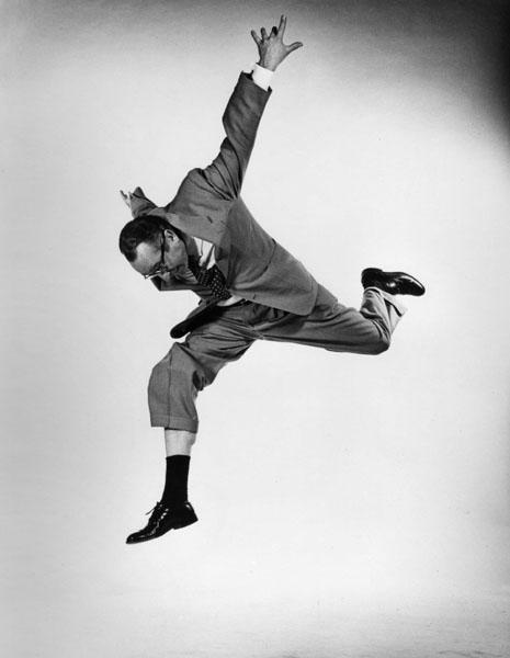
Most of these pictures are from Phileppe Halsman's "The Jump Book." It might just as well have been called "The Wrinkle Manifesto," because that's what it is: a visual argument for bringing back loose clothing that wrinkles easy.

Current fashions (above) don't wrinkle much. They make the wearer look good, but that's the problem. They make the wearer look too good. How boring!


It's selfish to dress for yourself. The truly social person dresses for the amusement or enlightenment of the people he encounters on the street. Nobody wants to see a street full of generic people, all without obvious defects. Why leave home if that's all there is to see outside?  


This woman gambled and lost. A gust of wind came up and blew her dress too high..but I don't think many people minded, at least not many men. I admire her for wearing a dress that wasn't risk free. 


Now, don't get me wrong...I'm not suggesting that we do away with tailoring and wear bedsheets. The best clothes from the Wrinkle Era (the 1930s and 40s) were all made from good fabrics and were all nicely tailored...but the tailoring was alternately loose and tight...it never did away with risk. 


It's true that wrinkles sometimes make the wearer look bad, but so what? To put on loose, wrinkly clothes is to take a risk, and that's what life is all about. "A harbor is a safe place for ships, but ships were not made to stay in harbors."


The Golden Age of Wrinkles ended sometime in the mid 50s. That's 50s Rock and Roll personality Dick Clark above. Dick did a great jump but his skinny trousers failed to flap and wrinkle at the right time and a potentially beautiful picture was lost.


Clark could have had this (above).


Monday, July 16, 2012

WHAT KILLED ROMANCE COMICS?

What killed romance comics? I wish all questions were as easy to answer. It's pretty obvious that what killed love comics was...good artists.  People who draw well, like Neal Adams, simply couldn't master the surreal, grotesque world of twisted love.  Good artists took over the romance comics and drove the readers away.

I know what you're thinking...Jack Kirby (above) was a good artist and he was one of the inventors of romance comics. True enough, and he did a good job. But Kirby was the rare exception that proves the rule.  Cheerful, wholesome, family men like the artists at D.C. simply couldn't get down and dirty enough.

BTW: How do you like the Kirby drawing above? I like the way the man with blocky fingers wraps his arm around the girl with the webbed claws.  Amazingly, their faces seem to occupy the same space.


Here (above) a lesser artist tackles the same subject. In real life the girl's neck would be broken by this pose, but it works. The pose on the man's hand is a bit off, but it appears to have been scratched by bears so we forgive the mistake. 


Is this guy (above) kissing a cardboard cutout? What are those ginger root thingies on her arms? And why is she posed like that? I don't know, but it works for me. This is the kind of artist who belongs in the romance biz. 


The girl (above) puts her tiny little arms around her giant behemoth of a boyfriend, who appears to be sucking on her forehead. The artist is on to something here. The real life size difference between men and women is shocking. You can't imagine how people so different could even procreate. It's an interesting observation,  but only the lesser artists take the trouble to comment on it.  


Here (above) the girl has the usual tiny arms, awkward perspective cheats, and fish fingers.  That's okay, I'm used to it. 

What I'm not used to is the way their faces fit on their skulls, The girl's face is extremely wide, and wraps around the whole front of her head. The boy's face is just the opposite...it's pinched and crammed into a thin, vertical strip. You see incongruities like that in real life but only the lesser artist is brave enough to comment on it. 

Like I said, good artists killed romance comics. Good artists are too predictable, too wedded to stereotypes to portray the kind of quirky love that romance media demands.