
 Well, I don't think we nailed this problem last time. I tried Jorge's method of printing the covers in black and white and that helped a lot. Now we see the girl is done entirely in middletones. In B&W her panties almost disappear. The whole middle part of her body appears as one, big, grey haze. It's as if that part of her was an uncluttered area where the eye could rest, a blank area to contrast with the stark angles and colors elsewhere.
In B&W I see that my eye starts the picture by fixing on the guy's face, but the face lacks detail so I allow the wedge of white light to carry my eye down to the girl's thighs. Being a guy I naturally want to linger there but there's no detail to fix my attention. I follow the greater complexity of her upper body to her eyes and they lead straight back to the guy, which is where we started. My eye keeps circling the page.
 A commenter last time mentioned that the guy (above) looked like he was lit by colored gels on spot lights. The girl is lit more naturally. Two people that close together still get a different light treatment.
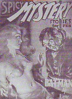 In black and white you can see that a lot of this cover (above) is in middletones. Only the yellow in the titles comes off light. The guy appears to be both underlit and toplit. The girl is only bottomlit. Interesting. They have seperate lighting.

For me this is a warm picture with cool accents though you could argue that the cool threatens to dominate. My eye starts on the girl's face then travels down to her thighs where it gets lured away by the yellow in the bottom title. From there it travels up the guy to his face, which is looking at the girl, which completes a circle. The problem is that the two are looking at each other so intensely that there's a temptation to keep your eyes on the two heads. Spizz was put off by the overt sexuality in this picture but it seems to me that the artist had to give the girl a sexy, detailed body to keep the eye moving.
14 comments:
Come to think of it now- it's not the best composition considering he's lit more dramatically but in the middleground- she should have been in the middle. The reason she's lit so softly and he's lit dramatically is to favor each's features. She's a soft women- so she's lit softly- he has manly features that require more intense lighting.
They did more of this in old movies - a great example is any of Leni Refienstahl's The Blue Light etc.
Yay Eddie!
I think the lighting is the key... The girls are lit in the clear light of day. They're undressed, making them totally vulnerable and out of place in the daylight, as if they were snatched from a private moment and thrust into the stark light of day.
The men are in the dangerous lighting of night. Light sources are coming at them from all angles and in all colors to indicate the chaos and danger of the situation. The one on top is totally in control, with gun drawn and a determined expression. He has his hand on the girl's shoulder as if to grab her and drag her from her lighting to his. Even the lighting indicates corruption of the innocent!
The top image is definitely the most powerful.
See ya
Steve
Spizz was put off by the overt sexuality in this picture but it seems to me that the artist had to give the girl a sexy, detailed body to keep the eye moving.
Wha? Where did I say that? Or do you have me confused with Jorge? ;-)
I like the way the b/w scans immediately emphasize good vs. evil, especially in the first cover. It's practically sliced right in half diagonally, like that old tobacco package.
Half of me
wants to be
g-o-o-o-o-d...
Here's something I just noticed: in color the man comes off as menacing, like he's kidnapped the girl and he's snarling,
"One false move, and the skirt gets it!"
but in b/w he looks more like her protector:
"Listen, sister, this could get messy, but don't you worry your pretty head!"
Lighting most definately. And I guess the girls wouldn't be quite as attention-grabbing if they were in jeans and a t-shirt. Vulnerability = sexy in these pictures and what's more vulnerable than the damsels in distress being in their underwear?
Then of course the natural, brighter lighting of innocence brings that out more.
Then the men are shadowed; the first indicating power and control. The second as something more foreboding and frightening. He *is* dead, so what can be more frightening than that!
This is actually similar to what I commented last time, but I was overanalysing the colour schemes. Black and white really do help see these things better!
Jenny: Mary Blair!? I LOVE Mary Blair! A lot of her color schemes are tints of analogous colors with one startling accent.
Spizz: I assumed you thought the cover was lurid because you said the people who bought those magaines were loathesome sleazeballs (or something like that). I think the writing in magazines of that type was pretty good. I wish there was a good anthology of pulp writing, one that left out the big names like Chandler and Hammett!
Kali: Wow! Refienstahl and Buster Keaton! You have good taste! How do you like Otis?
Steve: Nice prose! If I'm ever in a sadistic mood I think I'll drag the vulnerable, half-dressed girl I'm with into my masculine, chaotic lighting.
Anonymous: You start with one over-all color then put in harmoneous accents? Wow! Interesting!
"Kali: Wow! Refienstahl and Buster Keaton! You have good taste! How do you like Otis?"
I'm glad you share the same taste! I'd love to read a bigger list of your favorite things to watch!
I like Otis- it's near where I've always lived- which is a big plus. I'm in the Digital Media department- so I get to do all the cool stuff. There are many awesome teachers here who also teach at Calarts- and it really(with any school) depends on how much you want to learn- so I always hound the teachers after class for more-plus they all have such interesting lives. Making friends is always good for little jobs here and there- I always have something to do!
Pretty much, I'm having tons of fun working- yay!!!
Spizz: I assumed you thought the cover was lurid because you said the people who bought those magaines were loathesome sleazeballs (or something like that).
Oh, the cover is lurid, but it's supposed to be, isn't it? And sleazy, maladjusted creeps, as I described them, aren't necessarily loathesome. Shame on you! Now look what you've done! The poor little sleazy maladjusted creeps have got their feeelings all hurt thanks to your reckless stereotyping! Cripes!! I hope you're proud to bursting, Mr. Say Bad Things About Sleazy, Maladjusted Creeps! Way to say bad things, Mr. Say Bad Things About Sleazy, Maladjusted Creeps! Now I'm going to be up all night arduously rebuilding their self-esteem, yet again. This sucks.
Kali: Favorite live action things to watch? Well, it would be a long list: Detective Story (B&W version), Young Man With a Horn, Mildred Pierce, Clash by Night, Night of the Hunter, Jane Eyre (Welles version), the best Dickens and Shakespeare films, Dodsworth, Shop Around the Corner, It's a Wonderful Life, the best silent comedies, Maltese Falcon, noir films like Nightmare Alley, Gun Crazy,...the picture where Robert Ryan confronts Robert Mitchum, the one where Vince Edwards plays a hit man, Man for All Seasons, the best dance scenes in Astaire and Nicholas Brothers films, Garbo in Grand Hotel and Romance, the best Jerry Lewis scenes, a couple of Jim Carrey movies, Paul Muni as Zola and Pasteur, Robinson as Max Erlich, Greer Garson as Madame Curie, Magic Flute, Lust for Life, Burn Witch, Burn, Glengary Glenn Rose, The Fountainhead, Jason and the Argonauts, Night of the Living Dead, The Ring (the horror film), Mr. Bean, Fawlty Towers, Monty Python Python, Sid Caesar, Kovaks, Stranger on the Third Floor, The Raven (b&w), Leonne, The Matrix, Kill Bill....There's more but I better get back to work.
Jorge: I looked up the pictures. A nice one of me and some funny ones of John. Do you mind if I use the ones of John to illustrate an article on him sometime in the future?
Oh so many movies to catch up on! Now I know what to grab at the library for the week ahead!
Kali: where did you seen Leni Riefenstahl's "The Blue Light"? Is it available on DVD? I've seen only some excerpts in the documentary "The Wonderful Horrible Life of L.R." and it looks like a strikingly beautiful movie.
Uncle Eddie: that's a fantastic list! Many of my favorites are there. And thanks for last month's recommendation for "The Stranger on the Third Floor". I managed to find the copy yesterday and really enjoyed it. It has the creepiest apparition of Peter Lorre, and that incredible 10-minute dream sequence wouldn't be out of place in a Clampett cartoon or John K. psychodrama. Nice b&w photography too... it's a great example of an inventive low budget production that puts some more expensive movies to shame.
hammerson: I've only seen the blue light on vhs at my school-probably is dvd somewhere...so yay vhs!
"The Wonderful Horrible Life of L.R." she's so fiesty for a 90 yr old in that video!
I'd never heard of Burn, Witch, Burn until now, and I initially thought it was a remake (or pre-make) of the transcendant Horror Hotel, possibly my favorite terrible horror movie of all time. It's even more entertaining than Plan 9 from Outer Space. Yes. It's that good.
In Horror Hotel, though, the college professor is pro-witchcraft, and the story begins with him delivering one of his fascinating witchcraft lectures:
As the scene opens we are treated to the full-screen image of the professor's contorted face. "Burn, witch, burn! Burn, BURN, witch!" he recounts for his rapt audience of eager pupils, who furiously scribble notes for the Big Final. Since the professor is played by the incomparable Christopher Lee, one can surmise that trouble lies ahead.
"Burn, witch, burn! Burn, witch, burn! BURN, WITCH! BURN, BURN, BURN!" becomes a sort of chant throughout the film. So does the battle cry of The Handsome Young Student, who calls out to his missing love interest, "Pat! Patricia! Pat!" as he searches for her in the graveyard. "Pat! PAT! Patricia! PAT!!" Who among us wouldn't prefer to be addressed by our given name rather than some crass diminutive foisted upon us? We're in peril, and only the name given to us by our dear old mother will do.
"Pat! Pat! Pat! Patricia!"
Now that's more like it.
If you took a great film and converted it to b/w and it turned out to be less great, would that mean that it really wasn't as great as everyone thinks? I mean composition-wise, drama-wise, that sort of thing.
Maybe the fact that the two characters are lit so differently also helps to create depth and perspective: if the man at the back has a different sort of light shining on him we interpret that as meaning that he's farther back, even though they're not very far apart. Maybe it's an easy, instant way to create depth, something I like very much so I'm guessing other people like it as well. And these covers are made to be appealing and attractive.
Post a Comment