
 Two of my favorite spots at Disneyland are Mickey and Minnie's houses. None of the pictures here do them justice. The best parts are beautiful and surprisingly sophisticated.
 The exteriors (one shown above) are amazing for their use of space. The houses seem simultaneously very big and very small. I'm not referring to spaces behind facades but to what you actually see from the street. How did they do that? And look at the garden; the balance of shapes somehow makes it look like all the elements are in motion. The effect is shocking! Are any architects paying attention to this? This is a really interesting idea.
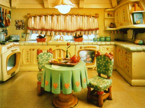 Sadly the picture of the kitchen (above) doesn't capture the dynamic quality of the space. The scale of the objects, the scuptured negative spaces and the magnificently sheltering ceiling are exciting! The only thing that mars it for me is the even spacing of the folds in the tablecloth. I only wish I could have gotten good photos of the living rooms.
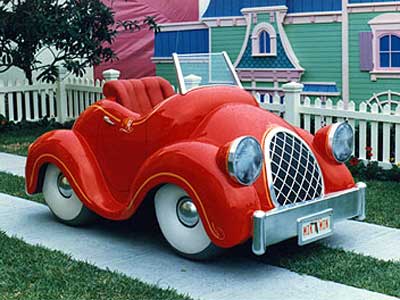 The car outside is amazing! Why aren't there real cars like that? I had to elbow some kids to sit in it but it was worth it. It's even more attractive when seen from the vantage point of the driver inside the car.
A final word about the house: don't misunderstand me. I know that wacky, wonky, skewered lines would grow tiresome if you had to live with them every day. I'm not suggesting that the real world be dismantled to make room for Roger Rabbit-type houses. What I'm saying is that the spatial proportions here are fascinating and would continue to be so even if the lines were straightened out.
21 comments:
Are these from DisnyLand or DisneyWorld in Florida?
sorry...i missed the first sentence ( what an idiot)
Hi Eddie,
Do you have a background in architecture or structural engineering? I noticed that a lot of your commentary on building structures has an architectural analysis to it...
-- J
Too bad it's all made out of stucco!
You sat in the car with someone else's kids? Where were yours?
Yes, I like that place.
It looks like such a happy place to live.. I couldn't imagine someone really depressed living here. Is so bubbly and fun
Wow, this brings back memories. I went to the houses in Disneyworld, and they look similar. I remember looking into the fridge and finding everything made out of cheese... mmmm... the cheese cake! Hehehe. Heck, not only does the construction of the houses look fun and pleasing, but so do the colours!
Off Topic!!!!
my first assignment for my Low Brow art class- name your favorite low brow art. This was his example list:
1. Hot rods
2. Tats (tattoos)
3. Comic books (original, pre-underground or alt)
4. Graphic novels
5. Pin-up art
6. Burlesque
7. Stand-up comedy
--- and....
8.Carnivals
9.Roadside attractions and architecture
10. Pulp fiction covers from the golden age of paperbacks - 50s and 60s
11. "Knucklehead" graphic art
12. Folk and outsider art
13. TV animation (Jetsons, Ren and Stimpy, Simpsons, etc)
14. Tiki culture/ Polynesian Pop
15. Cheesy exploitation films and film noir - 40s, 50s, 60s,70s
16. Retro culture in general - mid-mod (mid-20th century)
17. Punk music culture
18. Beat culture -- Burroughs, Kerouac, etc and the art of the Beats (Wallace Berman, Jess, etc)
19.Hippie culture -- rock poster art
20. Comix -- Crumb etc
21. Graffiti
WhahahahahahahahatttT?T??T?T?T?T?T????
This place is way too happy and cute for me. I don't know how anyone can eat in this kitchen...not only is the environment sickenly cute but the curved contours throughout this room give it a 'looking-through-a-fishbowl' appearrance.
Perhaps seeing it in person might give a better impression, but by these pictures it looks like everything is just overinflated, as if it was all made of blister pack plastic. There aren't enough contrasts. Maybe when you're in the room, you provide the contrast.
Imagine Eddieland!
C'mon kids! Put on your sausage noses and let's cut in line at the Delsarte ride! Kick the walkaround Ray Bradbury in the shins!
I've always had mixed feelings about these character homes. On the one hand, I can kind of appreciate the cartoony, wonky perspective for its pure whimsy. However, on the other hand these domiciles always seem too contrived, as if designed by people who really haven't watched any Disney cartoons at all. For instance, though I don't mind the approach they've taken to Mickey's house, I really can't stand the silly houseboat they've created for Donald with a big, dumb sailor cap on top. While the Donald of "The Wise Little Hen" may have lived on a houseboat, the Donald of the 40s and 50s was clearly a resident of suburbia and I think they could have created a more accurate home for him based on gags from actual Donald cartoons with his nephews.
By the way, the first set of these cartoony buildings was built at Walt Disney World for "Mickey's Birthdayland" in, I believe, 1988, his 60th year. Sometime later, after the success of "Who Framed Roger Rabbit", they replicated them at Disneyland along with a whole Toontown backdrop. Admittedly, I never much cared for the concept of Toontown, either in "Roger Rabbit" or the 3-dimensional park version. Again, I felt that Toontown was too oddball and had no relevance to actual Disney shorts. Aside from that, the Disneyland version was all sizzle and very little steak - a bunch of whimsical facades that really didn't have much to offer in the way of entertainment or attractions. In the words of John Cleese: "Not much of a cheese shop, is it?"
The backgrounds in theatrical cartoons, whether they be, Disney, Warner Brothers, Lant, Columbia, Paul Terry, van Beuren, Ted Eshbaugh, Pat Sullivan, Winkler, or otherwise never looked like they look like in Toon Town, although it is assumed there that the typical cartoons of the fourties (like in Rodger Rabbit) featured exaggerated, cartoony background. In the silent era, the backgrounds were pretty barren, in the early sound era, to the 50s, they were usually straightfoward, and in the fifties, they were usually very angular, but they never looked like THAT, especially Disney.
I think that while the icing may be too saccharine, the proportions of these buildings really are pretty wild. They obviously come from people with a lot of spatial experience. In that respect I think they may be successful; the designer wasn't trying to recreate a cartoon backdrop, they were trying to create an inert space with the energy of a cartoon. I think the authenticity of remaking Mickey or Donald's houses was secondary to creating the feeling of these places.
Merle Travis, Larry Collins and Joe Maphis!
See ya
Steve
Heck yeah, I'd want a car like that!
I'm pretty sure there never were any backgrounds/buildings in the 30s/40s cartoons that looked anything like this, but what the hell, its fun. I especially like the "urban" area of DL's toontown, where they have the gag warehouse and the electric company, etc.
Personally, I love the concept of Toontown. The crazier and more irreverent the better. Actually, I think they could make it even crazier. I always imagined that a ride based on a cartoon would be more of a fast/rollercoaster type ride than a slow moving ride.
Justin, Anonymous: You're right! Where did the Roger Rabbit people get that wonky style? My guess is that Alberto DiMello at Filmation figured it out sometime in the 70s but I could be wrong.
Kali: My first thought was that the course didn't sound very interesting since it's not centered around technique but the more I thought about it the more I warmed up to it. That's a useful list. Thanks for putting it up!
Pete: So that's where it's from! Maybe I was wrong about Alberto inventing it.
Steve: That was an amazing Merle Travis clip! You have a good ear!
Off the top of my head I'd disagree that this style came completely out of nowhere. Fleischer certainly had plenty of environments where the objects were this "cartoony" and exaggerated. Other than that I think they were taking off from the MM shorts, and reinterpreting them to be what people think was the looks of 30s cartoon backgrounds(with a definite helping of Roger Rabbit phony-cartoon-land tossed in). But I have seen Van Bueren Tom & Jerry cartoons and some Iwerks that looked something like too, so...nope, can't agree with the other poster that there's no precedent.
...what designs at Filmation ever looked like Disneyland's Toontown?
My buddy Joe Lanzisero, former Cal Arts alum - had much to do with the design of Toon Town and the wonderful Roger Rabbit Car Toon Spin attraction...
8ball: You're right! I take back the reference to Alberto. He was simply the first person I personally knew who drew that way.
Tangoroa: If he was responsible for the things I was talking about then I tip my hat to him!
Post a Comment