

Thanks to a link on Michael Sporn's site I discovered a terrific blog devoted entirely to animation backgrounds.
Michael's blog: http://www.michaelspornanimation.com/splog/
Rob Richard's background blog: http://animationbackgrounds.blogspot.com/
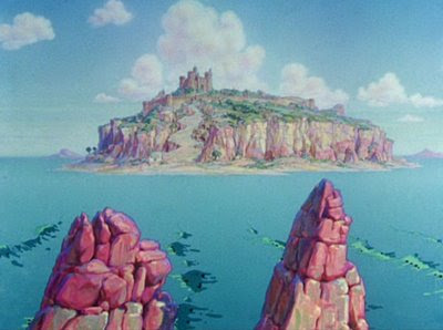
The one at the top (above) is one of my favorites, maybe from "Saludos Amigos." Man, I'd give a lot to own that! One of these days I'll copy it just to see what I can learn from it! I've learned something already, namely the primal graphic appeal of the dog penis (the red-tipped mountain on the upper right).
 Here's (above) another example of that, from a Popeye film. It does seem to add something.
 Looking at the Disney backgrounds I'm struck by how often the artists used very dark colors. I envy audiences who saw these films in technicolor. Technicolor reproduced rich, saturated darks without losing the details.
 Is this background (above) from "Alice" or "Peter Pan?" It doesn't look like much when shown small like this, so be sure to click to enlarge.
 Here the darks aren't just an an accent, they completely dominate the picture. In spite of that, the picture comes off as colorful. I'll bet characters read beautifully on top of this. I'm guessing that this is inspired by Mary Blair, who in turn might have been inspired by 17th century Dutch flower paintings.
 Speaking of Mary, here's her head made into a cottage for Alice in Wonderland.
 Rob provides us with a picture (above) for comparison.
 Even Pinocchio BGs (above) had lots of darks.
 TVs used to be bad at reproducing darks. Maybe the Trinitron was the first to do it successfully. A whole generation of artists saw films like Alice only on inferior TV monitors and probably couldn't understand why the backgrounds were so well-regarded.
 Sometimes Disney took the dark thing too far, as with this downshot of Goofy's home (above). The garish orange house looks like it was pickled in formaldehyde. The darks seem menacing and inappropriate to the subject. Even so, it's an interesting experiment.
23 comments:
That tree with the river and the stepping stones is from Bambi, I think.
wow this is making me want to re-watch pinocchio. right....now...
I don't know much about Disney, but I know that Paul Julian's backgrounds for Tweety cartoons in the 40s and 50s were insanely good, they used lots of dark colours.
I think I prefer them to these.
Great backgrounds! I got to work with a background from 3 Cabs for a work project and I zoomed in on every detail and every subtle nuance. It was absolutely incredible. The background was a birdseye map of Mexico but across the sky it went from sunrise to night. And the transition from the the on-fire reds and yellows to icy-cool, dark blues was amazing.
Great post Uncle Eddie!
I think all that black is because the DVDs are too high contrast.
Remember we met a person who remasters these and she said they turn the contrast way up?
Surprised there was no mention of Batman the Animated Series! The backgrounds were airbrushed onto black paper!
-Jordan
I wonder if one good reason for dark colors in backgrounds is to make sure that they don't grab too much attention. One thing you don't want is a BG that thinks its the star.
I've seen original BGs from the cottage sequence of Alice and Bongo (the forest scene). They painted the dark areas at a much lower contrast than in these images, knowing that Technicolor would boost the contrast a little bit. If they painted that dark, the shadows would have no details.
But when it comes to these particular images, John is right... the dark areas are due to a huge boost in contrast in the video transfer. It also exaggerates the saturation of the colors and tends to reduce subtle differences between hues.
See ya
Steve
John, could you elaborate more on the crappy Canadian overcluttered way of doing backgrounds? I agree completely and have seen it firsthand but Id really like to see you articulate it
!!!!!!!!!!!!!!!!!!!!!!!!!!!!!!!!!!
That Mary Blair cottage head is great!
Eddie, I can't seem to explain that dog penis thing. I'm still working on a theory about that. I'll let you know if I make any progress with it.
Hi Eddie-
The last background you used is actually by Thelma Witmer for "Three for Breakfast", one of Jack Hannah's Donald Duck cartoons.
That particular framegrab comes from one of the Disney Channel masters, which were really poor.
Hey Eddie - Perhaps you should see Hans Bacher's blogs on backgrounds. http://animation-treasures1.blogspot.com/ and http://animation-treasures2.blogspot.com/ He reconstructs animated pan backgrounds from classic films so you get to see the whole thing as it was painted. Check it out.
Jorge: True enough! Those Tweeties had great backgrounds! I didn't know that was Julian's work!
Jordan: The TV Batman had some great backgrounds! Much credit to Eric Radomsky and his BG artists!
Steve, John: Fascinating and undoubtedly true! Even so...
Thad: Thanks for the correction!
Kevin: Thanks for reminding me of that site! I just spent an hour there. Fantastic!
I'm pretty much in awe of anyone who can make even a mildly decent background. I have kind of a hole in my skills as far as bg's are concerned, so posts like this are great!
Hey Eddie- I got to see some of these Disney backgrounds in person here in Hamamatsu last spring. Walt sent them over here... with a TON of Mary Blair stuff... to publicize "Sleeping Beauty" and they disappeared for almost 50 years, only to turn up in a warehouse at Chiba University.
So they toured all over Japan. The cottage painting was one of the pieces. They had stuff from as far back as "Steamboat Mickey" or whatever that first one was called, then some backgrounds from "Snow White" on up through "Sleeping Beauty" itself.
It was fascinating to get up close and see how they went from a more classical style with no visible brushstrokes to a more painterly, modern style with lots of obvious brushstrokes. None of them show up in the films, of course, but seeing the painting from about 5 inches away, it's another story!
Really cool. I bought a book on Mary Blair and the exhibition catalog, too. I've been wanting to scan a lot from the catalog and put it on my comics blog... maybe when I have time in a month or so.
Gorgeous stuff, Eddie!
Some of the originals of these BG's do look downright murky. They sure don't look undersaturated in Technicolor.
Ever since color came along, there hasn't been enough emphasis on values. The layout artists have framed a lot of these compositions in dark tones to highlight the center area where the action will take place & soften the edges of the screen. In Alice, things tend to get darker as you go deeper into the distance, which emphasises the mystery & odd menace of the setting.
They were designed to be projected in a dark theater instead of on a household appliance in someone's livingroom. If you go to the 2nd site Eddie lists, you can see the artwork against a dark background. The colors really pop.
Thanks for sharing these....
Oh great... I was wrong. I looked over my show catalog and it's not that particular "Alice" cottage painting that's here in Japan, but a different one that's all pink and hazy because it's sunset or something.
Wow, great post!!! These backgrounds are beautiful! I think some of your background color theories work for other types of drawing, too! I like using lots of greys and browns when I color stuff, because they make happier colors pop even more, and the result to me looks MORE colorful than if I'd only used candy colors alone.
Thanks Eddie!
Katie: True, so true!
Kris: Bambi!? Maybe. My guess would be Peter Pan!
Post a Comment