
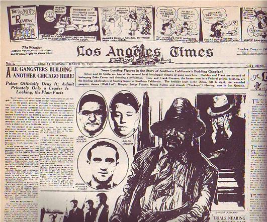
 At least the LA Times did on this Sunday in 1931 (above). It's a good-looking page, isn't it? Only an artist could have created a page like this. Newspapers need artists, not just for cartoons but to do page layouts. They just don't know it.
 Compare it to a typical modern page (above). The layout and choice of pictures is uninspired and the color doesn't add anything except cost. I doubt that an artist was consulted.
Normal color photos don't look good in washed-out daily newspaper color. U.S.A. Today was the first daily paper to carry lots of color photography but they were smart. They knew the color news photos sucked so they made a big deal about making a flashy artist-driven weather page with large, solid areas of flat color. Not only that but they put the flashy weather on the back page where every commuter on the train could see it while the owner was reading the side with the bad photos.
 It seems like drawings began to disappear from the first page of the Sunday Times somewhere in the mid-30s. Maybe WWII, with its need for diagrams and maps, brought them back for a while but after that they vanished almost completely. Why? I wish I knew. Anybody care to make a guess?
18 comments:
Hey Eddie! I went to college and learned all about layout and compostion and color theory and all that good stuff. I then got a job at a newspaper designing ads for the advertising department. They dont want artists that know stuff. They just want you to cram as much information and graphics and photos into the smallest space concievably possible so that the advertisers will get their moneys worth. I guess that goes for the page layout people too..
At least the sun has 2 different pictures of Mr. Potatohead on it.
Newspapers these days are anti-comic. They don't give a crap about them anymore, thus, they try to shrink them as much as possible and remove about 30% so they can make room for Dear Abby.
Alternative newspapers, however, tend to have drawings in the front page. One of the unique thing about altie newspapers is that their "front page" is really a cover, so if they can have it, they will hire somebody to draw the cover. Whether those cover are good or not depends on the newspaper and your sense of taste.
You've been spending alot of time analyzing newspapers. Do you work for one now or something?
Do you have a bigger version of that one on top?
Those, of course, are editorial cartoons, not comic strips, as such. A number of papers would put the editorial cartoons right in the centre-front (or "A-head," as the position is called at the Wall Street Journal). The LA Times and the Chicago Tribune (both very arch-conservative newspapers in those days) were notable for placing them there, rather than on the editorial page, where most papers put the cartoons. The LA Times had decent cartoonists in the era (Bruce Russell, primarily), but the Tribune had John McCutcheon and Carey Orr (Pulitzer winners both) squaring off against Vaughn Shoemaker and Herbert Block (ditto) in the early 30s (and their paper, the Chicago Daily News, was another paper that did front-page cartoons). I believe Ding Darling's cartoons were on the front page of his home paper, the Des Moines Tribune, as well.
Generally speaking, cartoons were eye-catching (good on the newsstand) and a good way of putting forth the paper's editorial policy, as most (but not all) cartoonists backed the party line. (Herblock, when he was drawing for NEA in the 30s and early 40s, was an exception.)
I'm not entirely certain where the Hearst papers put their editorial cartoons, though I know Winsor McCay's stuff was put in a special place inside.
Hi Eddie
What do you think about the old SPUMCO comics that John K & the gang did in the late 90's?
Those to me were the funniest comics I have ever read. Not only were they funny but the drawings were works of art. You just don't see any drawings like that in other comics. Jimmy The Idiot Boy & George Liquor are the best comic book characters ever. The Ren & Stimpy comics would have been alot better if John K did them!
Jesse
"Newspapers these days are anti-comic. They don't give a crap about them anymore, thus, they try to shrink them as much as possible and remove about 30% so they can make room for Dear Abby."
I agree,at most comics strips today have three measely panels, then again,whould increasing the number of panels of today's crappy comics really help ? As to why they are no more cartoons in the front page,my theory is people must prefer a photo instead of a drawing about a major story.
Jesse: Those were amazing comics, weren't they? John still intends to start a comics division at Spumco one of these days.
C.A.M.: Too late! I brought the book back to the library!
Max: You don't have to work for a paper to find their problems interesting.
E.O.: Wow! Interesting background detail! Imagine Having Darling on the front page of your paper!
Ryan: I figured that's the kind of thing that happens.
Darling was a notable and beloved figure in Iowa during the fifty years or so he drew editorial cartoons (with time outs for government service and some sickness). He was also an inveterate booster of Iowa, and took great pride in the state and its people. (Darling was a Republican by nature, but he was especially sympathetic to Herbert Hoover, who had deep ties to Iowa -- see the book "As Ding Saw Hoover," now alas long since out of print, but in my private library.)
Darling's placement on the front page of the Des Moines Register was in part due to his superb draughtsmanship, but also was a function of his love for Iowa. The Register had more than one good reason for putting him there.
(Many books that reproduce Darling's cartoons credit the New York Herald-Tribune, which syndicated Darling's cartoons; it was the GOP paper in NYC at the time.)
A not-quite-on-topic thought...
Remember when editorial cartoonists would use the old "John Q. Public" character in their work? This was usually a non-descript guy wearing a hat who be used as the reader's proxy within the panel.
These days, it seems that if an editorial cartoonist depicts "John Q." in their daily panels, he is depicted as a drooling idiot who is too stupid to understand the point being made. He is invariably a fat slob, with buck teeth and no chin who is more often than not shown wearing a propellor beanie. That WRIGHT guy does this a lot.
My question is, why did the nation's editorial cartoonists "turn" on their target audience?
Just a passing thought...
Craig: Interesting question. Americans seem to think other Americans are stupid. This seems harmless but it has economic consequences since don't buy things made by people they don't respect. We need to be the type of people we can admire.
Follow up (since I can't edit my post):
I believe the specific "Wright" I had in mind was Don Wright. (There are a few editorial cartoonists named "Wright" it turns out!) SAMPLE
I wonder if this a lazy way of saying, "I'm making such an amazing point! Do you want to agree with ME or do you want to be a loser and take this idiot's side?" Kind of an ad hominem / straw man maneuver.
The jokes are weird, but this site has a plethora of stock art.
Craig D's point takes some added resonance when you look at the way Herbert Block and Vaughn Shoemaker used to use their John Q. Publics. Shoemaker's especially would often be the one making the comment or observation, speaking for the cartoonist.
Don Wright's last cartoon for the old Miami News, when it went under, shows him sticking out his tongue at his critics. Wright was never much of a class act, if you want my opinion.
Ha!
Anyone heard of Bruce Tinsley? He draws "Mallard Fillmore" and always draws liberals as ugly as possible. I don't mind if conservatives disagree with liberals, but does Bruce have to draw them as idiots? I guess so.
Scott Stantis has the same problem too. While his cartoons can be decent, he always draws Democrats as fat as possible (even the Donkeys are fat)
>At least the sun has 2 different >pictures of Mr. Potatohead on it.
ROTFLMAO
Post a Comment