 I like "Jolly Rounders" so much that I can't help adding to what I wrote last time. It's wonderful to have a blog like Theory Corner where things like this can be discussed in detail.
Anyway, I like the textured barebones background and the midlevel line of the wall boards. Some artists avoid midlevel anything because it divides the composition into two and gives it an ignorant, unschooled look. For me that's precisely why the technique is useful. Sometimes you want an ignorant look.
I also like the way the artist puts the irritable wife on the left and gives the open doorway equal emphasis. No doubt this is to make a space for the kids when they come in later, but it serves another purpose. Given that the woman is touchy and has a short fuse it's funny to think she's near a doorway where any doofus could walk in and bother her.
We cut to the outside and her ridiculously huge number of comically eager clones. I like the open front door which reminds us that there's a touchy, irritable person inside.
The kids react to something O.S. and run inside.
The little clones run in and announce that Dad's outside and he has a "bimbo" (that's what the title card calls her) with him. Mom tosses the broom and heads for the door.
Uh-oh. Whatever fools are out there now have the total attention of a Type A character.
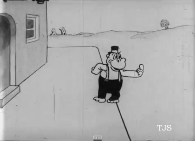
There's Dad outside, beckoning to his "bimbo." This is a technique I often use myself. The bimbo is an outrageous character and a character that funny shouldn't be in the scene when you first see them. They have to make an entrance to underline their importance. The act of beckoning functions as a kind of fanfare.
I have more thoughts about the staging in this cartoon but I'll have to save them for the time when I have the whole cartoon infront of me, and not just a tiny fragment.


