Here I am, back at Disneyland! Many thanks to my anonymous friend whose employee pass made this possible!
Here's (above) my tram which connected the parking structure with the park. Yikes, half the people hid their faces in a panic when I snapped the picture. I felt terrible. Everyone was so jovial only a moment before. I'll have to be more discreet when I take pictures of crowds.
Once in the park we headed for the Cars ride, which was great. They set it up so you appear to be racing the car beside you.
Above, the line for the Pinocchio ride. I love taking crowd shots close up but as I said, I'll have to be more discreet.
Above, the Pinocchio attraction again. This wall painting is the first thing you see at the start of the ride. How do you like the idea of the dual proscenium, one within the other?
No trip to Disneyland is complete for me without a visit to The Golden Horseshoe. I love the architecture. It's small scale, but succeeds in being grand at the same time.
Traffic in Disneyland is handled beautifully. The people in the lower left are in a sunken, elliptical line leading to the Pirates of the Caribbean ride. On the bridge above them (our level) is the walking traffic from Adventureland. Above that is a staircase leading to a V.I.P. restaurant, and above that (in the distance) is a rope bridge that leads to Tarzan's Treehouse.
I love the way traffic flows in and out, up and down and all around in this part of the park. The people watching opportunities are endless!
Above, another view of the treehouse bridge.
On the way up the treehouse (above) what you see mostly is a beautiful tangle of Burne Hogarth-type branches. Even in the tree you become aware of the human traffic going on in all directions around you. I marked the passageways with red arrows.
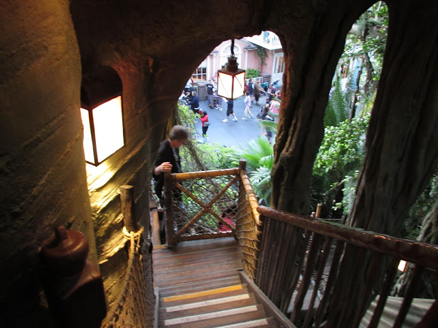
Going down (above) you're treated to great views of the park.
Stunning! Views like this took my breath away!
Above, the treehouse bottom. Seeing this reminds me of how important it is for our era to plant lots of exotic, slow-growing "old-growth-type" trees so our successors will have something to look at besides pine.
Here's (above) the caricature nook in Adventureland. I hate to say it, but the talent wasn't that impressive.
Here's the silhouette shop. The caricatures were okay, but not very imaginative.
Here's an exhibit showing a real animator working at a traditional animation desk. I can't convey how strange it was to see the ordinary, everyday tools of my trade in a museum setting behind velvet ropes. I felt like a time traveler in a future era where my own time was regarded as quaint and old-fashioned.
The live entertainment at the park (above) was unbelievable. The dancers were as good as ones you'd find on Broadway. The front row of the crowd was devoted to the handicapped so I couldn't get close enough to get a good picture.
When it was time to go home I had to stop at a souvenir shop to try on one of the new Oswald hats. Nice, huh? Expensive, though...16 bucks!


