Showing posts with label disneyland. Show all posts

Sunday, August 21, 2016

I LOVE L.A.

Gee, I love Los Angeles. I ask myself what person typifies the city. Walt Disney? Charlie Chaplin? Jack Warner? Howard Hughes? Raymond Chandler? Ray Bradbury? Architect Cliff May? All those names, surely, and dozens of others, but for me the name that sticks out is simply...Jayne Mansfield.


I don't know what her personal life was like but her public image was one of frivolity and lightness, of driving along Malibu beach with the wind in her face in a brand new convertible. I can't imagine someone like her coming out of a gritty city like Chicago.


Can you get a good, classical education here? No, possibly not, but that's a problem the world over.


For me Los Angeles was a utopian dream the world had. We're a fantasy conjured up between beatings by some prisoner in a dictator's dungeon.


Even now, years after the golden age, there's still electricity in the air.


Even when you're not on the beach, you're on the beach...'know what I mean? There's a delightful lightness here.


The city does have a culture. We're all just too busy to notice it.


Don't worry about it. Just have a hot dog.


Some really dopey ideas originated here, and we'll no doubt pay the price, but history will marvel at what happened here...what all us Okies and misfits managed to pull off in the Southern California desert.

When I'm forced to leave they'll have to pry my fingers off the city limit sign.


Wednesday, February 17, 2016

DISNEYLAND ARCHITECTURE

Minnie's House in Disneyland is a destination I never get tired of.  The skewered, wonky look of it would be too caricatured for everyday living. Even so, you wonder if some modification of that could be made to work in the real world. 


Wonky or not, the house has a wonderful vibe and that's hard to achieve. Whenever someone succeeds with that they should get a medal. 


Disneyland doesn't contain a reproduction of the home in "Alice in Wonderland," but I'll discuss it here anyway. 


In this frame from the film (above) Alice is a little too big for the house but I can imagine a more practical scale that would still make the visitor feel tall. 

I also like the scale of the stairs. They're the kind of stairs you see in split level houses as opposed to two story houses. In split levels the higher level is off to the side rather than on top of of the bottom level. That makes for a shorter staircase.  It's an interesting idea. 

Also, notice the slant of the ceiling.... 

From this view the film gives the ceiling a different height than it is in the establishing shot. That's okay, it's all about artistic license. 


What a beautiful bedroom (above)!
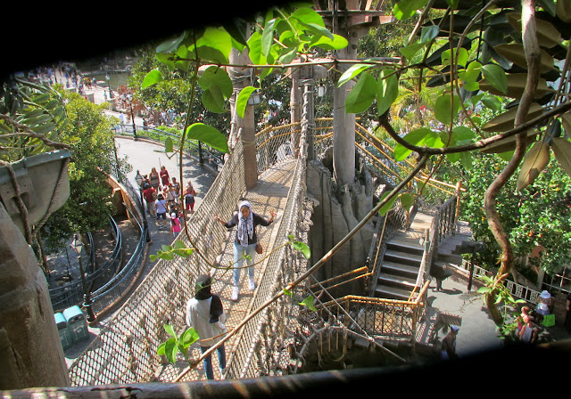

A visit to a Disney park would be inconceivable without a visit to Tarzan's Treehouse and The Swiss Family Robinson walkthrough, but wouldn't it be even more fun to actually live in something like that? No, we don't have to wait for the far future when we can grow trees fast. We can do it now, with realistic synthetic tree trunks and fast growing real-biology leaves and buds stuffed into fake branches.

I have to admit that most people would rightly rebel against the idea of synthetic trees in real neighborhoods.  I'm only introducing the idea as a thought experiment.

Let me digress for a moment to ask, "Why haven't architects made use of real-size Banzai-type trees?" Can Bamboo, which is fast-growing, be trained to bend in useful ways?


Disneyland attractions are impeccably lit. It seems to me that all new houses should incorporate that kind of professional Hollywood-type lighting. By "professional" I don't mean the expensive quartz lights that are actually used for stage and film, but artistic arrangements of more safe and affordable lights that can mimic stage lighting.

Little old ladies shouldn't have to figure out these lighting schemes themselves. Professional designers should do it and install it before the first owners move in.

 Gee, there's lots more to say about this, but I'm running out of space. I'll pick this up again in another post.


Friday, December 04, 2015

PINNOCHIO'S DARING JOURNEY


I had more to say about Disneyland than I could fit into Monday's post, so I'll write about that today.  What struck me on the last visit was the architecture of the Pinocchio ride, "Pinocchio's Daring Journey." I was amazed to see how many iconic details were packed into it. Everywhere there were turrets and towers, carved and painted pillars, flower boxes on balconies, colorful pennants of all types...well, it would be a long list. Suffice it to say that Central European motiffs were well represented there.


Inside (above) the architectural compression was even more extreme. Parts of faux buildings overlap and interfere with each other as if an earthquake had pushed them together. I found myself wondering if real-world business buildings could be made like that, I mean with tumbling block shapes. Would they be disorienting for the real-world people inside? Could they be made cheaply? I don't know.


I love this picture! The whole foreground and middle ground is a sort of art-directed tunnel in which cars on rails ratchet up to the front under a canopy of colorful shapes. It's all carefully lit like a Hollywood set with natural sunlight providing a counterpoint. The focal point, what everything points to, is a mysterious dark cave where we glimpse a warm-colored...something.


The car we're sitting in takes us into the cave and up to the something, which turns out to be dancing puppets (above). I love that double proscenium arch with the carving in the middle. I don't think that design was used in the movie, though.

 
The proscenium in the film (above) was simpler.


The ride fills the viewer with enthusiasm for puppets. You'd think the ride would let out into a store where you could buy puppets, but it doesn't...a missed opportunity in my opinion. Fantasyland desperately needs a good toy store where puppets of all kinds can be had. Most of the Pinocchio toys sold at Disneyland are plush dolls, which are inappropriate.


They should sell posters, too, like the one above.


The Pinocchio ride ends with a ride through Gheppetto's workshop where unique wooden toys are on display. Toys like that should be on sale.


One more picture (above) and I'm out of here....whaddaya think of these pennants? I'm considering making something like this for my workroom at home.


Wednesday, September 16, 2015

GEPPETO'S WORKSHOP

Sometimes I wonder if Gustaf Tenggren was indirectly responsible for Disneyland. His paintings of Geppeto's workshop were so appealing and so real that they must have created a desire in the viewer to walk into the shop and examine the toys close up.


This is Tenggren at the peak of his powers, when he was at his most inventive and charismatic. I wish you could buy reproductions of these toys at Disneyland.


For comparison here's (above and below) backgrounds from the same film by (I think) Claude Coats, who's no slouch himself. They're great but I wouldn't say they fill the viewer with a desire to walk into the painting and look around.


A painter as good as Coates (above) would normally dominate a project like this but Tenggren wipes the floor with him.


Who painted this one? The clock designs are specific and real like Tenggren's but are a tad generic like Coates'. Maybe the two artists collaborated. Notice the Horvath-type detail on the clock at the lower left. I'll return to this in a moment.


Here's the Geppeto's workshop from the ride at Disneyland. Some of the toys have a Tenggren influence and some seem disconcertingly generic.

The dolls seem oddly spaced at first glance, but the passenger car goes through this pretty quickly and you could argue that they wouldn't read if they were more densely packed. Even so....


I don't see many of the unique clocks that are in the film.


Apparently some earlier attempts were made at reproducing some of the clocks and toys in the film.  Seeing this photo (above) makes me appreciate how difficult that job must have been. The sculptures contain some nice elements but don't capture the flamboyance of the original artwork.

There's that clock again (above). Why did the artist delete the Horvath-style bottom?

Tuesday, August 04, 2015

My LATEST TRIP TO DISNEYLAND 8/2/2015


Here's (above) my favorite destination at Disneyland: Tarzan's Treehouse. Everyone on the trip wanted to live up there.


It's a whole city in the sky. 


Lots of rope bridges, lots of leaves.


It's impossible to find a bad vantage point on this tree. The view is beautiful from every angle.


Even the structural elements (above) are interesting.


Here's the view from the very top. There's lush greenery everywhere. 


The walk back down is exciting beyond all expectation. The downward steps are steeper than the steps leading up, so the ground appears to rush toward you as you descend. You feel like you're in a controlled fall. There's a lot more verticals in the side tree trunks, too, and that heightens the effect.


Here's (above) the Royal Theatre in the part of the park I call "Princessneyland." We saw "Frozen" re-enacted here with live actors. 


Above, the actress who played the Princess. How do you like her costume? Boy, 18th Century Europeans really knew how to design. 


The vest design looks Polish. Poland was enormously influential in European folk art. 


Here's some awning covers from the outside of The Enchanted Tiki Room in
Adventureland.


Where can I buy that fabric?

In the Indiana Jones ride (above) there's a fenced off area showing Jones' office.


It kinda' makes you want to rethink your own workspace, doesn't it?


Is that a picture of John L. Sullivan on the wall?


Here's (above) the starting point of the Peter Pan ride. The ride begins with a glide over the London rooftops...


...and right into the open window of Wendy's bedroom. Well, actually it's an open wall. Gee, if only rooftops and rooms were really like that. Isn't there some way real-world architects could make that possible?


Here's (above) a window display from one of the shops on Main Street. It's a little too girly for my taste but, wait, there's more. The set is integrated with holographic pixie dust that transforms the characters. How do they do that?


Good old Disneyland! It never ceases to be inspiring!