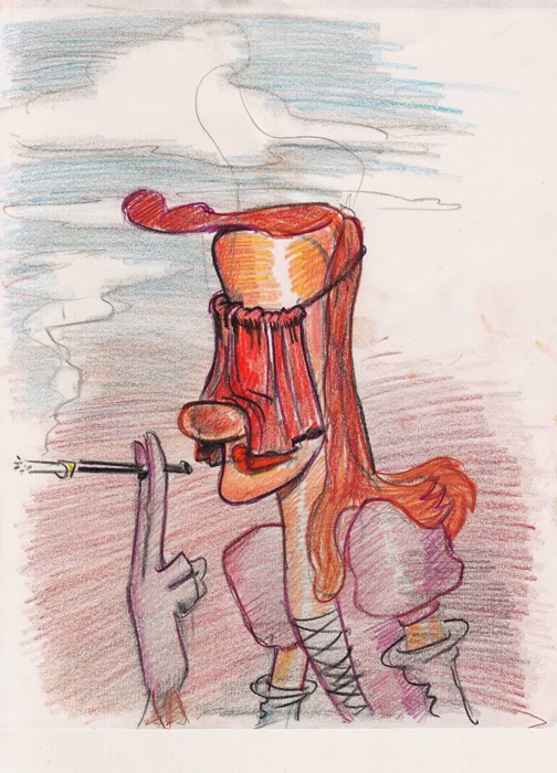
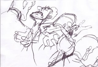
 That's me (above) pitching a board at Disney's. I think the guy giving the black power salute is Bob Taylor. I can't see very well but I think the drawing I'm pointing to is a black and white doodle of Donald that I later re-did in crayon (reprise below). I love working in crayon but hardly ever get the chance. One of these days I'll do a post about how great crayons are, even the Crayolas you get in the supermarket. But I digress.

What I really want to talk about is how much influence a storyboarder should have on a film.
I'm a storyboarder myself and I like it because in some ways it's close to direction and I like to direct. In a small and limited way storyboarders are the visual kings of the projects they work on and like every other storyboarder I like to be king.
Hearing me talk like this would have amazed animators in the 30s and 40s. In the golden age of Warners, when cartoons were done right, storyboards weren't a big deal. Boards were done by writer artists and were so rough and so lacking in continuity that a casual reader would have had trouble understanding them (example below). That's why so few Warner boards of that era survived. Nobody thought they had any value. Really, the story only came together visually in the mind of the director who did a bunch of drawings for his handouts.

Later on, in the TV era, writers and executives effectively got rid of directors and a new category of artist was born, the non-writer storyboarder. This was a terrible defeat for animation.
The problem is that films with a strong script and storyboard feel often don't lend themselves to animation very well. If you look at the funniest Bill Nolan black & white Terrytoons you'll see that the highlights, the real audience-grabbing scenes, are often something the animator (or the animator-director) thought of. Cartoons lost a lot of their playfulness and innovation when animators were reduced to fleshing out other peoples' ideas and layouts.

Of course audiences like structure and and so do I. In the current factory system some of the storyboard feel is inevitable. Even so, without the animators' input into the stories cartoons will continue to be a sad thing, very much cut off from its roots. We need to bring animators and directors back under the roof of the parent studio. We storyboarders should remind ourselves that the animators are the stars (or should be) and we're just there to make them look good. Everybody else, the executives, directors, writers, storyboarders, layout people and colorists...all exist solely to make the animator actor look good on the screen.
BTW, this post was inspired by Mark Mayerson's almost current blog about storyboards:
http://mayersononanimation.blogspot.com/
The storyboard at the bottom is from Ward Kimball's "Mars and Beyond." I don't know if it helps to make my point, I just put it in because I like it.


 What I really want to talk about is how much influence a storyboarder should have on a film.
 Later on, in the TV era, writers and executives effectively got rid of directors and a new category of artist was born, the non-writer storyboarder. This was a terrible defeat for animation.


