Showing posts with label animation. Show all posts

Wednesday, June 08, 2016

MILT GROSS AND RUBE GOLDBERG

Two of my favorite cartoonists were Milt Gross and Rube Goldberg. Milt Gross often gave top flight poses to all the players in the frame, both the aggressors and the reactors. 


Rube Goldberg staged everybody in the same shot too, but frequently gave the best poses to the reactors, as in the in the strip above.


Okay, he sometimes gave the aggressor (above) the best poses, but you you see what I'm getting at.


I've been influenced by Goldberg so in photo stories, like the kind I do on this blog, I usually give the emphasis to the listener.


 Here's excerpts from a photo story I did in June, 2009. The girl (played by me) is surprised when her stupid ex-boyfriend (off screen) approaches her in a restaurant. I'll leave out the dialogue.


 She humors him, hoping he'll go away.


 But he doesn't.

He says that, now that he knows she hangs out at this restaurant, he'll hang out there too.


 Yes sir, they'll be inseparable from now on.


 The boyfriend bids goodbye for now...


 ...but adds that he'll be back.


 Well, it goes on. You can link to the whole thing on the side bar. The story's called "The Ex-boyfriend."


The odd thing is that, despite my affection for reactive acting, the animation I worked on usually put the emphasis on the speaker.


That's because I like to work with aggressive characters. They're appealing. The audience naturally wants to see what they're doing, and so do I. Even so, I had a lot of Goldbergian fun working on the reactive scenes and I wish I could have done more of them.

BTW: the last two pictures above aren't mine.

Saturday, May 07, 2016

SOME ANIMATION DRAWINGS

I just unearthed some of my old doodles and photos from a box in the garage. Some of these pictures are admittedly terrible and were never meant to be seen by anyone, but...what the heck...it's OK to blog about trivial things sometimes, isn't it?


The cat here (above) is even bigger than the dog, which is a mistake, but then again...this isn't a storyboard...it's just a visual way of writing a script. Oops! I spotted a misspelling but hopefully you won't see it.


Here's a REALLY quick doodle from some other cartoon. The dog and the human walking him are going in different directions because I changed my idea in midstream and didn't bother to redraw.

I saved this because it made me realize that there's something surreal about walking in a world where everybody else is walking at the same time. Anyway,
nothing ever came of this because it would have required too much animation.


I don't know why this would interest anyone except my mother, but here's (above) a photo of me at work at Filmation way back in 1980.


Above, the same timid dog we saw in doodle form, a little later in the cartoon. Even squirrels push him around. Once again, this is a fragment of a visual script rather than a storyboard.

I love writing prose but scripts work best when they're drawn out rather than written. There is one drawback to that technique, though. You can unconsciously lose your feel for structure when the story's drawn. That's why it's useful for an artist to outline a story first with words, if only in bullet points.


Monday, October 19, 2015

JOHN KRICFALUSI, KELLY ARMSTRONG


Haw! I don't believe it! This is the most insulting caricature I've ever gotten and yet it's so funny that I wouldn't part with it for anything. How does John do it?


Here, thanks much to commenter "ibcf" and his source Bob Jacques, is an unedited deleted scene from "Tales of Worm Paranoia."  Animator: Kelly Armstrong. Boy, Kelly did a great job on this! It's a pity it had to be deleted for time.

Tuesday, April 29, 2014

ANIMATING ON THE IPAD MINI

I promised to put up some of the animation I've been doing on but I'm still having trouble getting it online with the original timing anf framing intact. A friend has offered to help so I guess things'll work out soon. In the meantime, here's a few frame grabs from a recent film, if you can call something as short as this a film..


The time it took to do this? Less than an hour! It's amazing how fast you can go on these little iPad apps.


The key to working fast is to forbid yourself to redraw anything. 


If a line doesn't work, just draw a better one beside it.  


At this point (above) I accomplished what I set out to do...I sat a man down on a chair. All my tiny films have limited goals like that. When the film doesn't seem to be working I just delete it and start another.  If I don't have an idea I just start drawing and hope for the best. It's like doodling with animation.


I still felt like drawing so I added a table and a newspaper.


The man grabs the paper and opens it...


...and lifts it up to read. That's it. You can do zillions of these little shorts in waiting rooms and restaurants or while watching TV.


Tuesday, July 03, 2007

I JUST SAW "RATATOUILLE!"

Before I get to "Ratatouille" I can't help but comment on the audience I saw it with. I saw the film at The Los Angeles Film School, across the street from the old Cinerama Dome in Hollywood.

I'd never been to that school before and I was amazed to see how Godawful tasteful and intelligent everyone looked. All the students looked like they were Harvard Phi Beta Kappas. I couldn't help thinking, "Is this a good thing? Should IQ points determine who gets to make films? Doesn't creativity and street smarts enter into it?" How would Rock and Roll have fared if only Julliard grads had been allowed to make records? Anyway, I was still glad to be there.

This review is going to come across as negative. It's not. The film represents a big advance and I'm glad I saw it. If I sound negative it's because the film's many good points have been covered in countless other reviews and I don't see the point in repeating them. I only have a few paragraphs so I'll limit myself to talking about what might have been done better in the film. Nitpickers and curmudgeons, this is for you!

One of the biggest flaws in the film is that it doesn't contain memorable characters. The characters aren't bad, they're better than average for 3D, but they're supporting actors trying to do the job of leading actors. They just don't have the weight to carry a film. Memorable characters used to be a Disney specialty: The Witch and the Dwarfs in "Snow White," Pinnochio, Jimminy Cricket (spelled right?), Peter Pan and Captain Hook were all heavy hitters. What happened?


On another point, the writing contained too much exposition and too often sounded like a fleshed-out story bible. You get the feeling that an elaborate ending was figured out, then the rest of the the film evolved in logical steps backwards from the ending. In my opinion that's a mistake. It's a good idea to know where you're going but a good story is more organic than that. Writers (hopefully artist writers) shouldn't sit down at a table and say, "What logical step are we going to flesh out today?" They should be saying, "What can we do at this point to wow the audience!? "

On another point, Ratatouille is skimpy on set pieces. What's a set piece? The Mad Tea Party in "Alice in Wonderland" was a set piece. The giant cactus dance in "Three Caballeros" was one. Groucho and Chico's "party of the first part" sketch in "Night at the Opera" was a set piece. Olivier's speech at the opening of "Richard III" was a set piece. It's an almost self-contained sketch or musical number within a larger story that's an excuse for tour-de-force writing and performance. Set pieces are the reason a film exists. In a way the rest of the story is just binder to hold the set pieces together.

And where were the funny scenes? I saw plenty of humorous scenes but only a few funny ones. The film needed a character that could support broad comedy. Maybe Remy's undiscriminating friend could have done it.


And why was the dialogue so normal? I expect films to have memorable dialogue. Aren't you glad Bogart said, "We'll always have Paris," rather than "Think of the memories we'll have of Paris" ? Aren't you glad Anthony Hopkins said, "I ate his liver with some fava beans and a nice Chianti" rather than "He bothered me so I had to eat him"? Some writers and artists are specialists at dialogue and every filmmaker should have their addresses on hand. You hire them as consultants.
Last but not least, the film was 3D which is wildly expensive and extremely limiting. I hate to say it but in 2007 you can still get more funny acting with a ten cent pencil than a top of the line desktop.

But acting isn't the only way 3D is limiting. Suppose one of the Ratatouille artists had come up with really hilarious gags involving passers-by on the street?* You couldn't do them. You'd have to throw them out. It would take 3D artists forever to construct each new character and it would cost a mint. That's why 3D films are so infuriatingly claustrophobic. The limitations of the medium force you to be nose to nose with the same small set of characters for an entire film.


* The one gag that did involve a passer-by, a bicyclist, got a big laugh. Wouldn't it have been great to see more gags like that?


Wednesday, August 23, 2006

EDITING TOOLS ARE HURTING ANIMATION

In my opinion recent cartoons are too heavily edited, even when the editing is done by the cartoonist/creator himself. Now that editing is easy and can can be done on a laptop every shot in a cartoon is edited and re-edited til it's considered perfect. That may enhance the filmic quality but it diminishes the sense of preformance and risk. Some cartoons give me a case of "smoothitis."

Easy edits also tend to increase the number of cuts. We all know films that benefited from frequent cuts but I bet I can point to an equal number that were hurt by it. Fred Astaire used to cut his dance scenes as little as possible and it's easy to see why. It's the same reason that magicians on screen resist too many cuts. The audience assumes that the cuts cover up mistakes or chicannery. They think cuts make the performance easier, too easy in fact, and they paid to see somebody do something that's difficult.

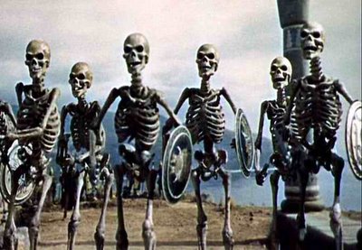
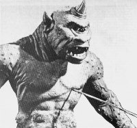
On a related subject, I'll add that quirky motion sometimes adds to the appeal of a scene. Some of the jerky stop-motion on Harryhausen's best scenes (I emphasize the words "some" and "best") actually improved the fantasy. It gave the monsters an unreal, unearthly style of movement that fit the story. Cartoon animation works the same way. Nobody wants jerky animation but we want to see some near misses, some last-minute saves, some cheats that give us an idea of how difficult it is to move this stuff. We want to see a first-rate animator's struggle. Hemingway wrote that nobody can appreciate a good bullfight til they've seen a bad one. That applies to what we do. Let's stop being so slick!

Sunday, August 20, 2006

MAKING A FETISH OUT OF TIMING

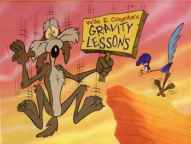
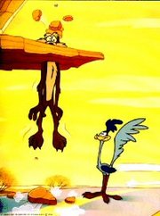
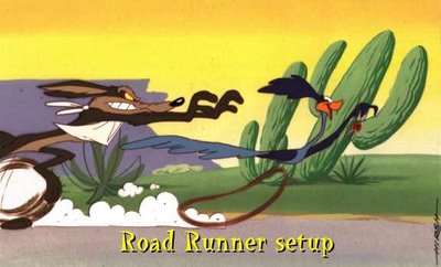
I absolutely love good cartoon timing but I have to admit that I've come to love it less in recent years. I've just seen it abused too often. A lot of cartoon producers and nearly every cartoon writer believes that timing will save an otherwise mediocre cartoon. It won't. It couldn't even save the Coyote and Roadrunner shorts and you're not likely to see better timing than that.


It all goes back to the purpose of cartoons. The purpose of a cartoon is simple: it's to blow the audience's mind. Nobody ever watches a cartoon, or any form of entertainment for that matter, with the intention of seeing something tepid that just passes the time. People want to be transformed and exhilerated. Even after a long day of work when you flop down infront of the TV and your standards are as low as they'll ever be, you'll still find yourself hoping to find a diamond in the rough. Timing isn't capable of delivering a diamond any more than a really good set of tires can drive you to the grocery store. Timing is just timing, something vital that takes its place among other vital things. Good timing plus drek does not a good film make.


A common story in recent animated features has a bunch of animals run away from captivity to pursue their dreams in some far away haven. How do you blow minds with a story like that? Is the premise intrinsically mind-blowing? No, but you could argue that some classic comedies had plots that were just as thin. Are the characters themselves "great" characters? Probably not. Are the gags strong enough to support the film? Well, maybe they're not THAT strong. It becomes clear when you look at the pre-production art that the backbone of the film, the thing that everyone's hoping will save it, is the timing.

The thinking is, tighten up the story, the animation and the editing as tight as they can possibly be and all the other problems will go away. But timing wasn't meant to bear that kind of burden. Timing is no substitute for charisma or imagination or street smarts or nobility or fine acting and animation or gut-satisfying humor and story. Timing is just timing.