Thursday, July 06, 2006

A READER REQUEST: MORE WORM PICTURES

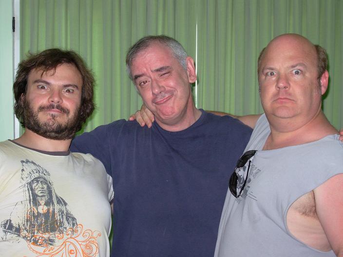
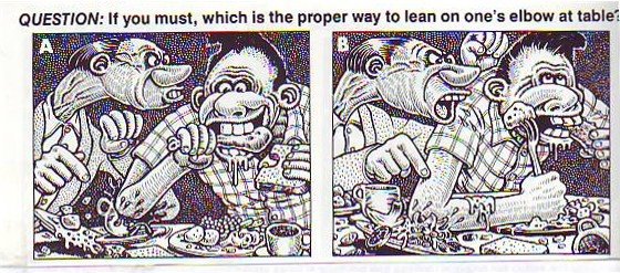
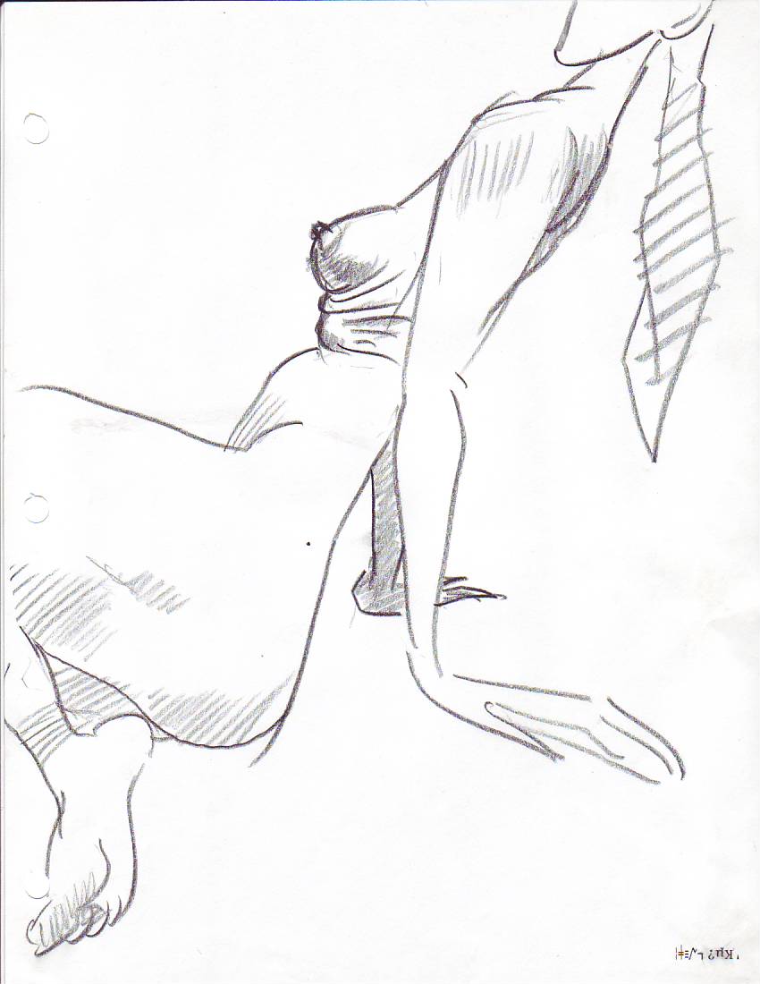
Anonymous asked to see more Worm drawings and here they are. The top one is a sketch that I did and which was beautifully cleaned up by Tuck Tucker. In the film the scene got some nifty animation by Bob Jaques and Kelly Armstrong. The freckles peeling off is an idea I got from Clampett. It makes for a good drawing but it slowed down the action so I had to cut frames.

The big hole in Sally's arm is her armpit. I realized I drew it too high and I meant to change it but there was no time.

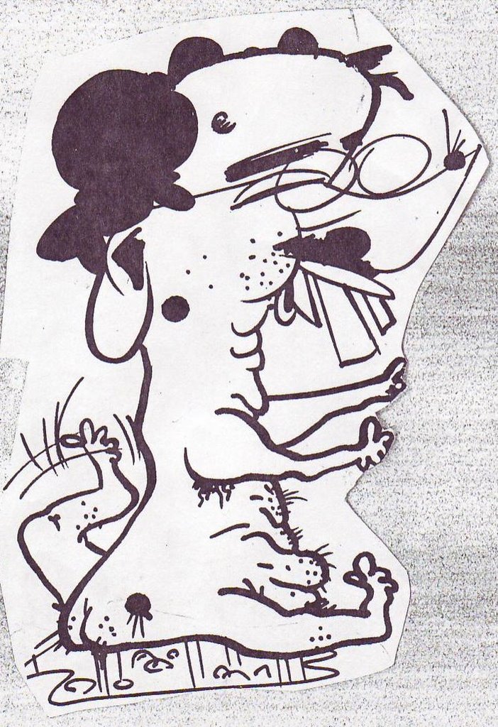
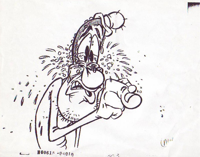
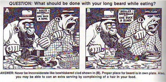
Here's (above) another inbetween from Glenn Kennedy's animation of the Worm addressing the audience. The dialogue in this scene is something like "What are you looking at? Look at yourselves why don't you? It is unto yourselves you should be looking!" John K pioneered this kind of over-the-top, Baroque dialogue and I'm always amazed to see how well it integrates with the more normal dialogue in his films.


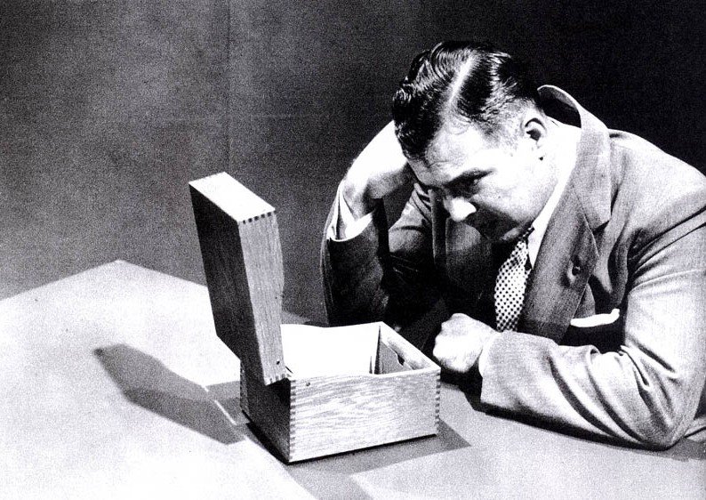
I don't have more Worm drawings at hand so I'll throw in a model that I did for another project of ghosts who chase people around a haunted mansion in airplanes. Sometimes the planes fly and sometimes they walk.

NEWS BULLETIN: If you haven't heard, YouTube has yielded to a demand by Warners to delete it's copy of "Buckaroo Bugs." I assume that Warners was responding to the use of clips from that film on John K's blog. This is a bad precedent.

The clips made it possible to discuss animation that everyone has just seen. No book could do that. They made possible to talk about animation on a deeper and more intelligent level than has ever been possible before. We need to be able to run these low-res clips! I'm going to write to Warners and I hope everyone reading this will do the same. Warners' addresses can be had at John's blog, "all kinds of stuff."

Wednesday, July 05, 2006

SOME INTERESTING PICTURES

A few days ago John K took this picture of me, Jack Black and Kyle Gass (Jack & Kyle =Tenacious D.). It's a terrific picture and I'm really glad to have it but I'll never be able to look at it without wincing. I was supposed to reciprocate by taking John's picture with Jack and Kyle and I goofed it. We didn't find out till it was too late to take another one. Sorrrryyyyyyy!

Jack turned out to be a real nice guy and his vocal range is amazing. He has a trained voice. He can speak in what comes off as a natural, conversational manner, and still be heard clearly in the back of the balcony. Every actor should be able to do that.


Here's a caricature John did of of me (above) covered with warts, with dog legs, sitting in a puddle of my own urine. I wonder what Sister Wendy would think of it?

Here's another picture of me (above), also by John. This was the head I used when I put together the yellow composite of John's Eddie pictures that I posted a few weeks ago.

Tuesday, July 04, 2006

LOOKING AT THE SAME PICTURES IN BLACK AND WHITE

Well, I don't think we nailed this problem last time. I tried Jorge's method of printing the covers in black and white and that helped a lot. Now we see the girl is done entirely in middletones. In B&W her panties almost disappear. The whole middle part of her body appears as one, big, grey haze. It's as if that part of her was an uncluttered area where the eye could rest, a blank area to contrast with the stark angles and colors elsewhere.

In B&W I see that my eye starts the picture by fixing on the guy's face, but the face lacks detail so I allow the wedge of white light to carry my eye down to the girl's thighs. Being a guy I naturally want to linger there but there's no detail to fix my attention. I follow the greater complexity of her upper body to her eyes and they lead straight back to the guy, which is where we started. My eye keeps circling the page.

A commenter last time mentioned that the guy (above) looked like he was lit by colored gels on spot lights. The girl is lit more naturally. Two people that close together still get a different light treatment.


In black and white you can see that a lot of this cover (above) is in middletones. Only the yellow in the titles comes off light. The guy appears to be both underlit and toplit. The girl is only bottomlit. Interesting. They have seperate lighting.


For me this is a warm picture with cool accents though you could argue that the cool threatens to dominate. My eye starts on the girl's face then travels down to her thighs where it gets lured away by the yellow in the bottom title. From there it travels up the guy to his face, which is looking at the girl, which completes a circle. The problem is that the two are looking at each other so intensely that there's a temptation to keep your eyes on the two heads. Spizz was put off by the overt sexuality in this picture but it seems to me that the artist had to give the girl a sexy, detailed body to keep the eye moving.

Monday, July 03, 2006

WHY ARE THESE COLORS SO APPEALING?

Here's a couple of terrific magazine covers. I'm especially interested in the way they're colored. Can any painter out there explain the color schemes to me?

Using my color wheel I see that the girl in the cover above seems to be orange and blue which are complimentary colors. The guy seems to be a double split complimentary with red and violet facing green and yellow. I love how he's a dark silo against white while she's a light area almost totally enclosed by darks.


The cover above seems to be done in analogous colors: from blue-violet all the way around the color wheel to yellow-green. No blues, no pure greens. Once again the guy is a dark silo against light color and the girl is light totally surrounded by dark.

Can anyone who knows more about color than I do add to what I've said here? I know what I've written doesn't begin to describe what's really going on here.

Sunday, July 02, 2006

SHOULD SHORT MEN PURSUE TALL WOMEN?


Yes, of course they should! Is a girl likely to accept such a man? No, why should she? There are plenty of tall men to choose from. Is the short man likely to be humiliated in the futile attempt to get a tall woman? Of course! It'll be a horrible experience for him. Should he attempt it anyway, even if the odds are overwhelmingly against him? Of course he should! Let me explain!


Men exist to compete with each other for women. That's the role that nature has given us to play. It's our lot in life to be disappointed, humiliated, frustrated, chased away by other men, and be otherwise miserable in our attempt to get women who are simply not in our league. A man who can make rational calculations about love and then act on them is an alien creature, devoid of human emotion.

I think tragedy is part of life and it's unnatural to go to extremes to try to avoid it. We are made better by the pursuit of the tragic end. The short man will try harder when he goes after the tall woman. He'll learn to dance, he'll try to get a better job, he'll try to cultivate wit and conversation. These will all come in useful later when he's eventually (and inevitably) snubbed by the tall woman and enters the competition for quality short women.

By the way, I'm not short myself but I see the dramas that are being played out on the street and I can't help but form an opinion about them. By trying too hard to avoid humiliation short men deprive themselves of essential, ennobling life experiences.

WHAT DO YOU THINK?

Saturday, July 01, 2006

HEADS THAT ARE GRAPHIC STATEMENTS!


It seems very odd to me that some people choose to make a graphic statement out of their head. Even more odd is the fact that some people deliberately choose to make their heads resemble favorite objects or foods. I call your attention to the man above who appears to have modified his upper body and head to resemble a salt shaker.


Here's a guy (above) who's made his head into a mushroom. A mushroom is a friendly, simple and sophisticated food which I guess makes it appealling as a head shape.


This man (above) appears to be paying tribute to the humble, flacid penis.


Here's (above) two feather dusters, one facing down and the other facing up. I kinda like feather dusters too but I don't think I'd want to look like one.

Here (above) is a head modeled on the cap of a Bic pen. People really like these objects. A modern pen cap has no threads and no clickable button like old ballpoints used to. A modern cap is simple and useful and these qualities appear to have attracted admirers who wish they could be pens. It's a real tribute to the product designers (I know bobbed hair goes back to the time before Bic pens but I assert that the bobbed hair enthusiasts of our day do it for a different reason than their predecessors).


The simple egg has it's admirers and imitators. My guess is that the individual above used to dye Easter eggs when he was a kid and it was such a pleasurable experience that he decided to be an Easter egg when he grew up. He's not alone. Lots of people try to be their favorite foods.

A FEW INTERESTING PICTURES


A friend turned me on to this killer WW2 syphilis poster (above). I don't know the artist's name.


Here's a detail (above) of a painting I'm especially fond of, Delacroix's "Orphan in the Graveyard." The girl looks stupid to me but she's portrayed with great nobility as if the artist was saying, "Even a girl like this is a human being and as such she has a divine spark and the potential for greatness."

Here (above) is the whole Delacroix picture. Below is an old drawing by John K where he's trying to out-Woverton Basil Wolverton.


Thursday, June 29, 2006

LIFE DRAWING!


These are horrible pictures. The anatomy doesn't make sense, the line quality is non-existent, the shapes and volumes don't fit into each other. ..terrible! And the color looks like it was done by a five year-old. I almost threw these away a dozen times. Now I'm glad I kept them because they're a memory of a session which proved to be a breakthrough for me. That was the night I realized I could draw and paint anything I wanted, regardless of what the model actually looked like.

All of the pictures on this post are of the same model. I drew her fat, thin, long-armed, short armed, red-haired, black-haired, small breasted and big breasted. I love the thin forearm. Imagine what she'd look like if she let her arms hang straight down!

Here I added wallpaper just for the heck of it. I do that a lot now but this is where it started. I'll post some more from this memorable night when the drawings turn up.

Wednesday, June 28, 2006

OK, LINE UP! THE FILM DOCTOR IS IN!


ASK DOCTOR UNCLE EDDIE:

This week's question: "I love the cartoon I'm making but I have to admit that it doesn't really take off till the middle. By then half my audience is gone! How do I start a cartoon?"

-Perplexed


Dear Perplexed: "It's easy! You start a cartoon the way a dirty joke teller starts a dirty joke. The first thing a joke teller does is make you like him, the teller. He establishes his own personality first. He dominates the scene, he gets a rhythm going, he exudes playful mischief, he creates an atmosphere which is electric with potential."


"That done, he gets started on the set-up. The set-up is the most important part of the joke. It has to be ignorant as hell. The teller gets you to smile and even laugh way before the punch line. It's as if the real joke was that the people in the story would put themselves in such an improbable and silly situation. The punch line is just an excuse to justify the funny set-up."

"Transpose all of this to a cartoon and you have your beginning. How do I know it works? Because this is more or less what Bob Clampett did. He'd start a barnyard cartoon by first establishing that it was a cool barnyard, where cool animals live. He infused the cartoon with a bouncey rhythm and a sense of life and playfulness before the plot ever got started. He took the time to make friends with the audience. A lot of animation directors seem like they're scared of the audience and try to keep it at a distance. Directors like Bob and Tex liked the people they were making cartoons for and took pains to bring them in."

BTW, the caricature of Uncle Eddie is by John K.

Tuesday, June 27, 2006

BOOK REVIEW; "WHY LITERATURE IS BAD FOR YOU"


I love this book! I also love literature and so does Peter Thorpe, who wrote the book. What he's saying is that literature, even the best literature, has an unrecognized dark side and that it's hurt almost as many people as it's helped. Here's a sample of Thorpe's style:


Sorry about the underlining. I hate to read a book after someone else underlined it. Usually I do all my underlining lightly in pencil so I can erase it if I have to. It looks like I used a ball point pen here. Sorry.


A few chapter titles: How Literature Seperates Us from Our feelings/How Reading MAkes Us Lazy/Our High Toleration of Incompetence/Oversimplifying Human Nature/Why We Write Badly/How Literature Gives Us the Lust for Revenge.

Interesting, eh?

"TALES OF WORM PARANOIA": DRAWINGS THAT DIDN'T MAKE IT TO THE SCREEN


This (above) is from a deleted scene where Sally finally realizes what the Worm's intentions are. I did the sketch and Tuck Tucker did a genius job on the clean-up. The scene was deleted for time.

These last two drawings are inbetweens from the brilliant animation Glenn Kennedy did on the Worm addressing the audience in the beginning of the film. He had great teardrop theories and a beautiful, cartoony line that made me regret the necessity to color the scene. The originals of these drawings, along with a bunch of others, were stolen from the studio before they could be photographed. Luckily I had xeroxed a few before the thief got them.

Glenn did the scene over again, and he did a good job, but the first version is the one that lingers in my mind.

Monday, June 26, 2006

PICTURES THAT INFLUENCED ME #1A


BASIL WOLVERTON

Three of these are pictures I saw in Mad Magazine when I was a little kid. One I discovered a little later, I don't remember how. I loved them when I was a kid and they continue to influence me even today.

What impressed me about the drawing on top (above) was the idea that you could do a drawing in the wonderfully ignorant, over-the-top style of the class clown but still project delicacy and restraint. This isn't a shout-at-you, Big Daddy Roth picture. The restraint actually makes it funnier than than Roth. I always meant to ask John K if this picture influenced him because John's caricature style can be described this way.

My school friends and I used to crack up over the galoot and the elbow (above). I KNEW guys like this, guys who aren't bullies, but who step on little people because they don't seem to be aware of their existence. When you're this big only other big people are on your radar. And look how eager and stupid the guy is!


This (above) is the picture that made me aware that cartooning is often about worlds in collision. Two men with totally different personalities are forced to sit so close that they interfere with each other. The pictures are funny even without the beard-in-the-soup gag. They made me aware of rhythm, framing, and funny staging. They also reminded me of the centrality of funny drawing. I stared at this a lot before the teacher confiscated the magazine.


The panel on the left (above) is the one that really captured my imagination. I thought the disgusted guy in the middle had such a funny face that I was driven to spend countless hours mugging infront of the mirror, trying to learn it. Now I've gotten really good at it.
I love to draw this kind of guy, A character who reacts with disdain and disgust to people around him.

Saturday, June 24, 2006

TRYING TO MAKE SENSE OF MY MEDICAL PROBLEMS


First let me describe what happened. I get the eye surgery and it turned out better than I expected. A few hours after the operation I lifted the patch and was amazed to see how clear everything was, clear and very, very clean. I had no idea that the world was such a incredibly clean place. You could eat off sidewalks like these! I went to sleep happy as a bug.

The next morning I wake up with a pain in the abdomen. I go to pee and nothing comes out. I try to pick something up and I can't. Just about everything I did hurt like crazy. Things get worse and worse til I end up in the emergency room of the local hospital. They speculate that the anasthesia I just had was responsible. They jam (and I do mean "jam") a catheter in ( a memorable experience) and the pee comes out like it was shot out of a firehose. I had to wear that stupid catheter and carry around a bag for a week. Well, it turns out that I get a bladder infection from the catheter and then, on top of that.....I'm going to stop here because I've probably already exceeded my gross limit. Anyway, I experienced more pain in the last two weeks than all the pain I've felt in a whole lifetime before that. I also discovered that pain sucks.


This has been such a bad experience that it's actually changed my philosophy. I used to think nature was all about fuzzy little ducklings and beautiful, forest waterfalls. I used think of nature as my friend. Now I think of it as a masked assassin hiding in the bushes with a knife. In my darkest moments I hear it saying, "Are you still here?"

I'm amazed at how little comfort people in pain can take from secular philosophy. Epictitusis is helpful but you have to change your whole life to make his ideas work. Modern philosophers are more interested in problems like "being" and what the order of words in a sentense tells us. Has philosophy ever been more irrelevant to the problems of real people than it is now?

Modern Christianity puts so much emphasis on God being love that it finds people in pain to be an embarrassment. When my dad was a kid everybody believed that love was only one aspect of God and that he was also a stern taskmaster who put us on Earth to test us. Pain fit into my dad's concept of the universe a lot better than it fits into ours.

Thursday, June 22, 2006

HOW TO WRITE A FUNNY CARTOON SHORT6

Here's everything I know about writing shorts in one short paragraph!

A funny cartoon is always built around a funny sketch and a funny sketch is always built around a funny situation. When I say funny I mean something that cracks you up just thinking about it and which makes other people crack up too, especially when they imagine your character doing it. You and your friends keep adding to the original funny situation until you've worked it up into a sketch. After that you're only problem is to figure out a story reason to justify the sketch and a quick way of getting out of it. The funny sketch is the core of the cartoon. That's it. Believe me, if you know that, you know a lot!

Are there exceptions? Of course there are, especially when you factor music in. Your music man is one of your most important people and no story should be finalized (or voices recorded) before you've integrated good opportunities for music & SFX into the story.

There's probably a lot more to say on this subject but this is the best I can do with my mind swimming from meds. I have no idea how people stretch stuff like this out into whole books. Short cartoon writing is the easiest kind of writing there is. If you draw, if you're funny (cartoon funny, not stand-up) and if you have a knack for structure then you're ready to hang your shingle out. Hmmm... Maybe there is one more subject to cover....6

OK, here's something on the subject of taste. If you want to cultivate taste then ask yourself this fudamental question: What is the purpose of a story? I mean any story, whether it's told by Shakespeare or indians sitting around a campfire. The purpose of a story is simple: it is to entertain by blowing people's minds. I don't know about you but I never go into a music store with the intention of finding something mildly interesting to listen to. I go with the hope that something I stumble on will change me forever. I go with the hope that I'll make contact with greatness in some way or be shown a truth that I didn't know before. I think everybody's like that. Don't deliberately disappoint.

HANS CHRISTIAN ANDERSSON'S PAPER CUT-OUTS


Every once in a while I cut something out of white paper just for the heck of it (above). I got the idea from a book on on Hans Christian Andersson's paper cut-outs.


According to the book, which I don't have at hand, Andersson thought he was ugly and hoped the cut-outs would make him more acceptable to the people he told stories to. That's Andersson above. In my opinion he's exceptionally handsome.


The cut-outs look like they could have been done by Matisse. Did Matisse know about these? Was he influenced by them?


Incidentally, Andersson always used big scissors and white paper.

Wednesday, June 21, 2006

GUSTAV TENGGREN"S BILLION DOLLAR PICTURE


I say billion dollar because my hunch is that these first two pictures are the ones that inspired Walt to make Disneyland. Look at the picture of the hearth (above). The artist beckons us deep into the picture then rightward for an imaginary walk into the fireplace. Look at the low, sheltering ceiling and at the beams which appear to struggle heroically to hold up the ceiling. Check out the ship which every boy would want to get a closer look at. Can't you hear your footsteps on the floor? Isn't the glow from the fire appealing?

Then there's the toy shelves (below). Each toy is one that you'd like to pick up and look at. You'd like to run your fingers along the edge of the shelves, maybe over the carvings. The artist could have made the shadows deeper and slightly more menacing, but that would defeat the purpose, which is to invite the viewer to come closer and examine the toys. There's a real tactile pitch going on here. I want to step into the picture then touch every toy on the shelf.

Maybe you don't see why I'm singling out Tenggren and the pictures above. Maybe you're thinking that all the top-grade Disney artists probably had the same ability, or close to it. OK, take a look at the picture below.

This is obviously a the work of a really skilled painter but it doesn't invite me in and I have no desire to hold the toys. The window might have been more interesting. After all, windows are a powerful psychological symbol just like hearths. Here the window is just a prop. The pillar is pretty good but we don't see where it connects to the ceiling so we never root for the hard-working little pillar struggling to keep the ceiling up. The floor is just textured color.

Tenngren had the ability to make the viewer want to enter his pictures, look around and pick things up. To me they suggest Disneyland where you really can enter these worlds.