Showing posts with label basil wolverton. Show all posts
Showing posts with label basil wolverton. Show all posts
Sunday, August 28, 2016
Sunday, November 28, 2010
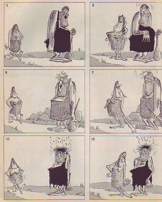
BASIL WOLVERTON WOMEN
Sorry for the minimal post. Thanksgiving, Christmas shopping, and agonizing over whether to buy a copy of Painter 11 at a "Black Friday" price, took all my time. Boy, I love Christmas but we can all be thankful that it's only once a year.
Making a decision about Painter 11 was hard because the specs support Leopard, but not Snow Leopard, which is my operating system. People on the net were divided about whether Snow Leopard is compatible. Half said it worked just fine for them and half said it didn't. Ordinarily I'd skip something as risky as this but the asking price was ridiculously low....I just couldn't pass it up. Geez, I hope I did the right thing.
Anyway, how do you like these Wolvertons!? They're made by someone who doesn't identify himself on his site, but whose watermark moniker is Stu Sutcliffe. Nice job, Stu!
http://stusutcliffe.blogspot.com/2009_07_01_archive.html
Labels:
basil wolverton,
cartoon women,
wolverton,
zbrush
Tuesday, July 25, 2006
WHERE ARE THE FUNNY DRAWINGS?
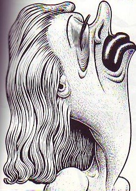
 What's funny? Well, for starters, this drawing by Basil Wolverton (above) is funny. Everyone I've shown this to laughs. Why do we so seldom see funny drawings like this in modern animation?
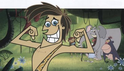
  It's odd to think that TV animation contains so few funny drawings. You'd think a few would slip in there, if only by accident. I'll bet the artists who designed the TV poster above have drawings of theirs pinned to their cubicles that are 10 times funnier than anything in the poster they made. Why is this? What's wrong? What's responsible for this? Why are there no crisis meetings when a poster or a comedy show fails to include funny drawings?
 I love drawings like this (above) because they so obviously exist just to get a laugh. The artist isn't ashamed of being funny, he flaunts it! They're not mildly amusing products for an era of reduced expectations...they're gloriously and unashamedly reaching for a laugh! If I see one more mildly amusing animated feature or TV show I think I'm going to explode. The audience is hungry for funny drawings! Why are we witholding them?
Labels:
basil wolverton,
don martin,
funny drawings
Monday, June 26, 2006
PICTURES THAT INFLUENCED ME #1A

BASIL WOLVERTON
Three of these are pictures I saw in Mad Magazine when I was a little kid. One I discovered a little later, I don't remember how. I loved them when I was a kid and they continue to influence me even today.
What impressed me about the drawing on top (above) was the idea that you could do a drawing in the wonderfully ignorant, over-the-top style of the class clown but still project delicacy and restraint. This isn't a shout-at-you, Big Daddy Roth picture. The restraint actually makes it funnier than than Roth. I always meant to ask John K if this picture influenced him because John's caricature style can be described this way.
 My school friends and I used to crack up over the galoot and the elbow (above). I KNEW guys like this, guys who aren't bullies, but who step on little people because they don't seem to be aware of their existence. When you're this big only other big people are on your radar. And look how eager and stupid the guy is!
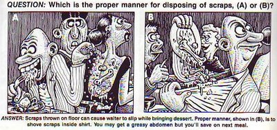
  This (above) is the picture that made me aware that cartooning is often about worlds in collision. Two men with totally different personalities are forced to sit so close that they interfere with each other. The pictures are funny even without the beard-in-the-soup gag. They made me aware of rhythm, framing, and funny staging. They also reminded me of the centrality of funny drawing. I stared at this a lot before the teacher confiscated the magazine.
The panel on the left (above) is the one that really captured my imagination. I thought the disgusted guy in the middle had such a funny face that I was driven to spend countless hours mugging infront of the mirror, trying to learn it. Now I've gotten really good at it.
I love to draw this kind of guy, A character who reacts with disdain and disgust to people around him.
Subscribe to:
Comments (Atom)


