Sunday, March 29, 2009

AT LAST: AN AFFORDABLE 2D ANIMATION PROGRAM!


At Last! A pencil test program that's cheap and easy to use, and has most of the features that animators look for. At least I think it does...I only just found out about it, and haven't actually tried it. 

I've been waiting for something like this for years! The Windows version shown above is the latest one, 6.0. Mac users will have to settle for 5.0 but I understand an upgrade is in the works. Anyway, if you're not already familiar with this program, go to the Digicel Flipbook site and check it out. Be sure to watch the video that's shown above. 


They also sell animation lessons. They're pricey but when you think about what a semester in art school costs, these prices seem like a downright bargain. 

The site links to animator Jason Ryan's site and he put up a free sample of his animation tutorials using this program. It was pretty impressive.


Lite is the basic pencil test program. There are no levels, so you can't put bodies on one level and legs on the other, but the price is right and it's enough to learn the basics on your own at home. I'm assuming that the Lite version still has the exposure sheet on the side bar. 


For artists who want to animate on paper and scan everything in, the autoscan plug-in (above) sounds like a Godsend. If you had a scanner of the right size with an automatic paper feed, you wouldn't have to worry about registering the peg holes, the program would do it for you. 


I thought I'd mention another inexpensive animation program (above): it's called the "Paperless Animation Program (PAP)." There's also an anime animation program, but I know even less about that then the ones I've already mentioned.


Animation programs usually require a Wacom tablet, which if bought new costs $70 or $80 for the small size. Someone told me there's no sense in getting a larger more expensive one if you intend to work on punched paper and scan the drawings in. 

The Bamboo Fun model includes a mouse, but is that really necessary? Does their mouse do something the mouse that's already on your computer can't do? The Cintique allows you to draw directly on the tablet and the picture appears under the pen, just like it does with paper, but that'll set you back $1,000. It depends how you're fixed for dough.

Thanks to Mark Kausler and Michelle Klein-Haas for some of the info here!


Friday, March 27, 2009

THE IMMENSELY INFLUENTIAL ALEXEY BRODOVITCH


Surely one of the most influential of all American artists was Russian emigre Alexey Brodovitch, the art director of Harper's Bazaar magazine from 1934 to 1958. It's hard to exagerrate what he did during those years. He transformed an ordinary womens magazine into an avante-garde art magazine that managed to sell clothes at the same time it was transforming the country's way of seeing the world.


Actually Harper's is still out there on the stands, but as you can see (above) it's a pale shadow of what it once was. 


I'm amazed that Brodovitch managed to sell so many middle-class women on something as weird as surrealism. 


I'd be amazed if the art magazines of the day offered the same value for the artsy dollar as Harper's and its imitators (above). 


Some of the best photographers of the day worked for Brodovitsch: Brassai, Henri-Cartier Bresson, Richard Avedon and Irving Penn, just to name a few. 


You could have framed the covers. 


In case you don't recognize the name Richard Avedon, that's his work above. The leaping girl holding the umbrella at the end off this piece was Avedon's too. Harper's was full of pictures like these and only cost 45 cents in 1947.


Can you believe this (above) was on the cover of a mainstream magazine? Women were reading this stuff when their husbands were reading "Field & Stream."


High fashion magazines were criticized for their use of cold, souless models. No doubt that harmed the women who were dumb enough to try to imitate that cold model lifestyle in real life, but what about all the other women? For them these magazines increased their awareness of art, of all things graphic, of style and sophistication.


A number of old covers like the one above and the Vogue cover higher up, contained... I don't know what else to call it...an element of evil.  The women on the covers look like they're staring out at the reader from a room in Hell. It's weird. I can't figure out what that means.


I wonder if Brodovitch and Harper's were unwitting catalysts of the feminist movement. Women who read these magazines over a period of years must have developed a more artsy attitude about life than their husbands, and that was bound to cause a disconnect somewhere down the line. Even today you see more women in art museums than men.  

Mens magazines like Playboy tried to catch up by wedding naked pictures to essays and sophisticated stories, but that effort, admirable and flamboyant as it was, wasn't exactly comparable to what Harper's achieved. Harper's was actually in the forefront of the art world. For about fifteen years Harper's readers actually got to participate in a real, high-quality, cutting-edge art movement. It must have been exciting! It may have changed a generation of women. 

Playboy was actually the true successor to Harper's, and it succeeded in its turn in influencing a whole generation of men. I don't know of any magazine that does that now.


Wednesday, March 25, 2009

INTERESTING MEN'S FACES


Here's a picture by Hans Namuth called "Armed Farmer." Where does this picture come from? The Spanish Civil War? Argentina? Why is the farmer armed? He doesn't look like he's worried about anything.


Here's one by Fracois Kollar called, "Railway Worker." The guy's head reminds me of a parrot's for some reason, but that doesn't detract from the drama. Click to enlarge. 


Guys with weak chins like myself are full of envy for men with heroic chins like this one (above). If I had a chin like that I'd wear a black body suit and ski mask with just one big hole for the chin and none for anything else. It's by Edward Weston. 


A streamlined head (above) that looks like the owner is facing the wind all the time, even if he isn't. It's another Weston.


Yet another Weston (above). This man just has to be a mad scientist. I can imagine this guy delivering Lugosi's lines from the "Ed Wood" movie, the lines where he threatens humanity with a race of atomic supermen who "...vill conquer da VERLD!"


Last but not least (above), Edward Sherriff Curtis's "Ankara Man." Click to enlarge. Once again we see an Indian portrait where the nose isn't long like the cartoon caricatures. Geronimo had a long nose and, since his portrait was the most reproduced, all Indians were believed to have long noses. I don't think most of them did.

This man is strikingly handsome.  The picture is from 1905, I think.

That's all the pictures I have. While I'm here I thought I'd say a word about "Love Nerds," which I just removed. I asked a few people about it, and they said they didn't post their pictures there because they were too fat, and didn't want anyone to see them that way. Son of a Gun! It seems that this site attracts a lot of fat people who want to pass themselves off as thin...like me! Geez, I should put up Jenny Craig ads and make a couple of bucks!


Sunday, March 22, 2009

THE TWO LADIES' GROUPS


Hotel Porter (V.O.): "Ladies, ladies! I have an announcement!"


Porter (cont): "The hotel regrets that there will be a delay due to overbooking. I'm afraid that it'll be necessary for members of the two clubs here to share rooms with each other."


Porter (V.O.) (cont): "That means the professional sniffers of "The Nasal Sensitivity Club of America" will have to share rooms with..."


"...'The Black Widows,' also known as 'The American Society of Husband Dispatchers.' "


Porter: "Ladies, we deeply regret the inconvenience! Just wait in the lobby on the first floor, and we'll assign rooms just as fast as we can!"


Meanwhile, up on the top floor...


Mildred: "Beulah, that food we had for lunch is giving me gas. What'll I do?"

Beulah: "Just let her rip! We're on the top floor, so nobody'll know, and I'm going to take a nap, so it won't bother me!"

Mildred: "Well, um...OK...I guess it's alright if it won't bother anybody. Here goes....BRAAAAAAAAAAAAPPP!!!!!


[Down on the first floor] Violet: "Yikes! Ladies, did you smell that!?"


Daisy: "Oh, Man! I certainly did! It's disgusting! It's of human origin, the usual sulphur and rotten egg smell with a hint of dead skunk and maybe a tad...yes, a tad of peppermint."


Magnolia: "W-What? I don't smell anything."


Gladiola: "Oh it's there all right! I smell it too! Definitely peppermints in there...Altoids, I think!"


Marigold: Maybe we should take care of the offender...permanently, I mean. Let The Black Widows handle this.


[On the top floor again] Beulah: "Mildred, I can't get to sleep! I ate the same food you did! Watch out, here it comes....BRAAAAAAAAAAAAAAAAAAPPPP!!!!!!!!!!


[On the first floor] Tulip: "Oh my Gosh! There it goes again!"


Lavinia: "Don't worry Ladies, I mixed cyanide in some coffee that was sitting here. We'll just find out who let wind and offer the person a friendly cup. End of problem!"


Iris: "You mixed it in my coffee, you twit, and I drank it!"


Petunia: "Well, that's one less sniffer to worry about!"


Iris: " 'One less sniffer!?' I'll show you!' "

Buttercup: "No, I'll show YOU!!!!"

Gladiola: "No, we'll show YOU!!!!"

All the club women get into a frantic shouting match and handbag fight. The hotel lobby is a scene of horrific devastation.


Unwary Hotel Guest: "Um...er, sorry to interrupt, Ladies. I'm lost. Do you know where the 'Centipede Strokers of America' are meeting?"


GOOD AND BAD SURREALISM


Surrealism was a powerful invention, which proved to be useful not only in painting but also in photography (above), music, film and novels. The problem with the technique is that it's usually considered to be beyond criticism. A lot of bad surrealism ( I don't mean the photo above),  gets by because no one knows how to logically criticize something that's supposed to be beyond logic. I say "supposed to be," because it seems to me that the best surrealism does mean something on some level.


Take Dali's "The Persistence of Memory" (above), for example. I don't see anything having to do with memory in the picture, but I do see a world where time has been slowed down and been rendered meaningless.  The dead tree, arid plain, and stagnant ocean tell us that such a world would be a bleak sort of Hell where nothing interesting or significant ever happens. It's like the Earth would be if it survived to see the energy-deprived, heat death of the universe. It's a useful metaphor when you're vegetating in a waiting room or looking back on a life of quiet desperation.


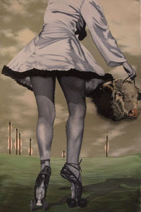
But not every kind of surrealism has meaning. The picture above is simply a collection of random images placed on a bleak, Daliesque-type plain. It heightens our awareness of how weird the world is, but not much else. The artist didn't have an idea to communicate.


Here (above) the artist is communicating, though what he's saying is open to interpretation. For me it says The dynamic world of heavy industry is present in some sense, even in a quiet and sedate room like the one above. It's a reminder that worlds can intersect, that dual realities can exist, that one world can suddenly and violently impose itself on another.  


Here's (above) another one where the artist has nothing to say. He attempts to remind us that man is capable of mathematical and abstract thought, but says we don't produce anything worth hearing about. The message is anesthetizing rather than interesting. This is the kind of arid, humorless surrealism you used to see on newspaper editorial pages. 


More meaningless surrealism (above). The images exist because the artist was free-associating and didn't know what else to say. 


Back to meaning again. This is Dali's "Daddy Longlegs" picture (above) where the artist posits a world of absurdity. Far from being arid and stagnate, this one posits frantic but meaningless activity. It's all about futility; beautiful, marvelous futility.  Once again, it's a great metaphor.


This (above) is one of the worst surrealist pictures I've ever seen. It has no meaning whatsoever. Even surrealist pictures have to have meaning. 


I don't mean to say that surrealism always has to contain serious messages. Some of my favorite examples are in ads that are just plain funny, like the parody of Dali above. Dali's bleak view of the world was always deliberately undermined by his sense of humor and drama. He seems to refute his own notion of absurdity by putting us in the judge's stand where we can laugh at the meaninglessness of it all. 


My favorite kind of surrealism is the kind (above) that makes fun of surrealism. Surreal commercials that sell things like peas and stockings are hilarious. They seem to say, "The world is meaningless, and you may as well commit suicide, but while you're meditating on that, how about a nice, cold glass of Schlitz beer?"


Dali's imagery is so funny that it's hard to resist parodying it, as Volkswagen did here (above). It's a very skilled picture, which isn't surprising because  you have to have skill in order to joke about Dali. That's because his own pictures are so obviously the product of old master technique and funny, high-fashion sophistication. His message is a dual one: The world is both meaningless and full of meaning. Striving is ultimately meaningless but strive we must, because we are striving creatures who cannot be happy unless we are constantly trying to improve ourselves.