Wednesday, May 30, 2012

A TRIP TO NEIMAN MARCUS

EDDIE (VO): "Hi Auralynn! I'm ready for another adventure! Where to this time?"


AURALYNN: "We're going to Neiman Marcus. I want to show you some clothes!"


EDDIE (VO): "Why are we stopping here? This isn't Neiman Marcus!"

AURALYNN: "I know, but you need to see some average clothes first. What do you think of this dress?"

EDDIE (VO): "Er...I dunno. I guess that's what girls are wearing now. I don't know much about things like that."

AURALYNN: "What do you think of that outfit?"

EDDIE (VO) "(Yawns) I dunno. One's as good as the other, I guess......Hey, look over there! It's The Sharper Image store! Let's check it out!"


AURALYNN: "Look at this neck massager! It feels like someones punching my back!"


EDDIE: "And this head squeezer....Ooooooooh, that feels goooood!!!!


AURALYNN: "This chair is nice, too....but.......we have to go!"


AURALYNN: "Okay, here we are...Neiman Marcus!

EDDIE (VO): "But the sign says 'Prada'."

AURALYNN: "Don't you see? Prada, Balenciaga, Arkis, Armani.....all the big design houses have little stores within Neiman Marcus!"


EDDIE (VO): "Uh-oh! Look at this store! The racks are almost empty. I guess they're going out of business!""

AURALYNN: "No, no. It's just the opposite. They're doing fine. They're just more exclusive than the other stores. Let's go in!"

EDDIE (VO): "Go in!!!???  But, but......well, er, okay."


SALESWOMAN: "Hello, Sir! Have you and your daughter been to this store before?"

EDDIE (VO): "My daughter!!!??? Oh, she's not my daughter. She's just a fr........"

SALESWOMAN: "Have a seat, Sir. I have just the dress for your adorable child. Wait here and we'll slip into the changing room and surprise you...."

EDDIE (VO): "Well, actually I'm not her......"


SALESWOMAN (VO): "Voila! What do you think?"

EDDIE (VO): "HOLY MACKEREL!!!!!! (Gulp!) Auralynn, you...you look great!!!"

SALESWOMAN: (VO): "Doesn't she? That normally sells for $4,000 but it's on sale for 2,000. Think of the good times your daughter'll have in it!"

EDDIE (VO): "Well, actually she's not....."


AURALYNN: Miss, I'm not really in the market for a dress today, but I'm impressed by the Z matrix cross stitch on the back and the canvas hensworth. I'm a designer myself and I know how rare good platerial hensworths are."

SALESWOMAN (VO): "You're a designer? So am I! I haven't seen a hensworth this long since Belenciaga formatted the triple thistlebain that way, give or take a double bevel now and then. Here, take my card. and I'll let you know when the next leather pith homey comes in."

SALESWOMAN (VO) (TO EDDIE): It was nice meeting you, Sir. I hope you'll bring your daughter in again soon."

EDDIE (VO): "Well, actually she's......Oh, forget it."


OUTSIDE THE STORE, IN THE MALL:

EDDIE: "That was interesting! But what did you bring me here to see?"

AURALYNN: "I wanted you to see why I'm a dress designer. I wanted you to see for yourself the power of design! You saw what average dresses were like....looking at them almost put you to sleep. Well, think about what you felt when you saw this one. The effect of real design is overpowering! It can make the wearer feel confident, it can change the way you move and talk, it can make or break a career. Sometimes I think design can change the world!"


EDDIE (VO): "Wow!"

AURALYNN: "Yeah."


Tuesday, May 29, 2012

"ENVIRONMENTAL ART"


I'm in a quandary because there's a type of sculpture that I like and it has no name. I call it "environmental art," but that's a purely personal name that would create confusion if I used it in conversation. There's already a formal environmental art, and it doesn't look anything like this.

Anyway, the example above (or rather the parts of it that I like: I don't like the whole thing) should help to define it. It looks like a combination of Jim Flora and Disney's "Night on Bald Mountain." It interrupts the space it's in, so I call it environmental. Wouldn't it be great to have a living room with demons like these flying all around the ceiling?


For me environmental art always looks three dimensional, even if it's not. I like the picture above which seems like cut out plates of different sorts, but which is actually all on a flat plane.


I even think of Miro (above) as an environmental artist, because his flat paintings look like they'd make terrific mobiles....if you could afford the time and expense of constructing them.


Calder's mobiles (above) capture some of the Miro feel, but with a lot fewer shapes. As a consequence you can buy cheap knock-offs for your home. Poor Caulder. The knock-offs seldom capture the energy of the original.

I like the way Caulder uses shadows on the wall to complete the design.

Miro influenced a lot of sculptors to make environmental designs like the one on the right, above. I love wire sculptures that seem to take the shape of tendrils on a bean plant. I used to have a real bean plant right outside my shower window and every summer I'd be treated to beautiful evolving spirals of plant dendrite.


 The problem with wire sculpture (above) is that it crushes easily if not handled right. I used to have a home-made one in my living room window. It got mangled again and again, but it was okay because the distortion usually turned out to be interesting. I One day the distortions just stopped looking good, and I had to throw it out.


 Here's another style that qualifies as environmental art for me: Red Grooms' "Book Store." It's life size and really captures the feeling of a used book store. I imagine that only museums buy this kind of thing.


For me, totem poles of all kinds are environmental art.


Of course the Canadian Indians make the best totems, but the Polynesians were no slouches. Banana plants (above) just don't look right without tikis.

That's all for now...no, wait! It's Memorial Day, and there's one more important subject to cover (below).......


Sunday, May 27, 2012

A FRENCH PHILOSOPHY GIRL


INT. ANTEROOM OF OFFICE RESTROOM, PARIS: 


JEAN PIERRE: "Hey in there! Other people need to use the facility, too!"


CHANTALLE: "Sorry. Somebody left a magazine in there, and it had an article about Uncle Eddie. I just had to read it."

JEAN PIERRE: "Uncle Eddie? The internet guy? Why read about him?"


CHANTALLE: "Why read about......??? You must be kidding!"


CHANTALLE: "Gasp! Oh, I get it. You're jealous!"


JEAN PIERRE: "Why would I be jealous? He has a nose like a pickle. Besides, he's John K's toady. Everybody knows that."


CHANTALLE: "Uncle Eddie's nobody's toady. He does Theory Corner and Theory Corner sponsors The Philosophy Girls."


CHANTALLE: "I'm thinking about trying out for the Philosophy Girls.  They travel all around the world, arguing and persuading in the service of truth and wisdom. Only the top 15% of applicants are accepted."


JEAN PIERRE: "Well that's all well and good, but I'm a member of...(Ahem!)... the...um... Philosophy Boys. It's an even more elite group. Only the top 5% are accepted."


CHANTALLE: "Really? What do they do?"


JEAN PIERRE: "Do? They...er...wear the coveted Philosophy Boys blue blazer, of course. We never go anywhere without it."


CHANTALLE: "Hehe! Well, if you never go anywhere without it, how come you're not wearing it now?"

JEAN PIERRE: "Er...it's in the next room. Stay here and I'll bring it in."


OUTSIDE, ON THE STREET: 

JEAN PIERRE: "Quick! Anybody have a blue blazer to sell!? You Sir, would you like to sell y...Madame, would you....."

***************

Saturday, May 26, 2012

YIKES!


Yikes!!!! I spent so much time with comments on the last post that I'm too tired to write a new one tonight. I'll try to post again late Saturday night.

Thursday, May 24, 2012

A POPEYE CARTOON THAT MISFIRES

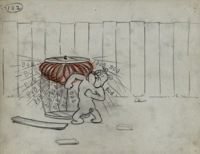
If you're one of those people who gets mad at internet swipes then you're going to hate me, because all of the Popeye visuals here were swiped from Michael Sporn's blog, the entry dated 5/23/12.

http://www.michaelspornanimation.com/splog/

They're storyboard drawings from a Paramount cartoon called "Barking Dogs Don't Bite." You can find a video of it somewhere below. I'm putting all this up because the story doesn't work, and I thought it would be fun to talk about why.


It's a pretty simple story. Olive Oyl leans on Popeye to walk her dainty little French Poodle and Popeye reluctantly gives in. Of course Popeye runs into Bluto who's walking his killer bulldog. 


The whole middle of the cartoon is action gags where Bluto beats up Popeye, and the  bulldog beats up the poodle. After a ton of beatings, the good guys manage to score some spinach and massacre the two bullies. Popeye now has new respect for the poodle who, with the aid of spinach, has proved himself a real man. That's the story. 


At first glance the story seems perfect: it’s clear and simple, builds in a logical way, and has lots of opportunities for gags. It’s only when you see the story executed that you realize how flawed it really is.


Compare it to the the best of the black and white Popeyes. They’re full of digressions, and are as much about the funky world that Popeye lives in as they are about Popeye.


In those cartoons Popeye was alternately violent and sentimental and so was the world he lived in. The wonderful, built in contradictions made it difficult to make slick and logical stories, so the studio didn’t even try. They aimed for a logic of the heart rather than a logic of the mind.

On a different point, I’d hate to be an animator working on a slick and logical comedy. There’s no breathing room. In a logical cartoon all the animator can do is move the storyboard poses. Any deviation is seen as subverting the story.

Sometimes I think the present industry should be called the storyboard industry or the writing industry because the animator’s contribution is so slight. Isn’t this supposed to be their industry?


Aaaargh! I've digressed way too much. What I want to convey here is how easy it is, even for professionals, to get seduced by a "tight" story like this one. Sometimes a story can be too tight. It can exclude any spontaneous humor in favor of gags that aren't really funny, but just happen to fit the subject at hand. Stories like that get an "A" for logical consistency, and an "F" for entertainment.


Okay, here's (above) the whole film.


**********************

BTW: Michael Sporn is working up a promotional reel for an animated film about Edgar Allan Poe. When I was a kid I read everything of Poe's that I could get hold of. My favorite book was "Tales of the Grotesque and the Arabesque." I used to love the way Poe used ornate speech to convey horrific ideas. It made humanity seem so frail. He has us put up a tissue-thin wall of eloquent words and manners in the belief that it'll protect us from an unimaginably hostile universe.

Take a look at what Michael is doing with the story, which is heartbreakingly tragic in parts. http://www.indiegogo.com/PoeProject