Tuesday, July 28, 2009

THE BEST KIND OF MAGIC POSTER


Here's a terrific one (above). It has it all: beautiful color and rendering, demons, advice from the Devil, and levitating women. Be sure to click to enlarge. You can hardly see what's going on in this tiny version.


I love this one (above). The color isn't as good, but the idea is wonderful: I'm guessing it's about an infidel magician who has penetrated into the secret enclave of a Moorish death cult. He's exposed when he tries to help a girl who's about to be sacrificed to a man-eating tiger. Only his knowledge of magic can save them now.


I don't like this poster (above). I'm a cartoonist but I take magic seriously, and I don't like to see it treated lightly as it is here.


Beautiful technique (above), but where's he rushing to? It's as if his magical powers were less important than a sale at Macy's.


Here's a good one (above). Thurston is presented as a scholar of the mystical arts. He's surrounded my mischievous demons and imps.


Another nice one (above), though the reproduction could be more colorful. Blackstone is portrayed as a man of such enormous power and mystical knowledge that his very presence rends the curtain that separates us from the demon world, and creatures from that place spill into our world all around him.


I don't know why, but the idea of lots of objects (above) floating in the air around a tied-up person intrigues me.


I like posters and magic tricks that are about cabinets (above). When we enclose a space we seem to steal that space from the nether world, and it becomes full of magical potential.


Nice poster...and big, the way all magic posters should be.


Another terrific Kellar poster (above)! The magician's presence has attracted demons who delight in helping him ensnare a space which is alive with mystical energy.


Awesome! The magician has revealed secrets to the audience (above) which were so fantastic and beyond our understanding, that he's driven his audience mad. Well, they can't say they didn't get their money's worth.


This magician's magnetism (above) sucks demons out of their own world and into ours.


A good poster (above), but it's a bit sparse. A magic poster should resemble the best of the old, crowded circus posters. It should promise more wonders than the mind can comprehend. I do like the lightning coming from his fingertips.


Here's (above) an improvement on the same theme. Demons always make a magic poster better.


Niiiice!


I like magic tricks that involve flash explosions. These remind us of Hell, and of the violence-inducing mysteries embedded in the real, everyday world.


Sunday, July 26, 2009

THE GLORIOUS TANGO!


My favorite ballroom dance...The Tango!!! It may be the best ballroom dance ever. It's sexy and drastic, street smart and funny, elegant and beautiful.


I love the way tangos (above) have bursts of fast, funny, complicated action...


...that ends in abruptly frozen poses (above) where the dancers whip their heads around with caricatured seriousness.


I love the weird, deco contortions.


Was the Tango invented by cartoonists? Sometimes it seems that way. Or maybe the Tango invented or inspired Argentine cartooning. That country has more than its share of world class cartoonists.


I asked that because it's obvious that Don Martin must have choreographed this (above)!


Add elegance and skill (above) and the funny pose becomes a shockingly beautiful funny pose.

The Tango is so innovative! How many ways are there to bend a woman over? Only about a million and a half!


Attitude (above) counts for a lot. It reminds me of Flamenco in that respect.


Surely this (above) is ballroom's most heterosexual dance. It assumes that men and women are attracted to each other, and that animal magnetism exists. I love the way it makes an art form out of our most primal urges.


For a while gays were really into the Tango, especially in Paris. My book says that Parisians came to think of it as a gay dance.


Finally the Argentines stepped in and with commanding authority...the result of single-minded devotion to the art...brought the dance back to its wild, heterosexual roots.


Of course the French gave us the Apache (above), which is a parody of the Tango. That's interesting because the Tango itself is a parody of previous dances, so it's a case of a parody being parodied.


My book says that it all started in the late 1800s when a lot of cowboy gauchos were put out of work, and forced to go to Buenas Aries to look for jobs in the big city. It was tough because a flood of Italian, Spanish and French immigrants soaked up a lot of the available work.


The proud cowboys (above), still wearing their kerchiefs, boots and knives (even though the picture doesn't show that), found themselves spending the day in what my book calls "low life" bars, brothels and dance halls.


There they encountered Argentine blacks (above) who danced something vaguely Afro-Cuban and Flammencoish called the Milonga. It was athletic and flamboyant and struck the gauchos as being hilariously funny.

I like the way the artist shows cats on the floor.


The gauchos liked to do dance parodies of it, which Italian and Spanish musicians worked hard to find a rhythm for. When they did, the word Tango was sometimes used to describe it.


Here's the street in Buenos Aries where the Tango finally earned some respectability and entered the mainstream of Argentine life. All the composers wanted to write for this new thing, the Tango.


Here's (above) a modern revue which conveys a little of the street smarts and humor that I spoke about earlier. How do you like the row of Tango men in the background? The one with the military jacket (or is it a doorman's jacket) is especially funny.

Argentine cartoonist Oscar Grillo wrote in to say that said this looked like tourist art and was a misuse of the dance. Boy, Argentines still get mad about deviation!


Wow! Isn't it great, the way it starts with the guy in red (above) telling the servant girl to buzz off because he's working on some other girl? Wouldn't it be fun to animate Tex Avery-type humor like the kind above? Sorry to say the major studios are all invested in cookie-cutter features where this approach would be irrelevant. Too bad. I'm going to get laid-off in a week. Maybe I'll have time to try some drawings of this type just for the fun of it.


So the Apache is a parody of the Tango, and the Tango is a parody of the Milongo. I think it stops there, though. I can't imagine going much farther than this video does. The dance starts half a minute into the clip.


Friday, July 24, 2009

WALKING WITHOUT GETTING ANYWHERE


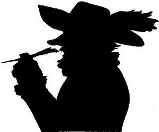
I was going to do a post about silly walks (above), ones that aren't in the famous Python sketch, but I got side-tracked into watching videos of mime walks, and now that's all I can think about. I'm going to learn the profile walk in these videos, and then do it in front of a dog. I have a feeling that it'll drive him nuts!


I posted three walk videos because each one contained some bit of information that the others lift out.


It does take strength in the legs to do this because, unlike real walks, you're putting your weight on a bent leg.


It's off-topic, but I couldn't resist putting a Moonwalk tutorial (above) in here. Actually this looks easier to learn than the profile mime walk. This guy does a good job of explaining it, don't you think?

Tuesday, July 21, 2009

HAVE YOU SEEN THIS CARTOON?


Unbelievable! Is this really a picture of Bugs Bunny displaying all his male assets? When a friend showed this to me I nearly dropped to the floor.

Actually, it's not what it seems. The offending object is simply the air space between Bugs' legs, and the color is the way it is because it's the color of the tub in the background showing through the empty space. Even so, it sure looks like......


Here's (above) the whole cartoon. Skip ahead to 2:55.

Thanks to Milkandcookies.com for the post this is based on, to lyzard and psyjax who commented on that site and explained what was really going on, and to Christina who turned me on to all this.


Sunday, July 19, 2009

THE OTHER POTTER


"It's a Wonderful Life": the film is falling out of favor lately, largely because it's been on the vintage favorites list for a long time and people are looking for something new. Too bad, it's a great film. Anyway, I brought it up because I want to talk about one of my favorite sequences in the film, the one where Potter tries tries to buy off George Bailey with the promise of a high-paying job.


It's an interesting sequence because Potter's been treated as a one-note villain up to this point so you'd expect him to play the sequence in a high-hatted, "Take this offer or else!" kind of way. Instead Potter uncharacteristically tries to sweet talk Bailey. Watch the clip. It begins 4 1/2 minutes into the video.


Did you watch it? What intrigues me about this is that it's a simple attempt at bribery that doesn't add anything to the story, yet it manages manages to be one of the best scenes in the whole film. Think about it. We already knew that Bailey and Potter were enemies. We already had abundant evidence that Bailey preferred integrity to money. The sequence tells us nothing new, and yet....


What I'm going to argue here is that the sequence exists for a theatrical reason. Up till now the Potter part of the story simply laid down information. It took great pains to let us know who the good and bad guys were. That's fine so far as it goes, but live theater people know that audiences crave scenes where they can boo the villain...where they're tempted to yell, "Don't go in there, Dick! he's got a gun!" Even in the middle of a story, they want sequences that end with the patriotic triumph of right exemplified with angelic choirs waving the flag and the villain being hissed off the stage.


Not only that, but actors need scenes where they can shine and not simply be pawns racing ahead to the next plot point. In this sequence Barrymore gets to be sunny for a while. This means he can anchor his performance in a deliberately insincere sing-song, which live audiences love to re-act to, and actors love to play.


That's all I have to say on the subject of live theater and film, but I have a copy of "Cyrano de Bergerac" on the desk in front of me and it wouldn't be much trouble for me to scan in a couple of terrific paragraphs that I read last night. Let's see...Okay...here goes!


Great, huh? Here's an excerpt from the same scene, a couple of pages later:


Wow! Good old Cyrano...a real force of nature!


Wednesday, July 15, 2009

THE NEXT NEW THING IN ARCHITECTURE


Here's (above) the previous movement: the "post modern" look, with flat, sterile concrete walls punctuated by uniform window slats. This hideous building is by Frank Gehry. Gehry later converted to the "crumpled" look, where buildings looked like crumpled pieces of paper in a wastebasket.


Crumpled evolved into twisted. Twisted is appealing on some level, but I don't think it lends itself to interesting interiors. I imagine this will last another ten years, at least.


Here's what's coming: buildings covered with bas-relief. How do I know? Because relief is beautiful and has become easy and cheap to make. That sounds like a formula for success to me.


Frank Lloyd Wright tried to introduce texture into modern building (above) but he was past his prime when he did it, and his interesting blocks were lost in bland, repetitious, modernist flatness.


What puts makes bas-relief a player again is the new building materials, especially the new hard styrofoams. Complex shapes are easily and cheaply molded and produced in quantity...sometimes from computer renderings. Sometimes the renderings are scans of old reliefs like the Aztec pattern above.


Right around the corner we'll also see a resurgence of interest in stone masonry for those who can afford it. I say this with confidence because when interest in texture returns to architecture, interest in stone, which is the ultimate texture, can't be far behind.

For those who have less money we'll see plenty of hard styrofoam stones which look identical to the quirky, pitted, silica-embedded real thing. Some of the fake stones will take designer shapes like the relief stone above.


I hope you like this Aztec relief calendar (above) because you'll see plenty of imitations of it on buildings in the near future.


The Mayans (above) were big on relief sculpture. Your kids may live in a house with Mayan-type walls like this, but punctuated with big, picture windows. Maybe they'll use undecorated real stone for the first floor, and realistic Mayan relief styrofoam for the upper floors.


Poor Rockwell Kent (above) will be plundered again and again for relief ideas.


Computer-guided hard styrofoam molding will put realistic cathedral window arches (above) within reach of average homeowners.


Some will prefer more contemporary abstract designs like the Frank Lloyd Wright stones above. Anything you can draw can be molded into what appears to be real stone. You'll have bricks made bricks that look like your family and friends. Lots of people will do this. I for one am tired of looking at bare, flat, undecorated modernist walls. Who said that things modern always have to be flat and sterile?