Friday, December 07, 2007

DRAWING LESSONS FROM MY DAUGHTER


"PORTRAITS" by Dad's Daughter


1) When drawing a man (like my Dad, above) always start with the stubble. Take time to get it right because it's the most important part of the face.

After that, draw what you see in a band that goes either across the face or up and down. Whatever's not in that band gets the short shrift. In the example above the band is horizontal and includes the ear and the nose. The mouth and eyes are outside the band and therefore are drawn tiny, as an afterthought.


2) Above the mouth the head bends. Paws make great hands.


3) Eyes are over-rated and are seldom worth drawing large. Now the ear and nose, THOSE are the true mirrors of the soul! Adults have HUGE noses! Glasses are also over-rated. Draw them tiny and floating Chagall-like in the air.


4) Adults are grotesque! Shapes bulge out of the face like ginger roots on steroids. On a face like my Dad's it's best to draw each section of the ginger root independently, without thinking of how it fits into the rest.
Pay attention to the muzzle and how the stubble wraps around it.


5) Sometimes it's fun to experiment with pie-plate head shapes. After all, the on-lookers are way too busy looking at the beautiful stubble you've drawn to know if the head-shape is working. Be sure to put lots of tiny blood vessels in the nose and don't skimp on the ear hair!
Note from Dad: I actually wrote this but the ideas are my kid's.

Wednesday, December 05, 2007

WHAT'S WRONG WITH ADVERTISING


The most striking thing about modern ads is that they don't attempt to sell anything that you can easily buy. Old ads sold soap, soup, cereal, gum, cigarettes, beer and coffee --cheap and easy to get hold of things you could buy at the local supermarket. New ads sell prescription drugs, expensive cars, erectile disfunction pills, insurance, and credit cards. I don't get it. Why waste time and money advertising things that people can't impulsively run out and buy?


Have you noticed that there's no Coke commercials on TV anymore? And where are the soap ads? People still have to buy soap, don't they? No doubt this is the result of market studies, but what studies? I'd like to read them. Maybe feminists and generic brands have something to do with it, but wait a minute...people still have to shop and we all know the generic brands don't taste as good...think about generic Cheerios...Ugh! So where are the name brand food commercials? Why are we advertising pills that require a doctor's visit to get, or cars that we buy only once every ten years?


By the way, I put up these commercials because they're each so interesting in their own way. The Coke commercial is just a straight sales pitch...no dancing girls, no frills...and yet it works! I was salivating for Coke while I watched it! Ditto the Camels commercial. A bizarre woman, shot frontally and in the middle of the screen by a nailed-down camera, holds our attention perfectly by the force of her personality and her weird articulation. Amazing!


And the Cools ad...wow! That girl on the beach is hilarious! What a gloriously cheap and fun-to-parody commercial! None of these have anything to do with the theme of this post but I thought you'd like to see them anyway.


For those who stuck with me this far...a reward: two scenes from "How To Get Ahead in Advertising," one of the most literate films I've seen in recent years. Hope you like it!

CLASSICAL MUSIC ANYONE?


I'm too busy to do a thoughtful post, but here's (above) something easy to put up that I think some people here will like a lot: Jascha Heifetz playing Wieniawski. Heifetz took a lot of flack for preferring minor composers like Wieniawski and Paganini to Bach, Beethoven and the like, but I have no problem with it. Wieniawski was a full-time violinist and he knew what other violinists liked to play. Listen to the incredible virtuosity on display here. I don't know of any living violinist who can come close.

It takes a minute or two for the documentary to get around to the playing of the piece.


Here's a couple of minutes of Glenn Gould playing Bach with Bernstein. Holy Cow! What I wouldn't give to have heard this live!


I hate to leave anybody out. For those who aren't partial to classical music here's (above) something to help you get through the day! Click to enlarge!

Sunday, December 02, 2007

SLOW vs. FAST INTROS


When I was kid we all played in the streets even after dark, every night that is, except the night "Zorro" was on. Then the streets were empty. Little kids were addicted to this show.

At the time I thought the intro was the height of sophistication. Now it seems a bit slow but the all the right elements are there and the arrangement of the music is terrific!

I have to say though, that the guy who put this video up goofed by not putting up the announcer's preamble to the intro. It was accompanied by music (not on this video) that set up the song perfectly. Listening to the song without it, as it is above, is like listening to the Stone's sing "Satisfaction" without the opening guitar statement.


Somebody at Disney's was good at setting up music. Look at the titles to "Davy Crockett" or the "What Makes the Red Man Red?" song in the original LP version of the "Peter Pan" soundtrack, or the "Look, up in the sky, it's a bird..." set-up in the classic "Superman" intro.


Fleischer has my deepest respect for coming up with this triple intro (above). First the look-up-in-the sky intro, then the actual titles with the great music, then the whole superman backstory, which might have repeated in every episode if he'd chosen to do it that way. Very nice! I'm all for long, multiple intros if you have the talent to pull them off! Sometimes the intro is the best part of the show!


These last three clips (above and below) are from "The Twilight Zone." The first two are quick, about 21 seconds, and are masterpieces of compression:


The graphics in the first two versions are much better than in this final one (above) but I still prefer a longer intro like this one from the first season. Why rush into a show that depends on mood and texture as much as The Twilight Zone?

TONIGHT I WAS IN A HORROR FILM


Tonight I played a psycho in Kali's student film. It was fun but I think I'll have to move to Argentina when it shows around. I forgot to bring a camera so I didn't get any pictures, but here's (above and below) some photos of John and I that Kali created for a scene.


Boy, when you get to my age you can look very spooky on film. Without even trying you can look downright evil. I noticed that about Robin Williams and Michael Keaton who occasionally do horror films now. Maybe that'll be my fate, chasing people around with a meat cleaver and getting paid for it.
I had a poolside picture of Kali here but it occurred to me that I shouldn't publish it without asking first, so I deleted it. Sorry guys!


Friday, November 30, 2007

UNDERLIGHT


Underlighting is an interesting effect. It emphasizes completely different details than top lighting. Look at the examples above . The two pictures are of the same person, only the light is different. The difference is amazing! The bottom-lit picture (picture #1) is simply unsettling. The the top-lit picture (picture #2) is over-the-top scary.

Amazingly, department store dressing rooms favor the scary top lit scheme. It's the easiest light to do and it makes people look thinner.


Underlight looks simple to shoot but you still have to pay attention to the overall effect. Here (above) a light was necessary to separate the back of the head from the background and a dark shirt was worn to eliminate the distracting body and keep the focus on the face.


This still (above) seems too good to be true. Were the eyes and mouth really that black in the original photo?


Girls playing victims look great underlit. It's such an unflattering light for them that seeing it there makes the girl seem completely out of her element and at the mercy of the killer.


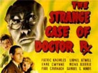
Peter Lorre (above) looked great when underlight .


Frankenstein was simultaneously hit by top light as well as a bottom light.
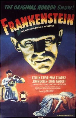

Above, an interesting interpretation (above) of Frankenstein's head, emphasizing the lower face and blacking out the forehead and hair.


Underlighting didn't seem to do much for this actor (above).


A classic example (above) of underlighting: The eyes are highlighted, the nose is a tall, dark cone, the upper lip is white with a dark moustache of shadow right above it to make the mouth seem bigger and wider.


One more comment about Frankenstein: he was sometimes lit to give the face two distinct tones, with the bottom half being grey. It's a great effect. The bright toplight makes him seem intellectual and supernatural. The greyed-down bottomlight makes him seem like the embodiment of fate-ordained death.

The brow ridge is still very prominent here and it marks the dividing line where the bottom of the face turns gray. Is that just lighting or did they help the light along with darker and lighter make-up in some scenes? How do you like the eyes and sides of the mouth?


Tuesday, November 27, 2007

JOSH HEISIE'S "SECRET STORM" PART 2


Wow! Theory Corner reader Josh Heisie supplied a terrific sequel to Secret Storm Part 1! Now we get to see who was behind the door and why Juanita and Rodrigo were so frightened! Here's (above and below) an excerpt!


"No, Rodrigo! Don't do it! You have your whole life ahead of you! Don't throw it away by..." Well, I'll let you read it for yourself. The whole episode can be found at:
http://www.mindblowingthrills.blogspot.com/

Many thanks and a tip of the Theory Corner hat to Josh Heisie!

Sunday, November 25, 2007

HOW ABOUT A SOAP OPERA!?


OUR PLAYERS: Juanita, the most beautiful girl in the village....


...and Roderigo, the brave bullfighter!

Announcer: "In our last episode, Roderigo shocked everybody by announcing that that he was canceling the marriage between himself and the beautiful Juanita! It seems that Roderigo got wind of a rumor spreading around the village to the effect that Juanita previously had a secret baby by the wealthy playboy and cad, Frenando Lopez.


Announcer (CONT): "Lopez can't be found and for some mysterious reason Juanita refuses to answer direct questions on the subject."


Announcer (Cont): "Roderigo, in an effort to forget Juanita, fled into the arms of the sultry village vamp, Carlita, and led a life of dissipation! In our last episode Juanita met Roderigo in the local cheese shop and begged him to take her back."


Juanita: "Why Roderigo? Why!? Everything was going so well! I'm still the same person you loved only weeks ago!"


Roderigo: "Hah! Love? You talk to me of love? What does a woman like you know of love!? And what do you know of honor?"


Juanita: "What do I know? I'll tell you what I know! I know the pure love of a woman when she loves from the depth of her soul! And honor? There is nothing more sacred to me than honor!"


Roderigo: "Well, in that case you'll be interested to know that I've decided to fight 'El Tigre', the greatest bull ever to set foot in the arena!"


Juanita: (Gasp!) "El Tigre!??? The mad killer!? The bull that's put two matadors under the ground!?!??"
Roderigo: "The very same!"


Juanita (CONT): "Roderigo, that's insane! With your gimp leg...the one you got rescuing that old lady...you wouldn't stand a chance! Fighting that bull would be suicide!"
Roderigo: "Perhaps so. What do you care?"


Juanita: "Then it is I who will leave this life first! If I'm the cause of your misery then I don't want to live!"


Roderigo (shocked): Juanita, wait! For God's sake, throw that devil blade to the ground! If anything were to happen to you, I couldn't bear it!


Roderigo (CONT): "Come to me little one! Let us put aside this rancor! Let us forget the past! We each know the worst about the other. Surely there is nothing new! This nearly broke us, but... "

KNOCK KNOCK KNOCK!


Roderigo: "Huh?"


Juanita: "Wha...?"


KNOCK KNOCK KNOCK!!!!!!


Announcer: "A simple knock at the door and everything is disturbed. Why? What are Juanita and Roderigo afraid of?

Announcer (CONT); "Does it have anything to do with an alleged baby? Or is something even darker and more disturbing about to enter their lives?
Join us next week for the next thrilling episode of...."THE SECRET STORM!"


Hey, do you have a digital camera? Then why not take a crack at doing the next episode of "Secret Storm" yourself? Post it on your site and I'll link to it! I may even swipe it and put it up here...with attribution, of course!

Saturday, November 24, 2007

HIGH MAINTENANCE WOMEN


Here's (above) my all-time favorite Bette Davis scene, from "Of Human Bondage." I just saw it at Mike's house. She's a wonderful over-the-top actor but when I see scenes like this I can't help asking myself what it would be like to live with someone like that. It would be a rollercoaster ride, no doubt about it.


Women like to think that men prefer stupid women, but if they do they never told me about it. The men I talked to overwhelmingly prefer smart women. The problem is that smart women are sometimes very high strung. If you're married to someone like this you better expect strong and frequent arguments over small things, and major crises on a frequent basis.


The complicating factor is that some high-strung, high-maintenance women are worth it, at least their men think so. Some guys crave the stimulation. Well, each to his own.

BTW, none, absolutely NONE of this, refers to people I know!

Thursday, November 22, 2007

THE BEST WAY TO DIE


On Thanksgiving night, after our friends left and my family was asleep, I watched again the recent film about Edith Piaf called "La Vie En Rose." It's an interesting film. It gives her an horrific childhood, fame in mid-life, and loneliness and isolation in old age. The old Piaf would lay flat on her back in bed with the covers pulled way up to her eyes, shivering with fear in the dark. Maybe she was afraid she'd go to hell. Maybe she was just terrified to be at the brink of death.


Watching this I wondered if hers was the wrong way to die. I always imagined myself dying the philosophers death where I calmly said goodbye to family and friends, and maybe even joked a little. That's not what Piaf did. She was terrified and tortured. I wondered who had the better plan.


Maybe Piaf did. I remember what Homer said about what we would call tragic heroes. The hero finds what he's good at and enters into a mystical relationship with it. He sacrifices everything to be the best at it. He may be a lousy father and husband, he may have bad table manners, but he's the best at something and that's no small thing. When the end comes, such a hero dies badly. There was never any attempt at balance in his life. He lived to experience life at its fullest through his skill, and nothing in his experience prepares him for death. He dies crying and digging his fingers into the ground. And Homer says it's a good death.

Maybe the kind of person who lives life well is incapable of dying well. Maybe living life well requires us to love life too much to casually put it aside.

Or...maybe Piaf was neurotic and her extreme attachment to her lovers was a sign that her life was lived badly. What do you think?

THANKSGIVING 2007


I was dying to post some some Wally Wood and Don Martin parodies of Thanksgiving but alas, they weren't available to scan. Maybe it's just as well because looking for them led me to discover this magnificent photo (above) of Canadian troops observing a thanksgiving service in WWI. The small version of this picture doesn't convey a shred of the grandeur of the occassion. On pain of death, be sure to click to enlarge.

I wonder what they were praying for? Maybe it was to give thanks for a recently won victory. I like to think that they were giving thanks for the wonders they'd seen in their lifetimes. It would be very touching if soldiers, who must lead a miserable life during wartime, could stop to be grateful for the gift of life...not just for survival, but for the sheer wonder of it all.


Here's (above) a mid-Civil War picture. The emotions here certainly seem heart-felt. Click to enlarge.


Here's a Victorian family (above) enjoying after-dinner coffee together. Of course the baby participates. Didn't they give gin to babies in those days?


Here's the classic Norman Rockwell picture, with ice cream substituted for Turkey.


And a Wally Wood varient.


Here's (above) a terrific picture of a family celebrating the holiday together. It's meant to be seen large so be sure to click on it.
I was tempted to run several pictures like this. I find happy famiies to be endlessly fascinating.