Sunday, August 20, 2006

MY FAVORITE COLOR REFERENCE

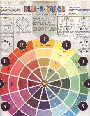
Here's my favorite wheel (above). Sorry for the condition. I bought it in the 80s and it's been stepped on, spilled on, ripped and repaired many times since. It may be out of print now. The copyright name is just an address: Box3193 Amarillo, Texas 79106.

Here's my second favorite (above). It's a reminder that there are warm and cool versions of every color.
Here's the version (above) currently sold in the art stores in my area. I took off the rotating wheel and use it as a single card.Here's the Itten wheel (above): Shades on the outside and tints on the inside. 'Not that useful for what I do but I have it on my wall anyway because it's so beautiful and mysterious! I should put up a Munsell wheel too but I can't find one that I like.

Friday, August 18, 2006

GOOD ACTING IS GOOD READING

I'm not a professional actor so I'm sticking my neck out on this. I hope the pros will let me know if I don't know what I'm talking about. OK, here goes....

Good live action acting is good reading. Acting is not a branch of psychology or dance, it's a type of music. That's why the most important part of rehearsal is the reading. The actors and the director sit around a table, scripts infront of them, and try to find the rhthym of the dialogue. They're like a jazz combo trying to figure out how they all fit together. Some may come out of the reading with a larger role to play and some will come out with a smaller role to play. Sometimes an extra line or an extra character will be mandated. It's all part of the quest to find the overall "sound."


When I use the word "reading" I'm not only referring to what happens around the table but also to the literal act of reading itself. Good acting is frequently rhetorical and oratorical, even when it's fairly intimate. Thinking about acting as a sort of heightend speech from a podium prevents an actor from getting too precious and emotionally self-indulgent about a line. It reminds him that his main asset is the quality and control of the voice itself. A good actor knows that how you say something is often even more important than what you say.

ONE OF MY FAVORITE AMERICAN PAINTERS

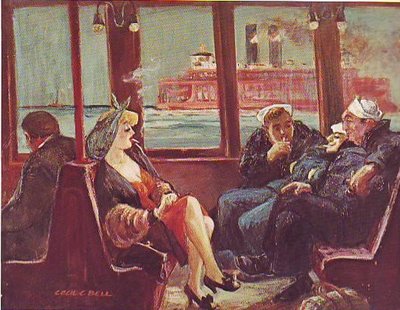
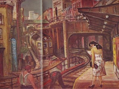
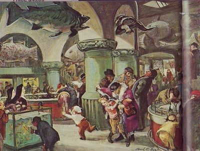
You'll have to click on these pictures because the small size doesn't do them justice. Even when enlarged they'll still be too small. There's nothing for it but to buy the book ( out-of-print) : "Cecil C. Bell" by Phyllis Barton.

Bell was a Depression-era "ash can" painter like Reginald Marsh or John Sloane. He clearly loved New York: the El, the ferries, the sidewalk fruit stands.

He's also one of America's greatest erotic artists. The sensuality of some of his subjects - always fully clothed and in public - seemed to echo the sensuality of the physical city all around them. He seemed to see the city as a labor of love by the people who built it.

He was great at mood pieces. It must have been wonderful to go to the city acquarium and take in all the big ugly fish, the institutional green walls and unvarnished wooden floors, the enthusiastic kids and the heroic mothers who tended them

Thursday, August 17, 2006

ARTISTS WHO "OWN" THINGS

The highest compliment one artist can give another is to say that he "owns" something. In other words, he draws something so well that it's definitive; no other artist is ever likely to draw it as well. In that sense I think most of us would agree that Wally Wood "owns" craters (above) and bullet holes.
Here's a few real craters (above) for comparison. Wood's craters are better than the real thing!


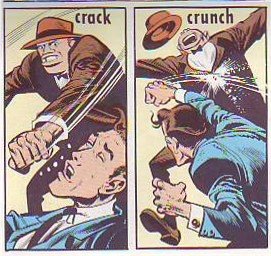
Of course Jack Davis owns knuckles. If you were thinking of competing, forget it. Knuckles are covered!

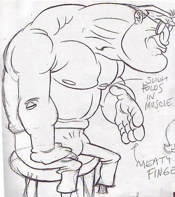
In my opinion John Kricfalisi owns lumoxes. Nobody draws a beefy, intimidating guy better than John. Come to think of it John may own crotches too, I mean crotches of clothed figures. He seems to think it's funny that men have to carry all that plumbing with them, sometimes in tight pants, and everybody who talks to them has to pretend not to notice.

Anybody else care to venture an opinion about who owns what? I believe my daughter may be the world's foremost neck hair specialist. I'll post the drawing the claim is based on as soon as I can find it.

Tuesday, August 15, 2006

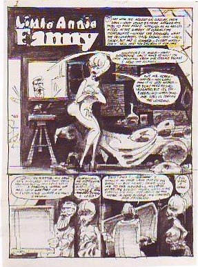
LITTLE ANNIE FANNIE LAID BARE

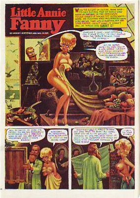
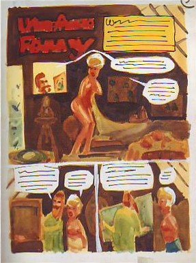
Here's (above) a Little Annie Fannie episode from September 1963. Attributed artists: Kurtzman, Will Elder and Russ Heath. I love the "dipped-in-strong-tea-and-burgundy" color scheme. Here's a treat (above): Kurtzman's original watercolor painting of the same page! All the colors we associate with Annie Fannie are here: brown, yellow, orange, red, and green. I think I prefer this rough color scheme to the finished product which mutes the colors to make the word balloons pop better.

Can anyone do a better job than I have at describing the difference between Elder's final color and the Kurtzman rough? I know there's more to it than what I described.


Here's (above) Kurtzman's original black and white value treatment. The first panel is a whole, self-contained art lesson in how to contrast values for maximum impact. Kurtzman's made me a believer in the idea that you should always take time to do a monochrome value treatment first.

Monday, August 14, 2006

NEWSPAPERS IN 1890 BETTER THAN OUR OWN?

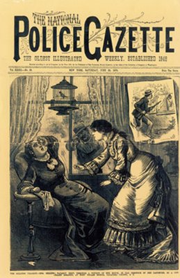
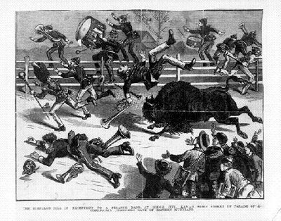
It's hard to believe but newspapers in the late 1800s were more attractive in one respect than papers are now. The biggest difference is that old newspapers relied mostly on pictures that were drawn. An artist can draw a news event, say a murder, in the most exciting way possible. He'll show you the shooter (top picture, above) sneaking up to the victim's home and taking a bead on her. A photographer can't do that. He's stuck with showing up the next day and taking taking a picture of an empty house surrounded by yellow police tape.
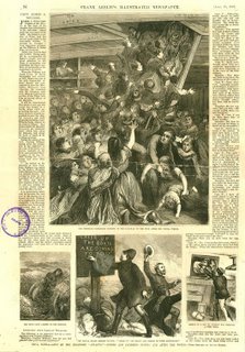
Even televised news is at a disadvantage compared to artist-rendered print media. How would the TV news cover an event like the one shown below where a buffalo went on the rampage? If the cameraman didn't happen to be there all he can do is photograph witnesses talking about it.
We all know that print media is eventually going to lose out to digital media but, given it's magnificent history, it should go down swinging, using every asset at its command. It should tell the news with both art and photography.

BTW, my sources for these pictures, The Police Gazzette and Frank Leslie's ,were weeklies and had a bigger budget for drawings than did dailies of the time.
Sunday, August 13, 2006

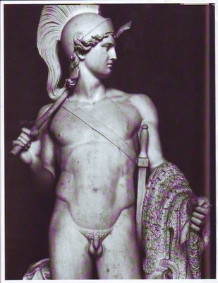
THE GREEK TRAGIC HERO AND HOW THE IDEA RELATES TO CARTOONING

Believe it or not, the Greek concept of tragedy applies to animation and cartooning. By "Greek" I mean the Homeric Greeks. According to historian Warner Yaeger the Greeks thought about tragedy differently than we do. We pity tragic heroes, they admired them.

The tragic hero led a deliberately unbalanced life. He devoted all his energy into becomming supremely good at one important thing. He may have been a lousy father and an indifferent husband, he may have had no table manners at all, but in his field of expertise he was unbeatable. Of course this skill came at a great price.

The Greeks believed that sooner or later the tragic hero would be brought down by his inability to cope with menace from the part of life that he neglected. They admired the kind of man who took this kind of risk. Modern people admire balance. The Greeks (before Aristotle's time) admired imbalance, though they thought only special people were suited for it.

How does this relate to cartooning? If you have skill and a special passion for it the Greeks say "Go for it! Go all the way and don't look back. " You'll definitely pay the price, but it's worth it.