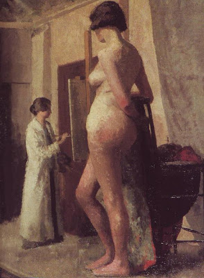
 I've always liked artist and model pictures. When they're done right they're strangely soothing and appealing and...classic, for lack of a better word. Even when they contain major perspective flaws like this one (above), where the painter seems to be a dwarf and the model a giant, they're still fun to look at. Maybe artists like them because they remind us of hours of pleasant concentration.
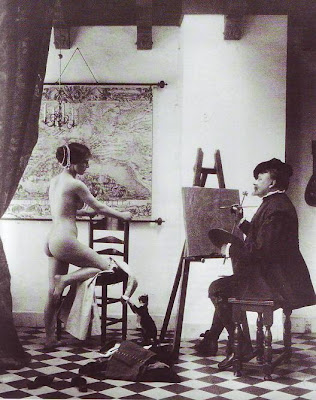 I used to think the main selling point was the sex, where a beautiful girl lets you paint her for hours on end. There's something interesting about turning sex into art. But that can't be all. Look at the photo above. It's got a naked girl, an artist and a faux Vermeer setting...and it doesn't work on any level. What's missing?
 You can make a great picture (above) even when the model has her clothes on, but naked is better. Nudity is always a profound and shocking revelation.
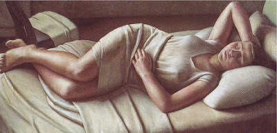
 Artist/model pictures seem to work best in soupy colors like yellow, brown, olive green, black,and white (above), or in warm grays and browns like the draped model picture above that. I wonder why that is? Somehow the 19th century managed to put a lock on this kind of subject matter.
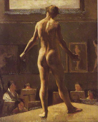
By the way, I think this figure with its back turned to us (above) is a guy.
 Here's another perspective problem (above) where giant men appear to be painting a tiny woman. Once again we forgive the flaw. The picture is terrific but, just to nitpick, the bold treatment of the men in the foreground seems to undermine the serenity you're supposed to feel in a classic artist/model picture. You're not supposed to be admiring the detail.
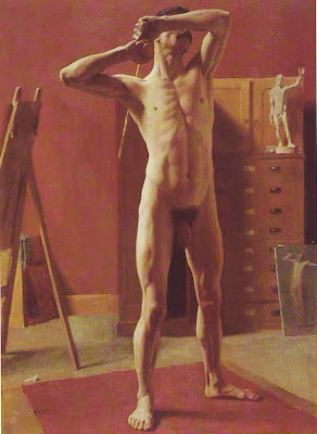 This picture (above) isn't by Eakins but it reminds me of his stark, anatomical style. This is a wonderful picture but once again, the boldness undermines the tranquility you're supposed to see in studies of this kind.
 In my opinion, artist/model pictures always seem to work best when they feel like a study, something the artist dashed off in two or three days. Maybe that's because quick studies are good at capturing the immediacy and starkness of the naked skin.

 Today I'm going to pay a visit to the Halloween stores in my neighborhood. I can't wait! For me Halloween is the time of year when the rest of the country agrees with me about what's important. I see it as a time to stock up on things I'll need the rest of the year.
 Mostly I like funny masks but I also like the kid art that people put up in their windows. Here's a sample above. Come to think of it, maybe these were done by adults trying to pass as kids.


 We marveled at how many Superfly accessories you could buy in those days: afro salt shakers, afro lamps, clippers to give your dog an afro...you could put an afro on anything and people would buy it! To make the point John drew some accessories of his own on his napkin, starting with the afro faucet (above).
 Then there's the afro pubic hair drawing which, in case kids are reading, I'll reproduce tiny. Anyway, John proved his point...anything can be embellished with an afro.


