Thursday, February 07, 2008

COMPLETELY RANDOM THOUGHTS


Warning: nudity below!


Forgive me for writing a post that's all over the place.  I just haven't had the time to write. Just rambling now, I thought I'd mention that I've been fooling around with imovie 08 and 06, the two amateur mac editing programs.  Holy Mackeral! The critics of 08 were right! 06 is a whole lot easier to use! Now at long last I've experienced the simplicity that mac is famous for and it's wonderful to behold! I was able to do almost everything quickly without resorting to a help menu. o6 is amazingly intuitive!  Of course 08 has the ability to send everything to YouTube with a couple of clicks.


I'm reading a book on the famous Chinese 36 strategems. My book implies that these traditional strategems were taught to every Chinese child for a long, long time, but Wikipedia says the book has only been available since 1961. 

 
Every strategy has a romantic title and a story that goes with it.  "Loot the house when it's burning" is another way of saying, "Take advantage of your enemy's misfortunes". Somehow expressing the idea with the metaphor of the burning house makes it more memorable. "Borrow a corpse to resurrect the soul" is a romantic way of saying "Re-interpret the past in order to influence events in the present." It's amazing that this is taught to young children.  It's a very practical way of looking at the world, very far removed from the Christian ethic that prevailed here until recently. 


In real life mildly crazy girls are kind of sexy.  Probably girls find crazy guys to be sexy too, if the craziness is mixed with charm. Isn't it odd that we're all attracted a bit by craziness? No wonder every generation has so many half-cocked people! 

I also find it interesting that the allure of craziness doesn't translate into photography.  These pictures are fascinating to look at but they're not exactly erotic. My guess is that in real life these girls would be very sexy, but in photography not so much so. Why is that? Maybe a lot of eroticism is in the eyes, and that's hard to capture in pictures. 

BTW, None, absolutely NONE of what I said about crazy people applies to anyone I know, thank heaven! I have to say that because every time I write about human oddities, half the people I know look at me strange the next day, as if they'd been insulted. 

Also, if one of the paragraphs is blue that's because I hit a wrong button and am too tired to do anything about it.  

Monday, February 04, 2008

WHY DON"T PAPERBACKS SELL AS WELL AS THEY USED TO?


Well, the price for one thing.  A new paperback novel averages $7.99 and a really popular author like Stephen King gets $9.99. That's outrageous!  But I don't think price is the only reason. Paperbacks just aren't as attractive as they used to be. 

Check out the 50s cover above where the "cheap and evil" girl is smoked on by the giant green head. Maybe the cigarette is a burning penis. It's beautifully executed but it's also weird, and vaguely supernatural. Weird and supernatural are spices you can add to any genre, the more the better.

 
I'm digressing here to include a magazine cover (above) from the paperback era. In evidence are girls, guns, an exotic locale, a picture of a real, live lurid girl, and exciting letter styling. What a feast for the eyes and for the imagination! No wonder these magazines sold!


Psychotherapy (above) was a popular subject in lurid paperbacks, maybe because men envied psychiatrists. Readers must have thought, "What a job! You get to put women on a couch and listen to their sex fantasies all day long!"  


Everybody likes to read about crazy people (above) for some reason, and if sex can be added, so much the better. It's sleazy but you have to admit that if this book was lying on a table, and no one was around, you'd pick it up and spot read it. 


There's a genre of paperbacks (above and below) which I call "Swamp Trash" for lack of a better name. Paperbacks readers were obsessed with the idea that hillbillies didn't work and spent their whole day drinking and having sex. Could that be true? If it's not, it's still an appealing fantasy for some. 


It seems to me that paperbacks of the past sold big because they gave the reader what he really wanted, even when it didn't make sense.  They sold stylized hyper-reality, rather than reality. There's a certain amount of pandering in that, but the quality of the writing and artwork was exceptionally good, which means that creative people found the medium congenial, even if they didn't like to admit it.  The weird subject matter lent itself to high style in the execution. 

One additional reason: I imagine that more books were aimed at men in those days and men's weird and sometimes deviant tastes made for more creative opportunities in print. My guess is that most editors today are women, Vasser graduates or the equivalent, and the subjects women choose to publish just aren't interesting to a lot of men.  We need more male editors.


Thursday, January 31, 2008

"THE SMOKER"

The Smoker:  "Hey sonny, here's twenty bucks! When the cigarettes come in, send a carton up to suite 316. And here's two bucks for you!"

Young Tobacconist:  "Gee whiz, mister! Thanks! Suite 316!"  (Then, to his friend after The SMOKER walks off...) "Billy, who is that guy? He orders a carton of cigarettes a day!"

Billy:  "Holy Cow! You don't know him!? He's a big-shot private detective! He's....'THE SMOKER!' "

ANNOUNCER:  "Yes, he's THE SMOKER, and a smoker knows what others can only guess at!"

  
Announcer (cont): "Through the tobacco mist he perceives truth and error...AND MURDER!" 


The Smoker:  "Yeah, I smoke a lot. It relaxes me, and things tend to happen when you smoke! Like the other day, for instance. I was sitting in my office, puffing away, when the phone rang...."


"It was a real cute girl, you could tell, and I knew she was classy because you could smell the expensive perfume right through the phone. She said she had a job for me, and that I should come down to her house in Beverly Hills."


"It was night when I got there. I didn't know what was going on,  but I figured I'd give the outside of the place the once over before knocking on the door.  I parked silently in the back and went through my routine. Wow! You coulda' fit my whole office in her kitchen! It looked OK, so I knocked."


"She answered as I was lighting up. Just another customer, I thought."


"Whoa! Let me revise that! NOT just another customer!!!! She was quite a woman, no doubt about it, about five-four, braided blonde hair, and with a body that said 'Wanna be my friend?'  Yeah, I definitely wanted to be her friend!" 


"She opened the door wide and gestured me in, but before I could take a step her face went pale. She seemed to be looking at something behind me."


"She backed up, trembling and saying "No...no! I won't tell anybody, I promise! Please...please...don't...."


"BAM! BAM, two shots rang out, and she crumpled to the floor!"


"I wheeled around to confront whatever it was, but before I could focus I took a heavy slam to the head and the next thing I knew I was out cold!"


"When I came to, maybe 15 minutes later, I found myself holding a warm gun. How did that get there? Not only that, but I was inside the house and it was dark.  I pulled myself up and groped along the furniture, looking for a light switch.  It didn't take long before I stumbled over something on the floor, and it wasn't furniture. It was something soft with braided hair. It was the lady from the doorway, covered in blood!"


"I let out a gasp and staggered backward! We'll never know what would have happened next because the next minute was all about the wail of police sirens, and the light from cop cars coming through the curtains."


"Maybe I shoulda' stayed there and explained everything...maybe... but there I was holding a warm gun next to a corpse, and somehow explaining didn't seem like a very good idea.  I pocketed the gun and headed for the back door.  That was when I got the second surprise of the evening...my car was gone!'


"My first thought was to run, then I noticed a fancy car with an open door and keys in the ignition. I didn't get it! Why would somebody take my old wreck and leave a car like this in its place? Who knows? No time to think! I got in and peeled out, before the cops knew what was happening!"    

"Did I say there were two surprises that evening?  Change it to three! On the seat beside beside me.....just sitting there was.....no, I think I'll save that part of the story for next time.  I'm getting hoarse and it's time to savor this wonderful menthol cigarette that I've been waving. Check in next week for another installment of ....THE SMOKER!"

SOME INTERESTING PICTURES!


I'm still wrestling with my new mac, trying to figure out how to get it to do what my old PC used to do. Boy, changing operating systems is traumatic! It's like going to live in a new country where you don't speak the language!  Every night I wrestle with some new mac problem, and I get so tense that it takes me a couple of hours to get to sleep.  Tonight I think I'll put all that aside and have some fun. Here's some pictures borrowed from other blogs that made me laugh out loud. Maybe they'll do the same for you!

Here's (above) a fine figure of a woman:  Bluto in drag from Bob Jacques' Popeye blog. What a pose! Why can't we buy cel set-ups like this? Click to enlarge.

 
In the best Popeyes the close-ups are always a special treat.  I'm awed by the unashamed cartooniness of this picture and the way it depicts Bluto's head as a tiny, ugly pimple  sitting atop a massive body. 


Bluto (above) makes his moves! It's profoundly disturbing and funny at the same time! Bob Jacques loves this stuff.  He even taught himself how to dance to the Popeye theme!  

 
How about some girlage, courtesy of Nico's blog.  Nico put himself to the task of enumerating the great cartoon women. He made some obvious choices like Red from the Tex Avery cartoons, but he also came up with some insightful, left-field picks like Olive Oyl (above). 


Nico says Beaky Buzzard's mom (above) was one of the greats, and maybe he's right! The Hungarian voice was inspired!

  
Of course Betty Boop's on the list!  How did Grimm ever think of giving her a head like a fly?


Nico also picked Jones' Ma Bear. Excellent choice! I wonder who did the voice? You don't think it was Stan Freberg, do you?


Man, she could turn on the charm (above)!


Here's (above and below) a couple of hillbilly pictures from Katie Rice's blog, "Funny Cute." This show needs to be on TV!


I'm getting all sorts of error messages so I can't provide links to these worthy sites, but most of you probably have them already.


Tuesday, January 29, 2008

SOME RANDOM THOUGHTS ABOUT ARCHITECTURE


Don't you hate wind traps?  I mean the buildings in big cities that catch the wind and throw it back at you, usually when it's cold outside and you're not dressed for the weather.  After a few minutes of walking past a wind trap you feel raw, like you've been sand-blasted.


I don't know any ordinary person who likes wind traps but amazingly, architects love them! How about this building by Frank Gehry? How'd you like to walk along the side of this building (above) on a windy day? Of course for wind trap-type buildings, every day is a windy day.  

I've never seen this building close up so I can't tell if it's accessible from the street. It looks like there's half a chance that the main door faces the river, not the front, forcing people from the street to walk around the bleak and arid concrete side. Probably most people come out of what looks like a wind trap parking lot on the right.  Imagine how cold the space in front of that lot gets when the wind blows off the river!

Maybe most people don't use the exterior doors and come into the structure from an escalator or an elevator in the parking lot.  Maybe it's just me, but that strikes me as sad. The space around a building is so electric and full of potential.  I think of a building as a big old shaggy dog of a thing that wants to be part of a community, not an isolated island that's imposed on it.

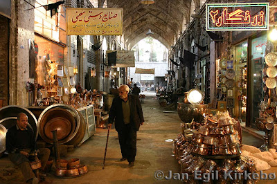
 On another point, I've never understood why architects don't make the exterior ground floor of their buildings more interesting. All you have to do is provide space for lots of little shops and let the merchants take care of the rest.  Of course you have to make sure the shops are visible from the street.  If it's a windy area you make an arcade. Visitors will come from all over to window shop along stores if they have the right "vibe."  Architects should be specialists in the art of "vibe."  


Here's (above) what every architect dreads...the cozy little street full of buildings conceived by by non-architects, and which come out of a specific cultural tradition.
 
 
On such a street you never know what you'll stumble on.  Every store reflects the unique character of the owner.

  
Changing the subject again, here's (above) a nice picture of St. Basil's Cathedral sitting in what used to be called Red Square, next to the Kremlin.  This has to be one of the most appealing buildings in the world. Legend has it that Ivan the Terrible had the eyes of the architects put out so they could never again build anything as beautiful.

  
Here's (above) the same building minus the snow.  What gorgeous color!


You don't see many pictures of the inside of St. Basil's.  Maybe that's because it's divided into eight chapels like the one above.  What an awesome room! The pattern looks like it was derived from delicate teacups and plates. It gives the room a fragile look, like a sneeze might bring the whole thing tumbling down.


Saturday, January 26, 2008

WHY SOFTWARE SUCKS


Well, there's a long answer and a short answer.  The short answer is the picture of a programmer's desk, above.   If you were a programmer yourself, can you imagine entering this guy's room and asking for advice about how to make a program easier to use for old ladies?

This is the domain of the ubernerd.  The guy's obviously obsessed with computing, has no girlfriend, eats his meals (frozen TV dinners, Kraft macaroni, canned chili) in front of his computer, and has a huge collection of action figures. This guy, who rarely sees the light of day, sets the standard for other programmers.  A guy like this couldn't even imagine a project less interesting than making programs easy to use. 

 
At least that's what David Platt says in his recent book (above) on the subject. Platt's a programmer himself and he used to be an ubernerd. He only changed when he started designing sites for big companies who had a financial stake in being accessable to the public. If you don't want to buy the book, try his websites: "whysoftwaresucks.com" and "suckbusters!"

According to Platt, programmers who try to make programs easy to use have no status at all where they work. Real status comes from increasing control, from figuring out how to increase the number of options for things, from helping the user to customize, and from making toolbars and desktops look pretty. 

I'm not kidding about the pretty thing.  A long time ago, when I got my first computer (a gift from John K) I lost a couple of hours trying to find the start icon on the computer screen. Everybody told me it was on the lower left but I didn't see anything there. I wanted to scream. Finally a programmer friend came over my place and, with eyes rolled up to show his annoyance, used a keyboard command to scroll up.  From the bottom of the screen, below anything you could see, emerged a start icon.  Just like a submarine surfacing.  I was shocked! Dumbfounded, I asked why anyone would hide a thing like that and he said it was necessary to make the screen more beautiful! He actually admired the people who made it that way!


That brings us to another point, namely that a large number of hardcore programmers consider themselves to be Nietzscean supermen and social Darwinists. They see themselves as a superior race. People who have trouble with programs are the unfit, the weak, the chaff -- those who need to be weeded out, or at least not catered to.  


That's such an odd attitude.  Don't the programmers benefit from the simplicity of supermarkets where all the types of food are conveniently under the same roof? Don't they benefit from the convenience of hospitals, departments stores and large electronic stores? If they benefit from the work of others who made things simple for them, how can they be so hard-hearted when it's their turn to return the favor?
 
Sometimes I wonder how valuable these people really are to the companies who hire them. They create value, no doubt, but they also remove value. How many people held off from buying programs or devices because they didn't want to wade through thick and boring instruction manuals?  

 America on Line got to be big enough to buy Time Warner because they attempted to make the internet more easy to use.  There's clearly a dollar to be made by making things easy, but the ubernerds aren't interested in that dollar, in fact they have disdain for it. Are they really serving the best interest of their employers?