Wednesday, November 12, 2008
THEORY CORNER FOR WOMEN: HOW TO SMOKE
MS. CRABBITER: "Hi girls! This is Semolina Crabbiter, head of the fashion division of Theory Corner for Women! I'm just thrilled because Uncle Eddie OK'd an invitation to Helen Girly Kratz of 'Neopolitan Magazine'...and she actually accepted! Here she is to enlighten us on the subject of feminine smoking."
KRATZ: "Thank you, Semolina, and Good Evening, ladies! I'm here to introduce you to the fine art of feminine smoking.
KRATZ: "You'll find that the hardest thing to learn about smoking is lighting the cigarette. I hate to say it girls, but there's no girly way to do this. You're putting fire near your face and tradition demands that you show the proper irritation."
KRATZ: "Once the cigarette is lit, you are in possession of a powerful instrument for turning heads in the room. It only remains to learn how to hold it."
KRATZ: "Here's a favorite grip of mine, called 'The Elegant." It's for light smokers, who still want to be seen."
KRATZ: "For the adventurous, there's the 'Baby in a Craddle.' "
KRATZ: " 'Baby THROUGH the Craddle' is an acceptable variant, as long as the cigarette is held loosely."
KRATZ: "For Heaven's Sake, never hold the cigarette in the infamous, male 'Shovel Grip."
KRATZ: "It's hard to believe, but they actually put the shovel up to their mouths and suck on it, like this. Disgusting!"
KRATZ: "I actually saw a man hold a cigarette like this once!"
KRAVITZ: "But enough unpleasantness...thank goodness we women are naturally dainty. Nature wants us to hold our cigarette as high on the fingers as we possibly can...way, way up there in the cloud-covered peaks at the tippy-tops of our fingers."
KRATZ: "I always try to cultivate an air of mystery when I smoke."
KRATZ: "I'm afraid that it's necessary to bend the wrist way back in order to look casual when conversing. For an adult with rigid bones, this can be quite painful, that's why I recommend teaching girls to smoke early, preferably when they're three or four."
KRATZ: "Well, that's it, ladies! Now you know the basic grips. Now get out there and SMOKE!"
Thursday, November 06, 2008
DID AL CAPP CREATE MAD MAGAZINE?
No, of course he didn't. Harvey Kurtzman did, but according to Mike Fontanelli there would nevertheless have been no MAD without Capp. Writing for the ASIFA-HOLLYWOOD ARCHIVE site, Mike says Mad's idea of making fun of comic strip characters, which is how Mad got started, came directly from Capp's running parody of Dick Tracy, "Fearless Fosdick."
Now that I've had a chance to think about it, that doesn't surprise me at all. Capp influenced Mad, Mad influenced Saturday Night Live, and SNL influenced...well, a sizable chunk of modern American comedy and culture
.
Dick Tracy was made for parody. Look at him: banana hat rim, razor-sharp profile, weirdly-graded hairline, an almost-too-good-to-be-true dedication to his work...
...and a delight in beating up criminals.
Fosdick doesn't just beat them up, he shoots them! It was really nice of Chester Gould to let Capp parody his character to such an extreme (above, click to enlarge). He never asked Capp for money, and never leaned on Capp to dilute the humor.
Fosdick was enormously popular with the public and newspaper editors alike. According to a Pageant Magazine the syndicate begged Capp to do Fosdick as a regular second strip, along with "L'il Abner." Capp declined. He was afraid that a too frequently appearing parody would soon run out of gas.
With the popularity of Fearless Fosdick, other comics parodies began to appear. Most fell flat but one was a spectacular success.
That one was Kurtzman's Mad. I don't mean to imply that Mad was a rank imitator. You can see from these first three pages of "Superduperman" (above) that Kurtzman and Wood added a lot to the Fosdick idea. Even so, the influence is obvious. The parody is pushed Capp-style to it's absolute, over-the-top limit. Kurtzman parodied lots of strips, not just one like Capp, so he didn't have to worry about running out of ideas.
Mad had its work cut out for it. It's hard to go farther over the top than Capp.
But Mad tried, and the public loved it. These were the days before political correctness when fun wasn't a crime.
Capp was amazing. Here (above) the criminal mastermind is a talking chair. Of course every crime boss has a dame and the chair is no exception. I'd have guessed that a chair might have a stool for a girlfriend, but nope...the girl is a real, live, human female. I wonder what their dates were like.
There's a lot more to Mike's article than appears here. Check it out at the ASIFA-Hollywood archive:
http://www.animationarchive.org/
Labels:
al Capp,
cmad,
comic strips,
kurtzman,
li'l abner,
newpaper comics
Tuesday, November 04, 2008
ONE OF THE BEST COMIC SITES ON THE NET
Congrats to "Stripper's Guide," which just celebrated its 1000th post! For those who still don't know the name, the Guide is a blog that's dedicated to archiving historical newspaper comic strips. Man, there's some good stuff on this site!
http://strippersguide.blogspot.com/
Straight from Stripper's Guide, here's (the two pictures above) some more George Herriman from 1907. Be sure to click to enlarge. Really, can there be any doubt that Herriman was one of the 5 or 10 greatest cartoonists of the last century?
More Herriman (above). It's a shame that modern newspapers insist on regular, repeating characters. Some cartoonists are better off doing whatever enthuses them at the moment.
Allan Holtz, the hero who runs the Guide, takes a special interest in finding neglected strips that no one else knows about. Here's (above) an interesting one from 1903: "Crazy Charlie." The premise is simple: every week Charlie escapes from the insane asylum and gets in trouble in the town.
Here's (above) another lost classic: "Pussy Pumpkin." Every week an outraged animal stumbles on a bully then beats the daylights out of him. Not what you call plot heavy, but it was good enough to back up the weird graphics.
I couldn't resist one more Herriman.
Sunday, November 02, 2008
THE BEST TV COMMERCIAL?
I thought I'd play my favorite current TV commercial (above), the one by Telebrands for a product called "ShamWow!" I'm guessing that this is just a polyester sponge cloth, the kind you can buy at any discount store for a dollar, but they're selling eight of them for 20 bucks plus postage and handling. You can decry the commercialism, but I hope you'll love the commercial. It's a fine example of the pitchman's art.
What kills me about this is that it doesn't pretend to be anything but what it is: hardsell. The announcer looks like the kind of sleazy fast-talker who sells vegetable cutters at carnivals. You wouldn't think anybody would trust a guy like that, but they do. Why? I think it's because people react to the skill in the writing and execution of carnival pitches. You think you're above it, but you're not. It's fun to watch a man who, using only words, can invest a product with magic.
One of the best TV pitchman is Billy Mays (above), who's famous for shouting at the audience. He has a terrific graphic look and a likable face, and the writing and editing of his commercials is superb. Nobody gets up to get a cheese sandwich when Billy's on.
I assume Mays also works for Telebrands, which seems to be the new Ronco. Telebrands never attempts to sell high-ticket items like insurance and cars. Instead it sells glue, closet lights, picture hooks (above), and the like. TV ads are probably most effective when they sell things like that. You want to sell something that's cheap and accessible. If I had a show on TV I'd kill to be sponsored by something basic like hooks. To sell a hook you have be creative, put on a show, add value to the product by stimulating the viewer's imagination.
Here's (above) Billy reading his voice-over lines in a recording studio. When you hear him speak without the distraction of art direction, you realize what a talent he really is.
Here's (above) another great TV pitchman, Anthony Sullivan. I wish I could have put up his "One Sweep" commercial, which is one of the stand-out hardsell commercials of the last five or ten years.
The clip above is about a minute and a half long, and I warn you that it starts slow and you'll be tempted not to finish it. RESIST THAT TEMPTATION! Watch the whole thing! He finally gets the line right at the end, and when he does you'll realize that he's well worth the zillion dollars they probably payed him.
This one is for serious students of film only. It's a ShamWow commercial re-named (now calles "Zorbeez") and done a whole different way by Billy Mays. It's a rare chance to study how two different masters tackle the identical problem.
Both commercials are great, but I prefer the ShamWow. The name is catchier, it focuses on the the character and his performance, the testimonials make a great counterpoint, and the beware of imitations warning plants the idea that the product is worth imitating. Billy's commercial starts with an unappealing wiping motion and attempts too many arguments. Even so, I still like it. Which do you prefer?
One final commercial for serious film students only: A recent softsell paper towel commercial for the purpose of comparison with the hardsell ShamWow and Zorbeez commercials. As you can see, the hardsell works better.
Wednesday, October 29, 2008
MY FINAL HALLOWEEN POST!
Holy Cow! It's almost Halloween! This'll probably be my last post for that holiday, so I'll try to make it interesting.
Here (above) Lon Chaney enters the Opera Ball as the Red Death.
Here's (above) some plague victims unearthed in Italy.
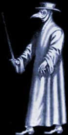
I always thought the costumes plague doctors wore (above) would make good Halloween costumes.
Speaking of the Plague, what do you think of this giant rat attempting to eat the passengers in this car?
The Stepford Puppets (above)!
What the heck is the "Jeckle & Hyde Club?"
The Yale Skull and Bones Society. Not even most people who go to Yale know what goes on in there!
The funeral of Siegfried (above).
A strange drawing I got off the net (above) showing jagged peaks on the Moon. Its not a great sketch but I kinda like it, because it assumes weird and menacing shapes are present on another world, and every day are defiantly but impotently threatening the Earth.
I wish I'd been able to find a good picture of a haunted house ride. This one's so infuriatingly happy!
Let's shake off all that happiness and check out this item from The Amsterdam Museum of Torture. It's a head vice. Good Lord!
The famous Iron Maiden of Nuremberg (above)!
Someone went to a lot of trouble to build this chair of spikes.
Here's (above) a less elaborate version of the same thing. It's still plenty scary when you consider what the weights on the floor must have been used for.
A bust (above) of Rondo Hatten.
Don't you love the masks (above) kids make?
Only the previous day the homeowner of this yard was seen mowing his lawn. Now all that remains of him is one shoe and the abandoned mower. Strange icons have appeared.
An interesting rubber mask (above)! Great color!
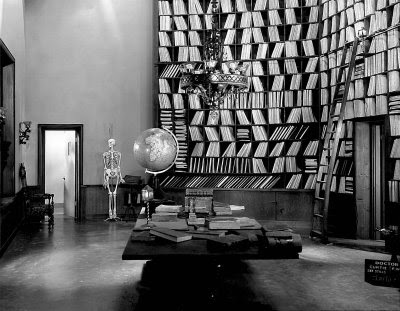
If you're planning to be a mad scientist, you'll need a study (above) as well as a lab. How about something like this? Is this set from "Metropolis"?
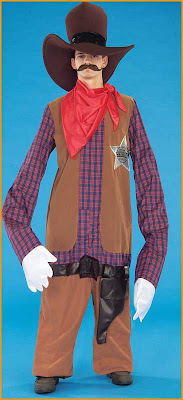
I like costumes that elongate the character (above).
Some trolls (above) from Steve Worth's ASIFA blog on Bauer.
A New Orleans-inspired voodoo mask.
Ah, gargoyles! I don't know why they appear on cathedrals but I'm glad they do.
Some modern-day churches (above)make use of gargoyles too! It's a tradition!
Well, that wraps it up! Have a good Halloween everybody!!!!!
BTW, some of the pictures used here were stolen from Karswell's superb horror blog:
http://thehorrorsofitall.blogspot.com
...and from Fournier's wonderful Frankenstein blog:
http://frankensteinia.blogspot.com
Subscribe to:
Posts (Atom)