Saturday, February 07, 2009

IF ARTISTS DESIGNED CITIES


I'm not a fan of the mega city concept, where one architect designs the look of an entire city. That unified look is great for sci-fi movies (above), but most of us want the city we're actually going to live in to have more diversity. I like cities where each division has its own flavor, each section has its own story to tell.


Architects aren't sympathetic to any of this. They believe in the one-size-fits-all philosophy where the solution to every problem is simplistic, bold shapes.  I hate stuff like that.


Architects are clueless about what people really want.


A lot of what they're building today (above) will be the crime-ridden, concrete slums of tomorrow.


There's plenty of examples of good, vintage architecture out there, but you can't get architects to pay attention to it. Maybe it's time to give artists a turn at bat.  They can't do worse than what's around now. 


These days artists are steeped in graphic novels which are always depicting the dark side of things.  If artists designed a city they'd probably go for something funereal, like Gotham City in the "Batman" movie.


Such a city is bound to attract a criminal element.  Rather than leave their housing to chance, artists should build it (above) for them. Maybe something by H. R. Giger. 


Maybe thugs would feel at home in this environment, and not be tempted to venture out looking for victims.


Giger fantasizes about making murals out of human remains. (above). criminals should love that.


If the city is going to have a modern design, let's try something really drastic (above). Imagine going down that staircase on the upper left.  The steep angle would take your breath away, and descending would be difficult and dangerous...but it sure would be fun! 


Maybe a city of raised platforms half a mile in the air would make for a stimulating walk.


Maybe we need to flood the streets the way Venice is flooded. Wouldn't it be fun to take a boat to work?


Here's (above) a little Lego city that Norman Mailer built years ago, and which still stands somewhere. Each Lego block represents an apartment. Mailer said philosophers would live on the top, call girls would live in the white blocks, and corporate executives in the black ones.


Here's an idea (above) for giving Manhattan a kind of colorful, kid's playroom look.


Here's (above) a goth city where half the population is Christian and requires a lot of churches, and the other half are irreverent satanists who delight in building churches upside-down.


A city which is divided like that will naturally be pretty tense. To distract the population from their differences I suggest a diversion, perhaps a race of genetically modified giants who will walk around and randomly intimidate people.  


If the giants get out of hand, the city's water monsters will be unleashed. Water monsters eat giants. 


Here's (above) a possible layout for a New York City.  The buildings would be crammed together...really packed. Every window would be butted up to some window in the next building. if you want to live here you better be the kind of person who gets along with your neighbors. 


Thursday, February 05, 2009

MORE STRIPS THAT DIDN'T MAKE THE CUT


All from that magnificent blog..."Stripper's Guide," whose address can be found in my list of links. I'm dying to comment on these but I'm so sleepy that I can hardly sit upright.

It goes without saying: be sure to click to enlarge. These won't look like much at thumbnail size.


Tuesday, February 03, 2009

YALE'S CONTROVERSIAL ART & ARCHITECTURE BUILDING


What do you think of Yale's Art & Architecture Building (above)? People who don't like it call the style "brutalist," which is a good name for the kind of bleak, concrete boxes that were built from the 50s to the 70s, but I'm not sure that name applies here. I concede that the building has a lot of brutalist aspects, but it's simultaneously innovative and imaginative, don't you think?


I like the idea of an indoor village (above) where the offices are like raised houses separated by grass. It's not very practical and it wastes space, and it must inhibit communication between the workers, but it's kinda fun and that counts for something surely.


This interior (above) looks like Frank Lloyd Wright's "Falling Water" house. Did he invent those long, concrete balcony railings coming off brick-shaped vertical supports?

I like the way the interior is on different levels. This must drive handicapped people nuts, but it's fun for the rest of us. 


It's weird to see a whole building made out of what looks like kids building blocks. You can buy natural wood building blocks with most of these shapes, including the flat planks. They're great to keep in a basket next to a coffee table, but you need to buy more than one set to build anything decent. 

These horizontals and verticals are interesting in small doses, but a bit hard on the eye over time.


The Greek statue (above) is simultaneously out of place, and not out of place in this modernist library room.


The Yale arts building is done in a kind of vertical/horizontal modernism that's out of fashion now. Everything now is diagonal, chaotic, and deliberately disorienting. That's OK, I don't mind being dis-oriented, it's fun, but I hate obsessively blank walls and wind traps like some of the facets on the building above.


This building (above) looks like a cubist bird. It's weird, and inadequately lit on the upper floors, but I'd still like to live in it.


Back to the Yale building: some of the spaces (above) succeed in being wide and tall at the same time. That's a neat trick. You can see how he does it with the lights. Wide rooms with bright, flat-colored carpets are appealing at first glance and tiring after that.  


The LA County Art Museum has steps like the ones on the Yale building above. It's odd to see steps, which imply power and grandeur, tucked away in an almost claustrophobic crevice. I think this is the main entrance.


Boy, you feel like you're walking along ancient Egyptian temples, except everything is obsessively clean and straight, and lacking in detail.


Modern architecture (above) has its good points, but it sure wastes space. 


You can see why the building (above) is regarded as brutalist.  Outside it's a concrete wind trap. 


The interlocking concrete rectangles are definitely interesting. Looking at them makes me aware of the marvelous design possibilities that concrete makes possible, but it also makes me aware of its limitations. The look is intriguing, but cold as ice. 


These balcony railings look like they're made of wood, but they're done in the style of flat, modernist concrete railings. It looks OK, but it's a waste of good wood to use it to copy minimalist forms made for concrete. 

I have to admit that I'm conflicted about this building.  What do you think?


Sunday, February 01, 2009

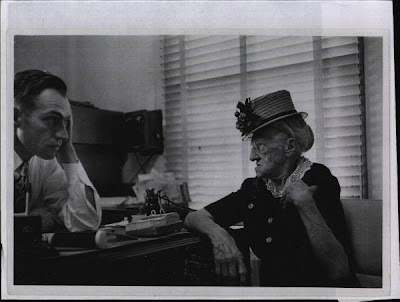
WHAT MAKES A FACE LOOK OLD?


This (above) is one of my all-time favorite movie stills: Marie Dressler as the dowager in "Dinner at Eight." One of these days I'll frame this so I can have it on my desk in whatever office I'm working in. 


Of course I'll have to dress like this (above), so I can play my part. That's me playing Max Fleischer in a photo essay I did last year. 


The idea is to pass the desk picture off as being my wife.  My real wife doesn't look or act this way at all, but she'll have to take an undeserved fall, because in classic cartoons middle-aged men are always married to battle axes who they address as "Schnookums," and "Sweetie Puss."
I'm a cartoonist, so the tradition must be honored. 


Writing about this age thing got me to thinking about the subject of grey hair and how aging affects the face. 


I only have womens' pictures to illustrate this, so I'll pick on them. Most women don't know how to to make their faces look good after 40.  


When you're in your prime your face (above) has lots of hills and valleys...


...but when you get older (above) your face tends to flatten out.  This coincides with the skin becoming dry and wrinkled. Women ignore the face flattening and try to compensate for the skin problem by layering on tons of make-up, but this comes from a misunderstanding of the problem.


The main problem isn't wrinkles, it's the flattening of the face. A flat face does even more than wrinkles to make you look older ("older" as I use it here doesn't refer to the characteristics of extreme old age, which are different).  Putting on lots of make-up (above) only makes that worse. The extra color evens out the facial color and makes it seem even more flat and featureless. Worse yet, women compensate for the enhanced flatness by putting extra make-up on the eyes, something that doesn't work at all. The diversion is too obvious, too artificial.


The odd thing is that nature already compensates for wrinkles by making middle-aged flesh more textured and ruddy. The increased and uneven texture takes the observer's eye to interesting places all around the face, and prevents him from seeing the overall flattening. Nature gave middle-aged women ruddy faces to compensate for the wrinkles, but a lot of women refuse the gift. 


Middle-aged women also need to re-discover grey hair.  Grey makes the skin seem even ruddier by contrast, and that makes the face look younger. I know what you're thinking; grey hair is universally recognized as a sign of aging. That's true, but it's also true that people who look at you close up will judge your age more by the face than the hair.  Grey hair may be an attempt by nature to prolong beauty, not put an end to it. 


Before I leave this subject, I can't resist reminiscing about old ladies I've known. When I was a kid I encountered a lot who struck me as mean and frightening. Oddly enough, when I got to be an older teenager I saw fewer women like this. I think it's because I stopped doing the things that irritated them, and began to see their sweeter side.  


I was born too late to see old ladies with waxed fruit on their hats (above), but I did see quite a few who had other kinds of cartoony hats, and I got to see lots of Olive Oyle dresses. They were mostly nice people with incredibly sunny dispositions.  They had lots of friends their own age, and weren't stay-at-homes unless they were forced to be. They worked hard, had enormous dignity, and were universally respected.


These final two pictures are from my favorite Life Magazine photo essay, the one about the country doctor. You can find it on google.


Wednesday, January 28, 2009

ARE PEOPLE STUPID?


Well, we all know that stupid people exist. I guess what I really mean to ask is, how many stupid people are there? What percentage of the population? 5%? 10%? 50? 80? My own guess is that there aren't as many as most people think.

I came to this realization a few years ago when I was on the road, and it occurred to me that if a large number of people were really stupid, then there would be a lot more traffic accidents. On the whole, most people drive pretty well. 


A lot of people we consider stupid are simply out of their element in the area that we're focused on. Or maybe they just had a bad day, or a bad hour. Who hasn't had that? The guy who holds up traffic while he thinks about which way to go, isn't necessarily a bad welder or a bad lawyer. He may have just had a lapse. Maybe we stumbled on him at the only time he did something dumb like that all year.


It's tempting to think people are stupid because they vote differently than we do. That's silly. Half the time they're just starting from a different premise, which is not so irrational, once you know what it is. 


It's hard to judge people. The modern, urban, bureaucratic state is hardly what biology equips us for.  A lot of people just aren't suited for this stuff. Their intellect and instincts are sound, but modern life punishes people who operate on instinct. You could go to jail for that. An awful lot of what we're expected to do every day is counter-intuitive. Some people don't mind that.  Others feel disoriented and out of sync, like there's no place for them, and in some cases they're right.


It's amazing how many normally intelligent people are mistakenly considered stupid. That's because they have no challenging job or activity to discipline their minds. Lots of teenagers are like that. They're restless and energetic and not really ready to settle down to school work, so they do bad in school. Most don't know any crafsmen who would teach them a trade. What are they supposed to do? You can call people like that stupid when you see them unemployed and clowning around the mall, but are they?

It's a fact that every era favors one kind of personality type and penalizes another. Sometimes more than half the population can be on the outs. It's scary! 


I used to think a lot of old people were stupid. Well, actually I still do, but I feel guilty about it. I'm getting older myself and I'm becoming more aware of the obstacles those people face. Recently the elderly father of a friend told me how many different pills he takes every day: fourteen!  Fourteen, and I'll bet every one of the bottles has a dizziness warning on it. The amount of medication the average old person takes is staggering, and who knows what effect all those pills have on each other? I wonder how alert some of those old people would be if they could safely chuck the pills? 

Teenagers also seem stupid, but they're influenced by drugs too.  In their case it's hormones. 


My own view of other people is benign...at least it is when nobody's cutting me off in traffic. I don't think most people are stupid. I rely on other people. I can't even understand most things without the help of other people.

 I'll go farther and admit that when I choose my beliefs, I choose between the common ideas that are in the air in my time. Everybody does. I feel guilty about that, and once in a while I take the time to really think things out, but even then I sometimes have to borrow. It's frightening to think how much we all rely on other people's ideas. Our brains don't seem to work right unless we connect to other brains. We need other people to function as information gatherers for us. Stay-at-homes aren't just socially impaired...they can't even think.