Thursday, May 14, 2009

LESTER DENT'S ADVICE TO WRITERS


I covered this subject before but here's a fuller and more satisfying version of pulp writer Lester Dent's famous advice to writers, written...when...in the 50s? Even if you've seen this before it's worth re-reading, and if you haven't seen it, then it'll surely strike you as a revelation, the way it struck me. 

Some of the books presented here claim to have been authored by Kenneth Robeson, but Robeson was the pen name of Lester Dent. Dent wrote a zillion Doc Savage novels, but he didn't invent the character, his publisher and editor did. Anyway here's the timeless advice of Lester Dent to short-form adventure writers everywhere.


No yarn of mine written to the formula has yet failed to sell.

The business of building stories seems not much different from the business of building anything else.

Here's how it starts:

1. A DIFFERENT MURDER METHOD FOR VILLAIN TO USE
2. A DIFFERENT THING FOR VILLAIN TO BE SEEKING
3. A DIFFERENT LOCALE
4. A MENACE WHICH IS TO HANG LIKE A CLOUD OVER HERO

One of these DIFFERENT things would be nice, two better, three swell. It may help if they are fully in mind before tackling the rest.


A different murder method could be--different. Thinking of shooting, knifing, hydrocyanic, garroting, poison needles, scorpions, a few others, and writing them on paper gets them where they may suggest something. Scorpions and their poison bite? Maybe mosquitos or flies treated with deadly germs?

If the victims are killed by ordinary methods, but found under strange and identical circumstances each time, it might serve, the reader of course not knowing until the end, that the method of murder is ordinary.

Scribes who have their villain's victims found with butterflies, spiders or bats stamped on them could conceivably be flirting with this gag.

Probably it won't do a lot of good to be too odd, fanciful or grotesque with murder methods.

The different thing for the villain to be after might be something other than jewels, the stolen bank loot, the pearls, or some other old ones.

Here, again one might get too bizarre.


Unique locale? Easy. Selecting one that fits in with the murder method and the treasure--thing that villain wants--makes it simpler, and it's
also nice to use a familiar one, a place where you've lived or worked. So many pulpateers don't. It sometimes saves embarrassment to know nearly as much about the locale as the editor, or enough to fool him.

Here's a nifty much used in faking local color. For a story laid in Egypt, say, author finds a book titled "Conversational Egyptian Easily Learned," or something like that. He wants a character to ask in Egyptian, "What's the matter?" He looks in the book and finds, "El khabar, eyh?" To keep the reader from getting dizzy, it's perhaps wise to make it clear in some fashion, just what that means. Occasionally the text will tell this, or someone can repeat it in English. But it's a doubtful move to stop and tell the reader in so many words the English translation.

The writer learns they have palm trees in Egypt. He looks in the book, finds the Egyptian for palm trees, and uses that. This kids editors and readers into thinking he knows something about Egypt.


Here's the second installment of the master plot.

Divide the 6000 word yarn into four 1500 word parts. In each 1500 word part, put the following:


FIRST 1500 WORDS

1--First line, or as near thereto as possible, introduce the hero and swat him with a fistful of trouble. Hint at a mystery, a menace or a problem to be solved--something the hero has to cope with.

2--The hero pitches in to cope with his fistful of trouble. (He tries to fathom the mystery, defeat the menace, or solve the problem.)

3--Introduce ALL the other characters as soon as possible. Bring them on in action.

4--Hero's endevours land him in an actual physical conflict near the end of the first 1500 words.

5--Near the end of first 1500 words, there is a complete surprise twist in the plot development.

SO FAR: Does it have SUSPENSE?
Is there a MENACE to the hero?
Does everything happen logically?


At this point, it might help to recall that action should do something besides advance the hero over the scenery. Suppose the hero has learned the dastards of villains have seized somebody named Eloise, who can explain the secret of what is behind all these sinister events. The hero corners villains, they fight, and villains get away. Not so hot.

Hero should accomplish something with his tearing around, if only to rescue Eloise, and surprise! Eloise is a ring-tailed monkey. The hero counts the rings on Eloise's tail, if nothing better comes to mind.
They're not real. The rings are painted there. Why?


SECOND 1500 WORDS

1--Shovel more grief onto the hero.

2--Hero, being heroic, struggles, and his struggles lead up to:

3--Another physical conflict.

4--A surprising plot twist to end the 1500 words.

NOW: Does second part have SUSPENSE?
Does the MENACE grow like a black cloud?
Is the hero getting it in the neck?
Is the second part logical?

DON'T TELL ABOUT IT***Show how the thing looked. This is one of the secrets of writing; never tell the reader--show him. (He trembles, roving eyes, slackened jaw, and such.) MAKE THE READER SEE HIM.

When writing, it helps to get at least one minor surprise to the printed page. It is reasonable to to expect these minor surprises to sort of inveigle the reader into keeping on. They need not be such profound efforts. One method of accomplishing one now and then is to be gently misleading. Hero is examining the murder room. The door behind him begins slowly to open. He does not see it. He conducts his examination blissfully. Door eases open, wider and wider, until--surprise! The glass pane falls out of the big window across the room. It must have fallen slowly, and air blowing into the room caused the door to open. Then what the heck made the pane fall so slowly? More mystery.

Characterizing a story actor consists of giving him some things which make him stick in the reader's mind. TAG HIM.

BUILD YOUR PLOTS SO THAT ACTION CAN BE CONTINUOUS.


THIRD 1500 WORDS

1--Shovel the grief onto the hero.

2--Hero makes some headway, and corners the villain or somebody in:

3--A physical conflict.

4--A surprising plot twist, in which the hero preferably gets it in the neck bad, to end the 1500 words.

DOES: It still have SUSPENSE?
The MENACE getting blacker?
The hero finds himself in a hell of a fix?
It all happens logically?

These outlines or master formulas are only something to make you certain of inserting some physical conflict, and some genuine plot twists, with a little suspense and menace thrown in. Without them, there is no pulp story.

These physical conflicts in each part might be DIFFERENT, too. If one fight is with fists, that can take care of the pugilism until next the next yarn. Same for poison gas and swords. There may, naturally, be exceptions. A hero with a peculiar punch, or a quick draw, might use it more than once.

The idea is to avoid monotony.

ACTION:
Vivid, swift, no words wasted. Create suspense, make the reader see and feel the action.

ATMOSPHERE:
Hear, smell, see, feel and taste.

DESCRIPTION:
Trees, wind, scenery and water.

THE SECRET OF ALL WRITING IS TO MAKE EVERY WORD COUNT.


FOURTH 1500 WORDS

1--Shovel the difficulties more thickly upon the hero.

2--Get the hero almost buried in his troubles. (Figuratively, the villain has him prisoner and has him framed for a murder rap; the girl is presumably dead, everything is lost, and the DIFFERENT murder method is about to dispose of the suffering protagonist.)

3--The hero extricates himself using HIS OWN SKILL, training or brawn.

4--The mysteries remaining--one big one held over to this point will help grip interest--are cleared up in course of final conflict as hero takes
the situation in hand.

5--Final twist, a big surprise, (This can be the villain turning out to be the unexpected person, having the "Treasure" be a dud, etc.)

6--The snapper, the punch line to end it.

HAS: The SUSPENSE held out to the last line?
The MENACE held out to the last?
Everything been explained?
It all happen logically?
Is the Punch Line enough to leave the reader with that WARM FEELING?
Did God kill the villain? Or the hero?


Tuesday, May 12, 2009

FAMILY PHOTOS


Many thanks to Anonymous for these photos from the hilarious awkwardfamilyphotos.com. Boy, I was lucky to get these; if I hadn't I would have been strapped for something to post. It's not that I haven't any ideas...my mind is teeming with ideas right now...I just haven't had time to write them down.

One of the reasons is that I'm trying to learn a program that infuriatingly resists being learned, and I only have a short time each night to spend with it. Bear with me. I'll be happy just to get it set up, and get the cables tucked away, then I can attack it at a more leisurely pace.


Awkward is certainly the right word for these (above). 


This (above) is my favorite of the Awkward Photo pictures. I imagine that the people shown here are a family of poisoners. Over the years the two ladies tried out samples of their poisons on the guy on the left and he lost all his hair and much of his muscle control. He's not mad, though. He's a poisoner himself, and he understands the necessity of practice.
.


Like I said, I'd like to try my hand at family photography. If I had willing subjects I'd like to  take a picture where everybody acts out a character. Imagine the four people above in a single picture.  A whole family of over-actors.


A horrific, underlit family (above) would be nice...


...as would a family of super-intelligent space invaders (above). All it would take is the right lighting and the right clothes.


Imagine a family photo where everybody had wide-angle heads like Hillary in the picture above.


Of course I'd take some classic pictures (above) too, but only if I had the right subjects.


Sunday, May 10, 2009

THE WEIRD WORLD OF BOOK COVERS


It's hard to imagine now, but at one time book covers were called "dust covers," and were thrown away as soon as the owner got the book home. People liked the look of leather bound books on their shelves. Some people still do and they'll pay premium prices to have uncovered leather-bound editions of their favorite novels.
 
Since it was necessary to put the name of the book on the dust cover, publishers would sometimes indulge in mildly fancy lettering or woodcuts.  The rule was that the dust covers had to use course paper, be cheap,  and be monochrome.


What changed all that was the proliferation of posters, especially film posters. Publishers reasoned that if posters could sell films, why couldn't they sell books?


For a while book covers did what film posters did and tried to sell personalities.  That was a mistake. Books and films are different media and have to be sold different ways.

Here's (above) a cover that attempts to sell "Too Much of Water" by fixing a visual image of the heroine in our minds.


Here's (above) an attempt to sell the same book by focusing on the idea of murder on the high seas at night.  Surely this is the cover that really sold the book.


Publishers continued to  put personalities on the covers (above) but it generally didn't work. I say "generally," because it worked for Doc Savage and Harry Potter and a handful of others.


The James Bond books (above) finally settled on a generic handsome man seen at a distance, allowing the reader to fill in his own specifics. The reader was allowed to imagine the specific character.


Large art departments arose at all the major publishers. The people who worked there cultivated an image of mystical seers, who had a mysterious sixth sense for what would sell. The front office cut them a lot of slack and authors were seldom consulted about what would appear on the cover. 


Genre novels (above) were the easiest to make covers for.


It took a while to figure out what kind of covers fit modern literary novels (above). The solution, when it came, was fascinating. Since most new literary books portrayed their characters as victims and anti-heroes, the covers would portray people who were out of focus, as if viewed through tears. The lettering was jagged, as if the book were written by the trembling fingers of a traumatized sufferer.


A variant on this was the deliberately under-stated, thin line style (above) which appealed to New-Age readers. I'm guessing that the idea was to flatter the reader who perceived of himself himself as a delicate thing, a contemplater of nature and not a purveyor of what he considers evil smoke-stack industries. 


Here's (above) an interesting variant on the idea that a cover should sell the mystery, not the personality of the crime solver.


The Dell "Keyhole" symbol (above) on the map covers was a nice touch. They should resurrect it.


Magazines gradually phased out illustration and replaced it with photography. The book cover people tried this too, but to no avail. Buyers of fiction still preferred illustration. I'm glad they did, but I wonder why. 


Of course, there was the occasional photo cover (above), even on paperbacks. Some of them sure pop out!


Photos currently dominate non-fiction covers. The cover designers still attempt to appeal to the  unconscious yearnings of their readers.  Here the reader is flattered by the association of reading with high culture and timeless architecture. The print is low-key and seems to say, "We readers may be quiet and unassuming, but we make the world work, so how about some respect!?"


English book covers (above) were among the worst in publishing. Why that was, I don't know. 


Finding the right cover for a literary novel like "Catcher in the Rye" can be tough. Here's (above) a cover, maybe by Fletcher Stone Martin, in the scratchy sensitive style. 


The first paperbacks attempted lurid realism (above), a style I usually like, but in this case it didn't fit the subject.


Another scratchy cover (above), well executed but it doesn't communicate the feel of the story. 


Finally the book was successfully issued in plain red, the cover of Caulfield's hat. The publisher threw in the towel when he realized that he'd never find a picture that captured the flavor of the novel. 


I'll close with a couple of examples of the eccentric but always interesting cover style of Victor Gollancz. 


Gollancz was a radical left publisher (he published Orwell) who defied the common wisdom by making chatty covers without pictures. Most were yellow because that color read best in railway terminals. Gollancz must have worked closely with his authors because all the books of his company that I've seen have a common author's ethos, that of a friendly, creative, and passionate man who's eager to engage in argument about subjects that most people never think about.

I have a few of his books. One is a  book that gives star ratings to the great classics of English literature. What an odd but wonderful thing to do! Another claims that the 17th century was the greatest of centuries, and yet another is a defense of fascism, which attracted a lot of socialists in its early days. I don't have the slightest sympathy for either fascism or socialism, but Gollancz is high on my list of people I wish I could have had dinner with. 

BTW: In my opinion the author shouldn't be permitted to chose the cover unless he has exceptionally good taste and market savvy.  Most authors will chose a picture that conveys what the book was trying to say, and this is sometimes a mistake. The art department, if it's a good one, will add to what the book was saying. They're concerned with selling a lifestyle, something most authors don't care about, but which has tremendous reader appeal.  

Tuesday, May 05, 2009

TAKING A STROLL THROUGH LONDON: 1899


Actually some of the photos are more recent than that, but they're all pretty old. I thought you might be interested to see the city as it looked from the vantage point of a casual stroller, about a hundred years ago.

That's regent Street above. No poor folks there. Employees of the shops often lived in nearby hostels. Click to enlarge.


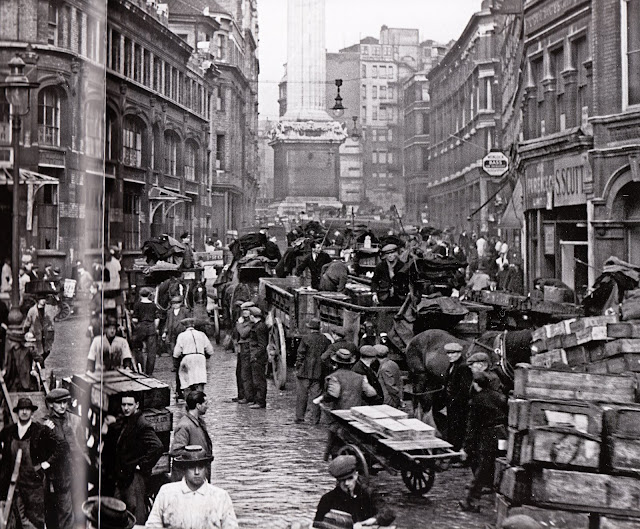
This (above) is Billingsgate, under the shadow of the monument to the victims of the Great Fire in 1666.


Above, The Round House in Chalk Farm, built in 1847.


In the 16th century this tavern (above) was frequented by river thieves and smugglers.


Above, Marylebone Station as it looked in the 1920s. Lack of funds meant the station had to be designed by a staff engineer, and he took a bolts and braces approach. It's still impressive.


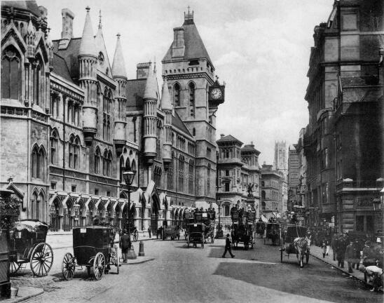
Above, The Royal Courts of Justice. I spent a few hours here, being a tourist and looking in on a couple of cases. This is my favorite spot in London.  What a debt we all owe to English law!


Many, many, many thanks to Kellie for the interesting links, which included this Youtube video.