Friday, November 12, 2010

MORE FACES TO DRAW (PART ZILLION)

I don't know why, but muzzles fascinate me. It's the first thing I look at when I regard a face. This girl (above) has a protruding muzzle. When that's combined with rounded shapes and full lips as it is here, the effect is one of warmth and friendliness.
For contrast, here's (above) a flat, linear face, also very friendly. Three elements dominate the face: a straight vertical nose, down turned eyes at the corners, and dimples that form a marionette's mouth. All these straight lines are set off by an unusually graceful curve of the jaw and a long neck. This is a very appealing face.

And did I mention the Klimt hair!? Wow!
Here's (above) an interesting face. Can you guess why? Sure, she has a high forehead and a reduced chin, but what else? Well, if you're a muzzle fan like I am, then you noticed that she has minimal cheeks and no dimples, not even the most common ones. I wish I knew how faces like this age. 

The glasses make a great statement.

Where did I get this picture? Somebody deserves credit for digging this up. No comments on this one; it's all too obvious.

BTW: Mark Simonson speculates that these are all guys: Mathew Broderick, Jimmey Kimmel, and Stephen Fry. Simon says the Boderick picture is really Brendon Frazier.

Art technique books are always saying that some people have square heads. If you ever doubted it, then regardez vous!

A fascinating face dominated by the rounded forehead, and big eyes which have prominent lids on both the top and the bottom. Note also the thin hair. I always imagine that thin-haired people are high-strung, but I might be wrong. 

Egad! It's Hermione's hair (above) from the Harry Potter movies! Is it real? That hair looked great on Emma...Emma whatshername from the movie, and everyone was heartbroken when she appeared without it. The two latest Potter movies even gave Hadgrid (spelled right?) a haircut.


What a find (above)! Once again though, I don't what blogger to thank. The muzzle here is minimal. Gee, minimal muzzles are more common than I thought! The small mouth makes for a terrific contrast with the over-the-top, sad, bored, wide eyes. The eyebrows are calligraphic. The hair is perfect.

Aaaargh! In a comment Stephen claims that this is an aristocratic playboy/actor and writer named Brian Howard.


Thank Goodness...a muzzle (above)! The facial features are all bunched up into a tight package which is surrounded by oceans of empty flesh.  Er....is this a guy? Mike says it's Matt Lucas from "Little Britain."

Tuesday, November 09, 2010

HALLOWEEN 2010: HOW WAS IT?

It was a pretty good year, considering that everyone was bummed out by the economic crisis. Even fashion magazines had Halloween issues (above).

I collected plenty of good Halloween pictures on the net, but I forgot to label some of them. Where did I get this (above) from, and who did it!?


There were some really imaginative outdoor displays (above) this year.

It's amazing what people will put on their lawns (above)!

Since we're on the subject of outrageous Halloween efforts, I wonder if Glendale artist Peter Montgomery ever built that Jules Verne machine in his driveway? He went on the internet to ask for money for it.


This year saw zillions of gross pumpkin displays (above).

I'm wondering if Tim Burton and ray Bradbury have made Halloween Trees (above) a permanent holiday fixture. I saw a lot of Halloween trees this year. Some  people have beautiful trees on their lawns and simply hang pumpkins on them...


...others set up Halloween trees inside their houses. Mostly the indoor trees are dried up twigs painted black. People either buy ornaments or hang homemade stuff from them: little poison bottles, paper witches, Godzillas, etc.


The "Blair Witch" movie (above) continued to influence reality TV this year. A zombie mini-series debuted, but I missed it.

Zombies (above) are still a big item at Halloween time.


Expensive rubber masks took a hit this year; nobody could afford them! I saw lots of cheap masks, though, some of them good. It looks like the last of the old vintage masks (the two pictures above) have finally been put out to pasture. They lingered on for years in updated versions, but I haven't seen any this time around.


I saw some vaguely similar ones, though. How do you like this one (above)? It's the love child of the famous Ernie Kovacs caveman mask with a Schnauzer. 


I stumbled on a couple of Halloween blogs which featured photos of abandoned amusement parks (above).  


Gee, it kinda puts things in perspective, doesn't it? Everything we know and love will eventually end up like this park (above). 


So that was Halloween, 2010! The holiday is alive and well, at least in my part of the world. 


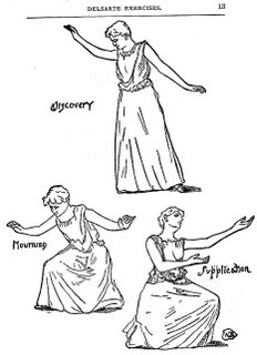
ACTING AND STAGE MOVEMENT FOR ANIMATORS


Sunday, November 07, 2010

STROMBOLI'S PUPPET THEATER

Disneyland is sitting on top of a gold mine, and they don't seem to realize it. That's it above: Stromboli's theater from "Pinochio," pictured here in a concept painting by Tenggren.

What a beautiful building! It has the feel of a wooden circus tent. It's architecture that's meant for fun.

Here's (above) the original Albert Hurter drawing that Tenggren referenced. The perspective's off, and the rear of the building lacks detail, but it's still a powerful statement. Tenngren improved it by moving the Russian-style tower closer to the front and bringing the banner poles closer in.

Hmmm...well, maybe the tower is okay where it is.

I'm always amazed to see how cloth artifacts can improve the look of a building. Awnings, banners, draperies...all serve to take the hard edge off structural geometry.

The Hurter/Tenggren building was never used in the film. The design didn't go to waste though, it's one of the main attractions in Fantasyland.

I love this facade, though it seems underused in its role as the front door to a crystal glass store. It would work better as the come-on of a functional marionette theater, with a barker and teaser puppet show on the balcony. With poles and banners restored, with some real wood, it would make a great stand-alone structure as Hurter and Tenngren imagined it, especially if it was kept small and intimate, as in the original artwork.

If Disneyland hosted a real marionette theater, imagine how many puppets they'd sell in the gift shop!

 Maybe the show would be hosted by a Stromboli look-alike. I nominate puppet enthusiast Steve Worth. For the puppeteers...maybe the Flexitoons people.

The plot for the show? Just like the film: a bewildered Pinochio interacts with manic puppets.


                                                                  C'mon Disney!

Thursday, November 04, 2010

"NOW, VOYAGER"

Aaaargh! Lots of goof-ups here! It's blurry, too small, full of misspellings, the story doesn't make sense, the characters aren't sufficiently identified, typos....what a mess! Unfortunately I'm busy and don't have time to correct any of this! So here it goes....AS IS. It's the comic book version of that venerable 40s love story........"NOW VOYAGER"


Copyright Note: The film, "Now Voyager" is owned 100% by Warner Bros, or the subsequent owners. This is a one-time only parody.

Tuesday, November 02, 2010

RECENT ASTRONOMY PICTURES

Here's more pictures from that never-fails-to-please astronomy site, "Astronomy Picture of the Day," link on the right sidebar.  Above is the clearest picture yet of the surface of the Sun. Click all these pictures to enlarge.


Recently a gigantic rip appeared on the Sun's surface. Flares were ejected and the rent closed again.


Here's (above) the Earth and the Moon as seen from the Messenger probe near Mercury.


Above: not a ring nebula....a ring GALAXY! A number of these things are on record. Nobody knows how they formed, but it's speculated that bar-shaped arms may have been present earlier in the galaxies' development.


Above, a Martian plain as it was recently seen from the Opportunity rover. I mistook this for an aerial view when I first saw it. Click to enlarge.

Not recent (above), but still interesting: a Voyager picture of the odd wrinkling in Neptune's atmosphere.
It reminds me of the way that pond scum distorts near the shore.


Above, dark clouds in the Carina Nebula, home of supermassive stars. Do you see those canine shapes? I'm surprised that it's not called The Dog Nebula.


Here's (above) a vortex in the clouds over the South pole of Venus.


Above, Calypso, a moon of Saturn. Nobody knows why it's so smooth.


Last but not least: turbulent clouds in the Lagoon Nebula.