Monday, March 30, 2015

DISNEYLAND ARCHITECTURE [EXPANDED]

Yep, I had another weekend trip to Disneyland! I wish I could have spent the day taking pictures of the interesting people that the park attracts, but I didn't know how to do that without coming home with a black eye, so I photographed architecture instead. See what you think!

I like the idea of giving a high-ceiling room a display gallery like this (above) one. The lower tier of the gallery contains tracks for a model railroad. 


I love complex wooden ceiling/roof structures (above) like the kind you see in Fantasyland.


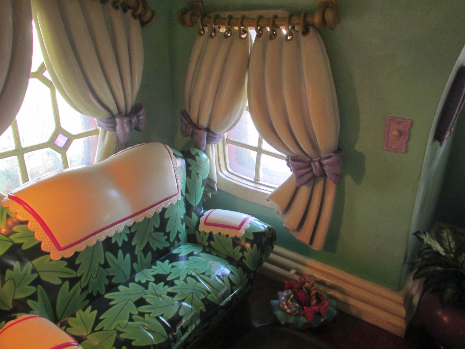
Here's (above) Minnie's House in Toontown. It's a craftsman bungalow modified to be wonky and super cozy. That 30s/40s look works great. 


The leaf pattern on the sofa works with the green walls.


Opposite the sofa (above) is the fireplace and an intriguing grotto with steps leading to an imaginary second floor.


Next door is Mickey's house (above) and that has a somewhat different fireplace.


Mickey's kitchen lets out into a small sun porch. Here its used as a potting shed or a greenhouse. With screens instead of glass it might be a breakfast room or even a sleeping porch.


I like the storage area (above) in Mickey's house. Those green columns look great! Stained wood is the way to go, but stains need to be repainted every six years or so.


Disneyland is full of ideas that you can adapt to your own real-world situation. I like the idea of having contrasting shapes and thick shelves on the wall.

Borrowing an idea from Adventureland, you could hang things from the ceiling in nets.


Nice banisters, but what are they made of? It looks like a combination of plastic and concrete, but I'm probably wrong. 


Wow! A nice car design! I wish someone would build real cars like this. The front windshield frame could serve as a rollbar as it does here, and the fenders might serve as rubberized shock absorbers protecting the driver from broadside collisions.


Here's (above) what appears to be the second floors of two adjacent buildings. Actually it's one building with two stylized fronts. I'm guessing that the second floor interiors are one extended room with two different levels connected by steps.

Well, that's all I have room for now.

Sunday, March 29, 2015

THE AESTHETE


Haw! I looked up "aesthete" on the net and here's (above) what I got.


This type really exists! I wonder if that'll be me somewhere down the line?

Thursday, March 26, 2015

MORE OF MY VIDEO GAME IDEAS

Another Theory Corner first: here's more of my video game sketches. In this drawing (above) I tried to give Aztec/Mayan motiffs a sort of Basil Wolverton sensibility.


 Above, some fake Aztec wall decoration (above).


I like the idea of sometimes finding yourself skating in cramped quarters. In a situation like this (above) the possibilities are endless. You can be crushed by the trolley or you can dive into manholes or open doorways that lead to other locales. You can also press yourself against the wall and accept the punches, slaps, kisses, cat scratches, farts, etc. of the passengers and pets leaning out the windows.


I love stuff like this (above).


This thought (above) would have required a total redo if it had been accepted. I was trying to make fun of traditional Japanese furniture which is very low and close to the ground, but the idea doesn't come across here.


Copyrights by the copyright holder.

Monday, March 23, 2015

MY BEST AND WORST JOBS

I'll start with the worst animation job I ever had. No, I didn't draw the picture above. It was a handed out as reference for a cartoon I was invited to freelance for about a zillion  years ago. It was not, to put it mildly, my type of thing and I should have respectfully declined it, but I needed money so I took it home and tried to get started.

I spent hours then days staring at white paper, unable to draw. I simply couldn't imagine how a creature as appallingly generic as that would think or act. I ended up giving it back and the schedule no doubt took a hit. It was not my finest hour.

My best job? I've blogged about some of them, but here's one that I might not have mentioned. It was for a video game that Spumco consulted on, and it was so much fun that I could hardly wait to get to work in the morning.

One of my tasks was to think of obstacles a skateboarder might encounter on his trip through a haunted house, a demented Disneyland-type theme park, etc., etc. Not a bad job, eh? I had to work fast but it was pure pleasure.


One assignment was to draw a ghost airplane and I sketched several versions.


One of the versions had a ghost with a big pistol. The one that was chosen was the one on the right.


I cleaned it up (above) a bit.


You can do anything with airplanes.


Once I realized it might be okay to to use guns in a video game I began putting them in everything (above). I realized that trees can have guns, parakeets and goldfish can have guns, and even ghosts can have guns. Guns make everything funnier; witness Oil Can Harry's shootouts with Mighty Mouse. Of course, modern audiences are sensitive about the subject so you have to be careful.


Ghosts are easy to think of ideas for because they can never get the hang of dealing with real world objects. Even eating a meal (above, bottom right) is done in an unconventional way.


I also like the idea of purse bashing old lady ghosts on skateboards (above).


Old ladies are on the cutting edge of animation though few people realize it yet.


I did some shoe ghost gags.


Haw! Here's (above) an update of an old Mack Sennett gag.


Here (above) was a first pass on city buildings that resemble people. I had to try several versions before I got it to work.

Well, that's all I have room for. Copyright by the copyright holder.

Tuesday, March 17, 2015

EMIL NOLDE'S PAINTINGS

I've blogged before about the mysterious and aggressive quality of color, especially when it's relatively unrestrained as it is in the Nolde picture above. Lots of people wouldn't agree with that. For them color is sentimental and comforting. I envy them. My own innocence about color has been shattered by the discoveries of a painter named Emil Nolde (1867 - 1956) who's the subject of this post.


Nolde couldn't draw people. Maybe that's a good thing because his difficulties with line may have been what led him to concentrate entirely on color.


Nolde's early paintings (above) were influenced by Van Gogh. 


Later he shows the influence of Gauguin and the Nabis.


He was even influenced by Matisse. Here (above) he takes what I call the the bold, aggressive quality of color and successfully harnesses it to decoration as Matisse did. The public liked what he was doing and he might have profitably painted this way for years to come, but around this time he seems to have become interested in color for its own sake. He became obsessed with the idea that color had a life of its own which was suffocated by line.


 Nolde wasn't the only artist to dream of liberating color. Fauves like Vlaminck and Derain (that's a Derain, above) attempted it but they confined color with line and that had the effect of taming it down.


Kandinsky (above) did the same. Even in his abstract pictures he was usually afraid to remove the lines.


Bonnard got rid of the lines but still didn't liberate the color. He just confined it a different way, in this case by muting it with white. It's as if all the painters I've mentioned wanted to open the cage door to give color its freedom, but once it was on the outside they insisted on walking it on a tight leash.


Not so Nolde. He opened the door and let the tiger escape. He allowed his color, indescribably brutal and mindful of nothing but its own will to live, to leap out and grab the viewer by the jugular.


Look at this landscape (above). The liberated red comes off as a predatory beast roaming the landscape and looking for victims. I don't know about you, but I hear the strident parts of Stravinsky's "Rite of Spring" when I look at it.

 Nolde painted almost exclusively in watercolor during the WWII years, and therein lies a story.

According to Wikipedia, Nolde became a passionate Nazi while he was still living in Denmark in the 20s. His work became very well known and even caught the attention of Goebbels who was a fan of Expressionism and who arranged for Nolde to work on an infamous anti-semitic film. It must have seemed to Nolde that he had it made, but fate had something else in store for him.


It turns out that Hitler loathed Expressionism and he gave Nolde pride of place in his Degenerate Art show. Goebbels, being the toady that he was, not only dropped Nolde like a hot potato but claimed to have discovered that the artist had a Jewish ancestor. Nolde was given a rifle and shipped off to the army where he painted watercolors in secret. He was forbidden to work in oils.


So Nolde was not what you'd call a nice guy, and his pictures have a very disturbing, neurotic quality to them. Even so, you have to credit the man with liberating color in a way that nobody else had. It's impossible to imagine DeKooning or Hoffman or many of the Abstract Expressionists or even Mary Blair without reference to Nolde. What can I say? Nature distributes its gifts in ways not understandable by man.


Saturday, March 14, 2015

GERMAN TOYS


A friend is in Germany right now and I wish I could have gone with him. I yearn to see real traditional architecture, even if it exists mostly in out-of-the-way rural spots or in touristy pockets like the village above. A commenter has some interesting things to say about this. 


If I was there I'd hit the toy stores first. I want to see the latest designs in wooden blocks.


I also want to see the latest Lego designs. Lego's a Danish company but I'm told that German stores are full of Lego toys that you can't get in America.


Here's (above) a Lego train.


And here's (above) a prototype steampunk locomotive. The design doesn't work but I'm glad the company experiments like this.


 Here's a great wolf toy designed in the North European style for the Disney film, "Pinnochio." It's by Gustaf Tenggren who was a Swedish American steeped in the Old World sensibility.


 German traditional costumes are wonderful! Here's some Tyrolean costumes with the distinctive wide-brimmed Tyrolean hat.


Good Lord! Is it possible that cowboy hats of the American West originated in Germany or Austria?


 We all know that a lot of American Christmas traditions started in Germany, but it's less well known that the same goes for Halloween. When I was a kid the stores were full of German Halloween dye-cuts like the one above. Wow! High art for a price that kids could afford!

Here in California there are stores that sell Halloween items all year 'round. I wonder if that exists in Germany?


German design (above) still influences Halloween in the U.S.


Boy, that country loves its witches!


I wonder if posters of traditional architecture are for sale over there?


There must be lots of old photos that would make interesting posters.


Pictures like this Austrian interior (above) would make great posters, too. Does anybody sell posters like this?