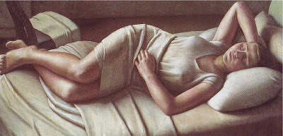
 Sorry! I can't keep my eyes open!
Sunday, September 23, 2007
Saturday, September 22, 2007
MY TASTE IN NEKKIDS
WARNING: NON-PORNOGRAPHIC NUDES BELOW!
 Here's (above) my all-time favorite nude photograph, taken by Weston. It's probably influenced by Matisse. It's indisputably a terrific work of art but... that's not what this is about. This is about what John K calls "nakeds", steamy pictures that are meant to be a turn-on.
I'm not turned on by dominatrices and cold, inhuman model types. I like real girls, the way they really look. There aren't many sites with pictures like that but here's three. See what you think.
 The first is "Suicide Girls." Man, goth girls are sexy! I don't buy into goth philosophy but who cares about philosophy when you have girls like this to oogle!?
 Nongnong,nong,nong,nong (knuckle biting)! OK, she's not naked but I can imagine it!
 I'm going way out on a limb with this one (above). She has a sense of humor and that's sexy, don't you think?
 Here's (above) a neo-hippy girl from the "Hippie Godess" website. She looks kind of surly for a hippie but maybe I'm misreading the expression. The hippies were half right...underarm hair really is sexy, but not leg hair. Click to enlarge.
 Here's (above) a disgustingly wholesome girl from the "Domai" site that Kelly recommended a while back. Behind the sincerity there's something phony, but behind the phony there's more sincerity so I'm buying into this one! Click to enlarge.
******
******
 Here's (above) my all-time favorite nude photograph, taken by Weston. It's probably influenced by Matisse. It's indisputably a terrific work of art but... that's not what this is about. This is about what John K calls "nakeds", steamy pictures that are meant to be a turn-on.
I'm not turned on by dominatrices and cold, inhuman model types. I like real girls, the way they really look. There aren't many sites with pictures like that but here's three. See what you think.
 The first is "Suicide Girls." Man, goth girls are sexy! I don't buy into goth philosophy but who cares about philosophy when you have girls like this to oogle!?
 Nongnong,nong,nong,nong (knuckle biting)! OK, she's not naked but I can imagine it!
 I'm going way out on a limb with this one (above). She has a sense of humor and that's sexy, don't you think?
 Here's (above) a neo-hippy girl from the "Hippie Godess" website. She looks kind of surly for a hippie but maybe I'm misreading the expression. The hippies were half right...underarm hair really is sexy, but not leg hair. Click to enlarge.
 Here's (above) a disgustingly wholesome girl from the "Domai" site that Kelly recommended a while back. Behind the sincerity there's something phony, but behind the phony there's more sincerity so I'm buying into this one! Click to enlarge.
Wednesday, September 19, 2007
THE FIRST TIME I SAW A CLAMPETT CARTOON
I must have written about this before, but if so I can't find it. I guess an occasional repeat is inevitable after 520 posts. If I am covering old ground I apologize. It's a fun story for me to tell and maybe something new will come to light in the re-telling.
It all started in Berkeley, California where I had plans to start an animation studio. I figured I'd begin by making commercials for local TV then, when the time was right, I'd move the studio to L.A. where I'd become the next Walt Disney. The fact that I'd never animated before never struck me as an obstacle. It was the era just before video tape recorders so I didn't have much to study. Mostly I read books and did the animation exercizes in a book I got in the mail, Heath's "Animation in 12 Hard Lessons."
 I was super-serious about this and I even got rid of all the furniture in my apartment to make a bigger working space. Using the plans I found in animation books, I carpentered together animation tables and discs, cel drying racks, an editing area and a photography stand. With the money from tutoring and a post office job I bought a camera and lights, swivel chairs and enough used editing equipment to get started. It was great! Amazingly someone found out what I was doing and donated the use of a completely professional motorized animation stand so I was really in business. My girlfriend and I had to sleep on the floor because there was no room for a bed but, what the heck, you have to make sacrifices to start a career, right?
Getting animation gigs proved to be difficult. I got two short ones but they didn't pay much.  It was just as well because shortly after I met an art student who recommended me to her dad who was a big shot at Hanna Barbera. Thanks to favoritism I was a shoe-in! Aaaargh! I put so much effort into getting my own studio together...it seemed a shame to leave all that ... but this was a real job at a real Hollywood animation studio -- How could I turn that down? My girlfriend and I sold the animation equipment and dashed down to L.A.
 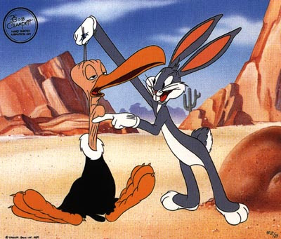 One day a friend (he might not want me to mention his name) told me he'd be projecting "Crumpet cartoons" in the 2nd floor hallway after work. I'm being disingenuous, he clearly said "Clampett," but I can't resist rewriting history to make the word sound the way I heard it for the first time months before. My friend was a real Clampet fan but I'd never seen a Clampett cartoon and I was a little skeptical of the hype. Surely, I thought, Friz and Chuck had the top spots locked up. Clampett, whoever he was, couldn't possibly be anything but the lackey who polished their shoes.
 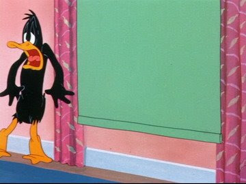 Well, as I may have said elsewhere, the lights dimmed and when they came on I was a different man. Clampett, to put it mildly, was not a shoe shining lackey. He was the only director to use all the elements of entertainment in a single film: funny and surprising writing, hilarious cartooning and animation, great pacing and choreography, killer voices, just the right color, efx and music...I was overwhelmed!
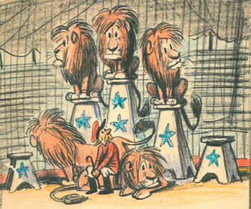
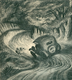
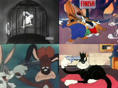
I thought I'd better put something together to show what I and my friends could do, or thought we could do. We advertised ourselves as a full animation studio even though none of us had ever even inbetweened professionally. For a first project I picked a childrens book by Bill Peet (the first two pictures above are Peet's) . I figured he was an obscure childrens book author who lived in a shack behind the railroad tracks. I figured he would jump at the chance to see his pathetically obscure little book animated by suave and sophisticated artists like myself. I wrote a letter to him but never got an answer.
 It was just as well because shortly after I met an art student who recommended me to her dad who was a big shot at Hanna Barbera. Thanks to favoritism I was a shoe-in! Aaaargh! I put so much effort into getting my own studio together...it seemed a shame to leave all that ... but this was a real job at a real Hollywood animation studio -- How could I turn that down? My girlfriend and I sold the animation equipment and dashed down to L.A.
 I got my first job at Filmation and I was ecstatic! I worked all day then spent hours at night sitting at the desks of the older animators, flipping their animation and trying to figure out how they did it. Some of the old guys liked me and I had real cartoonist friends for the first time. My hero was still Bill Peet, who I discovered was a famous Disney story man, and through friends I discovered the names of my favorite directors: Chuck Jones and Friz Freleng. I was in heaven! I didn't mind working on the Filmation characters and I couldn't even imagine anything better than what Friz and Chuck did.
 One day a friend (he might not want me to mention his name) told me he'd be projecting "Crumpet cartoons" in the 2nd floor hallway after work. I'm being disingenuous, he clearly said "Clampett," but I can't resist rewriting history to make the word sound the way I heard it for the first time months before. My friend was a real Clampet fan but I'd never seen a Clampett cartoon and I was a little skeptical of the hype. Surely, I thought, Friz and Chuck had the top spots locked up. Clampett, whoever he was, couldn't possibly be anything but the lackey who polished their shoes.
 Well, as I may have said elsewhere, the lights dimmed and when they came on I was a different man. Clampett, to put it mildly, was not a shoe shining lackey. He was the only director to use all the elements of entertainment in a single film: funny and surprising writing, hilarious cartooning and animation, great pacing and choreography, killer voices, just the right color, efx and music...I was overwhelmed!
 That night I completely flip-flopped. I disavowed my entire past and I even shed my desire to have a studio. Clearly I had a lot to learn and I could only learn it in the studio system. The next day I came to work feeling like the world-destroying infant at the end of the film, "2001." With a deeply grave look on my face I willed the studio door open (OK, I'm exaggerating) and slowly and deliberately levitated (so it felt) up to the second floor where the old guys were. I confidently approached them and announced that everything they were doing was wrong. I would brook no disagreement. The new law had had been laid down.

Tuesday, September 18, 2007
THINKING ABOUT ART SCHOOL
 BEFORE YOU START TO READ RUN, DON'T WALK, TO JOHN KRICFALUSI'S SITE WHERE HE TALKS ABOUT HIS IDEAL ART CURRICULUM FOR ANIMATORS. IT'S SIMPLY THE BEST THINKING ON THE SUBJECT THAT I'VE EVER SEEN IN PRINT!
What I'll try to do here is put down a few thoughts on the state of art schools in general (which includes traditional colleges offering an animation/art program) and animation courses in particular. The biggest recent change in animation curriculums is that they're almost all computer-centered. Every school wants to be known as cutting edge, preparing students for the jobs of the future and all that. As a consequence drawing courses have diminished in importance and now you can graduate from art school without being able to draw or paint. That's an historic change! Imagine that! The practice of hundreds of years reversed in my own time! How did such a big change come about?
 Well, the computer obsession is the obvious first answer. That's odd because the favored animation of art students -- what they watch for recreation and inspiration when they're not being forced -- is anime, which is 2D. Students seldom watch 3D for fun unless its video game graphics. You get the feeling that they don't really like 3D all that much but they're persuaded that learning it is the only way they'll get a job. Is that true? Who gave them that impression?
 The obvious answer is, "The box office told them! 3D is the only animation that makes money!," but is that true? 3D has been in TV animation for well over a decade now and what are the most popular animated programs? The answer is "The Simpsons," "South Park" and "Family Guy," all 2D. OK, south Park is computer animated, but it's deliberately made to look like it's not. No computer TV that looks like computer TV has been a prime-time hit. 3D has beaten 2D at the cinema box office but what was the competition? "Treasure Planet?" "Home on the Range?" These are executive-driven films are not at all what I would call fair competition.
 My own guess is that high school teachers and art schools turned things around; high school teachers because they scared their students to death with the "college-or-scrub-toilets-for-a-living" rhetoric, and art schools because they took in so many non-artists that the foxes are beginning to rule the hen house.
The upshot of this irresponsible advice in high school was that every student who wasn't academically inclined went on a frantic search for colleges that offered easy degrees...and what college is easier to graduate from than an art college? In unprecedented numbers non-artists flooded art schools and they were backed up by big, tax-payer-backed student loans, so they were not turned away. How will these students pay back those loans? Remember when art schools had strict entrance requirements?
 The influx of non-artists into art school is changing the nature of art school. A lot of students don't feel comfortable with traditional art and are much relieved when they can bail out into computers. Very often non-artists run art schools and they tend to repeat the non-artist mantra: "Everything will be computers right around the corner." That's only a half truth. 3D certainly is the future of animation but good animation programs are not by a long shot right around the corner.
Present-day 3D programs like Maya are clunky and unresponsive and there's no relief in sight. Art schools should be preparing students for a longer transition period but instead they're putting all their eggs in one futuristic basket. Maybe that's because 60s-type people run the schools and that generation was obsessed with what used to be called the "generation gap." They watched their parents lapse into irrelevance and they learned the lesson... on pain of death don't fall behind the trends. Unfortunately for them the anticipated trend in 3D was slow in coming. Today, all these years after "Tron," 3D animation is still expensive, insensitive to cartooning and expressive acting, has difficulty creating appealing characters, and is hard to use.
Even so, the fantasies of non-artists about how art should be done can't be ignored. They're training the next generation of artists and that'll have its effect. We still have to meet the challenge of anime, which is the immediate threat on the horizon, and that battle will likely be fought with 2D. My advice to young animators is to learn how to draw, cartoon and animate effectively, in addition to whatever computer skills you can pick up. If John K ever starts a school then kill to get into it. That's the real article. One day 3D will be as easy to use and creatively useful as a common pencil, and we'll all wonder how we got along without it....but we're far from being there now.
By the way, my own experience with art school management has been the opposite of what I've described here. Everybody I've worked for has been an artist, sometimes really good ones. Good art schools with competent and idealistic managers do exist and they're worth seeking out.
MORE DELSARTE ACTING THEORIES
 I just re-read one of the Delsarte acting posts I put up months ago. Gee, I didn't do a very good job of explaining it. Let me try again, using my own words and my own sketches this time.
Delsarte believed that certain movements are highly symbolic and powerful. When you're happy you want to throw your arms up in the air. When you're sad you want to put your head down and slump forward. Probably everybody in the world recognizes and uses these gestures...everybody except actors.
Delsarte believed that actors avoid these obvious gestures because they seem too over-the-top, too caricatured. He thought that was a pity because no other gestures convey so much power. He created a system for using gestures like these without looking ridiculous.
In the sketches above, drawing A is a watered down version of the gesture that's full strength in drawing B. The second has a lot more power, especially when seen from the side, but it might be too strong for some scenes. Delsarte says, use the broad gesture anyway, but do it at an angle that would flatten it a bit from the audience's point of view, as in drawing C. Interesting, huh?
 Delsarte wanted to bring broad gestures like the one on the left above, back to acting. Of course extended arm poses aren't the only type of broad action he was interested in. The guy on the right doesn't simply talk to his friend to get his attention, he grabs his arm before speaking. That conveys to the audience that what the speaker's saying is important. The arm grab's a powerful symbol and Delsarte wonders why we don't use it.
Sunday, September 16, 2007
A FEW PHOTOGRAPHS FROM THE 50S
 I'm embarrassed to say that I don't know who took these pictures. Anybody here know? They're all serious, seemingly 0ff-the cuff pictures of literary people from the 50s. Maybe the John Houston picture above was taken a little earlier, I'm not sure. Click to enlarge.
 It's funny that the intellectuals of that era preferred raggedy, hazy, snapshot-type pictures like this one (above) of Sartre . My guess is that a formal picture, taken with a view camera and lights, was considered bourgeois. I think it still is some circles. I like both kinds myself.
 Here's a picture of Edith Piaff who's one of my favorite singers. She has a tragic face which is appropriate for someone who sings so often about love gone awry.
 But love gone awry or no, intellectuals were expected to have tragic faces. My guess is that they wanted to convey how difficult it was to live in a society dominated by the man. The fact that they lived in a liberal democracy with universal education and a standard of living unmatched in history made no difference. Their job was to convey great suffering and inner anguish.
Saturday, September 15, 2007
LOOKING AT ARTIST/MODEL PAINTINGS
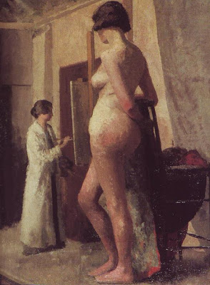 I've always liked artist and model pictures. When they're done right they're strangely soothing and appealing and...classic, for lack of a better word. Even when they contain major perspective flaws like this one (above), where the painter seems to be a dwarf and the model a giant, they're still fun to look at. Maybe artists like them because they remind us of hours of pleasant concentration.
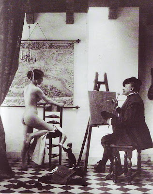 I used to think the main selling point was the sex, where a beautiful girl lets you paint her for hours on end. There's something interesting about turning sex into art. But that can't be all. Look at the photo above. It's got a naked girl, an artist and a faux Vermeer setting...and it doesn't work on any level. What's missing?
 You can make a great picture (above) even when the model has her clothes on, but naked is better. Nudity is always a profound and shocking revelation.
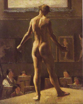 Artist/model pictures seem to work best in soupy colors like yellow, brown, olive green, black,and white (above), or in warm grays and browns like the draped model picture above that. I wonder why that is? Somehow the 19th century managed to put a lock on this kind of subject matter.
By the way, I think this figure with its back turned to us (above) is a guy.
 Here's another perspective problem (above) where giant men appear to be painting a tiny woman. Once again we forgive the flaw. The picture is terrific but, just to nitpick, the bold treatment of the men in the foreground seems to undermine the serenity you're supposed to feel in a classic artist/model picture. You're not supposed to be admiring the detail.
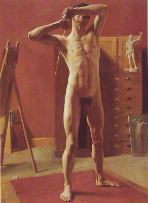 This picture (above) isn't by Eakins but it reminds me of his stark, anatomical style. This is a wonderful picture but once again, the boldness undermines the tranquility you're supposed to see in studies of this kind.
 In my opinion, artist/model pictures always seem to work best when they feel like a study, something the artist dashed off in two or three days. Maybe that's because quick studies are good at capturing the immediacy and starkness of the naked skin.
Subscribe to:
Comments (Atom)


