Monday, August 17, 2015

RECENT ASTRONOMY PHOTOS 8/2015 [EXPANDED]


Hold your hats because this (above) is a much more significant picture than it seems. It's the Andromeda Galaxy, AKA M31, as seen recently on a clear night over the Swiss Alps. "So what?" you say. "What's so special about this?"


The answer is that we've all seen good pictures of M31 taken with the aid of long  exposures, pictures like the small colorful one above,...but the large picture at the top was taken with an ordinary camera. It's what the naked eye would have seen. In other words, the rounded disk of another galaxy was visible to the unaided eye in the night sky over Switzerland, not as a pinpoint of light, but as a hazy blue disk with a bright center. It'll be visible in American skies starting in September and lasting through the Fall. Amazing, eh?


Here's (above) a shot taken from the Curiosity Rover on Mars. The camera was about four feet high.

Above, layered Martian rocks, also taken by Curiosity. The layers are believed to be deposits made a couple of billion years ago near the shore of an ancient, long-gone river.


Here (above) a comet has just "turned on" as its orbit takes it closest to the Sun.


Lastly, here's (above) a small cluster of galaxies which is independent of our own Local Group of galaxies.

Our own group is a much larger one consisting of 54 galaxies, many of them dwarf galaxies that orbit the two local giants, Andromeda and The Milky Way.  According to Wikipedia the center of our local group is a point between these two galaxies.

Sunday, August 16, 2015

CHILDREN OF OTHER LANDS

I'm packing up my books in preparation for a move and to make the load lighter I have to sell books that have been on my shelf for decades. Geez, it's hard. It's like getting rid of old friends. These are books that have guided my thinking for decades and determined the course of my life. Yikes!

A typical book in the "sell" pile is this old-fashioned one (above and below): "Children of Other Lands" by Piper and Holling. I can't justify keeping it because it has no immediate utility but I've frequently thumbed through it over the years and have been seduced by its charm every time. I'll miss it when it leaves the house.


By way of an example of Hollings' work, here's a black and white picture that always reminds me how important culture is to a family. This modest room with it's dutch door and plates arrayed on a ledge, and the beautiful costumes worn daily by the women, reminded me how people who are steeped in culture have an easier time in life than the rest of us. They know where they fit in and what's expected of them, and that frees them to think about other things. Well...that's my admittedly romantic take on it, anyway.
   

It must be nice to live in a part of the world (above) where architectural styles are somewhat set and homes are expected to reinforce the culture of the whole community.


Of course I live in modern America and part of my culture is to change styles constantly. Here's (above) a beautiful picture (above) of a cluster of pueblo buildings nestled in a pocket of towering hills. If such a landscape actually exists I wouldn't change a single stone, but the picture compels me to imagine what would happen if the mountains were skyscrapers and the river a highway.

In my minds eye I see a modern city where clusters of tall, modern buildings are punctuated by rolling hills capped with Montemare-type bohemian villages.


But....the book has to go. You have to be ruthless when you're undertaking a long move.


Friday, August 14, 2015

COMIC BOOKS VS. ILLUSTRATED KIDS BOOKS

I've been busy today so I had to reprise an older article to stay on schedule. I hope nobody minds. I think you'll find the subject interesting:

Before I begin this piece I want to apologize for ripping into kids book illustrator Lane Smith so hard in a previous post. I deliberately chose his least-appealing book so it wasn't a fair appraisal. Sorry Lane! Maybe I can make up for it by illustrating this new piece with the best book my local library had (above) by another artist, Mark Teague. It's a pretty appealing book, I admit, but I have to criticize it to make a larger point.


The point I want to make is that books of this type are trying to compete with comic books and they can't. In a comic book the picture of the two kids above would have rated a single panel on a single page. In Teague's big, expensive picture book, the kind that only has a few pages, it gets an entire two-page spread. All that for a picture of two kids talking on a porch? That seems odd to me.

Kids picture books always give too much weight to minor events and too little to major events. There simply aren't enough pages to tell a good story correctly and the artist is burdened with the necessity of trying to make each page, no matter how trivial in content, an artistic masterpiece. Is that really what kids want?

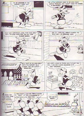
  Any one of these Carl Barks comic book panels (above) might have been a full-page illustration in a Mark Teague book, but all that elaboration would have gotten in the way of the story. My experience with my own kids is that kids definitely want stories, but the expensive illustrated books aren't geared for that. They're geared to deliver a simple artistic impression. Kids want stories but the expensive picture books we give them deliver objects of art instead.


Mark Teague is a really talented guy but he's working in a medium...thin illustrated kids books...that doesn't tell stories very well. I bought a couple of Teague books for my kids when they were still young, and all these years later I still have them. They're almost in mint condition. The hardcover Cochran Barks collection, on the other hand, is falling apart from my kids frequent reading. What does that tell you about what kids like to read?

One last point: we all have favorite illustrated books that we actually did read often when we were kids. My admiration for those old illustrators knows no bound because they managed to entertain in such an uncongenial medium. I'm glad I had those books and the illustrators that created them deserve a lot of credit. Even so, it's my belief that really young kids would learn more and have more fun if the bulk of their illustrated reading favored cheap, well-done pulp comics rather than pricey illustrated books.

Tuesday, August 11, 2015

ANOTHER WALLY WOOD MASTERPIECE

Wally Wood fans might be familiar with this (above) puzzle Wood did in the late 50s. It illustrated a Mad Magazine article called "Mad Visits Corny Island." 

I have an original copy of the Mad that contained the article,but I never put the puzzle together, probably because I didn't want to cut up the magazine. I don't know why it didn't occur to me to Xerox the picture and cut up the copy, or to simply look it up on the net. Well, it occurred to me yesterday, so here it is...in both versions. 

That's (above) a detail from the cut-up xerox...

...and here's (above) the original artwork, which I found on the net. Nifty, eh?


Sunday, August 09, 2015

MORE CRIME STORY BEGININGS

Here's a few more short story openings I've come across recently. I found a great graphic (above) to illustrate the first one. How do you like the sinister way the man in the crowd looks, the man who's looking over his shoulder a bit right of the middle?

Anyway, the story: an off duty police detective is in a football stadium watching a game when he spots a suspect (above) in a kidnapping case he's investigating. The rich parents paid the ransom and the child was promptly returned as agreed, but the suspect escaped and the money wasn't recovered.


The detective follows the man back to his apartment, cuffs him and, on an impulse...even though he's never done anything like this before...he demands half the ransom the 'napper took for the child. The kidnapper is appalled. The unfairness of it rankles him. After all, he did all the work so why should he get only half the pay? A fight ensues and the two roll around the floor, battling for the cop's gun.

There's more to it, but I'll leave it at that. It's an interesting story because the corrupt-only-once detective and the "wronged" kidnapper are both strangely ethical in their own way.


The next story (above) takes place on a lonely path near a lake. A man's boss believes he's having an affair with his wife. The employee is innocent and he's hoping to clarify that as they walk along a lake at night, but when he turns to talk to his boss...he isn't there.

After a futile search the man calls the police. They look and find nothing, then the wife shows up and claims the employee had threatened to drown her husband that very day. It's a frame-up! Is the boss still alive? Did the wife kill him? What's the employee to do?


The next story (above) is about a boys' summer camp in the 1950s. Every camp has at least one boy who doesn't quite fit in and who's ridiculed by the other boys. In this camp the adults made the mistake of giving the kid a .22 rifle for shooting practice. You can imagine what happens.

The kick in the story is that it's told from the timid boy's P.O.V., and he's not honest with himself. It's hard to know exactly what went down because the narrator isn't reliable.  The writer raises the question: could a murderer who really believes his own innocence ever be found guilty of a crime?  


Lastly, here's (above) a story about a sentimental crook and his beloved mother. The crook hires a hit man to bump off a pesky business partner, and the whole thing is discussed in front of the crook's mother. She doesn't seem to care, she's just concerned that the two men eat their chicken soup and bundle up when they go out. 

The story seems straightforward enough at first, then the mother is slowly revealed to be cagey and calculating, and maybe something worse. It's the kind of crime story O'Henry would write, if he wrote crime stories. 
  

Thursday, August 06, 2015

THE LAND OF MAKE BELIEVE

I just discovered this large "Land of Make Believe" map (above) behind some paint cans in my garage. I bought it for my kids when they were young and then promptly lost it...and now here it is again! Maybe someone's still selling it. 

Here's (above) a darker, more serious version of the Make Believe map.  Jaro Hess drew it in 1930. 


I went on the net to find out more about the more about the Make Believe map and I discovered other fantasy maps that I didn't know existed. This one (above) seems to have come with a board game. Judging from the unflattering way black tribesmen are depicted I'd guess it's from the 1930s or 40s. 


Wow! Here's a European-made map (above) showing what appears to be an arab fantasy landscape. How do you like the Moon in the upper right corner?


That's all the fantasy maps I have but I'll throw in a realistic map of India (above) from 1805.

And here's (above) an early Chinese map painted on sandstone. The rest of the world showed no interest in landscape painting until fairly recent times, but the Chinese seem to have long regarded it as an art form.  


Above, a well-drawn map showing Britain's connection with far flung colonies.

Interesting, eh?

Tuesday, August 04, 2015

My LATEST TRIP TO DISNEYLAND 8/2/2015


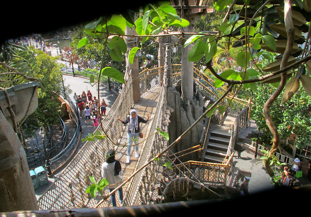
Here's (above) my favorite destination at Disneyland: Tarzan's Treehouse. Everyone on the trip wanted to live up there.


It's a whole city in the sky. 


Lots of rope bridges, lots of leaves.


It's impossible to find a bad vantage point on this tree. The view is beautiful from every angle.


Even the structural elements (above) are interesting.


Here's the view from the very top. There's lush greenery everywhere. 


The walk back down is exciting beyond all expectation. The downward steps are steeper than the steps leading up, so the ground appears to rush toward you as you descend. You feel like you're in a controlled fall. There's a lot more verticals in the side tree trunks, too, and that heightens the effect.


Here's (above) the Royal Theatre in the part of the park I call "Princessneyland." We saw "Frozen" re-enacted here with live actors. 


Above, the actress who played the Princess. How do you like her costume? Boy, 18th Century Europeans really knew how to design. 


The vest design looks Polish. Poland was enormously influential in European folk art. 


Here's some awning covers from the outside of The Enchanted Tiki Room in
Adventureland.


Where can I buy that fabric?

In the Indiana Jones ride (above) there's a fenced off area showing Jones' office.


It kinda' makes you want to rethink your own workspace, doesn't it?


Is that a picture of John L. Sullivan on the wall?


Here's (above) the starting point of the Peter Pan ride. The ride begins with a glide over the London rooftops...


...and right into the open window of Wendy's bedroom. Well, actually it's an open wall. Gee, if only rooftops and rooms were really like that. Isn't there some way real-world architects could make that possible?


Here's (above) a window display from one of the shops on Main Street. It's a little too girly for my taste but, wait, there's more. The set is integrated with holographic pixie dust that transforms the characters. How do they do that?


Good old Disneyland! It never ceases to be inspiring!