Tuesday, July 11, 2006

IF YOU'RE A GROTESQUE ARTIST....


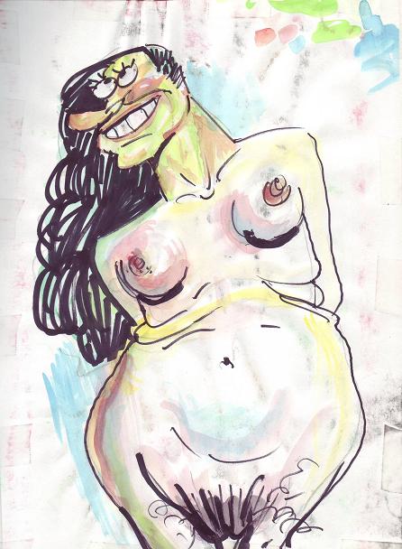
IF YOU'RE A GROTESQUE ARTIST, STOP IT! STOP IT RIGHT NOW!!!!!

There are a lot of grotesque artists out there. I feel sorry for them because there's no market for this stuff. At least the over-the-top grotesque artists like the guy who did the picture above can probably get published in punk or alternative magazines. What about the artists who are hybrids: half normal and half grotesque? These unfortunates are doomed. They're not drastic enough to appeal to punks and not normal enough to appeal to a mass audience. If you're one of these caught-in-the-middle types I have a valuable piece of advice for you...stop doing what you're doing! Stop it right now, this minute! Either get more drastic or get more normal! Stay where you are and you'll be eating cereal for dinner for the rest of your life!


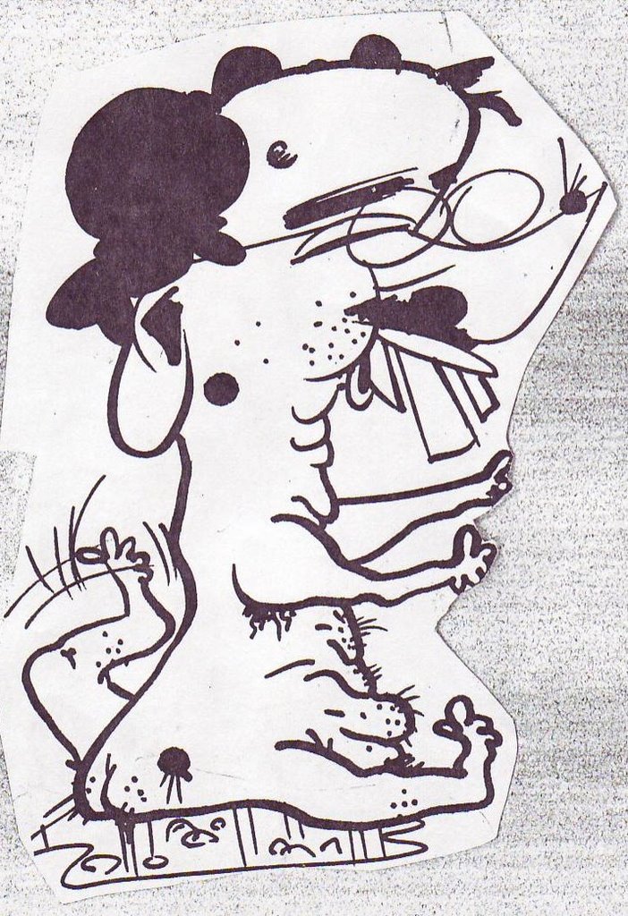
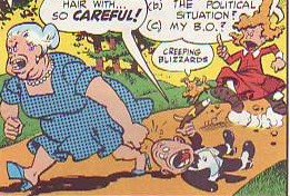
I wish I could have illustrated this piece with drawings that are more illustrative of this middle condition. I couldn't bring myself to hold fellow cartoonists up to up to ridicule so I opted to use classic pictures instead, only I had trouble finding them. Thomas Rowlandson is a famous grotesque artist but I couldn't find really good examples of his work. The lame Rowlandson above is the best I could do.

I also tried to find examples of my own inadvertantly grotesque art. Normally my house is cluttered with this stuff but now that I need it I can't find a single drawing. By grotesque I don't mean the extreme Worm poses I've posted so far. They're just exagerrated. Believe me, I have nothing against wild or extreme cartoon drawings. By grotesque I mean drawings that are unintentionally off-putting to the audience, which lack an understanding of the principles of design and therefore have no pleasing elements to balance out the gross parts. Grotesque art of the kind I'm talking about subverts the intent of the artist which was simply to be funny.

Please don't ask me to evaluate your work. I wouldn't presume to do that! All I can offer is advice: if you even suspect that you fall into the category I'm talking about then get a designer friend to redraw some of your questionable drawings so you can see what you might be doing wrong. Pay the person if necessary. You want to keep the guts and humor of the grotesque drawing but use design to make it more appealing. Think of Rod Scribner. He managed to be appealing and drastic at the same time.

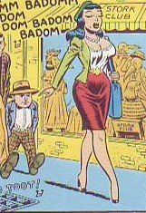
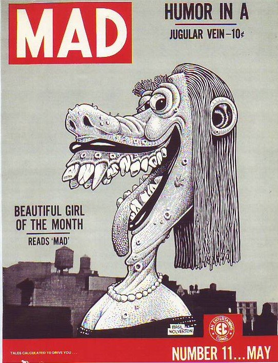
Basil Wolverton is often sited as the ultimate grotesque artist. I don't see him in that light. He knew how to use design to make the gross elements more palitable. In the drawing above he balances out the grotesque face with straight, ordered hair. He lets plenty of airspace into the face which softens it. The drastic face is integrated with the whole, sedate grey and red graphic surrounding it.

Monday, July 10, 2006

A FEW MORE WORM DRAWINGS!

A commenter said there was a big difference between the colored Sally (above) and the black and white layout drawing (below). Boy, there sure is! The color drawing feels a lot more psychological, a lot more like it's embedded in a story. The color also puts less emphasis on the armpit, which is not a bad thing.


Here's the Worm (above) preparing to apologize to the human. He's drawn three different ways here and it all still seems like the same character, at least it does to me. I'm amazed at how forgiving animation is! At other places in the story he's drawn differently than anything you see here!

Apparently the audience will accept differences like this as long as you occassionally return to a model and as long as you show differences up front, at the beginning, so people know what kind of cartoon they can expect. Model sheets should be a guide, not a pair of handcuffs.


No more Worm drawings at hand so I'll throw in another of my ghost sketches (above). I love to draw ghosts. They do commonplace things in an uncommon way.

Sunday, July 09, 2006

A FEW MORE DRAWINGS!


Boy, I'm really busy right now so I have to put up something quick and easy. Here's a model of a cavegirl that I did (above), taken from the mouthchart. I love drawing women that aren't pretty. I and a handfull of others have the non-pretty field to ourselves since pretty girl art is experiencing something of a silver age right now.

Here's the same cavegirl from the back. It would have been funnier with a slight buttcrack but it was for kids TV so... The woman on the right is a sort of Don Martinish varient on the Avery woman in the famous Screwy Squirrel cartoon. It looks like this version has some cleanup problems, especially around the feet and hands. I think we corrected that in the final model, at least I hope we did.


Here's a lady with a purse floating in the air, going around in a circle and being squirted by a perfume atomizer which is also floating. The reason she's doing this is....Aargh! It would take too long to explain! I've gotta get back to work!

Saturday, July 08, 2006

WHAT DO KIDS BOOKS MEAN?

Kids illustrated books used be pretty sedate, even when they delt with horrific subjects like a wolf trying to eat Red Riding Hood (above).

At some point radical utopian artists, which were all over the place in the late 1800s and early 19oos discovered illustrated kids books and transformed them. The picture of Goldilocks (above) is more about the Craftsman house than it is about the little girl. The house says, "Look at me! Wouldn't you rather live here than in some dopey tenament apartment? See what you could have if only you'd throw off your blinders and stop cow-towing to the establishment!"


The utopian theme ran through lots of kids books right up tp the 1960s when reality finally matched the revolutionary weirdness in the kids books and the utopian artists bailed out into other venues. Dr. Seuss was one of the last great utopians, though I'm not aware that he had a political agenda. The picture above is typical Seuss: water flows uphill to a Venice-like city containing narrow bridges and minarets. What imagination! Someday water may be made to flow uphill (liquid helium already does) and if it happens it might come about because the person who made it possible read Dr. Seuss.

Here's a Tenggren picture (above) of a girl walking through a beautiful, menacing forest. This too is a radical, utopian statement. It's saying, "Don't you want adventure in your life? Aren't you tired of living a life of quiet desperation? Why do you allow urban sprawl to wipe out the mysterious, primeval forests that make adventure possible. Take up arms! Man the barricades!"

Here's a Tenggren witch (above). The picture is saying, "Modern life has robbed us of the textures and characters that used to make life exciting! Tear down the modern buildings and make the world safe for witches, trolls and fairies!"

Am I reading too much into this? I don't think so. Romantic utopian movements like fascism, anarchism, and hippieism had to come from somewhere. Movements like that don't suddenly spring from nothing. A film like "Easy Rider" seems harmless and quaint to us now but it was regarded as a powerful motivator to radical utopian action in its day. "Uncle Tom's Cabin" seems harmless enough now but Lincoln is quoted as saying that it started the Civil War. When you look at a really well-done old picture you have to make an effort to imagine how it appeared to the audience it was created for. You have to imagine what motivated the artist to put so much passion into his picture. I believe utopian kids picture books were one of the powerful and uncredited shapers of the modern world.

Friday, July 07, 2006

ADVICE FROM UNCLE EDDIE'S MOTHER


MOTHER EDDIE, WHAT'S THE BEST TIME TO MARRY?

The best time to marry is.....(drumroll!)...... in your early twenties! I know this runs counter to the common wisdom which says, "Enjoy life before you settle down! When you're finally ready, maybe in your early 30s, you'll have sown your wild oats and will be ready for a mature relationship." That's silly. If you wait that long you may not have any relationship at all. Here's why.

Let me digress and say that I came to this conclusion after watching Zeffirelli's "Romeo and Juliette" about a half dozen times in the span of a couple of weeks. When you see it that often it becomes clear that the play is not only about love but about youth. Only young people can love so passionately. Only young people would rather die than be seperated. Only young people can see each other through rose-colored glasses, ignoring each other's flaws and emphasizing each other's assets. Only young people are adaptive enough to change themselves to fit the requirements of the person they love. At this age nature is shouting at you through a bullhorn: "Get married!" "Have kids!" "This is the time!"


If you're still unmarried by the time you're 30 then you've been around the block. You know that life will continue even if you're jilted and that there's always other fish in the sea. You have standards the other person is expected to meet and if they don't...well, there's the door. You're guarded because you've had bad experiences with love. You always withold a little of yourself so you won't be devastated if the worst happens. You still want a romantic relationship but you've unwittingly removed the foundation that would make that possible.

By the time you're forty the list of attributes that you expect a lover to have is incredibly specific. If you like cats then he better like them too, in fact he better like the specific kind of cat that you like or else. I don't see a romance here but rather a legalistic negotiation.


I believe in romance. I want to be seen through rose-colored glasses and I want to see the person I'm attached to that way. Very few of us look good in the cold light of reality. I don't think romance is possible without a total commitment, without the belief that nothing will be right if you loose the other person. Since only young people can feel this way I conclude that all great romances must begin when the couples are young.

Are there exceptions? Yes, millions of them! So many that I hesitated to write what I did. I know people who met late in life and are as happy as it's possible to be. I also know people who've divorced because they married too early. Even so, I'll stick by romance and early marriage as the standard model from which there are many legitimate and happy variations.

BTW, Let me acknowledge the happy exception represented by two recently married friends, Kr. and Shv. These guys are perfect for each other and I don't think they could be any happier, even if they were teenagers like Romeo & Juliette.

Thursday, July 06, 2006

A READER REQUEST: MORE WORM PICTURES

Anonymous asked to see more Worm drawings and here they are. The top one is a sketch that I did and which was beautifully cleaned up by Tuck Tucker. In the film the scene got some nifty animation by Bob Jaques and Kelly Armstrong. The freckles peeling off is an idea I got from Clampett. It makes for a good drawing but it slowed down the action so I had to cut frames.

The big hole in Sally's arm is her armpit. I realized I drew it too high and I meant to change it but there was no time.

Here's (above) another inbetween from Glenn Kennedy's animation of the Worm addressing the audience. The dialogue in this scene is something like "What are you looking at? Look at yourselves why don't you? It is unto yourselves you should be looking!" John K pioneered this kind of over-the-top, Baroque dialogue and I'm always amazed to see how well it integrates with the more normal dialogue in his films.


I don't have more Worm drawings at hand so I'll throw in a model that I did for another project of ghosts who chase people around a haunted mansion in airplanes. Sometimes the planes fly and sometimes they walk.

NEWS BULLETIN: If you haven't heard, YouTube has yielded to a demand by Warners to delete it's copy of "Buckaroo Bugs." I assume that Warners was responding to the use of clips from that film on John K's blog. This is a bad precedent.

The clips made it possible to discuss animation that everyone has just seen. No book could do that. They made possible to talk about animation on a deeper and more intelligent level than has ever been possible before. We need to be able to run these low-res clips! I'm going to write to Warners and I hope everyone reading this will do the same. Warners' addresses can be had at John's blog, "all kinds of stuff."

Wednesday, July 05, 2006

SOME INTERESTING PICTURES

A few days ago John K took this picture of me, Jack Black and Kyle Gass (Jack & Kyle =Tenacious D.). It's a terrific picture and I'm really glad to have it but I'll never be able to look at it without wincing. I was supposed to reciprocate by taking John's picture with Jack and Kyle and I goofed it. We didn't find out till it was too late to take another one. Sorrrryyyyyyy!

Jack turned out to be a real nice guy and his vocal range is amazing. He has a trained voice. He can speak in what comes off as a natural, conversational manner, and still be heard clearly in the back of the balcony. Every actor should be able to do that.


Here's a caricature John did of of me (above) covered with warts, with dog legs, sitting in a puddle of my own urine. I wonder what Sister Wendy would think of it?

Here's another picture of me (above), also by John. This was the head I used when I put together the yellow composite of John's Eddie pictures that I posted a few weeks ago.

Tuesday, July 04, 2006

LOOKING AT THE SAME PICTURES IN BLACK AND WHITE

Well, I don't think we nailed this problem last time. I tried Jorge's method of printing the covers in black and white and that helped a lot. Now we see the girl is done entirely in middletones. In B&W her panties almost disappear. The whole middle part of her body appears as one, big, grey haze. It's as if that part of her was an uncluttered area where the eye could rest, a blank area to contrast with the stark angles and colors elsewhere.

In B&W I see that my eye starts the picture by fixing on the guy's face, but the face lacks detail so I allow the wedge of white light to carry my eye down to the girl's thighs. Being a guy I naturally want to linger there but there's no detail to fix my attention. I follow the greater complexity of her upper body to her eyes and they lead straight back to the guy, which is where we started. My eye keeps circling the page.

A commenter last time mentioned that the guy (above) looked like he was lit by colored gels on spot lights. The girl is lit more naturally. Two people that close together still get a different light treatment.


In black and white you can see that a lot of this cover (above) is in middletones. Only the yellow in the titles comes off light. The guy appears to be both underlit and toplit. The girl is only bottomlit. Interesting. They have seperate lighting.


For me this is a warm picture with cool accents though you could argue that the cool threatens to dominate. My eye starts on the girl's face then travels down to her thighs where it gets lured away by the yellow in the bottom title. From there it travels up the guy to his face, which is looking at the girl, which completes a circle. The problem is that the two are looking at each other so intensely that there's a temptation to keep your eyes on the two heads. Spizz was put off by the overt sexuality in this picture but it seems to me that the artist had to give the girl a sexy, detailed body to keep the eye moving.

Monday, July 03, 2006

WHY ARE THESE COLORS SO APPEALING?

Here's a couple of terrific magazine covers. I'm especially interested in the way they're colored. Can any painter out there explain the color schemes to me?

Using my color wheel I see that the girl in the cover above seems to be orange and blue which are complimentary colors. The guy seems to be a double split complimentary with red and violet facing green and yellow. I love how he's a dark silo against white while she's a light area almost totally enclosed by darks.


The cover above seems to be done in analogous colors: from blue-violet all the way around the color wheel to yellow-green. No blues, no pure greens. Once again the guy is a dark silo against light color and the girl is light totally surrounded by dark.

Can anyone who knows more about color than I do add to what I've said here? I know what I've written doesn't begin to describe what's really going on here.

Sunday, July 02, 2006

SHOULD SHORT MEN PURSUE TALL WOMEN?


Yes, of course they should! Is a girl likely to accept such a man? No, why should she? There are plenty of tall men to choose from. Is the short man likely to be humiliated in the futile attempt to get a tall woman? Of course! It'll be a horrible experience for him. Should he attempt it anyway, even if the odds are overwhelmingly against him? Of course he should! Let me explain!


Men exist to compete with each other for women. That's the role that nature has given us to play. It's our lot in life to be disappointed, humiliated, frustrated, chased away by other men, and be otherwise miserable in our attempt to get women who are simply not in our league. A man who can make rational calculations about love and then act on them is an alien creature, devoid of human emotion.

I think tragedy is part of life and it's unnatural to go to extremes to try to avoid it. We are made better by the pursuit of the tragic end. The short man will try harder when he goes after the tall woman. He'll learn to dance, he'll try to get a better job, he'll try to cultivate wit and conversation. These will all come in useful later when he's eventually (and inevitably) snubbed by the tall woman and enters the competition for quality short women.

By the way, I'm not short myself but I see the dramas that are being played out on the street and I can't help but form an opinion about them. By trying too hard to avoid humiliation short men deprive themselves of essential, ennobling life experiences.

WHAT DO YOU THINK?

Saturday, July 01, 2006

HEADS THAT ARE GRAPHIC STATEMENTS!


It seems very odd to me that some people choose to make a graphic statement out of their head. Even more odd is the fact that some people deliberately choose to make their heads resemble favorite objects or foods. I call your attention to the man above who appears to have modified his upper body and head to resemble a salt shaker.


Here's a guy (above) who's made his head into a mushroom. A mushroom is a friendly, simple and sophisticated food which I guess makes it appealling as a head shape.


This man (above) appears to be paying tribute to the humble, flacid penis.


Here's (above) two feather dusters, one facing down and the other facing up. I kinda like feather dusters too but I don't think I'd want to look like one.

Here (above) is a head modeled on the cap of a Bic pen. People really like these objects. A modern pen cap has no threads and no clickable button like old ballpoints used to. A modern cap is simple and useful and these qualities appear to have attracted admirers who wish they could be pens. It's a real tribute to the product designers (I know bobbed hair goes back to the time before Bic pens but I assert that the bobbed hair enthusiasts of our day do it for a different reason than their predecessors).


The simple egg has it's admirers and imitators. My guess is that the individual above used to dye Easter eggs when he was a kid and it was such a pleasurable experience that he decided to be an Easter egg when he grew up. He's not alone. Lots of people try to be their favorite foods.

A FEW INTERESTING PICTURES


A friend turned me on to this killer WW2 syphilis poster (above). I don't know the artist's name.


Here's a detail (above) of a painting I'm especially fond of, Delacroix's "Orphan in the Graveyard." The girl looks stupid to me but she's portrayed with great nobility as if the artist was saying, "Even a girl like this is a human being and as such she has a divine spark and the potential for greatness."

Here (above) is the whole Delacroix picture. Below is an old drawing by John K where he's trying to out-Woverton Basil Wolverton.


Thursday, June 29, 2006

LIFE DRAWING!


These are horrible pictures. The anatomy doesn't make sense, the line quality is non-existent, the shapes and volumes don't fit into each other. ..terrible! And the color looks like it was done by a five year-old. I almost threw these away a dozen times. Now I'm glad I kept them because they're a memory of a session which proved to be a breakthrough for me. That was the night I realized I could draw and paint anything I wanted, regardless of what the model actually looked like.

All of the pictures on this post are of the same model. I drew her fat, thin, long-armed, short armed, red-haired, black-haired, small breasted and big breasted. I love the thin forearm. Imagine what she'd look like if she let her arms hang straight down!

Here I added wallpaper just for the heck of it. I do that a lot now but this is where it started. I'll post some more from this memorable night when the drawings turn up.

Wednesday, June 28, 2006

OK, LINE UP! THE FILM DOCTOR IS IN!


ASK DOCTOR UNCLE EDDIE:

This week's question: "I love the cartoon I'm making but I have to admit that it doesn't really take off till the middle. By then half my audience is gone! How do I start a cartoon?"

-Perplexed


Dear Perplexed: "It's easy! You start a cartoon the way a dirty joke teller starts a dirty joke. The first thing a joke teller does is make you like him, the teller. He establishes his own personality first. He dominates the scene, he gets a rhythm going, he exudes playful mischief, he creates an atmosphere which is electric with potential."


"That done, he gets started on the set-up. The set-up is the most important part of the joke. It has to be ignorant as hell. The teller gets you to smile and even laugh way before the punch line. It's as if the real joke was that the people in the story would put themselves in such an improbable and silly situation. The punch line is just an excuse to justify the funny set-up."

"Transpose all of this to a cartoon and you have your beginning. How do I know it works? Because this is more or less what Bob Clampett did. He'd start a barnyard cartoon by first establishing that it was a cool barnyard, where cool animals live. He infused the cartoon with a bouncey rhythm and a sense of life and playfulness before the plot ever got started. He took the time to make friends with the audience. A lot of animation directors seem like they're scared of the audience and try to keep it at a distance. Directors like Bob and Tex liked the people they were making cartoons for and took pains to bring them in."

BTW, the caricature of Uncle Eddie is by John K.

Tuesday, June 27, 2006

BOOK REVIEW; "WHY LITERATURE IS BAD FOR YOU"


I love this book! I also love literature and so does Peter Thorpe, who wrote the book. What he's saying is that literature, even the best literature, has an unrecognized dark side and that it's hurt almost as many people as it's helped. Here's a sample of Thorpe's style:


Sorry about the underlining. I hate to read a book after someone else underlined it. Usually I do all my underlining lightly in pencil so I can erase it if I have to. It looks like I used a ball point pen here. Sorry.


A few chapter titles: How Literature Seperates Us from Our feelings/How Reading MAkes Us Lazy/Our High Toleration of Incompetence/Oversimplifying Human Nature/Why We Write Badly/How Literature Gives Us the Lust for Revenge.

Interesting, eh?