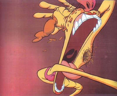
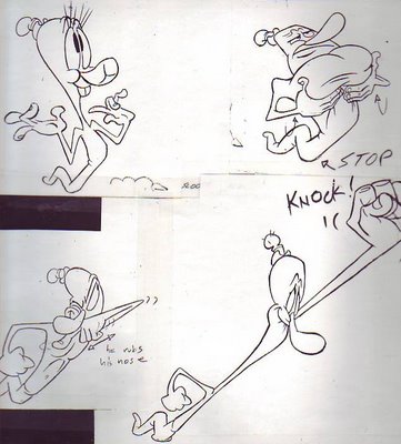
 A commenter said there was a big difference between the colored Sally (above) and the black and white layout drawing (below). Boy, there sure is! The color drawing feels a lot more psychological, a lot more like it's embedded in a story. The color also puts less emphasis on the armpit, which is not a bad thing.
 Here's the Worm (above) preparing to apologize to the human. He's drawn three different ways here and it all still seems like the same character, at least it does to me. I'm amazed at how forgiving animation is! At other places in the story he's drawn differently than anything you see here!
Apparently the audience will accept differences like this as long as you occassionally return to a model and as long as you show differences up front, at the beginning, so people know what kind of cartoon they can expect. Model sheets should be a guide, not a pair of handcuffs.
 No more Worm drawings at hand so I'll throw in another of my ghost sketches (above). I love to draw ghosts. They do commonplace things in an uncommon way.

20 comments:
These worm drawings inspire the hell out of me! I'm getting better at drawing just by looking at your blogs! Thanks!
I love the ghosts going through the chairs- they don't seem bothered at all.
I love their tummies too, they almost bend like fingers- ghosts seem fun to draw! I think I'll try......
Hey, Eddie, if you like Robert McKimson's work, you should check out my latest blogpost. B)
Thanks for posting these worm drawings Eddie. I watch that cartoon all the time.
I agree about the whole model thing. Those who really adhere to the "on-model" mantra don't allow themselves to really experiment and give the characters more variety.
do you have any contact names for aspiring animators/cartoonists.
"Model sheets should be a guide, not a pair of handcuffs."
I couldn't agree more!!!!!!!!!
these worm drawings are so encredible, the color one i LOVE. keep posting these so we can continue freaking out over them
David: Wow! A terrific article on McKimson! I'm a big fan of his animation but I don't think he was a great director. I like "Birth of a Notion" and the best Foghorn cartoons but these aren't typical films for McK. I'm also down on him for supressing Rod Scribner and for ruining the proportions of Bugs.
McKimson's best films are still well worth seeing and studying.
Eddie
>>Apparently the audience will accept differences like this as long as you occassionally return to a model and as long as you show differences up front, at the beginning, so people know what kind of cartoon they can expect<<
That is exactly why I love R&S so much. (Or Spumco related work) The characters are not confined to the model sheet and that makes it way more cartoony. The fact that anything goes and that the characters will be drawn around any situation is what makes it great.
Could you please post drawing of girls?
You are great to draw sexy girls, expecially the cavewomen!
man Eddie those worm pics are awesome
Hi Eddie
These Worm drawings are so friggin AWESOME! I love how the Worm looks like he has that cool looking strech animation movement in him. Keep the Worm drawings coming!
Jesse
"Yeah, and that's the way people are in real life. Human face are extremely malleable and change constantly depending on our mood and stuff, they're tons of distortion that goes by really kvick. That's why when ever sopmeone takes a picture of someone while they're unprepared and they're talking or something they appear to be making a werid face."
Well, that's not the greatest comparison--no matter how extreme the expression, the malleability is only so much; a picture of a person making the most distorted face they can is still plainly recognizable to people who know them.
That's kind of the point with animation, too--with having a "model sheet" at all. It's difficult to exaggerate eyes that aren't defined in the first place as being this or that size and shape!
As far as Eddie's comment about "apparently the audience will accept differences like this..." I know what he's saying, but I don't know who, how or where he got this info about 'what an audience will accept"--who told him? TV audiences don't give feedback. I'm just curious where this theory comes from...
Eddie
When I first saw an image from this cartoon, back before it ever aired on television, I cut it out and saved it waiting forever to see the actual short. I was never lucky enough to catch it (or the Bakshi Shorts from the same program), and I spent years trying to track down a bootleg. Thank goodness for the Internet! Now not only can I see the short, but I get all of this cool behind the scenes stuff.
I still have your "Cartoon Deathstar" Viewpoint article, and I wonder if after all this time are you still sold on the larger story board size?
Also, I assume they do, but does Warner own the "Worm", or did the character rights revert back to you like Bill Wrays "King Crab" Pilot.
Thanks,
James.
Was that from a cel of your "Tales of the Worm" cartoon? It's awesome. You got to put up more animation cels from the short (assuming you have any).
Regarding McKimson, well, personally I enjoyed his early cartoons. IMO, he directed some of the best Bugs Bunny cartoons out there, and when I think of memorable Bugs cartoons, McKimson's best ones usually comes up to mind, along with this of Clampett, that of Jones, Freleng, Avery, and the sole Bugs cartoon by Arthur Davis.
What do you think of the other McKimson brothers, Tom and Chuck? Chuck McKimson, BTW, had a brief stint in directing the 1961 animated sitcom "Calvin and the Colonel", which was literally a remake of the old "Amos & Andy" show using talking animals instead of black stereotypes.
Anonymous: You're right to ask for evidence but that would require a longer answer than I'm able to give it now. Maybe I can do a post about it soon.
Ohjeepers: Bill owns his crab cartoon now!? I'm envious! Warners still owns the Worm film.
"Cartoon Deathstar!?" Is that what that article was called? I'm so glad that you read that piece and that it aroused your interest in the film! I used a lot of over-the-top purple prose in the writing, so much so thatI was surprised when Animation Magazine decided to run it.
Yes, I stll believe that funny storyboards should be done on letter-size paper! The traditional format with several panels to a page is fine for dramatic cartoons. Having all those panels on a page allows the
dramatic artist to see the context of each panel and that promotes awareness of the cartoon as a film. That's fine for a serious film.
Comedy is all about the details. The flow of the film is less important than the gags and the funny drawings. For that big paper works better.
Eddie
Comedy is all about the details. The flow of the film is less important than the gags and the funny drawings. For that big paper works better.
Still, a comedy with a good flow will enhance many of the gags whether they come out of the small details or not. That's one of the reasons Mel Brooks' masterpiece Blazing Saddles works so well. Behind all the great gags is an equally great story backing it up.
Also, I personally love comedy with a satyrical edge to it. (The Daily Show, anyone?) Both those things either good story, satyrical edge, or both are the main support beams that hold the many gags and details together turning what some whacks would call "light and fluffy whimsy" into a masterpiece.
Comedy does not and should not take a back seat to drama in that sense. In some ways, if it's used the way I elucidated above, it can be BETTER than drama (and far less pretensious too).
Eddie
The article was actually called “Elements of Style”, and “Cartoon Deathstar” was just a really great phrase that you used in the article.
I had heard actually heard about the film before the article, but your optimism and enthusiasm completely cemented my determination to see the short! Everything you wrote made it sound like you had the greatest job on Earth, and I was envious beyond belief. I have the article saved in a binder of inspirational articles, along with another great one from around the same time by Ralph Bakshi called “Another Way to Go”.
These articles inspired the hell out of me, and I’ve read them hundreds of times each in order to motivate myself. The notion of working larger makes total sense. I think that there is a real loss of intimacy that comes from most artist working too small.
Thanks for all of the inspiration!
James.
Correction: "Hollywood Deathstar"!
Hi Eddie,
Do you remember which scenes Kelly Armstrong animated in Tales of Worm Paranoia? I'm making a compilation video of her work.
Post a Comment