Thursday, July 25, 2013

A MUSEUM OF FUNNY ART

Every once in a while I mull over the idea of a Museum of Funny Art.


I don't think most museums should give themselves over to this type of thing. Art has been trivialized enough in our time...I'd hate to add to that. But a museum that shows nothing else but funny, well...that's different. Funny art belongs in a funny place. 

What would hang in such a museum? That's a tough one. Everyone has their own idea of what's funny and what's art.


Then there's the question, do all funny things belong under the same roof?  Take this  drawing (above) by John K...it's hilarious and skilled, and certainly deserves to be in a museum...but what kind of museum?  

Some would argue that it belongs in a seperate museum of comics or animation art. That's because the best comic art of the last century is so uniquely effective at getting a laugh that it would reduce the impact of every other art form in the museum.   

Yikes! Is that what the future holds for museums? Is contemporary funny art destined to be parceled piecemeal to various niche collections?


Lots of people can't imagine contemporary funny artists sharing a wall with funny artists of the Eighteenth Century like Gillray (above).


Once you've seen Gillray you can't think of the 18th Century the same way again. Here (above) he parodies the women who wore thin dresses and insufficient petticoats in his time. Now I understand why hoopskirts became popular. 


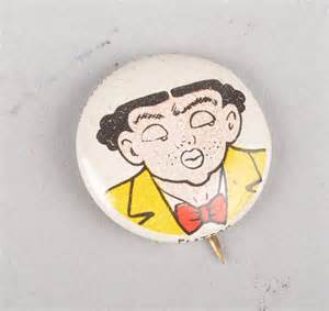
I don't doubt that Gillray would be delighted to know his work shared a wall with our own Basil Wolverton (above).


I think this large painting of Marylin is funny but I have friends who might disagree. 


Animation could provide lots of funny material, but much of it would have to be derived from frame grabs. The originals don't exist. Is it proper to hang frame grabs on a museum wall? I don't know. 


Tuesday, July 23, 2013

HOW TO BUILD AN ARTS DISTRICT (REPRISE)

Oops! This reprint was posted accidentally when I was perusing my archive and hit a wrong button. Google won't let me reposition it til a day has passed, so I'll have to leave it here temporarily. Hmmm...I kinda like this post. On second thought maybe I'll leave it up.


My favorite theaters are small. It's better to have several small theaters in an arts district, even ones as small as the one in the Cruikshank picture above, than to have a single giant one with elaborate parking facilities. Big theaters just don't belong in the intimate walking streets of an arts district.


Influenced by Charles Dickens' theatrical writings, I've come to like small semi-professional theaters where the matinee prices are cheap enough to attract people who wouldn't ordinarily go to live theater. The plays performed should include the classics, but also melodramas with lots of gun fights and fireworks. Maybe some vaudeville and magic shows, too.


Of course you have to entice people into the theaters, and that requires outdoor public displays. I like this idea (above) of putting performer/barkers on second floor balconies and cubicles.


Maybe the the smaller theaters should have fronts on an outdoor arcade like the one above. I like the way Hiroshige (above and below) depicted Eto's geisha district. The low and linear wooden architecture and the room lights spilling out give the street a terrific feel. I imagine the geishas stood on the platform outside the first floor and caught the eyes of passers-by, and the second floor lights must have been mysterious and intruiging. I like the way the shops are open to the street.

Maybe a Japanese arcade could be one of the arteries of the arts district. Others might be a farmer's market, or an arab-type outdoor bazaar.


Wow! Maybe we need a Japanese dinner theater, even if anglo plays are performed there.


Monday, July 22, 2013

MORE ABOUT PICASSO AND MATISSE


As the title suggests, this is about Picasso and Matisse and how their competition with each other helped to spur them both to greatness. I'm not an expert on this subject so if a reader catches a mistake I hope he'll let me know about it so I can change it. 

Anyway, a good place to start is this painting (above) from late in Picasso's Cubist period. He must have gotten bored with Cubism by this time because he seems to be flirting with representational painting again and with brighter color.


I think what jolted him out of Cubism was this picture (above) by Matisse. It was shockingly flat and colorful, and suggested a whole new way of depicting figures.


Picasso responded (above) by going even farther down the road Matisse had taken. Picasso flattened out his characters even more than Matisse had, and intensified and abstracted his color fields. I think he was also influenced by newspaper comics.

Actually this picture is probably from his slightly later "Heroic" period, but it still makes my point.   


Matisse (above) responded to Picasso by introducing colorful patterns into his work. The whole canvas was now vibrant with pattern.


Picasso followed Matisse's background-as-pattern idea (above) and upped the ante by abstracting the background more than his rival. It didn't exactly work. Matisse's backgrounds were warm and inviting, Picasso's were clever but cold. 


Maybe sensing that Matisse was beating him, Picasso devoted himself to making his  shapes and color more rounded and pleasing (above). Finally he hit on the marvelous color and line patterns that we call his "Heroic Period." In my opinion this was when Picasso did his best work.


Finally Matisse died. Without the Frenchman's ideas to spur him on Picasso lapsed into abstraction (above) for its own sake.


These new canvases (above) were cold and lifeless. You see Matisse's influence but Picasso can't find a way to make it work for him.

Interesting, eh?

Thursday, July 18, 2013

ASTRONOMY PHOTOS


Sorry I haven't put up a thoughtful post for a couple of weeks. There's a sort of family reunion going on at my house and it's too hectic to do anything more on the computer than put up interesting pictures. On the other hand, what am I apologizing for? These are very interesting pictures.

The one above is the clearest view of the surface of Venus that I've ever seen. It's from the Russian Venera lander that went to Venus in the 80s. Why haven't I seen these before? These are fascinating!


Venus is in the news again with controversies about the nature of the mysterious giant domes that dot the planet. They look like bacteria, don't they? 


These domes are enormous, but what are they? There's nothing like them on Earth. The color makes the domes appear molten, but I don't think they are.


Here (above) the Dolphin Galaxy collides with an elliptical galaxy. The two galaxies will spin around each other til they merge.


High speed photography has lately revealed a lot of events in Earth's atmosphere that are common but seldom seen because they go by so fast. An example are these electrical floating "jellyfish." You may have seen them and never realized it.


Here's (above) a star-forming region in Orion. The column in the middle had the classic pillar shape until it was blown apart by shock waves from the newly igniting stars.


This (above) is an animated film showing what you'd see if you were close to a black hole. Space is warped there so what you'd see in the sky would be a total field. The view from the back of your neck would be seen simultaneously with what the front of your face is seeing. Click the YouTube icon  which is hidden beneath the lower right corner of the flat black area.


This film (above) shows the formation of a supercell. A supercell is a type of large thunderstorm that can give birth to tornadoes. This one is forming over Texas, but is thought to be a common event on other planets as well.

This video needs to be seen large, in full screen. Enlarge the frame and get rid of the bottom text bar if one appears.


Above, a giant waterspout off the coast of Florida.


One writer believes that waterspouts may be the cause of some of the accidents in the Bermuda Triangle.

Monday, July 15, 2013

CARTOON LAPEL PINS

I LOVE the kind of cartoon buttons people wore on their lapels a hundred years ago. Aging doesn't seem to have hurt them, in fact the acquired yellow tint makes them look even better. 


A lot of these buttons were given out as freebies in packs of cigarettes.


 Buttons like these were everywhere in the 1920s.


Above, a Robert Crumb button? Nope, it's by Rube Goldberg.


Above, another Goldberg! Did he invent the idea of cartoon buttons?


Maybe not. Here's (above) a Yellow Kid button that may have pre-dated Goldberg.


Anyway, lots of cartoon characters have appeared on lapel buttons.  Me, I think a lapel is naked and unappealing without one. 


Goldberg was really good at this. The light watercolor and round lines on the character make a perfect contrast to the angular lettering.


Here's (above) one of his best. The design of the lettering perfectly frames the cartoon. 


Nice!


Al Capp (above) did a lot of buttons...


...and so did Chester Gould.

I've gotta do this for my own characters!


Wednesday, July 10, 2013

MORE ABOUT COMIC POST CARDS

Gee, I miss the vacation post cards (above) that were all over the Jersey boardwalks when I was a kid.


The cards (above) were nice and cartoony, and had a linen veneer that took color really well. They were probably printed in offset but some were so bright and saturated that I wouldn't rule out lithography.


Lots of the cards were risque but they avoided censorship somehow.


Maybe that's because the captions always were always couched in double meanings. Strangely, parents (at least American parents) rarely objected to their kids buying them. Maybe they figured that we wouldn't understand the sex references and, by and large...we didn't. We just bought them for the cartoons.

By the way, the picture above is by Donald McGill, the prolific British post card humorist, and the subject of a well-known essay by George Orwell: "The Art of Donald McGill." McGill came out of the bawdy British Music Hall tradition, the same as Benny Hill.

The Orwell essay:  http://orwell.ru/library/reviews/McGill/english/e_mcgill


For those who aren't familiar with Benny Hill, I offer the brief video above.


Anyway, even today I don't always get the jokes on those old cards. I think I understand the joke above, but I'm not sure.


Boy, some good cartoonists worked in that field (above). Here's a British ad for beer that's done in the vacation card style.


Here's (above) a later vacation card, probably done at the time they were being phased out. Are my eyes deceiving me, or is that drawn by Will Elder?


Monday, July 08, 2013

MALE FACES TO DRAW

Wow! This must be one of the best ever pictures of a screen villain. The subject is, of course, John Carradine.
Carradine had a face that looked great when underlit.


Don't you think this guy (above) looks a little like a Don Martin character?


Who is this man (above)? Whoever he is, he fairly cries out for a caricature. Come to think of it, this pose reminds me of a caricature I once saw of John Maynard Keynes. Hold on, I'll look it up....


......okay, here it is (above), and it's by Low, the editorial cartoonist. I'm not a fan of Keynes economics but he inspired some good caricatures. The poor guy had the problem that lots of tall people have: "What'll I do with my legs?"


I'm not a fan of Samuel Beckett, either (above). I actually had to walk out of one of his plays, "Krapp's Last Tape", after paying full price. There was just no beauty in it, nothing to reward the audience for showing up. I have to admit, though, that he did take a good photograph. Geez, it kinda takes the sting out of old age if you get to look chiseled and cool like Beckett.


David Levine liked to caricature him (above).


And while we're on the subject of craggy faces, how about that ultimate craggy-faced poet....W. H. Auden? In old age his face retained youthful proportions but his skin looked like a road map. 

  
Once more (above), a caricature by David Levine. Levine loved to draw wrinkles.