
 Here's (above) a reprise of the living room picture I posted yesterday. I like this room but I was surprised to find that some of my friends were indifferent to it. Well, I can see why. The book shelves are made with tacky wood, the coffee table looks like it came from a thrift store, the varnish looks like it was applied with a roller, and the fireplace is confined to a tiny box. the room definitely has flaws.
The amazing thing is that it succeeds in spite of the flaws. Against the odds it feels cozy. It's like a big, friendly mutt. An artist could get ideas in a room like this. I'd love to explain why it succeeds but I can't. Why do some spaces work and others don't? Maybe a comparison with some other types of rooms would help.
 Here's a Sears catalogue room (above).
Here's some sterile modern monstrosity. I won't bother criticizing these. It would be too easy. Instead I think I'll compare the room I like to other artistic rooms like the ones below. No I'm not gay, and I don't watch home make-over shows on TV. I just feel sorry for artists who are stuck with depressing environments.

Here's an artsy room (above) that has appealing shapes and colors but never comes across as a room that people live in. The furniture is uncomfortable and isolated in little islands, and there's a pervasive feeling of bad taste passing itself off as good taste. It looks like a furniture museum.

This room is better than average. It's tasteful, sort of. But a house isn't supposed to look like a furniture catalogue, and an artist is supposed to rise above simple good taste. An artist is supposed to be on the track of something profound, something really fundamental in life, and that's missing here. There's too much visual noise. I couldn't think in a room like this.

You see this kind of room sometimes, where one stark color dominates. The variety of the real world is reduced to a single, screaming statement. Architectural Digest loves rooms like this, which is why I never read that magazine.

Here (above) is a room that tries too hard to be rustic. It's a cliche. There's nothing spontaneous about it.
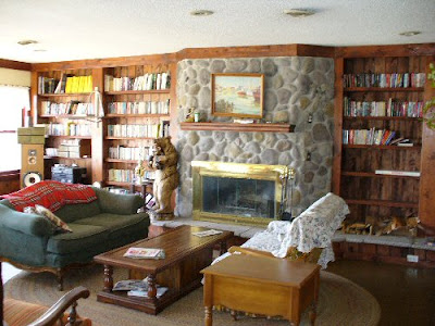 Here we are back at the original room again. Maybe now the naysayers can see why I like this room (above). It has "good vibes," and the right vibe is worth its weight in gold.
The furniture is plain and comfortable and the fireplace and book shelves have a nice, quietly dynamic design. If you know anybody who has a knack for making rooms with good vibes like this, beg them on bended knees to decorate your place. Pay them well for it, and take their advice, no matter how crazy it sounds. It's as important to have stimulating, cozy, sociable rooms as it is a good winter coat or a car. Bad or awkward rooms can kill your creativity.
21 comments:
"It's as important to have stimulating, cozy, sociable rooms as it is a good winter coat or a car. Bad or awkward rooms can kill your creativity."
Thanks for the good advice, Eddie. I need to fix up my room in a little while, since it looks like a storeroom (it was a small dinning room, once upon a time.)
BTW, I had recently done a post on Ub Iwerks on my blog, and it's available to all to read. I hope you'll enjoy it.
Just an observation. Is it because the particular environment you like has a lot of books/bookshelves and a mini library or study feel to it that make you feel more comfortable? Thats what struck me at first as why I also felt it more comfortable than the others.
For me, its important that all my books are always near where I do any sketching or writing as a source for reference, inspiration or to just make me feel more scholarly.
Maybe thats a critical component to your "cozy" feel. I know it really is for me. Just a lot of books around me tend to make me feel at ease and more creative for some reason. I always set up a space where my drawing table and books are next to each other with a big comfy chair
The stone helps, too. And the bear. I'd probably heave the furniture. I could do better. Maybe change the front on the fireplace. The bear stays.
The most important thing about my workspace? Is it bright? Regardless of how it's decorated, I really feelthe most comfortable with BRIGHT light, preferably natural, I love big windows.
Just a random/creepy observation: That Sears catalogue room looks surpisingly like the kind of rooms/studios they use to shoot mainstream porno movies in. Down to the cheap drywall, the cheap and tacky furniture and books and nicknacks obviously picked up in a yardsale.
I actually like the lighting in the sterile modern monstrosity.
See ya
Steve
This is fun Eddie! Searching for cool rooms...
Some cool rooms via google!!!!
My work room!
The lounging around room!
The entertainment room
The dining room!
Bedrooms!
What my place looks like on the outside!!
I prefer the 'modern monstrosity' to any of the others you posted. Overall I like the clean lines and space of mid-century / Eames era decor and architecture.
Example
All it needs is a big bowl of cashews.
Kali is right, no dinning room is really complete without a stuffed polar bear looming over the table.
Off Topic:
Hi Eddie,
I thought you might like this cranky article railing against modern "quirky" entertainment, from the Atlantic Monthly. It reminded me of you for some reason.
And if I had to chose a room, it's be either the Modern Monstrosity or the One Dominant Color room.
That Sears catalogue room looks surpisingly like the kind of rooms/studios they use to shoot mainstream porno movies in.
-Or half the TV rooms in the U.S.A.
The biggest difference is in what kinds of toys you find lying around.
That Sears catalogue room looks surpisingly like the kind of rooms/studios they use to shoot mainstream porno movies in. Down to the cheap drywall, the cheap and tacky furniture and books and nicknacks obviously picked up in a yardsale.
BWA HA HA HA HA HA HA HA HA!!!!
Anyway, the first room looks really cozy. I could just curl up on the couch, read a good book, and listen to really good music. Yes, some of the furniture is a little dated (that coffee table is so 1970s), but it looks very homey.
I also liked the 4th room alot (the baroque/gothic dining room). I love the color schemes used. I would have that design in my house.
While I loved the 3rd room (the modern/clean lines room), it's not livable to me. I would always feel like I'm going to break something.
The Sears catalog room is ugly! It's cluttered, plain, and so 1980s with the valances and the brass-and-glass tables. It also looks like a really lame "model apartment" room.
The red room - GAAAAAAAAAHHHH!! So much red!!! Red rum! Red rum!
I think the white walls kill most of the alternate rooms you posted. The couch cover throw almost kills your "flawed but works" room (although, it is conceivable that the couch cover is there for a reason, and there may be a monster underneath).
What really saves your "Flawed But works" room is BOOKS. All of the others do not looked lived in at all. None of the people setting up those rooms could even get a job as prop master on the typical sitcom set, which generally, look more natural.
But I do like the lighting in the most modern room. There is a lot to be said for lighting, and light sources.
There's too much visual noise. I couldn't think in a room like this.
Oh yeah? Since WHEN?
Now you take that back right now! Because not one person who knows you will buy this whopper! ; D
Seriously, I thought you luuuuurved clutter(artistic, bookish clutter)!
Ah well.
I will have to weigh in with Steve and say that while I grew up very much NOT a fan of modern, "sterile" design, my tastes have matured and now I have a much wider range of styles I can dig--though I wouldn't want to live in all of them.
I too thought the light in that "sterile" space is beautiful, and the height and airyness is lovely too.
I'd agree with you about the decoration except for the lovely carpet, which for me makes it fun and happy instead of dull and boring.
But in any case, where oh where are the references to your dream home? Carl Larsson's house
I actually printed out a picture of kliban wore it as a mask with a t-shirt i made that said "I RUINED CARTOONS" in Magic marker and walked around toronto all day. I actually met Judith Bixby and she seemed horrified and perplexed LOL!
my room sucks :(
there doesnt seem to be much i can do to fix it its a red green and white monstrosity (with horrible yellow lighting
i want my room to look like an old shamans room
Rodd, Hans: Books are decorative, no doubt about it. It's like being surrounded by old friends.
Kali: Nice rooms, but the ceilings are a bit high.
Jenny: There's some good modern design and occassionally you even come across modern stuff that's cozy and has good vibes. You have to look hard though.I still have a love/hate relationship to clutter.
I'll bet you're a good decorator. Why don't you take some pictures of one of your favorite rooms and post them?
Jennifer, Steve: I like the lighting in the modern room too but it's small compensation for the hotel lobby sterility.
High ceilings and big windows are what I like about recent living room design, but architects go too far and make all the rooms like that. Some rooms should have low, sheltering ceilings.
These ideas are really cool! I could use them for my new home in apartments in pittsburg ca. It's exactly what I needed for my redecoration project.
I am just stunned by your home decoration ideas. Kudos for such creativity! catania apartments broomfield co
Post a Comment