Showing posts with label interior decoration. Show all posts

Wednesday, March 02, 2016

BEFORE AND AFTER ROOM MAKEOVERS


As you probably know,  I'll be moving in a few months and I've done some research into "staging." In case you don't know the term, in the housing biz that's another word for "where you put the furniture." Some of the best staging advice I've found came from before-and-after comparisons that I found on the net.  Take a look at these examples and see what you think.

By the way, Most of the interior decoration shown here isn't to my taste. I'm just isolating the elements that interest me and ignoring the rest.


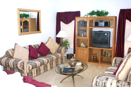
 Wow! Compare the "Before" and "After" photos above. What a difference moulding makes! The architect made the ceiling too high but the moulding saves it.


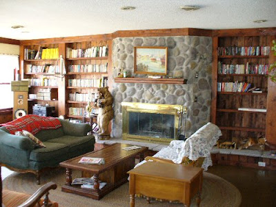
 Boy, leather furniture (above) looks great in wood-paneled man caves but it doesn't work in suburban living rooms. It attracts too much attention.  Fabric covered furniture does a better job of fitting in.

This comparison (above) also underlines another truth, that hardwood floors should never be stained too dark.


Let me digress for a moment to address another issue: does white fabric covering on sofas and chairs really work? It certainly does here (above) but then again this was designed by a professional to look good in photography. Could ordinary people pull this off?  Is white too girly for manly men? Is it practical?  It'll show every spill, won't it?  I don't know what to think.


 I have lots of books that'll require shelves, so I won't need decorative, elephantine cabinets like the one above.  I do like the table in front of the stone wall on the "after" side,  and the two black table lamps look great. Ditto the window curtains. Ditto the hanging light. The desk design in the after photo doesn't work IMHO.

This is an interesting photo because the elements I singled out...the black table, the two lamps, the curtains and the hanging light... are all items which wouldn't impress me much if I saw them out of context in a store. Professional decorators seem to have an eye for what works well in combination.


Wednesday, June 26, 2013

WHY I NEVER GOT MY BACHELOR PAD

When I was a kid I was certain that my future home would look something like this (above). I really liked the bachelor pad look, even when I was too young to know what a bachelor was.


 I figured I'd have a chemistry lab (above) in the basement....


...and an electric lab next to that. You never know when you might need to resurrect the dead.


I'd have a sophisticated telescope (above) on the roof.... 


....and a Bat Cave and Batmobile. I thought I might even dabble in fighting crime.


Oh, and control panels....I wanted lots of electronics with viewing screens and control panels!


So, what happened? How come I never got my manly dream house (apart from the expense, of course)?


This (above) is what happened. I grew up and got married. 


Don't get me wrong, I'm glad I got married. I wouldn't change that for the world. It's just that American tradition gives the girl a big influence in home decoration. If you're a guy and you muscle in on that your neighbors will think you're a monster.


Let's be clear about what we're talking about here. The girl who's going to decorate your manly dream house may have developed her taste while growing up in rooms like this (above). Yikes!


That extra room you were thinking of turning into a safari room?


Your wife may have other plans (above) for it. 


Let's face it, women are different than us. They're...I don't know how to say it....refined! When when they sit down to dinner they imagine they're on some country estate having high tea.  


You and I, being men, naturally think of a meal as "grub." We like to imagine ourselves in a cabin in the in the Klondike eating seal blubber with Bowie knives.


Fortunately rational people can resolve their differences by compromise. In the above example, the husband's desire for a safari motif neatly combines with the wife's desire for girly things. Problem solved...I think.

BTW: I showed this post to my wife, who thought it was funny but also appallingly inaccurate. I had to talk her out of demanding equal time.


Friday, March 15, 2013

HOW ARTISTS SHOULD LIVE


This, believe it or not, is a post about the need for fabric and textural variety in interior decoration. I need to make that clear right away because at first glance the whole post looks like a bunch of girls in their underwear. That's because all the images here come from adult sites. I just didn't know any other place where I could find the kind of colorful interiors I had in mind. I'll try to clean up the pictures where I can. It's the best I can do.

Anyway, I think the house shown here (above) is an Australian photographer's collective. This is the kind of environment artsy people of all kinds thrive in. Artists require color. We have to see it all around us every day. It's not enough to put colorful posters on the wall. Color requires texture and pattern to read effectively, and that means fabric, plants, stone, glass, and wood grain.


Look what these windows (above) do for this room.


I like fabric draped over furniture. The example above is a little too girly for my taste, but it makes the point.


I love this picture (above) because it really sells the idea of a sleeping porch that doubles as a sort of greenhouse or potting shed. It's a whole room devoted to color and texture, and to the changing quality of light as the sun makes its way across the sky.

How do you like the muted yellow bedspread and the purple and indigo pillows? What do you think of the weathered old rug on the floor and the artfully sagging old cot?


It wouldn't cost much to build a structure like this (above). The roof is corrugated translucent plastic, and the screens are weighted plastic screening fabric that hangs like drapes. I like the Japanese-style frame.


I like rooms that are drenched in light in the daytime, and are dark and mood-lit at night. For a spot that's dark no matter what the time of day I suggest luxurious, thick, heavy, dark green...either as a carpet (above) or as a drape.


Bed linens (above) are a great excuse for complex color. The patterns here remind me of washi, the Japanese colored rice paper that you see in craft stores.


You can't get away with fabric this flamboyant (above) unless you're a girl. On the other hand, Matisse probably had stuff like this around the house.

********************

Well, that's all I have to say about that. On another subject, I'll be posting twice a week from now on, probably on Monday and Thursday. That's one day less than before. The reason is that since December I've gotten more than a third fewer hits. The number is still pretty good, but I'm a ham and I miss the larger audience. Maybe it's for the best because this'll give me more time to work on income-producing projects.

Sunday, March 08, 2009

WHAT KIND OF LIVING ROOM?


What kind of living room do you prefer? Me, I like ones with lots of light, like the one designed by Carl Larsson above. Actually, my source might have mislabeled this picture. It looks more like a sewing room to me, but its nice and cheery, and there are elements that would be nice in a living room. Click to enlarge.


Amazingly, after decades of modernism the classic American living room (above) still holds up as an ideal.  The problem is that this was created for the kind of tasteful New England interiors they were building in 1920, and it looks a little out of place in most modern houses.


Some people (above) should have their license to decorate revoked. Really, if you can't do it yourself you should plead with a friend to help you out. 

Maybe more chords would help.


Here's (above) a sculptor's living room. The furniture is islands of marble and there's a forest of tall, awkward sculptures. It's completely impractical, but I like the idea of a house that reflects the vocation of the owner.  One kind of house for the accountant and the blacksmith is tyranny.


Yikes! A modernist nightmare (above)! I'd go nuts if I had to live there.


Funny living rooms (above) are seldom comfortable.


Sometimes people's hobbies (above) dominate the room.


Am I imagining it, or are living rooms dwindling in significance these days? Nowadays living rooms are often showcase rooms and the real action takes place elsewhere, in the rec rooms and kitchens. Some people have even converted their living rooms into offices. 


Some living rooms are absurdly small now.


On the other hand, kitchens have grown enormously. They're cozy, social spaces now.  The kitchens shown above and below belonged to the sculptor, Alexander Calder.


This wall in Calder's kitchen looks like it's hewn out of rock, but I'll bet it's plaster or stucco.


Eames, the designer, favored the austere living room shown above. You can't get much more minimal than that. I think Steve Job's house was like this.


Here's (above) another view of the same room. The sofa is pushed out of the way by a big, wooden slab. I guess Eames liked slabs.


Most hippies had little use for living rooms. Sometimes they didn't even furnish them. For hippies, the important thing was the bedroom, and above all, the sacred water bed.


The exception was rich hippie futurists who were partial to fuzzy living rooms with soft, rounded edges. 


Come to think of it, hippie musicians liked living rooms, too. The rooms were dimly lit and had lots of funny furnishings. 


The last living room I saw and liked was the one in Woody Allen's "Play It Again, Sam." It recently played on the Turner channel. It was funky, but seemed like the kind of place where memorable events would happen.


Sunday, September 09, 2007

MORE HOME DECORATION FOR CARTOONISTS


Here's (above) a reprise of the living room picture I posted yesterday. I like this room but I was surprised to find that some of my friends were indifferent to it. Well, I can see why. The book shelves are made with tacky wood, the coffee table looks like it came from a thrift store, the varnish looks like it was applied with a roller, and the fireplace is confined to a tiny box. the room definitely has flaws.

The amazing thing is that it succeeds in spite of the flaws. Against the odds it feels cozy. It's like a big, friendly mutt. An artist could get ideas in a room like this. I'd love to explain why it succeeds but I can't. Why do some spaces work and others don't? Maybe a comparison with some other types of rooms would help.
Here's a Sears catalogue room (above).


Here's some sterile modern monstrosity. I won't bother criticizing these. It would be too easy. Instead I think I'll compare the room I like to other artistic rooms like the ones below. No I'm not gay, and I don't watch home make-over shows on TV. I just feel sorry for artists who are stuck with depressing environments.


Here's an artsy room (above) that has appealing shapes and colors but never comes across as a room that people live in. The furniture is uncomfortable and isolated in little islands, and there's a pervasive feeling of bad taste passing itself off as good taste. It looks like a furniture museum.


This room is better than average. It's tasteful, sort of. But a house isn't supposed to look like a furniture catalogue, and an artist is supposed to rise above simple good taste. An artist is supposed to be on the track of something profound, something really fundamental in life, and that's missing here. There's too much visual noise. I couldn't think in a room like this.


You see this kind of room sometimes, where one stark color dominates. The variety of the real world is reduced to a single, screaming statement. Architectural Digest loves rooms like this, which is why I never read that magazine.


Here (above) is a room that tries too hard to be rustic. It's a cliche. There's nothing spontaneous about it.


Here we are back at the original room again. Maybe now the naysayers can see why I like this room (above). It has "good vibes," and the right vibe is worth its weight in gold.

The furniture is plain and comfortable and the fireplace and book shelves have a nice, quietly dynamic design. If you know anybody who has a knack for making rooms with good vibes like this, beg them on bended knees to decorate your place. Pay them well for it, and take their advice, no matter how crazy it sounds. It's as important to have stimulating, cozy, sociable rooms as it is a good winter coat or a car. Bad or awkward rooms can kill your creativity.