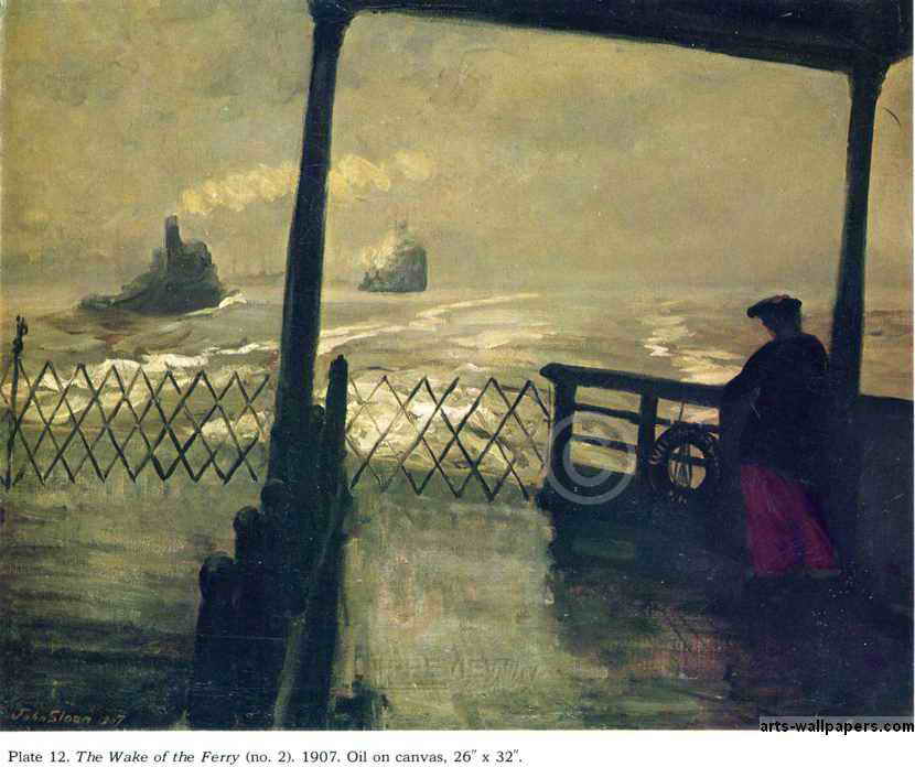
I came across this painting (above) when I was a kid. It was a cover illustration on a book of short stories by Jack London, which included his famous story about ferries and The Hudson River called, "Fog."
I'm guessing this picture is by John Sloan. It seems odd that the ship should be so low, almost at sea level. You'd think the water would spill in and sink the ship. I imagine that ferries have big, heavy keels to stabilize them. It also seems odd that such a dirty, gritty, big-city boat could venture out into raw nature. Of course, nature itself seems pretty dirty and soupy here.
Here's (above) a famous painting by Reginal Marsh. He seems to be equally repelled and attracted by the people he paints.
Here's (above) one of Red Grooms' city scenes. Grooms has fallen out of favor lately, but I still like the guy. Few modern painters capture the dirty, crazy, wonderful intensity of New York the way he can. In film, I'd say that Bakshi captured that in
Fritz and
Heavy Traffic.
hmmmm. Grooms pictures would make great "pop-out" greeting cards.
Above, a Grooms newstand. I don't know why, but buying a newspaper or magazine from a stand like this was a lot more fun than buying the same item from a bookstore. Maybe it's because you get to enter the dingy, 16-watt world of the news troll. Maybe it's because the magazines seem so current and exciting in this format, as if they were just snatched off the printing press.
Lots of New York artists did subway themes, but none as successfully as Grooms (above). It's hard to imagine that all those different kinds of people managed to co-exist, even for the short time it takes to ride a train.
Glackins took this fascinating photo of a real New York subway interior. Parisians especially are always lamenting how cold and impersonal people appear when riding the Metro but, really, all big city mass transit is like that. I kinda like it that way.
Here (above) Glackins captures a girl having her hair dyed while the public watches. I wish all architects had a print of this in their offices. We need to have buildings that are designed for people watching. People like to watch other people at work, which is one of the reasons McDonald's is such a success.
Is this picture by Sloan? I can't tell. The arching bridge is a great idea, one which we should duplicate today.
I think this picture of a small indoor theater is by Glackins. I imagine the same theater hosted boxing and equestrian shows. I like the fact that it's somewhat upscale and elegant. We need small modern theaters like this.
Here's (above) a picture by the man I consider America's most wrongly neglected artist, Cecil Bell.
For a long time I couldn't figure out why Bell (above) was so neglected by the critics, but now I think I know. It's because only a small number of his pictures are so stylistically sophisticated that they can be said to stand alone. You only get an idea of the great soul of the man when you have a chance to see a whole book of his pictures.
Unlike Reginald Marsh, Bell had a great deal of affection for his subjects (above). He knew there was nobility in the city dwellers he saw all around him, that the unique quality of the city wouldn't last forever, and that the future would have need to be reminded of it.
What a keen observer Bell was! Your first impression of the scenario he paints (above) is how seedy it is, but if you look at it long enough the wider context becomes apparent. You see the technology, the feel for how much work must have gone into making it, the way that humans divide themselves into vocations, the idea that people...even when pursuing raw basics like sex...never stop being thinking creatures, and can still be regarded as possessing destinies and interesting life stories.
I envy art students who are able to study in New York City. The teachers are among the best the country has to offer and the environment is stimulating. Look at the interesting and unorthodox model and the beautiful backdrop behind her. Look at the intensity of the teacher.
Here's (above) a student's homework assignment from The School of Visual Arts. I've often thought that one of the best things a student can do to learn color and composition is to do lots of rough, vague color thumnails of classic paintings. I was suprised to see that a teacher at SVA agreed with me. Now that's a class worth taking!


+El+station+Turnstile,+1940.jpg)


4 comments:
Yeah, New York City seems so awesome. Its bad for me, because I live in Virginia. all the best art or animation places are either in New York or all the way in California. :(
I'm definitely going to New York this summer and I'm very excited for it. I've had a strange craving to visit Brooklyn for some reason and I'm also am going to visit the Rutgers campus too in New Jersey! The NY artwork looks amazing. I had even thought about attending the Pratt Institute at one point, but realized how expensive the school is.
What are your thoughts on Boston, another great American city that I was fortunate enough to grow up in (not exactly, but I lived in a smaller town right outside of the city for a couple of years), in my opinion?
Two of my fave classes when I attended SVA were with Jack Potter (imagine a mix of Yul Brynner and a hyper-caffeinated Mr. Clean) for drawing...and also Jerry Moriarty for Drawing from Memory (exactly as implied). Eternally grateful!
Wonderful artists all: I am a huge fan of Mr Grooms, having seen his Ruckus in it's original form down near the Trade Center in 1979 (?) I am a native of the big apple but have been living in the outer reaches...soon to be moving back to the area. I love the Arts Students League, and had some memorable teachers over the years. I look forward to studying there again ( and SVA)
Post a Comment