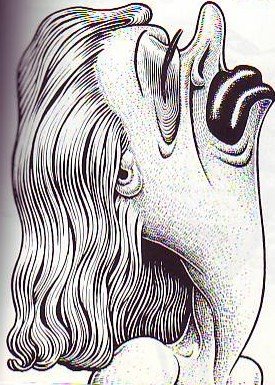
What's funny?
Well, for starters, this drawing by Basil Wolverton (above) is funny. Everyone I've shown this to laughs. Why do we so seldom see funny drawings like this in modern animation? 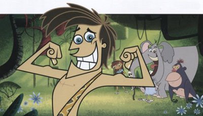
It's odd to think that TV animation contains so few funny drawings. You'd think a few would slip in there, if only by accident. I'll bet the artists who designed the TV poster above have drawings of theirs pinned to their cubicles that are 10 times funnier than anything in the poster they made. Why is this? What's wrong? What's responsible for this? Why are there no crisis meetings when a poster or a comedy show fails to include funny drawings?
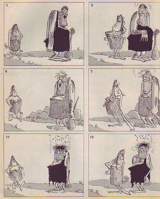
I love drawings like this (above) because they so obviously exist just to get a laugh. The artist isn't ashamed of being funny, he flaunts it! They're not mildly amusing products for an era of reduced expectations...they're gloriously and unashamedly reaching for a laugh! If I see one more mildly amusing animated feature or TV show I think I'm going to explode. The audience is hungry for funny drawings! Why are we witholding them?
 What's funny? Well, for starters, this drawing by Basil Wolverton (above) is funny. Everyone I've shown this to laughs. Why do we so seldom see funny drawings like this in modern animation?
  It's odd to think that TV animation contains so few funny drawings. You'd think a few would slip in there, if only by accident. I'll bet the artists who designed the TV poster above have drawings of theirs pinned to their cubicles that are 10 times funnier than anything in the poster they made. Why is this? What's wrong? What's responsible for this? Why are there no crisis meetings when a poster or a comedy show fails to include funny drawings?
 I love drawings like this (above) because they so obviously exist just to get a laugh. The artist isn't ashamed of being funny, he flaunts it! They're not mildly amusing products for an era of reduced expectations...they're gloriously and unashamedly reaching for a laugh! If I see one more mildly amusing animated feature or TV show I think I'm going to explode. The audience is hungry for funny drawings! Why are we witholding them?

56 comments:
HERE HERE!
there there
Good on yer fella
eddie: Gosh, everybody's smiling in that George Of The Jungle drawing, so it's really happy 'n' fun,right?
What would you suggest for a funny version of this thingy? I know you're busy, busy, busy right now, but how about a sketch?
Maybe that'd make for an interesting assignment for all we wanna-be (and "established") cartoonists...
Maybe that'd make for an interesting assignment for all we wanna-be (and "established") cartoonists...
Well, I'd prefer the original George of the Jungle designs myself (the way Jay Ward and Bill Scott intended it) but I'd totally do that assignment in a heartbeat. B)
It's sad. I find in a production, everybody's first priority is to just get their scenes approved. In order to make something funny, you have to stray from the model sheet, wich usually means a supervisor coming back with your drawing saying "why did you do this?" Funny drawings are very subjective, so unless you are the person in charge of everything, it is "safer" to do a safe, on model drawing. (Thus watering down the entire production)...... Plus it is a real art to make a truly funny drawing. Achieving "funny" is usually not fun at all. It is hard work! (unless you are drawing in your own personal style that you are comfortable....a luxury in animation that few experience).
With that said, nothing beats a funny drawing. That's what cartoons are all about.
mildly amusing products for an era of reduced expectations...
The chilling truth of that sentence hit me like a kidney punch. Man, that smarts. I wish I had a theory to contribute.
Nobody seems to want to put in the effort it takes to make those funny drawings. Everything is streamlined and deadlined, so they just reach into that "Stock- Box" of characters and expressions to hurry up and fill in the blanks before next week's story sequence.
I'm with what Brian R. said also--people are so afraid to take some chances lest some obscure thing about it offend someone.
I don't watch new cartoons anymore; they hurt my eyes too much.
Blair: Wow! A terrific summation of the problem! This begs to be answered in a longer format. I'll try to do a post about it!
Craig: A great idea but I don't have time! You're right though, it's kind of piddling to criticize someone else's effort if you're not prepared to back up what you say with a drawing of your own. My apologies to the guys who did the George poster.
This reminds of something Jerry Lewis said about criticism. He said only people who don't perform for a living make harsh, public criticism of performers. People who perform for a living are always sympathetic and helpful because they know what the problems are and how easily things can go awry. Thinking about that makes me feel like a rat.
Even so, I don't want to get off the track. Where are the funny drawings?
“Whatever happened to funny cartoon drawings?” he asks! That's the $64,000 Question.
You know the answer as well as anyone, Eddie: Corporate Scum controls modern cartoon content, and Fuck-Us Group Testing (which, essentially, is canvassing the creative thoughts of unwed mothers) has become the new arbiter of public taste, especially when it comes to what is still thought of as children’s programming.
The upshot is that outside of Spumco, the concept of funny cartoon drawings doesn’t even exist. Entertainment is always the last priority.
Don’t get me started, I deal with this shit on a daily basis at Warner’s – where I scream myself hoarse every day to no avail. Solve this problem and global warming will seem like a piece of cake.
You bring up another wrinkle – the whole tricky concept of the creator’s estate.
As is well known, the widows of Jay Ward and Dr. Seuss have been having a contest for years - to see which one can desecrate the memory of her dead husband worse.
I would’ve said they were about neck and neck – but this latest George Of The Jungle abomination just catapulted the widder Ward over the finish line.
(Gee, I never thought I'd agree with anyone named 'spizzerinktum'!)
Mike: LOL!!!!!!!!
Quote: "...it's kind of piddling to criticize someone else's effort if you're not prepared to back up what you say with a drawing of your own. My apologies to the guys who did the George poster."
Oh, my! I didn't mean to imply that you were unjustly ranking on the folks involved with the promo art or anything like that. (Though I see how one could read it that way.)
But what would be a better idea for just such a piece?
For instance, I recently saw a drawing of Ren & Stimpy dressed up as "fops." They were sporting hughe trouser zippers whose only function was to be unzipped in order to show how truly uncouth they are.
Would showing George prostrate, having slipped on one of Ape's banana peels be an example of a "better" idea? Not a hilarious gag, but it would give a springboard for interesting positions, facial expressions, etc. Would George be embarrased? Stoic? Clueless? All three? What about Ape's response? Would the other characters be in the background laughing? If so are they laughing at or with George?
...and would they be "drawn fuuny?"
I think it's been so long that people no longer know what is truly funny. I can't tell you how many times I've sat down to watch a show or animated sitcom with someone, both of us being totally silent through the whole show, and afterwards the friend saying, "That was funny." But then why the hell wasn't he laughing the whole time?! It's like if you tell someone a joke that bombs, and they say, "That's funny." But they aren't smiling or giggling!
I'll bet if you went on the street and showed random people the George poster and said, "Is this funny?" Most would say "Yes" without any emotional reaction. Its like if they don't find it funny then there must be something wrong with them.
For example, Eddie: When you typed "LOL!", I sincerely hope you did indeed laugh out loud!
People need to be reminded that often times what makes something funny is the fact that it is offensive! Or at least potentially offensive to someone else! The more unique and potentially offensive a drawing is, the funnier it is, in my humble opinion.
Eddie. I forgot to say in my comment that I'm a big fan of your blog....I check it every day! Thanks for getting my brain working every morning.
craig d: i think there is a distinction between the funny drawing and the funny situation.
shows like south park create situations that can be construed as funny (like hybrid cars causing a "smug" cloud).
i think the distinction of funny drawing is that the way in which the characters look or act is funny in itself. there is this one walk cycle in boo boo runs wild when they first come out of the cave that makes boo boo look SO stupid that it's hilarious. Same with the Wolverton drawing. It doesn't need pop culture references to support it. the drawing itself just holds this air of frivolity about it.
THAT'S a funny drawing. the character doesn't need to be doing anything extraordinary in context, but just the visceral treatment of the drawing itself.
OTOH, there are examples of cartoons with "funny drawings" galore where the actual action or show is meaningless. Funny drawings are static; funny animation or a funny scene is another thing altogether.
Mike for the love of Pastromi, please make a blog!!!!!!!!! you are so smart
(not that anyone asked, but I just realized my drawings are funny but only compared to coloring books from 1987 containing my little pony fetus)
I think people are just too lazy to teach an entire crew of artists to draw funny. It's easy for Basil Wolverton and Don Martin to make funny cartoons because they are funny artists and they do it on their own. But if you need an entire crew to draw something funny, forget it. It's just too much work to teach that many people to draw GOOD. Much easier to make someone draw one expression on a square face with perfectly round (boring) circle eyes.
Modern cartoons bore the hell out of me. And it's because most cartoonists are too lazy to make me laugh. It's a LOT of work to draw funny. Sometimes I KILL myself over it. But on rare occasions that it can actually happen, all the hard work is worth it.
>>In order to make something funny, you have to stray from the model sheet,<<
Well you could start by having a funny model sheet in the first place.
People just draw what the current trend is. Today that means flat, fake UPA drawings with thick outlines.
No one thinks it through past that.
Funny drawings would make lots more money than trendy drawings.
Everybody likes to laugh.
I think the last people on earth who would want flat stylized drawings would be kids. They don't care about trends or being pseudo-hip. They want pure entertainment.
The people in charge of kids' entertainment today are being very mean to them.
HELL YEAH !!! MORE FUNNY DRAWINGS ON TV IF U WANNA SEE SOME FUNNY DRAWINGS GO HERE http://makinita.deviantart.com/gallery/digitalart/?view=1&order=5&limit=24
IF U DONT THINK THAT THIS DRAWINGS ARE FUNNY I WILL TAKE MY GENITALS AND GIVE THEM 2 A HOMELESS GUY SO HE CAN PLAY HACKY SACK WITH THEM
NUFF SAID
HEHE
or here http://makinita.deviantart.com/gallery/digitalart/?view=1&order=5&limit=24
Dude, here's the god's honest truth: the pictures you posted above? The one by Basil Wolverton? The Cave Man one? Dude, those are OLD. Like, way, way, WAY out of date. As in funny, like Mad Magazine, back in 1982.
But hey, newsflash - guess who we get paid to make cartoons for? KIDS. 6 - 11 year old KIDS. Cartoon Network says "make me a show for six to eleven year olds that's funny". If we show up with a Basil Wolverton model pack, we'd never make it past the pilot.
See - stay with me now, I know this is complicated... 6-11 year old kids don't really think Basil Wolverton is hip. WOW! Holy SHIT man, have you turned on a television in the past ten years? Kids like Spongebob. And Lazlo. And Fairly Oddparents. NOT Mad Magazine. Danny's doing some crazy shit with the Eds, but even THAT maintains a modern feeling. The caveman stuff? Not so much.
I bet I'd find a similar post on a cycling site; some guy complaining that these fancy new mountain-bikes with a hundred different speeds that weight two pounds are a joke, that "back in my day, we made do with a single gear, and the frame was forged from iron!". Well, it's not the dark ages any more, we've evolved. Style has evolved. We don't wear plaid polyester suits anymore. It's 2006.
It's 2006 now. Style? It's changed. What's FUNNY has changed. Kids don't watch Lauren and Hardy. Know why? BECAUSE IT'S NOT FUNNY TO THEM ANYMORE. Go on, give it a whirl. Sit a ten year old down in front of a Three Stooges DVD and see how long he sits still for.
We make shows for TV that airs TODAY. So they gotta look current. Or we're off the air and waxing with our old art pals about "the way things used to be".
MTL: Maybe you should ease up a little on the arrogance until you learn something about spelling, grammar and sentence structure. Or are those concepts too old-fashioned for you, too?
By the way, what's a " Lauren and Hardy", Einstein?
u SHOW EM Mike woooooooo
Don't criticize how the guy worded his message, criticize the message itself. What does spelling, sentence, and grammar have to do with cartoons? Sidestepping the debate by bashing someone's grammar is like a big sign saying "I can't think of any way to refute that!"
Not that it ain't possible. Just saying. Its how flamewars start.
Anyhoo, I would say that it's up to the creators and artists behind the content being created to set the style and determine what's "current", not the kids. But today its backwards. Its one person making something that turns out to be popular and then a thousand other wannabes say "This is the hot new style!!!", and copying the same style over and over again, only faster and cheaper until you get the watered down nonsense you get today. They try to please the largest amount of people possible and eschew any form of creative innovation for fear it might alienate people.
And sure kids probably don't give a shit, but it wouldn't hurt to stimulate their little brains a bit more than the current crop of toon shows seem to do!
>>See - stay with me now, I know this is complicated... 6-11 year old kids don't really think Basil Wolverton is hip. WOW! Holy SHIT man, have you turned on a television in the past ten years? Kids like Spongebob. And Lazlo.<<
Both of which are poor-man's versions of Basil Wolverton.
>>Sit a ten year old down in front of a Three Stooges DVD and see how long he sits still for.<<
How about for ....hours? I've introduced many a little cousin to 3 Stooges, Betty Boop, Popeye, Daffy Duck and they watch them over and over again and imitate everything they see in them.
Hey, Eddie, I just did a series of funny drawings. At least I hope you think so. Some patented Fitzgerald feedback would look great next to it. B)
It's drawings like this, I think, that are the main high point of Spongebob, and I don't think it would be successful without them. It should have more of them, true, but it does put it a steps above most shows which only have a few drawings in them, the ones from the model sheets.
The George of the Jungle poster looks like it was made by cut-and-pasting the character designs. They could have had him smack into a tree in a funny way and drawn it funny. The uniform line thickness really doesn't help things, either.
Also Eddie if you want to post more images you can host them on photobucket.com for free.
Hi Eddie
If John K sells the 2 Dirty Pussies as a series would you still do the voices of Ciggaretts The Cat & Bugs Pussy?
I love how some animators & cartoonist don't only draw, animate or write cartoons but they can do voices too.
It's like what you say about John
"If your good at one thing your good at five things"
That is a great theory.
Jesse
Eddie,
Speaking of "Simpsons", there's a work print for the first episode that's part of the bonus for "Simpsons" season 1 DVD. The animation actually got warpy and off model...and I mean that in a good way.
Sadly, Matt Groening and the producers hated it and made the studio in Korea to redo the entire thing over with more "on model" designs.
I think that says something.
Oh, and regarding about posting John K and Gary Larson (not "Larrson") stuff. While I don't know about John K., I would avoid Larson, because Gary himself said that he prefers no one to post his cartoons on the internet (you can read the letter at http://www.creators.com/index2_anotefromgarylarson.html), so I'd respect the artist's wishes and use someone else's work. Maybe Bill Watterson (although Universal Press has been a pain in the ass over copyrights these days)
MTL: Nothing in your argument convinced me that audiences don't want to see funny drawings. They may want to see them done in a contemporary style but they still want them to be funny.
Spongebob is one of the best kids comedies out there so I'm less inclined to criticize that show than some of the others. I even voted for it to get an ANNIE the last time ASIFA consulted me. But what does all this have to do with funny drawings?
I don't know why you assumed that since I put up two older drawings that I'm completely resistant to anything new. This blog is full of references to John K and he's one of the founders of the contemporary style. 'Chances are you're working on a project that was influenced by John. I was a big fan of Gary Larson when that strip was in the paper. I like a lot of new stuff but I'd like it a lot more if only it contained more funny drawings. I can't imagine how any one who loves cartooning could disagree with that.
Everybody: The comments on this page are some of the best Theory Corner's ever gotten. The problem is that they were so good that there's no way I could answer them all thoughtfully. If it's any consolation I do reread comments all the time and I have a feeling a lot of other people do too.
Quote: " craig d: i think there is a distinction between the funny drawing and the funny situation.
K-jammer: You're right. I went off track by confusing a drawing of a funny situation with a just-plain-old funny drawing. There's nothing really "funny" going on in either the Wolverton or Martin drawings; they're just "drawn funny."
Perhaps I should've asked, "What could be done to make the George of the Jungle drawing funny?" and let it go at that.
David G: Kudos on your pose reel (for lack of a better term). I especially liked the last section with the green character jumping all over the place.
i agree. i'm tired of working on boring unfunny dialogue driven cartoons.
Modern Toon Lover, your arguement is pretty weak on the basis that shows are made for kids, and need to adhere to contemporary styles to appease "modern toon lovers." Kids are impressionable and when you plug anything into their heads for long enough they are going to like it regargless. If a kid grew up with a racist dad, he would probably turn out a racist as well. If a kid grew up with crappy cartoons, he would probably ending up liking them(that is why a lot of crappy 80's cartoons are still revered today because of the nostalgia factor attatched). There is something that lots of new kids shows lack, and that is appeal. Funny drawings have appeal, crappy watered down designs don't. Also, where they hell do you think all the new styles got their STYLE from? it is called postmodernism. it is called borrowing and bastardizing. Eddie's examples of Funny drawings were pulled from MAD, because any issue of mad magazine is bound to have funny drawings regardless of whether they are from 1982 or 1963. Eddie could have posted one of his own drawings (but i am sure he is modest about stuff like that) and used that as an example. It's people like you that ruin cartoons and continue to desecrate the artform, by thinking its okay to make crappy cartoons. great work.
"Don't criticize how the guy worded his message, criticize the message itself. What does spelling, sentence, and grammar have to do with cartoons?
Sidestepping the debate by bashing someone's grammar is like a big sign saying "I can't think of any way to refute that!"
Refute what? He's entitled to his opinions. I don't agree with them, and I think they're uninformed, but he's still entitled to them. What I took issue with was his sarcastic, superior attitude. He should have better manners when he's addressing someone (Eddie) who can dance circles around him intellectually.
A sub-literate person shouldn't make snotty, know-it-all cracks aimed at belittling people who are obviously more knowledgeable that he is. He hasn't earned that right and he doesn't deserve it.
You can either be ignorant and modest about it - or informed and arrogant. But someone who is ignorant AND arrogant is going to get his ass kicked every time. In this case I was happy to oblige.
"He should have better manners when he's addressing someone (Eddie) who can dance circles around him intellectually. "
Eddie, you should draw yourself dancing around the less genius and add it to your acting for animators post- The Jolly Wise Man Dances On Top Of The Belligerent Snooty Faced Commenters While Bobbing And Juggling
I think they are one reason why they are a lack of funny drawings in the media is executives who meddle in artist's affairs.Today's executives in the animation industry are oppressing artists, they are making artist's conform to today's low standards. I recall one blog by a Dreamworks artist who has amazing art yet you see none of this on screen thanks to oppressive executives.The animation industry needs more producers like Leon Schlesinger was,he left art to the artists.
"It's people like you that ruin cartoons and continue to desecrate the artform, by thinking its okay to make crappy cartoons. great work."
Yeah, I am also tired of the "The animation is bad but the writing is great" excuse.
"The Jolly Wise Man Dances On Top Of The Belligerent Snooty Faced Commenters While Bobbing And Juggling"
...Naked, of course.
>>It's drawings like this, I think, that are the main high point of Spongebob, <<
That drawing fits into Eddie's "grotesque" category, but it's not funny like the Don Martin and Basil Wolverton examples.
But it IS probably the reason kids like it. At least it tries to be weird on occasion which is a sort of form of creativity as opposed to being on-model.
"But it IS probably the reason kids like it. At least it tries to be weird on occasion which is a sort of form of creativity as opposed to being on-model."
Actually John, all of the weird faces have specific model sheets on how to do them correctly. I saw my friend at Nickelodeon doing a storyboard test- all of Spongebob's many faces and poses had like ten pages of direction. So yet again it fails along with everything else.
"...Naked, of course."
Except for his nipple and butt tassels- and spinach stuck in his teeth.
mike f. said... "The Jolly Wise Man Dances On Top Of The Belligerent Snooty Faced Commenters While Bobbing And Juggling"
...and what, do you imagine, is he juggling?
Methinks MTL is a prankster masquerading as a straw man. But, as proven herein, I've been wrong before.
My God, that character design for George of the Jungle really sucks.
They pilfered Jay Wards characters and applied Butch Hartman's design style and still this is the best they could do?
Modern Toon Lover, you may be paid well for what you do, but you are still a fraud.
"Actually John, all of the weird faces have specific model sheets on how to do them correctly. I saw my friend at Nickelodeon doing a storyboard test- all of Spongebob's many faces and poses had like ten pages of direction. So yet again it fails along with everything else."
Actually KF: What you saw were pages that were compliled pages of storyboard poses with good, non-generic acting, from the likes of Aaron Springer, Paul Tibbitt and a few very talented others.
Vincent
>>But there HAVE been lots of funny drawings on that show,<<
I agree with that, I've seen a few. You have to wait quite a while for it to happen, and the show wasn't designed for it.
They were lucky to get a few talented folk like Vincent and Aaron who would jam funny drawings into any show that they could get away with it.
Even crappy shows like that new George of The Jungle are influenced by Fairly Odd Parents/Dexter's Lab, which came from 2 Stupid Dogs, which came from, guess what, Mighty Mouse and Ren & Stimpy.
Jorge, you're wrong there. I know the guys who created 2 Stupid dogs, and they had zero to do with MM or R&S, nor were they influenced by it as far as design or style goes. *shrug*
John: You have a good point when you say that the Spongebob designs don't lend themselves to funny drawings.
Wouldn't it be even more difficult to take the new GOTJ designs and make funny drawings out of them? Personally I think when you make drawings that are that geometric, you remove too much of the humanity. But stuff like early Flintstones and Quick Draw McGraw is stylized and lends itself to funny drawings because the designs are already funny.
I want new Looney Tunes directed by John K & produced by Spumco!
John Kricfalusi is a real genius...who loves classic Looney Tunes (Avery,Clampett,Jones & Tashlin)
and he have a dream-team in Spumco (Eddie Fitzgerald,Vincent Waller, Jim Smith,Richard Pursel,Fred Osmond, Katy Rice and Nick Cross)
Try this --> http://johnkstuff.blogspot.com
Modern Toon Lover said...
Dude, here's the god's honest truth: the pictures you posted above? The one by Basil Wolverton? The Cave Man one? Dude, those are OLD. Like, way, way, WAY out of date. As in funny, like Mad Magazine, back in 1982.
But hey, newsflash - guess who we get paid to make cartoons for? KIDS. 6 - 11 year old KIDS. Cartoon Network says "make me a show for six to eleven year olds that's funny". If we show up with a Basil Wolverton model pack, we'd never make it past the pilot.
See - stay with me now, I know this is complicated... 6-11 year old kids don't really think Basil Wolverton is hip. WOW! Holy SHIT man, have you turned on a television in the past ten years? Kids like Spongebob. And Lazlo. And Fairly Oddparents. NOT Mad Magazine. Danny's doing some crazy shit with the Eds, but even THAT maintains a modern feeling. The caveman stuff? Not so much.
I bet I'd find a similar post on a cycling site; some guy complaining that these fancy new mountain-bikes with a hundred different speeds that weight two pounds are a joke, that "back in my day, we made do with a single gear, and the frame was forged from iron!". Well, it's not the dark ages any more, we've evolved. Style has evolved. We don't wear plaid polyester suits anymore. It's 2006.
It's 2006 now. Style? It's changed. What's FUNNY has changed. Kids don't watch Lauren and Hardy. Know why? BECAUSE IT'S NOT FUNNY TO THEM ANYMORE. Go on, give it a whirl. Sit a ten year old down in front of a Three Stooges DVD and see how long he sits still for.
We make shows for TV that airs TODAY. So they gotta look current. Or we're off the air and waxing with our old art pals about "the way things used to be".
Y'know, if the pott-head demographic would just stop watching TV, we wouldn't be in this mess anymore. >:P
But hey, newsflash - guess who we get paid to make cartoons for? KIDS. 6 - 11 year old KIDS. Cartoon Network says "make me a show for six to eleven year olds that's funny". If we show up with a Basil Wolverton model pack, we'd never make it past the pilot.
Would that be because YOU KNOW kids would not think it's funny, or because you are afraid that some executive would not understand it? I wonder how many times somebody told JohnK that kids won't want to see Ren and Stimpy?
It's 2006 now. Style? It's changed. What's FUNNY has changed.
I remember when Ted Turner colorized all the Flescher Popeyes because "kids won't watch something in black and white."
Did anybody bother to ask kids? Does anybody want to see those colorized popeyes today?
Has what's funny changed, or has the pipeline been throttled down by people who have no clue what funny is, but for some reason have the ability to stand between creators and their potential audiences?
I'm maybe just paraphrasing something that's already been said, but I think the funny drawings have gone, because nobody has the courage to stand up for them in a hostile climate. MAD magazine wants funny. Nick and CN do not. They want whatever they think won't make parents upset. They don't care about entertaining kids, they care about SAFETY. They don't want cartoons, they want carseats.
Don't most creators most want to please the people who can green light their shows? That's how you eat.
I'm not sure if that explains why the new George of the Jungle has to look so damn bland, but I think it does explain why it looks so damned happy. Maybe it's the overspill of everybody trying to ape something that did get greenlighted.
those drawings are not funny.
The problem I have with that George Of The Jungle pic is that it's so obviously part of a format, as evidenced by the background characters. If that were an inbetween of George morphing into some abstract, grimmacing Cubist monster, maybe that would be funny.
Anyways, I think the real problem lies in the production teminology. I experienced this while working on college TV with self-proclaimed geniuses.
We'll be in trouble until we get words like CONTENT and PROPERTIES out of the language of production.
CONTENT = "We gotta fill the space with something."
PROPERTIES = "They'll tune in for the name."
So you turn on the TV and get "stuff" and "names".
Comedy and tragedy are very tightly linked. Modern belief is to shield children from any kind of tragedy, for fear of hurting the child. Ergo, most comedy is removed for the same reason.
In a tremendously funny bit from "Stimpy's Pregnant", an innocent motorist is brutally gunned down on the highway simply because he was in the wrong place at the wrong time. His expression, and his frantically rolling up the window, pushed this from tragedy to comedy. The same principle applies to funny drawings as well. Many of the funniest have a tragic underpinning, which is where most of their humor comes from.
People aren't conditioned to see purely visual humor anymore. It's all verbal jokes or "funny actions" with a definite timing.
>>It's all verbal jokes or "funny actions" with a definite timing.<<
Not in anything I've seen. I see curse words, pop culture references, TV-risque subject matter, and all with monotonous formula timing.
funny drawing is very nice.......
by
Tamil Actor vijay
Post a Comment