Showing posts with label don martin. Show all posts

Wednesday, May 11, 2016

THE NATIONAL LAMPOON VS. MAD MAGAZINE

Until I saw a documentary on the subject at Steve's, it never occurred to me to compare the National Lampoon to Mad Magazine. After all, the two magazines were aimed at different audiences: Mad to high school kids and the Lampoon to college students and twenty-somethings. I liked both for different reasons, though Mad had already slipped into a rut by the time the Lampoon came out.


Later on, the Lampoon got in a rut as well but that didn't stop them from declaring war on Mad. Yes, war! They said Mad wasn't funny!


Well, I guess it wasn't by the time the Lampoon skewered them.


Yikes! NL's parody of Mad (above) was scathing. It drew blood! The Mad people must have had a bad day when they read it.


Mad took the criticism (above) to heart, however and, though it took years, eventually Mad adopted the Lampoon's adult, drug culture, dead baby joke, Republicans-Are-Mentally-Defective stance.


The problem was, that approach was obsolete by the time Mad adapted it.  Generation Y and the Millennials weren't averse to radical politics but they preferred to wrap it in a different kind of comedy.  


Mad lost its way. 

Since I'm a fan of the old Harvey Kurtzman Mad, I thought I'd mention a couple of things that magazine did right.


For one thing, Kutrzman's Mad (above) aimed for kids and adults alike. I'm not against cartoons for adults but the fact remains that kids form the core audience for cartooning and probably always will.  Deal them out and you deal out the future of your medium. You create a generational divide.


Also, Kurtzman's Mad put an emphasis on the unique artwork. The Lampoon was a writers magazine that used artists; Mad was an artists magazine that used writers. Too much of the Lampoon art was generic. 

Mad also had some first-rate artists in their best years, artists like Don Martin (above), Wally Wood and the young Jack Davis. The Lampoon had artists too, but they were mostly there to illustrate writers ideas. The writer was the star.


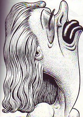
At the risk of stating the obvious, writers and artists see the world differently. If writers had conceived the Mad "Beautiful Girl" cover (above) they would have picked a specific target to make fun of...some female in the news who they thought deserving of ridicule. Mad artists like Basil Wolverton (above), on the other hand, seemed to prefer to make fun of the very idea of beauty. That's what artists do best.

Why that is, why cartoon art works best when addressing the human condition in general, I can't explain. Haw! I can already think of exceptions to what I just said, but for the sake of brevity I'll stick with my point.


Friday, February 08, 2013

DON MARTIN LOVERS

I'm sick as a dog and I really shouldn't be posting at all, but Valentine's Day is almost here and I couldn't resist putting up these pictures of young lovers by Don Martin. Yep, that's what young love looks like, alright! I've been there, haven't you? 

Haw! There's the girl's dad in the background!


If I wasn't so sick I'd scan all of Martin's strip but, as it is, I'll have to settle for this (above). That's a photo of the original artwork!


Here's a picture that was described as passionate on the net, but seems tepid compared to the Don Martin. Cartooning really can express some emotions better than any other medium!

Friday, November 23, 2012

BLACK FRIDAY SHOPPERS

 How was Thanksgiving? Get enough turkey? Yeah, Thanks to Milt and Katie I did, too. I could hardly stand.


How about Black Friday? Get any bargains?


Yikes!


I stayed away from the stores on Friday, and greatly regretted it by the time night fell.


After all, it's our job as cartoonists to personally witness things like this. We should be in the thick of it, sketching ideas and impressions and getting photos.


There was humanity in the raw, and where was I? I was listening to records at Mike's house.


If I had it to do all over again, I'd don an old lady wig, grab the zebra-striped handbag I bought at the 99 cent store, and wade into the Black Friday crowd bashing people with my purse. It would make a great blog post!

Geez, I lost priceless opportunities on both Halloween and Black Friday. Am I going to blow Christmas, too? It seems to me that the only fit place for cartoonists in the last days before Christmas (apart from being with family and friends and charity functions) is at the busiest, most crowded, most agonizingly stressful stores we can find. Camera batteries should be fully charged, wallets left at home lest we fall prey to the buying frenzy.


Sunday, October 18, 2009

WHAT IT'S LIKE TO BE SICK


I'm afraid I'm still down with the flu. I'm just too zonked to write a blog. Cold pills help a lot, but when I take them too frequently I get dizzy, so I have to go off them once in a while...like now. Anyway, I thought I'd post some of Don Martin's drawings, the ones where the characters look the way I feel. Nobody draws sickly and gruesome like Don Martin!


Here (above) the character is depressed rather than sick, but the guy sure looks sick. That first drawing where he drinks and claws the bar is genius. Click to enlarge.


Here's how I feel (above) when I'm not on cold pills.


Sick people (above) are self-absorbed and oblivious to the world's problems. That's one benefit of being ill: you're closer to the zen ideal of being in the here and now. It's strangely comforting to put your worries and anxieties aside and see yourself as a shellfish on a beach struggling to survive.

The next time a family member gets sick, I highly recommend cleaning their room for them and giving them fresh, clean sheets and a meal in bed. Do it for them even if they're not quite sick enough to need it. Being pampered when you're under the weather is one of life's great pleasures. If you were hit by a car and had minutes to live, I wouldn't be surprised if one of the images that would flash before your mind was how good it felt to slip between crispy sheets and have a smiling face give you a cup of soup.


Tuesday, June 30, 2009

DON MARTIN THANKSGIVING


I ate too much to post. I'm gonna sack out on the sofa. See ya' Thursday!

BTW: The drawing is of course by Don Martin.

Thursday, August 16, 2007

MORE EARLY DON MARTIN


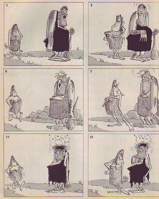
Here's another example of the early Don Martin style. The foreground guy looks soooo grungy! How do you like the Virgil Partch-type rake fingers? How about the class clown way of drawing shoulders high up around the ears?

I love a good set-up and this one is a classic: an intense, miserable guy is observed by an ecstatically happy guy with an ear-to-ear grin. It's the time-honored collision of an optimist with a pessimist (he's not really a pessimist but the word fits the point I'm trying to make). You can feel the electricity in the air!

When you think about it, a lot of comedy is about the collision between two different personality types. Cartooning does it better than live action because we can push the caricature farther. It's puzzling that so many TV cartoons don't seem to realize this. You see so many shows with similar characters who all hang around with each other. There's no conflict, no electricity.

Anyway, how do you like the way the happy guy taps on the other guy's back? Martin doesn't make a big deal about it but it's worth commenting on because tapping is funny. It means the nosey, intrusive tapper is invading your space and touching the precious membrane that holds your guts inside. Pecking is funny. Peck frequently, in real life and on the page.


The grinning guy pulls a bottle out of his jacket and the pickled guy downs it. He's a grunge ball troll and he knows it. He has nothing to lose. The swallow pose is great and I love the way the rake fingers enfold the glass.


Another virtuoso swallow followed by a moment of internal awareness.


Here's (above) the ending where all the characters grin at the reader. The soda water has made them blissfully happy! Of course this is a fake ad but it manages to communicate what it is that I like about real ads, namely that they promise happiness to anyone who afford the right toothpaste... which is just about everybody.
Buying happiness for a dollar is simultaneously funny, shallow and profound. Am I the only one who agreed with the hero's end speech in the film, "How to Get Ahead in Advertising?"

Tuesday, July 25, 2006

WHERE ARE THE FUNNY DRAWINGS?

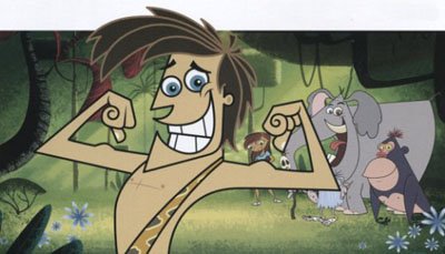
What's funny? Well, for starters, this drawing by Basil Wolverton (above) is funny. Everyone I've shown this to laughs. Why do we so seldom see funny drawings like this in modern animation? It's odd to think that TV animation contains so few funny drawings. You'd think a few would slip in there, if only by accident. I'll bet the artists who designed the TV poster above have drawings of theirs pinned to their cubicles that are 10 times funnier than anything in the poster they made. Why is this? What's wrong? What's responsible for this? Why are there no crisis meetings when a poster or a comedy show fails to include funny drawings?
I love drawings like this (above) because they so obviously exist just to get a laugh. The artist isn't ashamed of being funny, he flaunts it! They're not mildly amusing products for an era of reduced expectations...they're gloriously and unashamedly reaching for a laugh! If I see one more mildly amusing animated feature or TV show I think I'm going to explode. The audience is hungry for funny drawings! Why are we witholding them?