Norway (above) has to be one of the most beautiful places on Earth, and the people there are some of the most appealing. They have a lot of talented home furnishing designers there, in fact I just stumbled on one their sites on the net. It belongs to a woman who doesn't identify herself, but who has pretty good taste in design. See if you agree.
She likes a lot of what Americans have come to identify with IKEA, but she favors the most pure version of it. That's understandable. Norway has an even more extreme climate than Sweden. With long, dark winters, Norwegians naturally favor white (above). What better way to deal with the gloom than to capture every available photon and bounce it around the room?
Even her color accents are tinted with white, as if they were weathered. She has a way of bringing the harsh climate outside into her home and taming it. The tiny, delicate areas of color remind me of wildflowers, which I imagine have a special significance to mountain people.
Her inside windowsill decorations include lots of glass, including glass bottles filled with plants. Maybe the clear crystal of the glass reminds her of ice. Maybe the green is a symbol of hope.
Reminders of ice crystals (above) are everywhere. This designer has not only made her peace with snow and ice...she celebrates it.
Lace is a kind of cloth version of ice crystals and she uses it on lamps. The rest of the room (above) is a bit too minimalist for my taste but the light fixture is a good idea. It kinda looks like the full Moon, too.
At night the white walls take on a pleasing warmth. Very nice. it makes the room look like a comfy alcove in a country barn.
The textiles designed by this artist (above) tend to be rustic. Most of the colors are tints.
This banner looks like an explosion in a bikini factory.
Summer doesn't last long in this part of the world and when it comes, people cling to it. She doesn't just situate her dining table under a tree, she surrounds the tree (above), milking every ounce of green it has to offer.
For a color accent she puts out delicately colored tulips. Boy, Norwegians really know how to savor the Summer.
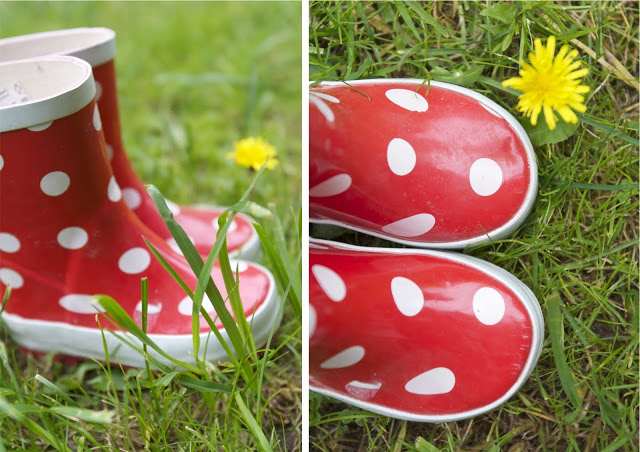
I noticed these boots in one of her photos. I'm sure she didn't invent this look but I like the fact that she appreciates it. When I was a kid little girls wore boots of fire engine red. These newer boots are a delicate, weathered, Scandinavian red. Very nice.