Showing posts with label ikea. Show all posts

Saturday, May 27, 2017

THE NEW IKEA SUPER STORE

Ikea just opened up it's largest American store, IKEA Burbank, and it's a doosey! The exterior is ugly in the extreme...a real eyesore... but if you can resist the temptation to flee you'll be richly rewarded.


The interior space is so large that some common items are doubled up just to fill the void, and the result is sometimes startling and innovative...like that long table above, for instance.

It's actually two tables joined together. Sure, it would be great for a large dinner party but this is 2017 when food is considered medicine and you can't find two people who share the same diet. I like the table because it invites thinking about large work surfaces. I like to spread out when I work, don't you?


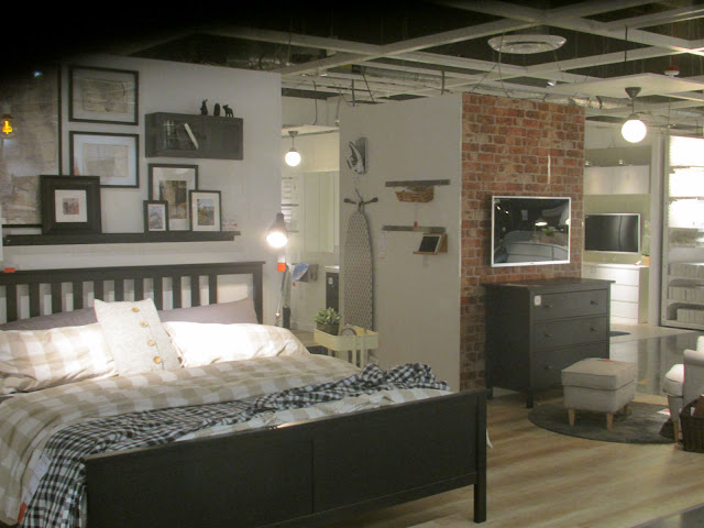
 Wow! Size really does matter! The large space surrounding the bed prompts a re-thinking of what a bedroom really is. This is a room for a creative and productive person who loves his work. It's one where the sleeper wakes up in the middle of the night and works for a couple of hours before going back to sleep.

In recent decades a lot's been written about the creative nature of sleep. We acknowledge that when we reach a creative impasse and decide to "sleep on it." How often have we all woken up and spent half an hour on our backs immobilized by our half sleeping brain still sifting through ideas?


Above, that's the identical bed in a different diorama surrounded by a different layout. Holy Cow! The store is so big that it can afford to show two ways of setting off the same furniture!


Here's an interesting concept: the room within a room...a sort of thinking area near the dining room table in the foreground. I get some of my best ideas during meal time. How convenient it would be to have a nearby room where I could work on those ideas immediately after having them.


 Here's (above) the thinking room interior. Notice the low, fake ceiling.


Notice also that the room is mostly white and the pictures on the wall are generic. The idea is to minimize distractions.

BTW, I'm aware that suddenly leaving the table to work is rude to the friends who remain. Obviously an idea like this requires modification to work in the real world. It's just fun to think about.


Saturday, January 02, 2016

BEDROOM DESIGN


Here's (above) a bedroom from Frank Lloyd Wright's Heart Island House. What do you think of it? For me it's too formal, too much like a terrific living room that just happens to have a bed in it. It lacks..."bedroomness." Wright was a peerless designer of living rooms but his imagination failed him when it came to bedrooms and kitchens.


 Ditto for Cliff May, another of my favorite architects. Bedrooms seem to have bored him. This one (above) looks like he devoted no thought to it at all.


For good bedroom ideas I find myself turning to less well-known designers. What do you think of this dark, low ceiling bedroom (above)? It's cozy and fun...evocative, too. It's like a Goldrush cabin in the Klondike or the Captain's quarters of an old 19th Century sailing ship.

I like to imagine that this room is one or two steps down from the level of the rest of the house, and that prompts an interesting question: is it a good idea to graft a cool historical bedroom onto a stylistically modern house? I'd say yes, but lots of people would disagree.


I like this (above) well-lit Ikea bedroom. I don't like what looks like a plain particle board cupboard on the extreme left, but the general layout seems fine. You can't see it from this angle but the headboard of the bed is a bookshelf on the side that faces the window. There's room to walk back there.


Here's a modest but still cozy bedroom idea, also from Ikea. It's cheery and even pleasingly austere, as if a nun sleeps there. Once again the lighting makes a big difference.


Monday, December 14, 2015

RAMBLING THOUGHTS ABOUT ARCHITECTURE


Hmmmm. I've decided that what I really want to live in is a converted 19th Century railroad station like the one above, but (Sigh!) what's the chance of that?


 Of course, a neo-craftsman house would be nice, too.

So would a one-of-kind artist's house like the one Carl Larsson built for himself!


Here's the same house with the color pumped up.


Wouldn't it be great to have a family room with a built in theatre like the one above? All family rooms should include a stage.


 On another subject, I take a lot of abuse from friends who don't understand why I like Ikea so much.  For them the store (above) is just a repository for cheap furniture. They're not getting the revolution that's happening there. Ikea is taking apartment design and applying it to homes. There's a youthful,  just-getting-started-in-life quality to some of the dioramas you find there, and I find them exhilarating. .


Traditional living rooms (like the blue room to the right) are meant to be fortresses against the world. They're a place of rest. The presumption is that you've had a hard day at work and just want to read the paper or watch TV. Not so the Ikea living room. Their living room is a place to work and think as well as rest. It's meant to be stimulating. That's the real revolution that's happening in architecture now, and no large company embodies that more than Ikea.


On my last trip to that store my mind was blown by the room above. Look at those greenhouse struts; you could hang anything on them! The room is so playful, so adaptable to any use you might have for it, and yet it's right next to the kitchen which is meant to be functional. In a real house you'd probably choose to have a permanent eating spot close by, but to put an anything room off to one side is pure inspiration!


Tuesday, August 18, 2015

NEW IDEAS FROM IKEA

"I was at IKEA yesterday and I thought I'd put up a few of the pictures I took there. Most of them are from an exhibit showing how IKEA might furnish really tiny apartments and homes. I thought they did a good job. See if you agree."


Here's (above) the living room, dining room and kitchen, all in one continuous space. It's a bit claustrophobic, but not nearly as much as you'd expect. Having white furniture and white walls makes the area seem bigger. 


 You'd need a bigger table than this, even with the extender up. Even so, it might be okay if you're eating alone.


 Extra chairs hang from hooks on the wall.


Off the kitchen, on the other side of the wall behind the sofa, is a corridor containing the bathroom and closets.

  
There's (above) the bedroom. It's pretty minimal. The bed looks like it only sleeps one.


One last picture: here's (above) the living room as seen from the dining table. You see another glimpse of the bed in the background. Storage boxes on top of the right hand bookshelves are black which hides them in shadow and reduces the storage clutter. Interesting, eh?


"I wonder if IKEA sells many of those "small space" suites? Maybe there's a lot of people who'll sacrifice space to live in exciting, expensive places.

I used to know a magazine editor who worked in Manhattan and she lived in a very tiny but well-furnished apartment. She seemed happy. Hmmmmm. Maybe it does work for some people."


Before I close I'll throw in a couple of unrelated IKEA pictures. I like this craftsman, "Seven Dwarves" style oak table. It would make a good desk. No...wait a minute... you couldn't slip file drawers under there. Maybe something simpler would be better.


I also like this idea (above) for a womans sewing room. The idea of a movable clothes rack situated in front of a three-part mirror is an interesting one. You'd have to roll the rack away to use the mirror, but that's okay.

I'll add that this is the way I imagine rooms must be like in the garment industry.  I like rooms for the home that are informed by working areas in the real world. I like to be reminded of commerce, of making things to sell.


"Anyway, that's it! See you later!"


Thursday, November 01, 2012

INTERIOR DECORATION FROM NORWAY


Norway (above) has to be one of the most beautiful places on Earth, and the people there are some of the most appealing. They have a lot of talented home furnishing designers there, in fact I just stumbled on one their sites on the net. It belongs to a woman who doesn't identify herself, but who has pretty good taste in design. See if you agree. 

  
She likes a lot of what Americans have come to identify with IKEA, but she favors the most pure version of it. That's understandable. Norway has an even more extreme climate than Sweden. With long, dark winters, Norwegians naturally favor white (above). What better way to deal with the gloom than to capture every available photon and bounce it around the room?

Even her color accents are tinted with white, as if they were weathered. She has a way of bringing the harsh climate outside into her home and taming it. The tiny, delicate areas of color remind me of wildflowers, which I imagine have a special significance to mountain people.


Her inside windowsill decorations include lots of glass, including glass bottles filled with plants. Maybe the clear crystal of the glass reminds her of ice. Maybe the green is a symbol of hope.


Reminders of ice crystals (above) are everywhere. This designer has not only made her peace with snow and ice...she celebrates it.


Lace is a kind of cloth version of ice crystals and she uses it on lamps. The rest of the room (above) is a bit too minimalist for my taste but the light fixture is a good idea. It kinda looks like the full Moon, too.


At night the white walls take on a pleasing warmth. Very nice. it makes the room look like a comfy alcove in a country barn.


The textiles designed by this artist (above) tend to be rustic. Most of the colors are tints.
This banner looks like an explosion in a bikini factory.


Summer doesn't last long in this part of the world and when it comes, people cling to it. She doesn't just situate her dining table under a tree, she surrounds the tree (above), milking every ounce of green it has to offer.


For a color accent she puts out delicately colored tulips. Boy, Norwegians really know how to savor the Summer.


I noticed these boots in one of her photos. I'm sure she didn't invent this look but I like the fact that she appreciates it. When I was a kid little girls wore boots of fire engine red. These newer boots are a delicate, weathered, Scandinavian red. Very nice.


Thursday, November 17, 2011

GLORIOUS IKEA!!!!!

After more than a week spent mostly in bed with a flu,  I finally felt well enough to venture into the world to buy a present for my kid. I ended up at Ikea. Man, what an experience!

I love the place. It's so bright and inviting, and full of ideas. An awful lot of them are bad ideas, but you forgive that because every once in a while you stumble on something that's a brilliant rethinking of something you thought couldn't be improved.


But like I said, it's not all good. Some of the kids rooms (above) bordered on child abuse. How do you like those High Kitsch flat-colored cabinets or the deliberately generic design of the ladybug? Why is the yellow stool so dorky?


On the other hand, you gotta love these bunk beds. Kids like stuff like that!


What do you think of this work space (above)? It's so tiny! Surely big ideas require big writing surfaces. Ikea does make beautiful, sturdy wooden desks but they're called dinner tables. I have lots of ideas for desk designs. Maybe I'll do a blog about them sometime.


Boy, Ikea sure is good at cheery! It's hard not to smile when you see a room like this, even if you'd go nuts if you had to live in it. This is the kind of place Stimpy would design for Ren, the kind of place that would provoke a curmudgeon into homicidal rage.


I think here in America we're shielded from the weirdest stuff (above). It would be great to go to Sweden and see what's for sale in the Ikeas there.


I think the native Swedish Ikea is chock full of promotions for their prefab houses and office buildings, and for plans for office interiors. Come to think of it, I think Ikea designs whole communities. Fascinating! Disney might have gone this route if he'd lived longer.

BTW: I haven't forgotten the Beatnik stuff. I'm working on it now, and it's a ton of fun. I was just too spaced out to do it earlier in the week!