Showing posts with label frank lloyd wright. Show all posts

Thursday, February 16, 2017

FRANK LLOYD WRIGHT MISTAKES

Like most people I'm a huge fan of Frank Lloyd Wright, but he's not above making mistakes.  Nobody is.  I thought it might be fun to review some of his faux pas.

Let's face it. A lot of his chairs don't look very comfortable.

Some of the worse offenders are his plywood chairs, like the one above. This chair is missing its cushions, but even so....

For a time Wright fell in love with plywood and used it to make visible walls even in his upscale houses, something few modern architects would do.

A more serious problem is his lack of interest in bedrooms and kitchens.

Here's (above) a Wright bedroom. It's a living room with a bed in it.  Taken alone it looks great but imagine a whole house where every room is a living room...it's just too much of a good thing. I see homes as a confederacy of different moods and purposes, the way nature itself is.


Here's another bedroom. It feels like a family room or a study that's doing double duty.


Here's a kitchen that also looks like a study. You get the feeling that the man never spent much time in kitchens.


Lots of people think of landscaping as an art form but the subject seemed to bore Wright.  All he seemed to want around his houses (above) was a nicely mowed lawn. 


His low-budget Usonian houses seemed all the more stark and unappealing on the plain lawns. 

Does anything I mentioned diminish the architect's stature in my eyes? Nope. Not a jot.  He's still the greatest builder of homes that I'm aware of.  I only mean to point out that nobody's ever perfect, not even the greatest geniuses.


Tuesday, August 30, 2016

GERMAN-AMERICAN RAILROAD STATIONS


I'm a big fan of the German built - North American railroad stations that were all over the East Coast and Canada about 140 years ago. 

Even small towns had terrific train stations in those days. I guess it was a matter of civic pride. 


 I'm curious to know who designed these. Were they built by German American immigrants or by European Germans who came over for specific projects then went back home again?


Surviving European German rail stations from that period (above)...the small to medium ones... don't look like the American type.

If our stations were designed by European Germans, and the Euro-Germans themselves didn't have them, then the good architects of this movement must have been lured over here by money, creative opportunities or by difficulties at home. There's a story there...I wish I knew what it was.


I'll assume that German immigrants built these beautiful things. I don't think most people realize how creative these people were. Look at the German-style "el" stations in New York City. They're first rate.


 I see a dynamic mixture of styles: Arts and Crafts, Gothic, traditional German, Victorian, and another style which I still don't know the name of, which deliberately exposes the structure of a building. It proudly puts the engineering right out there, where you can see it.


Geez, I think I even see a precursor of Expressionism in there (above)!


The German American railroad style even influenced Frank Lloyd Wright. That's his Nathan Moore House, above. It's like a railroad station you can live in...only with sharper angles.


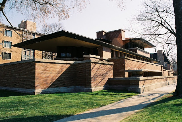
It even influenced his famous Robie House (above). It looks like a train station, doesn't it? The roof especially reminds me of something you'd see on railroad loading platforms.

Why is all this important' you ask? Because the German American rail station style is one of the best wide-spread architectural styles ever invented in the Western World. Maybe the very best. Let that sink in. The very best.

*************

BTW: Kinkade, a commenter, makes the point that German-American Henry Hobson Richardson (1838 -1886) might have been a big influence on this style. He certainly had a fondness for railroad stations. He was a terrific designer, no doubt about it, but the stations he built were influenced by his take on the Romanesque style, which is different than what I've shown here. But, who knows, maybe Kinkade's right. Anyway try some of the links he sent.  


Saturday, January 02, 2016

BEDROOM DESIGN


Here's (above) a bedroom from Frank Lloyd Wright's Heart Island House. What do you think of it? For me it's too formal, too much like a terrific living room that just happens to have a bed in it. It lacks..."bedroomness." Wright was a peerless designer of living rooms but his imagination failed him when it came to bedrooms and kitchens.


 Ditto for Cliff May, another of my favorite architects. Bedrooms seem to have bored him. This one (above) looks like he devoted no thought to it at all.


For good bedroom ideas I find myself turning to less well-known designers. What do you think of this dark, low ceiling bedroom (above)? It's cozy and fun...evocative, too. It's like a Goldrush cabin in the Klondike or the Captain's quarters of an old 19th Century sailing ship.

I like to imagine that this room is one or two steps down from the level of the rest of the house, and that prompts an interesting question: is it a good idea to graft a cool historical bedroom onto a stylistically modern house? I'd say yes, but lots of people would disagree.


I like this (above) well-lit Ikea bedroom. I don't like what looks like a plain particle board cupboard on the extreme left, but the general layout seems fine. You can't see it from this angle but the headboard of the bed is a bookshelf on the side that faces the window. There's room to walk back there.


Here's a modest but still cozy bedroom idea, also from Ikea. It's cheery and even pleasingly austere, as if a nun sleeps there. Once again the lighting makes a big difference.


Thursday, May 07, 2015

CLIFF MAY: ARCHITECT [EXPANDED]


Living in California has convinced me that the most interesting parts of a modern house are the roof and the patio. Get the roof right and the design of the home under it just follows naturally...or at least it seems that way when the architect is Cliff May.


May was known as the inventor of the modern ranch house. It's a style that combines cowboy ranch hand and Wright-style modernism with traditional Japanese, Mexican and Mediterranean styles. May was largely self-taught so he disregarded orthodoxy and just combined elements he liked.


Here's (above) a small Cliff May courtyard. He could have paved it with grass or gravel but he gave it a smooth, hard, light-colored surface similar to the one inside the house. That makes the courtyard an extension of the living room, following Frank Lloyd Wright's dictum: "bring the outside in and the inside out."


 Wow! A sort of indoor picnic table (above)! I like to spread out when I work so this would make a perfect working space for me, and with the substitution of chairs for the benches, it's also a perfect dining table.

BTW, how do you like the dynamic sweep of this room? It's so cheerful, so optimistic, so American in the best sense of the word.


May wrestled with modernism and made it cozy. I can't stand the depressing factory-style modernism that we associate with Bauhaus. This (above) is modernism done right.


May was a developer as well as an architect and he tried to bring low cost modernism within the reach of the common working man. For that he had to rely on prefab parts but that proved to be difficult because, as a pioneer, he was the only buyer and couldn't benefit adequately from economies of scale. Not only that but different suppliers worked to different standards. Some nearly went broke and May had to start a loan business to keep them afloat. The projects put grey hairs on May and were reportedly "not fun."


May's reward for his labors was Mandalay, a home he designed for himself near his favorite city, Los Angeles. The house was mostly demolished by a new owner but bits of the old structure remain. Here's (above) a picture of May's interior court yard which contains some of his books.

Nifty, eh? Why isn't May better known?

BTW: A friend expressed no interest in May and said he didn't see what was so special about him. I was astonished. For his sake I'll put up a couple of examples (below) of how other lesser architects handled the modern ranch idea.


Here's (above) one example: it's not horrible but it's modern only to cash in on a trend. There's no philosophy here, no awareness of how a space can be enclosed in an exciting and stimulating way.


 Here's (above) squares with built-in awnings (Yawn!). Once again, it's modern just to cash in on a trend. This architect was told that large windows and plain, flat walls are the latest thing so that's what he did. Cliff May, on the other hand, started with a question: "How can I excite the person who lives here? How can I challenge him to be a better man?

Okay, 'nuff said.


Tuesday, October 01, 2013

HOUSE ON THE ROCK


A search for "House on the Rock" produced some pretty exotic pictures, like the one above. Even so, I'll bet none of them have interiors half as good as the ultimate House on the Rock, the one near Madison Wisconsin (below).

This was a private residence built by Wisconsin industrialist, Alex Jordan. Jordan fancied himself an amateur architect and one day he showed up at Frank Lloyd Wright's door with some drawings he made. He expected Wright to praise him to the skies, instead Wright said, "I wouldn't hire you to design a cheese crate. You're not capable."

Fuming, Jordan decided to get back at Wright by buying a peak overlooking Wright's property and building an outrageous house of his own design on it. That building is what would later be called, "The House on the Rock."

Jordan had so much fun building it that he couldn't stop. What began as an instrument of revenge morphed into an obsession. The house got bigger and bigger, and sprawled out over a wider and wider area. Who knows how big it would have gotten if Wright hadn't bought the adjacent property to stop it?


What was it like? Let's start with the Gate House (above). Parts of it look Victorian....

...and other parts look like Pueblo Indians lived there.


Some of it is a cheesy knock-off of Wright.


I guess Jordan believed that Wright's forms looked better when covered with shag carpet and velour. I can only imagine what Wright thought of this.


In a separate structure Jordan built houses within houses. This charming little street is actually inside a larger house.


Some say the indoor carousel Jordan designed is the world's biggest.


He even built carousels (above) for his doll collection.


Maybe the dolls were just an excuse to build doll houses, a whole town of them.


That T-Rex is actually supposed to be a whale. You can see a boat in it.


The place has cars, of course. Here's (above) a Rolls-Royce.


In a building as big as an airplane hanger he housed his collection of musical instruments. Some are real, some are fakes.


Yikes!

Thanks to the architecture fan who told me about this. Now I can't wait to see it.