Friday, May 23, 2014

CARICATURING BOXERS

You'd think boxing would be the easiest of all sports to caricature for the papers. After all, the posing is often pretty extreme. My guess is that boxing is actually one of the most difficult sports to caricature.

The problem is, that some poses that look great in photography often don't work well in newspaper cartoons. Why, I don't know. Even when they're superbly drawn as they are in this Mullin sketch (above) they sometimes miss the mark.


If the newspapers would allow a caricatured blow by blow of a fight like Jack Davis did here (above), readers would probably love it.


Haw! Maybe they'd love it too much. It could provoke a lot of street frights.


I wonder if short, funny, animated caricatures of real newsworthy prize fights would work on TV? I could picture it on ESPN. In "Boo Boo Runs Wild" John K proved that animation was a great medium for things like this.


Tying animation to real prize fights would certainly offer challenges. For one thing, it would put a limit on how far the animator could exaggerate. In real life the kind of punches that do the most harm in the ring are often jabs and short, close-in blows (above) that aren't very photogenic.


That doesn't mean it can't be done.


*********************************************

And for the vets on Memorial Day...


THANK YOU!!!!!!!


Wednesday, May 21, 2014

BACK FROM THE HOSPITAL

I regret to report that I had the heart procedure done and it turned out that I didn't need a stent, just a funny-sounding drug. I should be happy about that but before I went under the knife I described the problem to friends in such gruesome detail that they were half convinced I'd never survive, and that had consequences.

They treated me to lunches, laughed at my bad jokes, gave me caricatures (above, from John)...everything to ease my transition into the next world. Gee, under the circumstances my survival seems somehow...ungrateful.


Here I am (above) flat on my back in the hospital, checking out the colorful plastic on the wall. Geez, you'd think Lego had designed the room. Immediately after I was wheeled into the operating room.


It was incredibly futuristic; something like the one above, but even better. I got this picture from the net.


It was something like this room, too.  Absolutely gorgeous!


For comparison here's (above) the kind of bare bones room I had my last operation in. Boy, what a difference!


In general the cardiac ward looked like a futuristic synthesis of three styles. One of the styles was an updating of the cool headquarters that SPECTRE always has in the James Bond films.


Then there was the Frank Lloyd Wright influence, especially in the nurses stations. I couldn't find any adequate pictures of those stations on the net so here's (above) a detail of a living room designed by Wright, which some of the stations resembled. The stations communicated dynamism, intellect, efficiency and fun.


The last influence was Lego. Lego should seriously consider branching out into real world architectural design. The Lego people somehow manage to make plastic glorious and fun, and hospitals are full of plastic. Wright's influence perfectly fits the Lego world and the best synthesis I've seen so far was my cardio ward. 

Well, that's it for now! Many, many thanks for the kind comments from readers!


BTW: John put up a blog post about my surgical woes: http://johnkstuff.blogspot.com/

Sunday, May 18, 2014

UNDER THE KNIFE!

Yikes! I'll be under the surgeon's knife in a couple of days so I guess it'll be midweek before I'm back to Theory Corner again. It's to fix a heart problem, maybe with a stent.  That meant major surgery in my Dad's time, but this is 2014 and the procedure might require only an overnight stay in the hospital. Thank God for fiber optics!

What they're doing requires threading a tube into the groin and up the coronary artery to the heart. Can you believe that? I swear, every medical thing nowadays has to do with the groin. Wait and see...even dentists will figure out ways to involve the groin in what they do. What is this groin fascination? And I have to be partially awake while this is going on!

Anyway, I'll be back in a few days.


Wednesday, May 14, 2014

THE FACE OF TYRANNY

I'll start with Cesare Borgia (above), a violent psychopath whose senseless wars of conquest helped to undermine the Italian Renaissance. Orson Welles played him in a film called "Prince of Foxes" which I highly recommend. 

His was an interesting face, no? Some contemprary painters patterend their depictions of Christ on him. 


Here's Caligula, the mad young Roman emperor. The sculptor made him look crazy, which must have been a dangerous thing to do.


How about Genghis Khan (above)? He waged brutal, senseless war just to enhance his own reputation.


Then there's the mass murderer, Stalin, shown here in the days when he was a young thug.


Here's (above) Ivan the Terrible, a man who was aptly named. He was an evil man but I cut him a little slack because at great cost he stood up to the Mongol invasion and thus bought time for Europe to achieve a new Golden Age.


Then there was Mao, apparently the greatest mass murderer of the 20th Century, stacking up a body count that exceeded even that of Hitler and Stalin. Read about what went on when he tried to enforce his "Great Leap Forward."

By the way, Hitler certainly deserves a high place in this rogues gallery but I left him out because I couldn't find a suitable picture. Every photo of him has already been seen a gazillion times.

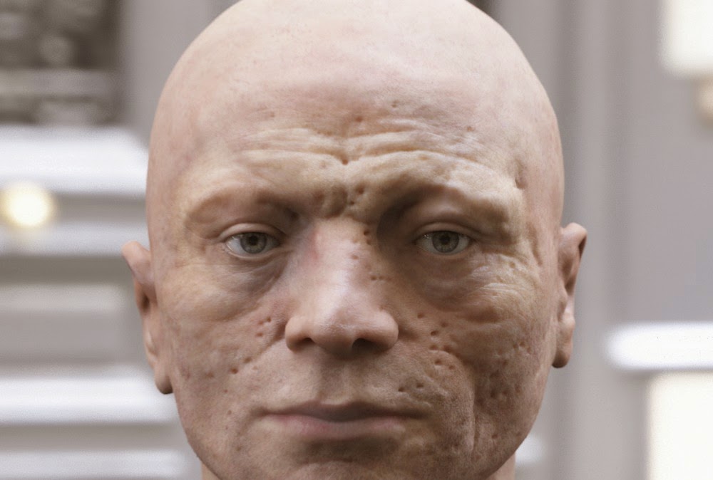
Not so frequently seen is this recent reconstruction of the head of Robespierre, architect of the French Revolution's "Reign of Terror." I always pictured him as having a thin, angular face, but I guess I was wrong.

Sunday, May 11, 2014

WHAT FASHIONABLE PEOPLE ARE WEARING NOW


Well, if you're a fashionable guy then you're probably already eyeing nerd pants like these (above). They're the latest thing. They show lots of ankle and a have high waists that wrap around the bottom of the ribcage.


Hey, it beats the old fashion look that it's replacing. I was never a fan of baggy shorts (above).


Let me digress to remark that you never see stovepipe shorts (above) on the street anymore. Stovepipes were always worn with black socks and a nose ring. 


Of course the recent guy fashion that you see on the street every day is the skin-tight neo-emo jeans. The picture above is the girl equivalent of that. It's all over the place now but the high waist-nerd look will probably replace it in a few years. Tight jeans are just too hard to put on. 


The big news in women's fashion is the replacement of high heels with ultra high heels (above). 


The newest shoes are thick and high, and are usually black. I saw women wearing shoes similar to these (above) at the mall today. 


Thursday, May 08, 2014

FREUD

I've never been to a psychiatrist but if I ever try it I'll be sure the doctor is a bonafide, old-school Freudian. I want to take Freud's inward journey into the fantastic realm of the unconscious. I want to see the arid plains and pounding surf of the Romantic 19th Century mind. I want to experience the storm-swept oceans and terrifying Minotaur caves that Freud believed fed into our emotions.


 Forget all the pills and advice that psychologists dispense nowadays. They're meant to help you cope, to help you function. But who cares about function? I want adventure.


I want access to the myths Freud says my mind has created for me. If my mind tells me that I'm a kind of Odysseus facing monsters then I want to see those monsters. If my mind is constantly cranking out stories to make sense of the world, then I want to know what those stories are.


I want to develop a gut feeling about what the mysteries of life really are. I want to run through Daliesque landscapes.


Before I leave I have to tell you how this desire to know what's in my mind came about. It goes back to the time my daughter was a young teenager and was reluctant to cut my hair. One day it dawned on me that she didn't want to touch my hair because she unconsciously believed that if you touch an older person you become old yourself. Of course that's not true, but it struck me that I believed that myself when I was a kid. Maybe all kids believe it. Maybe it sticks with us even when we become adults and know better.

Lots of us have beliefs that defy common sense. I don't believe in ghosts yet I wouldn't want to spend a night in a haunted house. I can't help wondering how many of these contradictory beliefs I entertain. I assume I have all the common contradictory beliefs...the belief in good and bad luck, etc., but I'm at peace with that. What gives me pause is the thought that maybe MOST of my beliefs fall into this category.  Maybe a large number of the important decisions I make every week are influenced by the mythology I developed as a kid.

If that's true then I'd like to know what that mythology is. I'd like to know what kind of world I've constructed for myself.


Saturday, May 03, 2014

LOVE SCENES

I like the way love scenes were handled in the films of the thirties and forties. Imagine how thrilling it must have been to have been a filmgoer in the days when gigantic, passionate heads loomed over audiences of silhouetted chain-smokers. Almost everybody smoked in those days, even some of the kids who sneaked in the exit doors.


Hollywood knew how to do love scenes in those days. They often started in the light...


...and then made their way into darkness. Maybe that was to assuage the Hays Office but I prefer to think that it was done to push the scene into the realm of myth and magic. 


Screen lovers of that period (above) were usually confronted with some insurmountable obstacle like a pesky, killjoy spouse previously thought dead. That elevated their love to the level of tragedy.


Sometimes the obstacle was a disease. Here (above) Garbo has only hours to live but she struggles to keep that a secret from her lover who can't understand why she seems to be so tired and mushy all the time.


Sometimes though, the couple won the lottery and ended up being deleriously happy. They looked into the future and saw nothing but a continuation of their bliss. 


I love the closeups (above) where one head studies the other. 


And how can you beat beach kissing?


Some argue that love scenes...the moment when two closeup heads come together for a crescendo kiss...are overrated. They point out that, when shown out of context, even well known love scenes seem disappointing. That's because the most interesting part of love is established in the light-hearted details or the torturous build-up spread throughout the film. For these fans the boffo climax seems unnecessary.


Maybe they're right, but I still prefer it. My Theory Corner gut tells me that you need a story that pays off...that builds to an exciting climax. Film is about hyper reality. You need a scene to hang that on, a memory the audience can take home with them.


Tuesday, April 29, 2014

ANIMATING ON THE IPAD MINI

I promised to put up some of the animation I've been doing on but I'm still having trouble getting it online with the original timing anf framing intact. A friend has offered to help so I guess things'll work out soon. In the meantime, here's a few frame grabs from a recent film, if you can call something as short as this a film..


The time it took to do this? Less than an hour! It's amazing how fast you can go on these little iPad apps.


The key to working fast is to forbid yourself to redraw anything. 


If a line doesn't work, just draw a better one beside it.  


At this point (above) I accomplished what I set out to do...I sat a man down on a chair. All my tiny films have limited goals like that. When the film doesn't seem to be working I just delete it and start another.  If I don't have an idea I just start drawing and hope for the best. It's like doodling with animation.


I still felt like drawing so I added a table and a newspaper.


The man grabs the paper and opens it...


...and lifts it up to read. That's it. You can do zillions of these little shorts in waiting rooms and restaurants or while watching TV.


Sunday, April 27, 2014

THE TEXAS AVERY AWARD

Sorry I haven't posted for a few days, I just got busy. I do not return empty-handed, however. Here's a couple of pictures of the Texas Avery Award that John K just received at the Dallas International Film Festival. Nice, eh?


The award was the brainchild of Reel Fx and The Dallas Film Society. What do you think of it? I love it. It's nice and cartoony.


The Avery Award reminds me of my other favorite cartoon award design, The Reuben, presented every year by The National Cartoonists Society. That one was designed by ace cartoonist, Rube Goldberg.