Friday, January 12, 2007

THEORY CORNER - SCIENCE SECTION


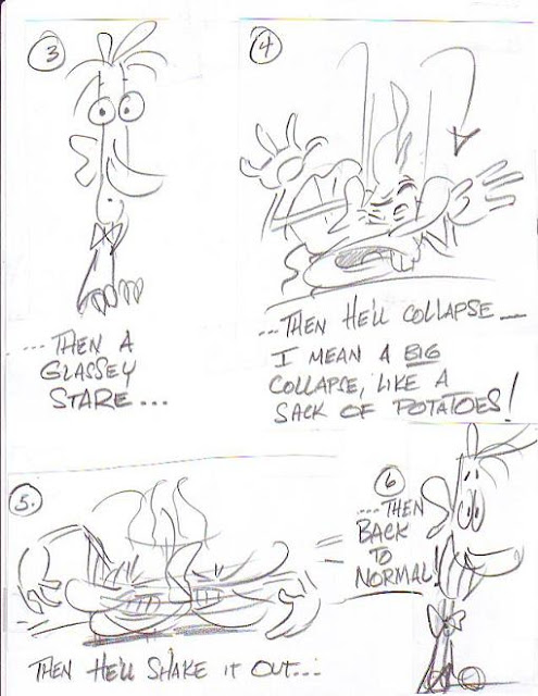
The reason is that the normal human attention span for just about anything is probably only two or three minutes. When the limit is reached people collapse then have to summon the strength to begin a new round of attention. The guy in the drawings wasn't bored, he was actually intensely interested in what was going on around him. He simply reached the end of his attention span.

So far as I know this important phenomenon was discovered by John Krisfalusi. One day I met John for lunch and I found him animating flipbooks on the restaurant table. Most of the books were funny, I wish you could have seen them, but one one book in particular stood out. It showed a guy getting a glassey-eyed stare, collapsing then straightening up again. I asked John what it was and he said he was just animating what the people at the other tables were doing. I stared at those people while John made more flipbooks and that's when I noticed what I drew above. Every single person at every table got a glassey stare and collapsed every few minutes. It's subtle, and I probably would never have noticed it if I hadn't been for the flipbook, but when you know what to look for it's unmistakable.

Interesting, huh?

Wednesday, January 10, 2007

I WANT TO PODCAST!

The more I hear about podcasting the more I like it. What it amounts to is radio that you can listen to at any time, almost anywhere, with no commercials. That's amazing! I'd love to try that on this site, maybe a 10 or 15 minute podcast once a week in addition to everything else that's here.

What kind of format? Not theories, they come off better in print. I'm dying to tell original stories: horror, sci-fi, comedy, kids'show etc. The first one I want to do would be a romance serial. Man, I can't wait!
I have no idea how to go about this. I got a book from the library, "Podcasting for Dummies" that mentions one way so I'll describe that here and see if anyone knows how to do it better. The method: 1) buy an iRiver T-10 portable mp3 player. It contains a microphone and converts voice recordings to digital mp3 files, 2) use Audacity software (for PCs, free off the internet) to edit, and 3) get an audio card installed in the computer. The book recommends the Audiophile2496 PCI digital Audio Card for Windows XP users. According to the book If you have this stuff you're ready to go.

I'll add that Kali told me about another possibility: use the microphone on any digital camera. I know that Windows XP contains some kind of sound editing program. Maybe that can do what Audacity does. Maybe it's not necessary to buy anything!

BTW, the pictures above are of radio personalities Orson Welles (topmost) and Jean Shepherd (below Welles).

Tuesday, January 09, 2007

THREE OF MY FAVORITE CLASSIC BOOKS

Here's the book (above) that influenced me more than any other: "Hamlet." I'd read Shakespeare in school and liked it but never gave a second thought to it after the assignments were turned in. One day, when I was 17 or 18, a friend and I took in Olivier's Hamlet at a revival house. I wasn't expecting much, I was just curious to see why other people liked it. Well, the curtain went up and I've never been the same since. When the film ended I could hardly stand. My friend and I walked home in silence. Neither one of us had the words to articulate the new and wonderfull thoughts the film had put in our heads.

I can truthfully say that I've never had a day in my adult life when I didn't think, at least briefly, about this play. I compare every book, film, song, bubble gum comic, and conversation, to it. It's the standard that I use to determine if the media I'm thinking about is "good enough." Actually I had one other experience like this, which was when I saw Clampett's "Great Piggy Bank Robbery" for the first time, but we're talking about books so I'll leave that for another day.


Like everyone else I've been reduced to tears by this story (above) many times. The candlestick scene is one of the greatest in all of literature. The story is especially important to me because I think it revealed my own true self to me. Before I read this I used to imitate what other people did and seemed to have success with, even if it felt hard-edged and out of character to me. After reading the story I realized that I was a Hugo kind of character, sentimental and earnest, and that life strategies that worked for other personality types probably wouldn't work for me. Frankly if I could chose my personality I think I'd pick something different but these are the cards I've been dealt and Hugo taught me to accept them.


"David Copperfield" (above) and Boswell's "Life of Johnson" (below) both taught me the importance of character in all the meanings of that word. One sense requires a layering and a balancing of interesting traits that don't always fit comfortably together. The other sense indicates reliability and guts. I don't have these characteristics but I'm grateful for the push in that direction provided by these books.


I also like the way England is described in these books. You get a sense of a rough, brutal place which is somehow struggling to give birth to something really impressive and worthwhile.

Well, that's it. I should add that I picked these pictures from the internet based soley on the attractiveness of the covers. If you're going to read these books then you should shop around for the the best type styles, editing and translations. For the Boswell book start with the part about a third of the way through where Boswell meets Johnson then, when you've read to the end, go back and read the first third. You might want a slight abridgement of the Hugo story.


ADVICE FROM UNCLE EDDIE'S MOM

This piece might just as well have been titled, "WHATEVER HAPPENED TO DINNER PARTIES?" or "THE CURSE OF THE FINICKY EATERS." My mom was right, finicky eaters have ruined the world, and the first step in that ruination has been the abolition of dinner parties.

Remember dinner parties? A group of friends would get together for a home-cooked dinner, something the host took hours to prepare. The meal might be something modest like a really well-done spaghetti from fresh ingredients or it might be something fancy requiring reduced stock and sauces. The only hard-and-fast requirement was that the food be cooked lovingly with attention to detail. Wine or good beer of course and, in a previous time, good cigars. And did I mention good conversation? What could be simpler or more delightfull? So why did these communal dinners dissapear?

I blame finnicky eaters. You can't find two people who eat the same dish anymore. This man's a vegetarian, that man's a carnivore. This woman drinks beer, that one likes wine. This person loves pasta, that person hates it. Even vegetarians can't agree. The whole thing has gotten out of hand! The little buggers who used to spurn their food as children are now grown up and are wreaking havok in the world. When dinner time rolls around it's not uncommon to see a group of friends split up, each to go to a seperate meal, either that or they all get in a car and spend an hour fighting traffic to find a restaurant on the other side of town that they all can at least tolerate. This is madness!

My mother absolved the finicky eaters but held their parents in scorn. A mother is supposed to wage a daily battle with her kid to get the kid to eat common foods. It's no fun for the mom to do this but she makes the sacrifice so that her kid will have some kind of social life as an adult and not be a hermit. Mother Eddie did this for me and as a consequence I am the sterling example of food consumer that you see before you. I can eat all the common foods...well, sort of. Of course the daily battles aged my mom way before her time. Thanks Mother Eddie for paying the price and a pox upon finnicky eaters!

Monday, January 08, 2007

DEAN CORNWELL, ILLUSTRATOR

I'm in a hurry so I'll put up these illustrations by Dean Cornwell without comment. I have a first edition of the hard-to-find classic Cornwell book but it's been drastically devalued by the reprint that came out a few years ago. Amazingly the reprint is just as well done as the earlier book and you don't have to pay collector's prices to own it.


Saturday, January 06, 2007

MY DINNER WITH ANDRE (ACTUALLY JOHN & KALI)

I'll explain the pictures later. I thought I'd start by describing a real "My Dinner With Andre" meal that I just had at the local barbeque restaurant. Nothing special, just an average lunch. In attendance: myself, Kali and John Kricfalusi.

John and Kali arrive and sit in the booth opposite me. Kali's feet graze mine and I look under the table to see if my feet are in the way. John: "I don't believe it! You just looked up Kali's dress!" Me: "No, I didn't! I was just..." Kali: (laughs uproariously). "Yes you did! I saw it! Good old Eddie, always sneaking a peak!" Me: "But... but..." John: "I'll bet you look into blouses too (he acts it out in the air)!" Me: "Wait a minute, that would be a great cartoon character! It's something Reggie would do!" John: "Reggie? It's something Uncle Peekaboo would do!" Uncle Peekaboo!? At this point the waitress takes our order.

Kali asks what book I have with me and I say it's "Romancing the Opiates" which claims that heroin is not highly addictive and withdrawal from it is not medically serious. Kali reacts with skepticism, John is still mulling over Uncle Peekaboo. Somehow the conversation drifts to Clampett, which it frequently does, and I mention that Clampett got a chance to direct because Leon was keen to compete with other studios and was therefore looking for "fighting generals" rather than the more sedate types who rise to the top in peace time. Modern American studios are more laid back, more business-as-usual, even though we face a serious threat from anime and 3D. John sends his meat back because it's tough and Kali starts drawing caricatures of me (below).

I bring up something Milt Grey said earlier, that a young Scribner would have a hard time learning his trade today. Few employers want to pay for funny animation so a young Scribner would have to have to do it at home like David Gemmill does and post his stuff on YouTube. This immediately jolts John out of his Peekaboo reverie. "That's true," shouts John, "you should do a blog about that!!! The best way to learn funny animation is to work your way up in a studio loaded with other funny geniuses! In fact the very best way would be to start in a rubberhose studio like Clampett did! You can make your mistakes there but the medium is forgiving and rewards gutsy ideas!" That's a terrific insight. If only some studios were still doing funny, fully-animated rubberhose what a terrific training ground it would be! I say that John ought to write it up on his own blog where he can really expand on it. John says no I should do it on mine. Yours, mine,yours,mine, etc.

While we're quibbling Kali is drawing another caricature of me on the doggy bag. This reminds John all over again of Uncle Peekaboo, which he proceeds to draw on the other side of the doggy bag (above, topmost). In case you have trouble figuring it out, that's an under-the-table shot of me looking at Kali's legs from the P.O.V. of those legs.

So that's my dinner (lunch) with Andre (John & Kali). I left out some stuff but that captures it OK I think. Later that hight we all met at Mike's where he had a plush doll that looked like me and Kali photographed it having sex with other plush dolls...but that's another story.

Friday, January 05, 2007

LEYENDECKER'S FIRST PASS

Here's some Leyendecker color sketches together with the finished paintings. Nifty, huh? Click to enlarge.


Thursday, January 04, 2007

A COFFEE TABLE BOOK ABOUT FONTS

"House Industries" is one of the oddest art books I've ever seen. House is a lettering company. They develop fonts and custom lettering styles for business. The book is all about the signs and fonts they worked on except that few (maybe none) of the fonts are printed in their entirety. it's a whole book of font fragments and a kazillion pictures of the guys who worked on them. Leafing through it is like looking at an art book with the bottom third of every picture missing and a trillion pictures of the artist.

There's an occassional interesting story. It seems like House tried to turn the old Stardust Hotel sign (above, topmost) into a font. They did a good job of figuring out what the rest of the alphabet would look like (below) but when they combined the new letters they discovered that the font only worked when it spelled out "Gleaming the Cube" and "Totally Rad." Evidently most good signs don't come from fonts. You can reference a font but a good sign has to be customized.
I'm in a hurry so I'll put up a couple of interesting page fragments (below). I don't know if they're all by House.


Wednesday, January 03, 2007

A MESSAGE TO THEORY CORNER MEN

Hello, men! Uncle Eddie here! It's come to my attention that some Theory Corner men (Jorge)don't like my posts about architecture. They (Jorge) think the subject is boring. Imagine that! A manly pursuit like architecture is boring to these people (Jorge)!!! Yes, it's hard to believe that some people (Jorge) who visit this site can be that depraved and uncultured.

I've thought about it and have decided that disciplinary action is called for. I hate to punish everybody for the misdeeds of a few (Jorge) but what choice do I have? A good captain someimes has to show his crew the cat-o-nine tails. Bad apples (Jorge), you brought this on yourselves!!!!


See this (above)? Kinda nice, huh? You'd like more, wouldn't ya?...Of course you would.


But THIS (above) is what you get!!!!!!!!!!!!!

And THIS (above)!!!!!!!!!

AND THIS (above) TOO!!!!!!!!!!!!!!!!!!!!!!!!!!!!!!!!!!!!!!!


AND...and...and even..even this (above)!!!!!!!!!!! (puff!)!!!!!!! (pant!)!!!!!!!!! Whadaya think 'a that!? (Puff!) (Pant!) (Puff!)

Now see what you've done? You bad apples have unleashed Mr. Bad! I take no resposibility for it!

Tuesday, January 02, 2007

ABOUT HUNDERTWASSER

Andrew asked me what I thought about Hundertwasser, the modern German painter-turned-architect. Well, I like some of his pictures . The one above is interesting.

I also like his small-scale architecture. The public bathroom above is brilliant. The idea of using a tree to symbolize urination is wonderfull. No doubt the public urinal is the focal point of the entire street. I also like the trim which looks like the kind of beautiful bead bracelets that little kids make out of painted macaroni.

I also like this corner restaurant (above). Hundertwasser's buildings make a great contrast to other styles. That's what he's best at. In my opinion a whole neighborhood in his style would be too much.


Here's a nifty wedding cake of a building (above).


I'm not a fan of his larger works, like the one above. Take away the colorfull, melted tile facade and you're left with fairly banal buildings. Architecture is mainly about interesting three-dimensional shapes and spaces, not quirky facades. Architects should revel in the idea of space and travel all over the world collecting interesting experiences of it. They shouldn't be seduced into a too literal transcription of ideas that only look good in two-dimensional drawings.

His large-scale, Nabi-neo-art-nouveau apartment exteriors (above) are terrible. I wish he'd return to small-scale work.


THE AFTERMATH OF CHRISTMAS AND NEW YEAR

I like Christmas, no strike that, I LOVE Christmas but I'm glad it only comes once a year. Every year I promise myself to make it simple and tidy and every tear it ends up being big, complicated, unpredictable, sloppy and sentimental.

The tree we got was big again. I can't see getting a small tree. A tree needs to be noble and awe-inspiring. It should never fit comfortably into the room it's intended for. Putting it up should be
difficult, the branches should knock over and break fragile knickknacks on shelves all over the room. There should be fights about how to fit the giant stump into the stand.
I like decorating a tree with a mixture of multi-colored and white lights. I like balls of many colors and lots of happy little toy and angel ornaments. When my kids were little they used to decorate by putting ornaments only on the branches they could reach so that the tree looked naked except for a kazillion balls on the bottom. They were really proud of their work and would frequently stand back and look at it, struggling to hold back a tear, they were so overcome with the profundity of it all. After everyone had gone to sleep everybody in the family would, one after the other, sneak into the living room and re-arrange the balls to suit their own tastes. I can't tell you how many fights this caused..and still causes, even now. I miss the kind of Christmas tree that was a simple, fragrent pine with lots of space between the branches. They looked a bit scraggley but you could hang tinsel and ornaments on them and they would hang straight down. Todays trees are more like round bushes that are cut into cone shapes with a chain saw. They're nice and plush...too plush! Nothing put on them ever hangs down. Ornaments just sort of lie on the branches. I have to admit that they look good though.

I made only one major blunder this year. My son lives in New York City now and he could only spend a week with us over the holiday. I was looking forward to doing all sorts of things with him but none of them materialized because he spent most of his time visiting his old school buddies. I was so disappointed at what I considered a snub that I half snubbed him when it came time to bundle him off on the plane back to NY. After the plane took off I felt horrible in the extreme! I should have learned my lesson from earlier years: never, I mean never, snub anybody over the Christmas holiday, even if they deserve it! We have the whole rest of the year for snubs. Snubs defeat the whole purpose of Christmas and make the snuber feel miserable. I think I'll call my kid when I finish writing this.
In spite of this I had a great Christmas and I hope you did too!

Saturday, December 30, 2006

Friday, December 29, 2006

MORE ARCHITECTURE

Here's an English residential street (above) done in the brutalist style. The houses are probably cozy enough inside but outside they present an intimidating row of clunky slabs which seem to menace passers-by.

The houses also seem oddly out-of-sync with the hilly terrain. Hills are usually friendly and inviting. You want to climb them so you can take in the view and the sweep of the sky. Here the hill has been taken over by big, dark cubes which conspire to block the sunlight and the view of the lowlands.


Here's another English street (above) built on an old continental model. The architecture may be foreign but it works and I can't for the life of me understand why the English are so reluctant to import good visual ideas from their neighbors.

Here's the brutalist style again (above), this time in America. This building is a terrain hog which probably throws all the smaller buildings around it out of scale. The building almost certainly is OK inside. Outside it's a big, sentimental, selfish Baby Huey of a slab, solicitous of its own workers and indifferent to everyone else.

I thought I'd end on a positive note. Here's a typical cluster of chain stores and gas stations that you find in American hollows where major routes intersect. I want to dislike it but I can't. It's a whore but it's an honest whore. It's happily commercial. Here the weary traveler can find coffee and a bacon, lettuce and tomato sandwich served by a cheerful local waitress. Here are liquor stores full of lottery tickets, tobacco, dirty magazines, candy, comics, beer and ice. Liquor stores are islands of sanity and if they ever disappear the world will be a sadder place.

BTW, notice the lack of garish signs and billboards. I've seen places that were actually enhanced by their signs but this little hollow does very well without them.

HOW GUYS SHOULD DRESS FOR A DATE

I was thumbing through the recent book on MacPhearson when I stumbled on these two cartoons. I must have stared at them for 15 minutes before I finally figured out what was so interesting about them...the people in these pictures are dressed perfectly for the occassion they're in!

The guys are wearing tuxes, which is a nice way to go if you can afford it, but that's not the most interesting thing. The really interesting thing is that they're all wearing black and white. When two black-suited men talk to each other they merge into a new black sillouette which incorporates them both. When a third or a fourth join them they form another shape still. A bunch of men alone still form a pattern: dalmation spots against a sea of white. As long as every man wears black the dark shapes keep changing all night like a kaliedescope.
Another reason a guy should wear black is that it sets off the girl he's with. If the girl wears light colors or flower patterns then black makes a perfect contrast (I can't believe how gay this sounds!). You would think that guys would lose their individuality by becomming a background for the women they're with. Oddly enough that isn't true. Black is background but it's also agressively foreground. Black and white looks good on a guy, they're's no denying it.

Thursday, December 28, 2006

REMEMBER THE CLOUDS I TALKED ABOUT?

It turns out that they were the precursers of a storm which knocked out my power lines. I'm writing this on one of my local library's computers with someone in line staring impatiently over my shoulder even though I only just sat down.

It's just as well. I can't access my picture file from here. I'll post later, or maybe tomorrow. Before I leave I think I'll see if the library has the Sports Illustrated swimsuit issue.

Bye for now.

Saturday, December 23, 2006

MERRY CHRISTMAS EVERYBODY!!!!!!!!!!

Well, it's that time of year! I'll take a couple of days off and come back...mmmm,...Wednesday, December 27th!

I don't know about you but I had a great year! Sometimes you characterize a year by just one word or phrase. For me that word would be "friends." More than any other recent year I feel that my friends made a big impact on my life in the past twelve months. It really is true that a man with friends is a rich man!

Have a merry, merry Christmas everybody!!!!!!!!!!!!!