Monday, January 05, 2015

IS JAZZ DEAD?

Above, that's a caricature of Al "Jazzbo" Collins the famous New York jazz DJ from the 50s. Below is an excerpt from a fairly recent Washington Post article which declares that jazz is dead. The upbeat tone of the pictures contradicts the negative tone of the article but I think I'll run them together and see what happens.

I love jazz myself. I don't see why it should be singled out for criticism when every other art form, even the best ones, have suffered the same decline over time. Even so, a site that calls itself "Theory Corner" shouldn't avoid controversy. Here's an abridgement of the article by Justin Moyer called "All That Jazz Isn't All That Great." See what you think.


Well, it goes on. Here's a link to the entire article, which is almost double the length of what you see here.

http://www.washingtonpost.com/news/opinions/wp/2014/08/08/all-that-jazz-isnt-all-that-great/


BTW, I stumbled on this jazz article from a mention on Mike Barrier's site. I went there to see if his new book is out. Apparently it's been out for a couple of weeks now, and it's on Kindle, too.

http://www.michaelbarrier.com/

Tuesday, December 30, 2014

WHAT I SAW IN THE 1950S

I had a wonderful Christmas but there was a lot to digest and it may be a few days or weeks before I can post about it. In the meantime here's something I reminisced to my kids about when they were here. It's an account of things I witnessed when I was a little kid in the 50s.


I was just a dimwitted kid in those days but even I could sense that it was a good time to be alive.


WWII vets must have dreamed of having their own house while they were freezing in foxholes, and in the 50s that dream became a reality for millions.


People were proud of their new lives and they liked to have their pictures taken with  symbols of prosperity. Here's (above) one symbol: formal clothes for kids, the kind that make little boys look like ventroloquist dummies. When I was forced to wear them I'd pray that other kids wouldn't see me. 


  Believe it or not, parents initially wanted their kids to watch TV. They thought it was educational. Haw! That didn't last long!


It must have been a great time to be a Dad.


It was the era of The Bombshell, the cinematic vamp who could turn men into drooling idiots.


The most worldly suburban women imitated the bombshells, I'm guessing by stuffing socks into their bras. It was only years later that I discovered that breasts don't naturally point straight up when women recline. 


Anyway, I didn't pay much attention to bombshell movies. I preferred the fare at the local kiddie matinee. This Theory Corner blog owes a lot to what I learned while watching sci fi in the dark.

It's worth mentioning that suburbia wasn't just for the middle class. Newspapers were always running articles about how it would soon be a feasible choice for anyone who could swing a loan for a few thousand bucks. Pre-fab was supposed to make it possible. Later on pre-fab fell into disrepute...I don't know why.


Once you had a house, the next step was to save up for a tail fin car. Check out this (above) Plymouth Belvedere convertible, just the thing to drive to...  


....the local Twist party! How do you like this room (above)? It looks like something out of Wally Wood. It only lacks driftwood sculpture and a mobile!

Actually few people in the 50s had a whole house full of furnishings that were up to date. My house was full of Art Deco with only a few 50s pieces. By the time we completely updated to 50s "moderne" it was the 60s and it was considered passe. 


Yes, the 50s suburbs were pretty darn good but that didn't stop dreamers from imagining something even better.


That something better was flying cars which every kid from that era desperately wanted. I think we're all traumatized because we didn't get them. 
  

So what happened to all this? Well, it's still with us in many ways, but people are a bit different now. 


Now we all like to think of ourselves as rebels.


BTW: Thanks to Steve for the great photo of Diana Dors.

Saturday, December 27, 2014

THE ART OF CONVERSATION


Hi everybody! 'Hope you had a good Christmas! Me, it's a holiday morning and I just got out of bed after lying there for an hour daydreaming. Usually I forget thoughts like that but today I had a pen and paper handy and I managed to write down some of them. See what you think.


Okay, lying under the covers I found myself wondering if there ever was such a thing as conversation.  I don't mean that conversational skills are lacking today, I'm questioning whether they ever existed at all, in any period of history. We all assume they did because they're embedded in things like novels, but did they? What if novelists made it up?

Storytellers are always doing that. Torrid love scenes, super villains in mountain fortresses, Gothic mansions with insane caretakers...they make up all sorts of things to keep you turning the pages. Maybe they make up the idea of conversation, too. After all, they have to have something to put between the action scenes.


In real life dialogue never ends the way it begins. It meanders all over the place. A conversation that begins with "Hmmmm...I wonder if drug abuse is an unintended consequence of Prohibition?" immediately takes a right angle turn with a reply like "Drugs? I have a nephew who takes drugs" which provokes the reply, "My dog used to eat aspirin" which provokes, "I don't like dogs. They bark too much." which provokes "Well, cats are no better." Real world dialogue constantly digresses like that and nothing is ever resolved. I figure there's half a chance that it was always that way.


I know what you're thinking, that smart people don't talk like that. Actually they do. A professor might say to another professor: "I can't forgive Plato for wanting to censor art" then his friend says "He didn't want to censor art. You'd know that if you read the whole book instead of the first half." then the first guy says, "Look who's talking, you never finish a book." then the other says, "And you never bus your own dishes in the cafeteria."

Maybe that's why bookish people are so mad all the time. They crave novel-type conversation which is something that's rare in the real world.


'Just a thought. I'm going back to sleep now to resume what I was dreaming about before.


Monday, December 22, 2014

MORE CHRISTMAS SONGS 2014


Here's an excerpt from Handel's "Messiah" performed by students in a small auditorium. I'm envious! The audience got to hear the music in a small hall with low ceilings that no doubt bounced the sound around til it resonated in their bones. That and the committed sound of an idealistic student choir and orchestra must have made for a fun evening.


It's always interesting to hear what Bach has to say.


In my opinion this version (above) is definitive!


The YouTube label calls this (above) a Puppetoon. Could that be right? Anyway, it's a well-read version of the classic poem. Alexander Scourby did the narration.


 Here's (above) the Italian Night Before Christmas.


MERRY CHRISTMAS everybody!

Saturday, December 20, 2014

MORE ABOUT NASH EDGERTON


 After discovering Nash Edgerton's brilliant work on Dylan's "Must Be Santa" video (see the previous post) I had to see more. Here's (above) another Edgerton short called "The Spider." Watch it and see if you can figure out how he did it.


I like the way he handled the action in the car.  I'm guessing he was influenced by "Gun Crazy" which was famous for its back-seat-camera shots. The GC cameraman makes the effect look easy, but that's an illusion. Without special equipment you could only get a shot like that with a very wide angle lens and that would have distorted the picture.

Here the characters look flattened out, meaning that the camera used a long lens (slightly long) and was farther back than you'd think. It must have been on a platform shooting through a glassless rear window, and the platform must have been attached to the car so it could take bumps in the road the same way the car did.


Real back seat shots aren't as easy to get as they appear in Gun Crazy, especially in the tiny cars everybody drives now.

So why did Nash go to so much trouble to give the illusion that his film was made cheaply with real back seat photography? I think he wanted the intimacy that comes from back seat shots. Notice there's no frontal shots. You could argue that cinema requires a variety of angles but Nash deliberately restricts his palette, as all artists do.

What you get from a back seat view is a real feeling of being cramped in a moving car. It brings back memories of past drives. Not only that but it forces you into a new relationship with the people infront. You see only the backs of your friends. You feel like  like a disembodied spirit eavesdropping on them. That creates intimacy.


Here's (above) a video which shows how a crane was used to shoot the dazzling interior pan near the end of Nash's film.

IMHO The most interesting thing about "Spider" was its highly disciplined narrative structure. Nash dials up the sounds of ordinary life and the film is cut to those rhythms. He creates a pattern of normalcy then shatters it.

After the final violence happens the pattern is repeated. We're left with the unsettling feeling that in our real world Alice-in-Wonderland universe horrifyingly unexpected events are a part of everyday life.


Wednesday, December 17, 2014

CHRISTMAS SONGS AND NASH EDGERTON


Here's a few Christmas songs that get a lot of play at my house this time of year. I thought you might like to hear them, too.


We're lucky to have a few good versions of Ave Maria. This one is by Connie Stevens, whose voice was unique.


My favorite part of Pavariti's version is his opening which is executed with dignity and power.


This Jingle Bells is a tad slow but I still like it.


I never studied this Dylan film closely but I can see that I'll have to. Dylan & co. did a great job with the music and the direction by Australian shorts director Nash Edgerton is nothing less than awesome. Think of it: he filmed dozens of moving actors in a real house where lighting is a problem and walls can't be removed. Not only that but he had a celebrity star who in his old age isn't as photogenic as he used to be. And that subplot with the guy who goes berserk...it was a brilliant way to rev up the pace of a film that was already fast. I'd love to hear the story of how this was made.

Here's a link to one of Edgerton's other YouTube shorts:
http://youtu.be/CKeooK0zfeU

Tuesday, December 16, 2014

A SECOND LOOK AT A GREAT CARTOON


I like "Jolly Rounders" so much that I can't help adding to what I wrote last time. It's wonderful to have a blog like Theory Corner where things like this can be discussed in detail. 

Anyway, I like the textured barebones background and the midlevel line of the wall boards. Some artists avoid midlevel anything because it divides the composition into two and gives it an ignorant, unschooled look. For me that's precisely why the technique is useful. Sometimes you want an ignorant look. 

I also like the way the artist puts the irritable wife on the left and gives the open doorway equal emphasis. No doubt this is to make a space for the kids when they come in later, but it serves another purpose. Given that the woman is touchy and has a short fuse it's funny to think she's near a doorway where any doofus could walk in and bother her. 
  

We cut to the outside and her ridiculously huge number of comically eager clones. I like the open front door which reminds us that there's a touchy, irritable person inside.

The kids react to something O.S. and run inside. 


The little clones run in and announce that Dad's outside and he has a "bimbo" (that's what the title card calls her) with him. Mom tosses the broom and heads for the door.

Uh-oh. Whatever fools are out there now have the total attention of a Type A character.


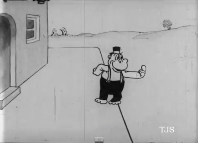
There's Dad outside, beckoning to his "bimbo." This is a technique I often use myself. The bimbo is an outrageous character and a character that funny shouldn't be in the scene when you first see them. They have to make an entrance to underline their importance. The act of beckoning functions as a kind of fanfare.


And here she is! I LOVE this hippo. Her design and very stiff but charming acting style is a masterful example of skilled ignorance. I also like having the empty space on the left where the angry wife will stand when she comes out. You could argue that leaving an awkward space there is unnecessary but...and this is important...if it's funny then it IS necessary. You could handle mom's entrance with cuts and pans and that might be good cinema, but it's not funny.

I have more thoughts about the staging in this cartoon but I'll have to save them for the time when I have the whole cartoon infront of me, and not just a tiny fragment.


Thursday, December 11, 2014

"JOLLY ROUNDERS"


I like the way the best old cartoons (above) used to look. They didn't have the production value of a film like "Frozen," but they were fifty times as funny and they were cheap to make.


 Here's (above) a fragment from a vintage short called "Jolly Rounders." The disk it was on credits Paul Terry as the director, but IMDB attributes it to someone else. I believe the disk because the film is hilarious and Bob Clampett used to say that that the young Terry was one of the funniest guys in the business.

Anyway, the film starts with an irritated housewife sweeping a carpet. She no doubt wishes her husband were there to help. I love the awkward way she handles the broom with her oversized hippo paws.


 Outside her kids see Dad coming, and they're alarmed at what they see.


 They run inside and snitch to Mother: "Dad's coming and he has a Bimbo with him!" She tosses the broom and heads outside.


 Sure enough, Dad's out there and he's beckoning to his "Bimbo."


She comes in, naked below the waist...but that's okay because she's a hippo and because her modesty is preserved by the fact that she's wearing socks and shoes.


They embrace...


...and snog.

Good Lord! Well, that's all I have.


I believe this cartoon can be found on Thunderbean's forthcoming compilation, "Cartoon Roots." Steve Stanchfield says it should be out sometime in December or January. Personally I think Jolly Rounders is worth the price of the whole set and everything else on it is free.


And did I mention that "Hot Tomato Mollie"...Hot Tamale, get it?...is on the same set? Our cup runneth over! 


Tuesday, December 09, 2014

BRITISH ART NOUVEAU


I thought I'd post about a Christmas gift idea I had, namely architectural posters. I did some research and was amazed to find how few decent ones there were. It looks like those who want that sort of thing will have to make them at home.


I'd just seen a documentary about British Art Nouveau at a friend's house so the first pictures I tried to track down were of Nouveau buildings like the famous chapel at Compton, England (above). No luck, though.


In this case it's possible that the lack of demand for posters can be accounted for by the offputting clutter and darkness of Nouveau interiors. English artists liked to mix Nouveau with Gothic and the combination didn't always gel.


British Nouveau rooms were often platypuses where different influences were thrown together, helter skelter.


The combinations seldom worked, but that doesn't disqualify them as art. I like British Nouveau. The flaws don't diminish the invigorating passion and intelligence behind it.


Nouveau/craftsman artists like William Morris were socialists and were embarrassed by the fact that the new styles (above) were labor intensive and weren't really affordable by the working poor.


To correct that he put a lot of effort into fabric design (above) that could be cheaply mass-produced. It was a case of no good deed going unpunished: the poor guy was denounced by his socialist friends who thought anything factory made was a tool of the Devil. A bitter schism took shape.


Morris must have had OCD. His leaf patterns were incredibly busy, even more so than you'd find in real life forest cover. When I was a little kid old ladies were fond of dress patterns like this. All these years later it occurs to me that some of them must have associated those busy designs with Morris and the avant garde of his day.


Anyway, the man created some beautiful fabrics but he was undercut by a brand new movement in architecture that believed in filling rooms with light. Morris's fabrics were meant for shadowy rooms illuminated by oil lamps. Bright sunlight seemed to call for something more light-hearted and airy.

Gee, thinking about all this reminds me of how fast art movements came and went in the astonishingly creative Twentieth Century. Art Nouveau had ten years, which is better than some had.