Here's a few of the ideas I've seen on the net so far. Most of them are from Reggio Emilia which is an Italian preschool of the Montessori/Waldorf sort. I have no idea if the theory behind Emilia has any merit...I just like the way some of their classrooms look.
I like their custom-made furniture. What do you think of the multiple easels combined with the long paint rack (above)? It's not a bad idea if you have more than one project going at a time.
I like some of their shelves (above), too. Also the idea of dividing the room into different work areas.
'Nice curved shelves! And I like the hanging branch and dangling...I dunno...stuff! The rest of this room (above) could be better, though.
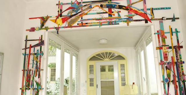
Wow! A nice door surround!
Here's (above) an interesting supply shelf/room divider.
Ni-i-i-i-ice!!!! It's a small bed sheet-type diorama/room light. It need only stand out from the wall a few inches, and it could be as small as 3' X 4'. Anything that would look good in silhouette could go behind it.
Here's an interesting idea for a basement studio. The rafters above are simply the exposed floor boards supporting the room above. Only the trees and cheap old railroad ties are added. Pillars like these might be great places to display artwork in progress.
Nifty, eh?
BTW: what about my previous attraction to Julius Schulman's studio design (above)? The answer is that I like it as much I ever did. When the time comes to build my own workplace I'll commit to whatever scheme seems to fit the space I have to work with.


