Thursday, October 11, 2007

MORE INTERESTING INTERIORS

Another Arts & Crafts living room (above)...but what's all that detail on the left? Is that a bed I see near the middle?

It's probably just a bench of some sort but it looks wide enough to double as a guest bed. If it is some kind of built-in bench bed then that's amazing! I know people used to build like that hundreds of years ago but I never saw the idea incorporated into homes as modern (1900) as this. Modern living rooms don't need guest beds because we have sofas. Even so...

I like the way the fireplace, the cabinets and the bed are tucked away in a kind of built-in theatrical stage. Maybe people like to be reminded of theater when they're home. Cars used to be designed like jets and rockets for no other reason than it made the owners feel good. Maybe theatrical shapes make homeowners feel good.


Living rooms frequently looked barren and uncomfortable in 1900. Maybe that's because they had a different function then than they do today. In those days living rooms were meant to show off the owner's wealth. So were dining rooms. A lot of the real living took place in spacious kitchens. Nowadays kitchens have shrunk and people actually use their living and dining rooms.

Here's (above) a couple of Russian-style rooms. Very interesting spaces! Nowadays only restaurants have interiors like this, which brings up an interesting point. If you want to know how to make your home cozy and social just copy what your favorite restaurant does. After all, they're in the business of pleasing people.


Architects should study successful restaurants. Even designers of business offices could learn something from watching the way people chose a place to eat. In the picture above everybody looks tickled to death to be sitting at outdoor tables under a canvas parasol. Maybe office buildings should be designed so that half the employees could work outside on weather and crime-protected terraces for part of the year.

Maybe indoor offices should be lit like reastaurants, just a bit dimly. Each desk or cubicle could be an oasis of light, just like restaurant tables are.


I like the small tapestries that you used to see in some Arts & Crafts houses. I think the Norwegians were the trend setters in this area.


Wednesday, October 10, 2007

ARTS & CRAFTS INTERIORS CIRCA 1900

I call a house like this (above) "Victorian" but it was in a book on the Arts and Crafts Movement so I'll include it here. Maybe the white trim qualifies it as an A & C house. I love houses like this but the interiors didn't always match the brilliance of the exteriors.


People of that era favored awkward high ceilings and furniture (above) that seemed oddly uncomfortable and out of place.


Low ceilings (above) worked a lot better. The low ceiling above offers shelter and helps to emphasize the luxurious width of the room. I love beamed ceilings, especially the ones that have occasional extra-thick beams for carving. I'll bet the orangey varnished wood looked great by candle light, and the reader at the raised desk in the foreground must have felt like a king when he surveyed the room.

I hate to say it, but even a terrific room like this has some defects. Arts & Crafts people didn't believe in comfortable chairs. They favored the medieval straight-backed chair and the bench. They also didn't believe in large social spaces. They'd design a big space like the one above then break it into tiny alcoves.

Even the alcoves weren't really social. Look at the big alcove on the right, above. Two uncomfortable and unmovable bench-sofas face each other across an awkward space dominated by the fireplace. It looks great but there must be times when the owners yearned for something more comfortable and friendly.

Here's (above) an odd and uncomfortable barn of a room which still succeeds in being imaginative and stimulating. The plain, maybe too plain, white cabinet dominates. The recessed bench area looks like a theater proscenium. I like the Nordic chevron pattern on the cabinet.


It's funky, and probably impractical, but I like it. The room above looks like The Globe Theater.


The color in watercolor above is so appealing that it distracts us from the defects of the room. The long, narrow shape of the dining room is uncongenial to pleasant eating and the china cabinet sits there like a big T-Rex, threatening to eat the guests.
I don't understand the appeal of monstrous cabinets, especially when the precious dishes they're supposed to contain are locked away, out of sight.

This picture (above) is off-topic but I couldn't resist including it. It's the Hungarian Pavilion at an international exhibition held in 1901. I love the stark, expressionist roof tops. I also like the way they're set off nicely by the girders in the ceiling above.


Monday, October 08, 2007

WHAT KIND OF FUTURE?

I've written about this subject before but I can't resist another try. Are there any professionals more clueless than architects? Why are they always foisting sterility (above) on us? Can't they get it through their heads that no one wants to live that way?


My guess is that most people would prefer a nice place on a quiet street (above) to an apartment in a megastructure.


Even so you have to admit that city living has some advantages. All those bright people living in close quarters! Anything is possible in a place that! My prediction is that in my own lifetime we'll see holographic robots and dinosaurs roving the city streets, visible to fans of holographic art who wear the right glasses.


I think people would much rather live in an aquarium than visit one. Big cities should have an abundance of everything that's interesting in the world. Let's have sea turtles and giant squids swimming in places that we visit frequently.


Both cities and suburbs should be full of bridges: iron bridges, wooden bridges, covered bridges, Chinese and Japanese bridges, high and low foot bridges, safe bridges, unsafe bridges...and there should be something interesting below the bridges. Waterways? Rapids? Urban kayak canals? Trees? Animals? Trolley cars? Waterfalls? Houses?


Let's plant giant trees and have tree houses (above)! I want to live in the Tarzan treehouse in Disneyland!


And let's figure out a way to bring exotic animals into urban environments. I'm tired of seeing dogs, cats and pigeons. I want free-roving monkeys and lions and ostriches. If we put our minds to it, we can figure out a way to make that happen, can't we? I mean some way that doesn't require capturing animals in the wild.


Let's have fun transportation! Can we take a submarine or a sailboat or a ferry to work instead of a bus?


Horseback riding is just about the most fun transportation there is. Can we make that possible for millions of suburbanites?


Can we have real, urban transportation like the kind we find in water parks? Can rapidly flowing water be made to channel through cities?


Why did we do away with trestles and steam trains? People like stuff like that! Can we bring these to the suburbs and cities?


Ever since I heard that Bangcock (spelled right?) uses urban kayak canals as a means of serious transportation I've been chomping at the bit to see them. Is that really possible? We have to wait for floods (above) to get our urban kayaking in.
Horse-drawn coaches of all kinds make great transportation. Not for the freeways of course, but they'd be great in the suburbs. And while we're at it, let's have affordable convertable sports cars.


Vincent said weird hippie vehicles slowly cruised all over the Burning Man festival area. They went slow enough that anyone could get on or off without the vehicle stopping. Maybe the hippies are on to something.


Somehow we've got to make cheap, safe, silent private airplanes available for urban use. I want to explore the caverns in cotton-candy clouds then land in my backyard in time for dinner. I guess if everybody did that the planes would blot out the sun. I haven't the slightest idea how to make this practical. Airplane buses, maybe?

A while back I read that one way to keep jobs from being outsourced is to make American cities so exciting and attractive that employers and skilled workers won't want to leave them, even if they can make more money some place else. Let's put that idea to the test!


Saturday, October 06, 2007

THOUGHTS ABOUT PHOTOGRAPHY

When I take pictures which include bright, sunlit ground I sometimes go for a "high key" effect, trying to unite the composition with white or light colors, and deliberately flattening people out til they're just color shapes. The picture above is pretty extreme version of that (I didn't take it) but I thought I'd include it here because it makes the point so well.
A lot of times you get that effect by tilting the camera up and getting more bright sky. Here's (above) a picture emphasizing the ground...

...and here's (above) a slightly different one which includes the sky. The composition isn't nearly as appealing as the previous one but it makes my point about using the sky to add another bright element. I wish I could use my own pictures to illustrate this but they're all of my family and they get mad whenever I attempt to post pictures of them.


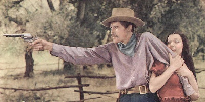
I like the way old black and white films use white. Somebody always gets the white shirt even if they're cowboys on the range. It helps the composition.


Or a white blouse.


On another subject, I hate commercial portrait photography. Mall-type photographers are always trying to use Rembrandt lighting and it looks terrible. The guy above is just too stark and three-dimensional. You can see every pore. Rembrandt pictures work best when the camera's at a distance and can flatten the subject out. Mall pictures are always taken in cramped spaces where the photographer's only a few feet away. Besides, not every face is appropriate for that kind of treatment.


I don't like this picture (above), but it's a slight improvement on the previous one. It's flatter at least, and the color isn't as jarring.
Maybe I'm giving the wrong impression by mentioning flat so often. I only use flattening long lenses for special pictures. Flat pictures with out-of-focus backgrounds killed the old Life Magazine. Maybe I'll do a blog on that one of these days.


Wouldn't it be great if mall photographers could do pictures like this (above)?


Or this (above)?


Wednesday, October 03, 2007

A DISCUSSION OF PLATO'S "REPUBLIC"

SOCRATES: "Glaucon, we've been through this before. You know the type of person
who would best rule the city."

GLAUCON: "Sure Socrates, the philosopher king."

SOCRATES: And what qualifies a person to be a philosopher king? "

GLAUCON: "He has to be honorable and have studied math til age 30."

SOCRATES: "And why should he study math?"


SOCRATES'S WIFE: "Because math is completely abstract and nobody ever has emotional arguments over it. Since all human activity can be expressed mathematically, a philosopher can settle disputes with numbers without fear of upsetting anyone."

WIFE'S FRIENDS: "Wow! That's cool!"


SOCRATES'S CONCUBINE: "Wait a minute! Wait a minute! You can talk all you want about being honorable and all that but in our culture the honorable man is expected to serve without pay. This poor-but-honorable stuff sucks! Look at me! I'm your concubine and I can't afford underwear without holes!"

SOCRATES: "Those are virtuous holes. You should be proud of them."


WOMEN: "Boy, that Socrates knows how to pinch a penny!"


GLAUCON: "Quiet everybody! You're not giving Socrates a chance to answer! He says the philosopher king can solve the poor-but-honorable problem by appearing austere during the day and enjoying his luxuries at night, when the curtains are closed."
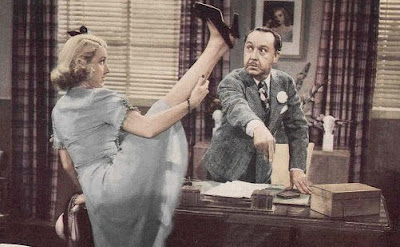
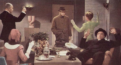
Um... why does everybody have their hands up? I'm just scratching my unmentionables."


FRIEND: "A different philosophy for the night? That's the dumbest thing I ever heard of! And that thing about solving disputes with math is just plain silly! Why does anybody bother to read about Socrates, anyway?


GLAUCON: "Glad you asked! Socrates is weird alright, but he's completely honest, even when he's advocating dishonesty. He has a way of getting to the root of a problem, and he expresses it in simple, human and very memorable terms. You only realize how rare that is when you read other philosophers.

Was he right about math solving all disputes? No, of course not, but when you think about it there is no satisfactory solution to a lot of disputes. Socrates reminds us that we should seek objective solutions while remembering how liable to error we are, and he does it in a uniquely poetic way that's likely to stick in our minds. And the closed-curtain solution really is the best way to handle the concubine's problem. It's not perfect but can you think of anything better?

I don't blame anyone for thinking Socrates is silly or boring on the first hearing, but the day will come when you'll be glad you read about him.

Many, many thanks to Barbie Miller for the terrific pictures. I stole them from her site:

Tuesday, October 02, 2007

HOW SOME WRITERS VIEW ARTISTS

When you talk to some animation writers you think they're viewing you the same way you view them, but that's a mistake. Every species sees the world through different eyes and that makes a difference.


Animation writers don't have compound eyes (yet) but the difference in vision is just as drastic. They also hear things differently.

You no doubt see yourself as reasonable and practical. I hate to say it, but that's not the way you are viewed.


When you start to speak the image degrades to something like the one above. This artist might be saying something like "There's not enough jokes in this script! If it's boring to draw then what makes you think the audience will want to see it!?" The writer hears only gibberish.


You might ask the writer, "Why are there so many characters in this show? Do they all have to be on screen at the same time? Why do I see the same characters in every series: the inventor, the minority computer whiz and the girl who can out think and outfight any boy? Why all the cliches?" The writer hears only, "Whine, whine! Grumble, grumble!"


The problem is that some writers can't write anything but that type of story. Take that away from them and they'd be out of a job. Another type of writer can can do better but they simply chose not to. They're freelancing on two other shows and cliches are easier to write quickly. These types are definitely not interested in listening to complaints by artists.
The artist says, "Why can't cartoonists write some of these shows? We know what draws well, you guys are just guessing! At least let the show have a real artist/director who can hire his own writers." The writer hears only gibberish again.


The artist says, "These scripts are way, way too long! I have to work overtime for free to do pages that'll just be thrown in the wastebasket for length. Gimmie a break will ya?" The writer hears, "I'm too lazy to do these extra pages, which I admit are fine examples of the writer's art. Can I use your couch?"

The frustrated cartoonist storms out of the writer's office believing that the primal image of his manly, angry back will compel the writer to have remorse. That's not what the writer sees.