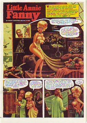
 Here's (above) a Little Annie Fannie episode from September 1963. Attributed artists: Kurtzman, Will Elder and Russ Heath. I love the "dipped-in-strong-tea-and-burgundy" color scheme.
 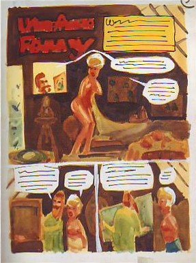 Here's a treat (above): Kurtzman's original watercolor painting of the same page! All the colors we associate with Annie Fannie are here: brown, yellow, orange, red, and green. I think I prefer this rough color scheme to the finished product which mutes the colors to make the word balloons pop better.
Can anyone do a better job than I have at describing the difference between Elder's final color and the Kurtzman rough? I know there's more to it than what I described.
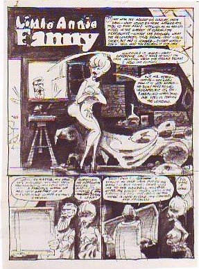 Here's (above) Kurtzman's original black and white value treatment. The first panel is a whole, self-contained art lesson in how to contrast values for maximum impact. Kurtzman's made me a believer in the idea that you should always take time to do a monochrome value treatment first.

