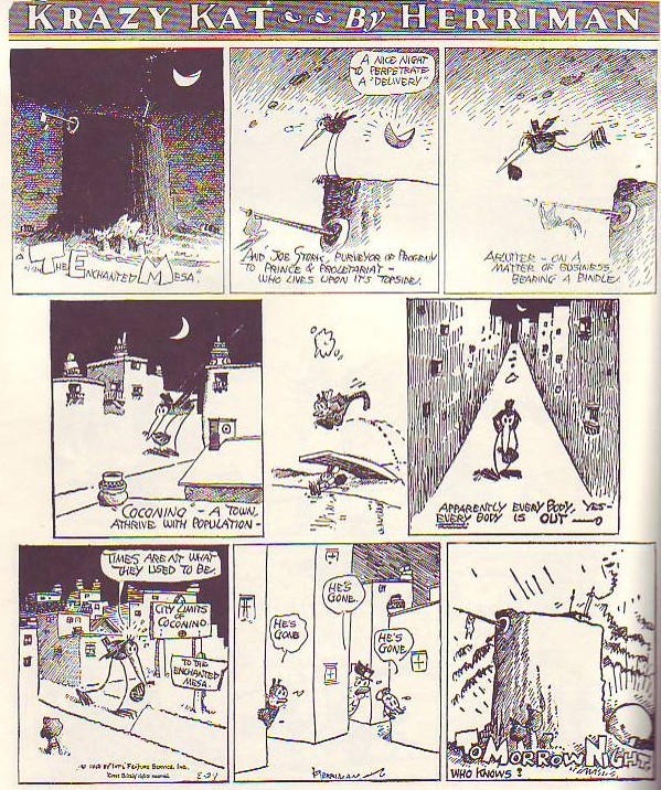
 Whatever you do be sure to click to enlarge before you attempt to read this. Herriman's work doesn't read very well when it's reproduced small and that's the only way most people have read it..that is, if they've read it at all.
I confess that I've only recently begun to like Herriman. Like almost everybody else I used to think of it as primitive, plotless and pointless. Moderns aren't the only ones to feel this way, even in it's own day editors only carried it because the big boss, Randolph Hearst, liked it. It had a fan following which included Hemingway, Picasso, T.S. Eliot, Menckon, Stein, and Edmond Wilson but the public was divided about it. Me, nowadays I love it, in fact it's one of the best strips ever in my opinion. Take a look at the Sunday page above, printed originally in 1926.
The drawing of the mesa in panel one is exquisite. Blogger doesn't reproduce fine, cross-hatched lines very well but if you could see the larger print version it would blow you away. It's moody in a way that only graphics can achieve. The mesa lettering reminds me of the title letters Eisner used in The Spirit. Come to think of it, the content of the words throughout the page are funny and full of the love of language. They're also beautiful, even the ones in word balloons: ignorant, horse-hairy kind of letters, the scratchy kind that fleas would make if they could write.
The stork tries to deliver a baby in the town but the closely-packed, glowing, night-time town is empty. Look at the size of the buildings relative to the characters! I love that! I also like the fact that the buildings are larger when they need to be. Why be consistent? How do you like the bird walking down the street with the buildings diminishing behind him in railroad perspective? That street almost animates! In the end the sun, which is bottom shaded like a ball, comes up below the mesa throwing sizzling, frenetic clouds before it. All this in a page displaying a wonderfull and innovative balance of shapes, of blacks and whites, and strangely appealing steel wool-type lines. Wow! What a treat!
Buy this book or you'll regret it later: "Krazy & Ignatz" by George Herriman (covers 1925-1926).