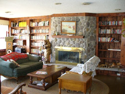
Here's (above) a reprise of the living room picture I posted yesterday. I like this room but I was surprised to find that some of my friends were indifferent to it. Well, I can see why. The book shelves are made with tacky wood, the coffee table looks like it came from a thrift store, the varnish looks like it was applied with a roller, and the fireplace is confined to a tiny box. the room definitely has flaws.
The amazing thing is that it succeeds in spite of the flaws. Against the odds it feels cozy. It's like a big, friendly mutt. An artist could get ideas in a room like this. I'd love to explain why it succeeds but I can't. Why do some spaces work and others don't? Maybe a comparison with some other types of rooms would help.

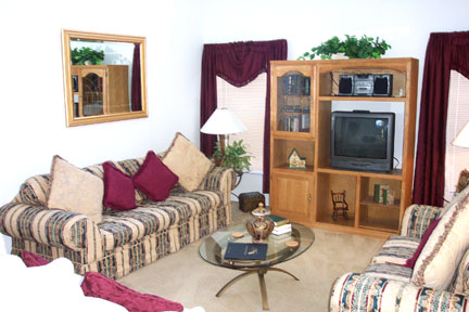
Here's a Sears catalogue room (above).
Here's some sterile modern monstrosity. I won't bother criticizing these. It would be too easy. Instead I think I'll compare the room I like to other artistic rooms like the ones below. No I'm not gay, and I don't watch home make-over shows on TV. I just feel sorry for artists who are stuck with depressing environments.
Here's an artsy room (above) that has appealing shapes and colors but never comes across as a room that people live in. The furniture is uncomfortable and isolated in little islands, and there's a pervasive feeling of bad taste passing itself off as good taste. It looks like a furniture museum.
This room is better than average. It's tasteful, sort of. But a house isn't supposed to look like a furniture catalogue, and an artist is supposed to rise above simple good taste. An artist is supposed to be on the track of something profound, something really fundamental in life, and that's missing here. There's too much visual noise. I couldn't think in a room like this.
You see this kind of room sometimes, where one stark color dominates. The variety of the real world is reduced to a single, screaming statement. Architectural Digest loves rooms like this, which is why I never read that magazine.
Here (above) is a room that tries too hard to be rustic. It's a cliche. There's nothing spontaneous about it.

Here we are back at the original room again. Maybe now the naysayers can see why I like this room (above). It has "good vibes," and the right vibe is worth its weight in gold.
The furniture is plain and comfortable and the fireplace and book shelves have a nice, quietly dynamic design. If you know anybody who has a knack for making rooms with good vibes like this, beg them on bended knees to decorate your place. Pay them well for it, and take their advice, no matter how crazy it sounds. It's as important to have stimulating, cozy, sociable rooms as it is a good winter coat or a car. Bad or awkward rooms can kill your creativity.
 Today I'm going to pay a visit to the Halloween stores in my neighborhood. I can't wait! For me Halloween is the time of year when the rest of the country agrees with me about what's important. I see it as a time to stock up on things I'll need the rest of the year.
 Mostly I like funny masks but I also like the kid art that people put up in their windows. Here's a sample above. Come to think of it, maybe these were done by adults trying to pass as kids.
  This one (above) isn't too bad.
 More kid stuff (above). Grade school teachers are great at setting off kid art to the best advantage. Individually these masks aren't special at all but together against black they look great. The gray stripe along the bottom is a touch of genius. Put your thumb over the gray and you'll see that the picture suffers without it. Where do teachers learn how to do that?


 We marveled at how many Superfly accessories you could buy in those days: afro salt shakers, afro lamps, clippers to give your dog an afro...you could put an afro on anything and people would buy it! To make the point John drew some accessories of his own on his napkin, starting with the afro faucet (above).
 Then there's the afro pubic hair drawing which, in case kids are reading, I'll reproduce tiny. Anyway, John proved his point...anything can be embellished with an afro.


 Here we are back at the original room again. Maybe now the naysayers can see why I like this room (above). It has "good vibes," and the right vibe is worth its weight in gold.