 When I take pictures which include bright, sunlit ground I sometimes go for a "high key" effect, trying to unite the composition with white or light colors, and deliberately flattening people out til they're just color shapes. The picture above is pretty extreme version of that (I didn't take it) but I thought I'd include it here because it makes the point so well.
  A lot of times you get that effect by tilting the camera up and getting more bright sky. Here's (above) a picture emphasizing the ground...
 ...and here's (above) a slightly different one which includes the sky. The composition isn't nearly as appealing as the previous one but it makes my point about using the sky to add another bright element. I wish I could use my own pictures to illustrate this but they're all of my family and they get mad whenever I attempt to post pictures of them.
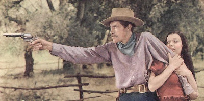
  I like the way old black and white films use white. Somebody always gets the white shirt even if they're cowboys on the range. It helps the composition.
 Or a white blouse.
 On another subject, I hate commercial portrait photography. Mall-type photographers are always trying to use Rembrandt lighting and it looks terrible. The guy above is just too stark and three-dimensional. You can see every pore. Rembrandt pictures work best when the camera's at a distance and can flatten the subject out. Mall pictures are always taken in cramped spaces where the photographer's only a few feet away. Besides, not every face is appropriate for that kind of treatment.
 I don't like this picture (above), but it's a slight improvement on the previous one. It's flatter at least, and the color isn't as jarring.
Maybe I'm giving the wrong impression by mentioning flat so often. I only use flattening long lenses for special pictures. Flat pictures with out-of-focus backgrounds killed the old Life Magazine. Maybe I'll do a blog on that one of these days.





 Tour Guide: "The sets are massive! It takes rows of powerful arc lights just to make the the living room set look authentic. Wait, there's Uncle Eddie now! Maybe we can get him to say a few words!"
a.JPG)


 Uncle Eddie: "Here, I know you'd like this bread if you only tasted it. Let me cut a slice for you!"


